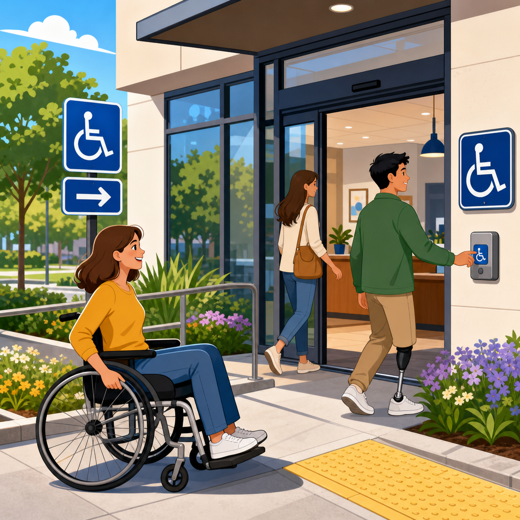
ADA signage, notice, and posting practices determine whether people can move through a workplace, store, campus, or housing property with confidence or run into avoidable barriers at every turn. In practical implementation terms, ADA compliance is the day to day work of translating legal requirements into visible instructions, room identification, wayfinding, public notices, and employee postings that people can actually use. That includes permanent room signs with tactile characters and Braille, directional signs that guide visitors to accessible entrances and restrooms, policy notices that explain accommodation processes, and temporary postings that still need readable placement and clear language. I have worked with facility teams during remodels, audits, and complaint response projects, and the same pattern appears repeatedly: organizations often focus on ramps and door hardware but underestimate the friction caused by poor signs, missing notices, inconsistent posting locations, and inaccessible communication formats. The result is confusion for visitors, delays for employees, avoidable assistance requests, and higher legal risk.
The Americans with Disabilities Act sets the baseline, but implementation is also shaped by the 2010 ADA Standards for Accessible Design, Department of Justice guidance, state accessibility codes, and where applicable, local building requirements and fair housing obligations. Key terms matter. Signage usually refers to physical signs such as identification, direction, information, and warning signs. Notice refers to policy or rights communication, including accommodation procedures, nondiscrimination statements, and service information. Posting refers to displaying required information in places employees, tenants, students, or the public are expected to see. Reducing friction means designing all three so people do not need extra effort, extra explanation, or extra courage to get what they need. A good hub article on practical implementation of ADA compliance must connect procurement, facilities, HR, communications, legal review, and front line operations, because accessibility fails when any one of those functions treats signage and notices as someone else’s problem.
Start with the signs people rely on most
The highest priority ADA signage is not decorative branding or promotional displays. It is the small set of signs people use to identify spaces independently and make decisions without asking for help. Permanent room and space identification signs, such as restroom signs, room numbers, exit stair labels, and conference room identifiers, generally need tactile characters and Grade 2 Braille when they designate permanent spaces. Directional and informational signs become essential when an accessible route differs from the standard route, when an accessible entrance is not the main entrance, or when features like restrooms, elevators, and parking are not obvious from the path of travel. In audits I have led, the most common breakdown is not a complete absence of signs but incomplete routing. A building may have one compliant restroom sign mounted correctly at the latch side, yet no directional sign from reception, no indication of the nearest accessible route around a level change, and no parking to entrance guidance.
Placement and consistency matter as much as content. The ADA Standards specify mounting locations, character contrast expectations, and tactile requirements for certain sign types, but a technically compliant sign can still create practical friction if it is hidden behind an open door, blocked by a plant, mounted at inconsistent heights, or contradicted by a separate printed notice taped nearby. I recommend facilities teams build a sign schedule tied to floor plans rather than purchasing signs one by one. That schedule should identify every permanent room sign, every directional decision point, every accessible feature marker, and every notice board. During implementation, walk the route as a first time visitor would. If a person entering from accessible parking cannot find the entrance, reception, restroom, elevator, and service desk without assistance, the signage system is incomplete even if individual signs meet dimensional rules.
Use notices and postings to explain rights and processes clearly
Physical signs help people navigate space, but notices and postings explain how the organization behaves. This is where many ADA programs become fragmented. Employees may see a poster about equal opportunity, applicants may find a web page about accommodations, customers may hear a verbal explanation about service animals, and tenants may receive an inaccessible PDF about maintenance requests. Friction rises when rights and processes are scattered across channels or written in legalistic language. Every organization needs a plain language notice framework that answers practical questions directly: how to request an accommodation, who to contact, what response timeline to expect, how auxiliary aids and services are arranged, where to report barriers, and what alternatives exist during outages or renovations.
For employee settings, required labor postings often intersect with disability rights communication. Federal contractor obligations, state fair employment notices, workers’ compensation postings, and internal accommodation procedures should be organized so employees know where the official information lives physically and digitally. For customer facing environments, place concise notices at the point of need. If an accessible entrance is around the side, a sign at the main entrance should say so plainly with an arrow. If a counter has a lower accessible service point, mark it. If assistive listening devices are available in an assembly area, say where to get them. If a building is temporarily operating with an outage affecting an elevator or automatic door, post the issue, the expected duration, and the alternative accessible path or service method. Vague statements like “ask staff for assistance” shift burden onto the visitor and should be a last resort, not a standard practice.
Create a practical implementation system instead of chasing one off fixes
Practical implementation of ADA compliance works best as a repeatable operating system. The organizations that improve fastest usually assign ownership across four functions: facilities manages the physical sign inventory, HR or people operations owns employee accommodation notices, communications controls plain language standards and alternate formats, and legal or compliance reviews policy alignment. Procurement is the fifth function that often decides success, because inaccessible sign vendors, inconsistent templates, and rush orders undermine standards. I have seen campuses spend thousands replacing brand new signs because a purchasing shortcut produced the wrong Braille, the wrong mounting details, or low contrast finishes that looked stylish but failed in use.
A reliable rollout starts with an inventory and a decision matrix. Teams should document each sign or posting by type, purpose, location, permanence, required format, responsible owner, and review cycle. That approach turns accessibility from a reactive complaint response into a manageable asset program.
| Implementation Area | What to Standardize | Common Failure | Better Practice |
|---|---|---|---|
| Permanent room signs | Tactile text, Braille, mounting location, finish contrast | Signs ordered ad hoc during construction closeout | Create a master sign schedule tied to plans and field verify placement |
| Directional signage | Accessible route language, arrows, decision points | Only marking the destination, not the route | Map the route from parking, transit, and main entry to key services |
| Public notices | Plain language, contact method, alternate formats | Dense legal text on a bulletin board | Use concise summaries with QR and phone options for details |
| Temporary postings | Outage protocol, dates, alternatives, removal process | Handwritten signs taped randomly | Use preapproved templates and assign daily checks |
| Digital counterparts | Accessible PDFs, web pages, screen reader compatibility | Physical notice updated but website left outdated | Update physical and digital channels in the same workflow |
Once the inventory exists, train site managers to use it. New construction, tenant improvements, office moves, and departmental rebranding all affect accessibility communication. A simple move of a service desk can invalidate directional signs, change queueing patterns, and leave an accessible route unmarked. Include signage review in change management, punch lists, and annual audits. This hub topic connects naturally to articles on accessible procurement, facility audits, policy communication, temporary barrier management, and staff training because implementation is cumulative, not isolated.
Handle temporary conditions with the same discipline as permanent compliance
Some of the worst accessibility failures come from temporary conditions that were treated as informal. Elevators go out of service, accessible restrooms close for repairs, events add crowd control barriers, snow blocks curb ramps, and renovation detours reroute entrances. None of those situations suspend ADA responsibilities. They increase the need for accurate notices and directional signs. Temporary postings should therefore be preplanned, not improvised. Develop templates for outages, detours, relocated services, and after hours accessible entry. Include fields for start time, expected restoration, alternate route, alternate service method, and a direct contact number that reaches an informed person.
Plain language improves compliance because it reduces hesitation. “Elevator out of service. Accessible meeting room available on Level 1. Call or text this number for immediate assistance and alternative check in” is better than “For accessibility accommodations please contact management.” The first statement tells the visitor what happened, what substitute is available, and how to act. The second creates uncertainty. In healthcare, education, hospitality, and government buildings, temporary notices should be reviewed like safety communications, because the risk of exclusion rises quickly when people cannot predict how to enter, circulate, or receive service. Good practice also includes removal discipline. Outdated notices are a credibility problem and a navigation hazard; people stop trusting the system when signs conflict with reality.
Make communication accessible across formats, not just on the wall
ADA compliance implementation is incomplete if the wall sign is accessible but the supporting communication is not. A posted notice that directs people to a PDF must lead to a tagged, readable document. A QR code on a sign should open a mobile friendly page with headings, alt text, and clear contact options. A video explaining accommodations should include captions, and when critical details are delivered by phone, staff should know relay-friendly procedures and text based alternatives. In practice, the most resilient programs pair every physical notice with an accessible digital counterpart and every digital message with a clear in-person backup.
Language choice also reduces friction. Signs and notices should use concrete nouns and verbs, avoid internal department jargon, and state the next step explicitly. Compare “Reasonable accommodation requests are processed through centralized employee services” with “To request a workplace accommodation, email accommodations@company.com or call HR at this number.” The second version is easier for everyone, including nonnative English speakers and people under stress. Where a facility serves multilingual communities, translated notices should cover the same core actions, not just a summary. Translation quality matters; machine output without review can distort legal rights or directions. The goal is not to simplify away substance. It is to remove avoidable ambiguity so the substance is usable.
Audit for friction, train the people who maintain the system, and measure results
The best ADA signage, notice, and posting practices are verified in the field. Conduct route based audits with a checklist anchored to actual user tasks: arriving from parking or transit, entering the building, finding reception, locating restrooms, reaching a service counter, requesting an accommodation, and exiting safely. Include people from operations, maintenance, HR, and customer service, because each group sees different failure points. If possible, add user testing with people who are blind, have low vision, use wheelchairs, are deaf or hard of hearing, or have cognitive disabilities. They will identify friction a code checklist misses, such as confusing directional wording, cluttered posting boards, reflective sign finishes, or staff who do not know what a posted notice means in practice.
Training should be role specific. Facilities staff need mounting, replacement, and inspection standards. Front desk and security staff need scripts for accessible entry, temporary route changes, and auxiliary aid requests. Managers need to know how notices connect to accommodation workflows. Communications teams need document accessibility skills using tools such as Adobe Acrobat accessibility checker, Microsoft accessibility features, and content management system templates. Measurement closes the loop. Track time to replace damaged signs, number of unresolved wayfinding complaints, accommodation request clarity, outage posting accuracy, and audit findings by location. When organizations measure friction, they usually find that relatively small operational fixes deliver outsized gains in independence, dignity, and efficiency.
ADA signage, notice, and posting practices reduce friction when they are treated as an operating system for access rather than a box checking exercise. The core principles are straightforward: identify permanent spaces correctly, guide people along accessible routes, explain rights and processes in plain language, plan for temporary disruptions, and keep physical and digital communications synchronized. In real facilities, these basics prevent missed interviews, delayed services, confused visitors, repeated staff interruptions, and complaints that could have been avoided by better implementation. They also support broader compliance work across procurement, maintenance, training, document accessibility, and policy administration, which is why this topic functions as a hub for practical implementation of ADA compliance.
If you are improving a site, start with an inventory of signs, notices, and postings tied to actual user journeys. Then standardize templates, assign owners, audit regularly, and update both the wall and the web whenever conditions change. That disciplined approach lowers legal exposure, improves everyday usability, and makes accessibility visible in the places where people need it most. Use this hub as the foundation for deeper work on audits, procurement, training, and temporary barrier response, and turn compliance into a dependable part of operations.
Frequently Asked Questions
What kinds of signs typically need to meet ADA requirements in a workplace, store, campus, or housing property?
The signs most commonly subject to ADA requirements are permanent room identification signs and other signs that identify a space, destination, or functional area. In practice, that usually includes restroom signs, room numbers, exit stair identifiers, offices, conference rooms, electrical or mechanical rooms when they are part of the built environment, and permanent labels for amenities such as fitness rooms, mailrooms, leasing offices, or community rooms. These are the signs people rely on to confirm where they are and whether they have reached the correct location, so they need to be designed for consistent, independent use.
For many of these permanent signs, compliance goes beyond simple readability. They often need tactile characters and Braille, along with compliant mounting and placement so users can locate and read them without guesswork. Directional and informational signs can also be important from an accessibility standpoint, especially when they guide people to entrances, elevators, accessible routes, service counters, reception points, or posted notices. While not every temporary notice or promotional poster falls under the same technical standards as a permanent room sign, the overall system still matters. If a property has compliant room signs but confusing wayfinding, blocked notices, or inconsistent posting practices, people still experience friction. The practical goal is to treat signage as a coordinated accessibility tool, not a collection of isolated labels.
Why are tactile characters and Braille so important on permanent room signs?
Tactile characters and Braille are essential because they allow people who are blind or have low vision to independently identify rooms and spaces without needing assistance. A visually attractive sign is not automatically an accessible sign. If a person cannot physically read the room identification through touch or locate the sign in a predictable place, the sign fails at its most basic job. ADA-focused signage standards address that by requiring room identification information to be communicated in formats people can reliably use.
Beyond compliance, tactile and Braille signs reduce delays, dependence, and uncertainty. In a workplace, that may mean a visitor can find a restroom, suite number, or office without asking staff for help. In multifamily housing, it can help residents and guests navigate common areas with more confidence. On a campus or in a healthcare setting, the value is even greater because people may be under stress, short on time, or unfamiliar with the property. The broader accessibility lesson is that tactile communication is not an add-on feature. It is part of making a building usable in real life. When permanent room signs include compliant tactile characters and Braille, and when those signs are installed where users expect to find them, the environment becomes noticeably easier to navigate.
How does sign placement affect ADA accessibility and everyday usability?
Placement has a major impact on whether a sign is actually usable. Even a well-manufactured sign can create accessibility problems if it is mounted too high, placed on the wrong side of a door, hidden behind an open door, obstructed by furniture or décor, or installed where users cannot approach it safely. ADA signage is not just about what the sign says. It is also about whether someone can find it consistently, reach it, and read it under normal conditions. This is especially important for tactile signs, which depend on predictable placement next to the latch side of the door or in another compliant location when standard placement is not possible.
Good placement also improves flow for everyone, not just people using tactile information. Clear signs at decision points help visitors know whether to turn, continue, enter, or seek assistance. Notices posted at accessible heights and in visible locations are more likely to be read. Directional signs that appear before a person reaches a dead end reduce backtracking and frustration. In operational terms, thoughtful placement cuts down on interruptions to staff, lowers confusion at reception areas, and helps properties present themselves as organized and welcoming. Accessibility works best when the user does not have to struggle to locate basic information. Proper placement is what turns a compliant sign into a practical one.
What are common ADA signage and posting mistakes that create unnecessary friction?
One of the most common mistakes is inconsistency. A property may have some compliant room signs but rely on paper printouts, homemade labels, outdated directories, or conflicting directional signs elsewhere. That mix causes confusion and undermines accessibility. Another frequent issue is using decorative fonts, low-contrast colors, glare-heavy finishes, or crowded layouts that make signs harder to read. In posting practices, businesses sometimes place required notices in locations that are technically public but not meaningfully accessible, such as behind counters, inside cluttered bulletin boards, or too high for comfortable viewing.
Operational mistakes are just as important as design mistakes. Signs are often installed without considering door swing, wall clearance, lighting, or future remodeling. Temporary notices can cover permanent signs. Renovations can change room functions without updating identification. Staff may tape instructions to doors instead of using a more durable and accessible communication method. In larger environments, another common problem is poor wayfinding logic: the building has signs, but they do not appear where people need to make decisions. Reducing friction means auditing the entire user journey. If someone enters the property, looks for the correct route, identifies the destination, and reviews posted notices, each step should be supported by clear, accessible communication. The biggest mistake is treating signage as a final decoration rather than a core accessibility system.
How can organizations build a signage and posting system that is both ADA-conscious and easy to maintain over time?
The most effective approach is to create standards before ordering or replacing signs. That means identifying which spaces require permanent room identification, where tactile characters and Braille are needed, what naming conventions will be used, how directional signs will support major routes, and where public and employee notices should be posted for accessible viewing. A written signage plan helps prevent piecemeal decisions that lead to inconsistency. It also makes future updates easier when rooms are renamed, departments move, or amenities change. For organizations with multiple buildings or locations, standardization is especially valuable because it creates a familiar user experience across the portfolio.
Maintenance is just as important as initial installation. Signs should be reviewed during remodels, tenant turnovers, staffing changes, and periodic accessibility audits. Posted notices should be checked for visibility, accuracy, and placement. Teams should confirm that compliant signs have not been blocked by furniture, seasonal displays, vending machines, or wall décor. It is also smart to coordinate facilities, operations, HR, property management, and marketing so that wayfinding, legal postings, and public communication do not evolve in separate silos. When signage is treated as an active part of accessibility and daily operations, organizations reduce avoidable barriers, improve confidence for visitors and occupants, and make compliance much easier to sustain.