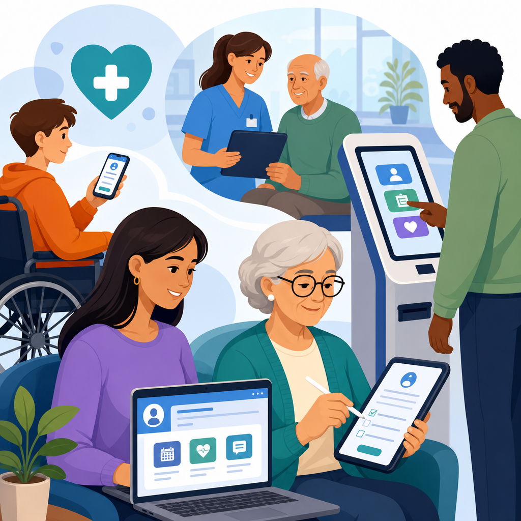
Patient portal, intake form, and kiosk accessibility in health care determines whether patients can schedule visits, complete registration, review lab results, pay bills, and sign consent documents without preventable barriers. In practical terms, accessibility means digital tools and self-service devices work for people with disabilities, including patients who are blind, have low vision, are deaf or hard of hearing, have limited dexterity, cognitive disabilities, speech disabilities, or temporary impairments caused by injury, illness, medication, or aging. In clinics and hospital systems I have reviewed, these barriers rarely appear as a single dramatic failure. More often they show up as unlabeled buttons in a portal, a timed intake form that logs a patient out mid-completion, a check-in kiosk mounted too high for wheelchair users, or a signature pad that assumes every person can grip a stylus.
This matters because health care is a high-stakes environment. If a retail checkout flow fails, the customer may abandon a cart. If a patient cannot request a refill, read discharge instructions, or check in for chemotherapy, the consequences can affect safety, treatment adherence, privacy, and legal compliance. Accessibility also affects operational performance. Front-desk staff spend more time rescuing patients from broken digital experiences, call volumes rise, and no-show rates can increase when reminders, maps, or preregistration steps are difficult to use. Health systems that treat accessibility as core infrastructure, not a side project, usually see better completion rates, fewer support escalations, and more equitable access across the care journey.
Three terms shape this discussion. A patient portal is the secure online platform where patients manage appointments, messages, records, forms, and payments. An intake form is the digital paperwork used before, during, or after a visit for demographics, insurance, history, screening, consent, and disclosures. A kiosk is the on-site self-service station used for check-in, wayfinding, queuing, copay collection, ID capture, or printing labels and receipts. Each tool sits at a different point in the patient journey, but all should support perceivable content, keyboard operation, understandable instructions, compatible assistive technology behavior, and equitable alternatives when automation fails.
For health care organizations building an industry-specific accessibility program, this hub article maps the main issues, standards, workflows, and procurement decisions that shape accessible portals, forms, and kiosks. It is designed as a foundation for deeper guides on telehealth, PDFs, captioning, mobile apps, and medical device interfaces. The goal is simple: help health systems reduce barriers before they affect care, while aligning design, compliance, operations, security, and patient experience around a single expectation that every patient can use essential digital services independently or with effective accommodation.
Why accessibility in health care digital access points is different
Health care accessibility is not just another website problem because the environment is regulated, urgent, multilingual, privacy-sensitive, and often stressful. Patients may use a portal while in pain, after a diagnosis, or under medication that affects concentration. Family members, proxies, and interpreters may participate. Identity verification, consent, and health information privacy add steps that can become barriers if not designed carefully. I routinely see organizations focus on branding or throughput before they address fundamentals such as error recovery, plain-language instructions, and support for screen readers, switch devices, voice control, and screen magnification.
Legal and technical expectations come from several directions. The Americans with Disabilities Act establishes broad nondiscrimination duties for places of public accommodation and state or local government health entities. Section 504 of the Rehabilitation Act applies to federally funded programs, and Section 1557 of the Affordable Care Act reinforces nondiscrimination in health programs and activities. For digital implementation, teams usually rely on the Web Content Accessibility Guidelines, commonly WCAG 2.1 or 2.2 Level AA, because they provide testable success criteria for content, controls, time limits, contrast, focus order, error identification, and more. For kiosks and hardware, the 2010 ADA Standards, physical reach ranges, operable parts requirements, privacy considerations, and audio output design all matter.
Patient portal accessibility requirements and common failures
An accessible patient portal must support the entire patient account lifecycle: account creation, authentication, scheduling, messaging, records access, refill requests, bill payment, notifications, and proxy access. The highest-risk failures are usually basic but consequential. Missing form labels prevent screen reader users from knowing what to enter. Modal dialogs trap keyboard focus. Appointment calendars require drag-and-drop or hover behavior that does not work on touchscreens or with keyboard-only input. Color alone marks required fields or abnormal lab values. PDFs open without accessible text structure. Session timeouts occur without warning, deleting long medical histories a patient has typed carefully.
Authentication deserves special attention. Many portals add multifactor authentication, CAPTCHA, or third-party identity proofing tools that create accessibility blockers. A secure design can still be usable. Offer accessible authentication methods, support password managers, avoid image-only verification, and provide clear recovery paths that do not depend solely on phone calls during business hours. For proxy access, make the authorization flow explicit so parents, caregivers, or legal representatives can act appropriately without exposing more data than necessary. The best portal teams test real tasks, not just static pages: finding a test result, sending a message to cardiology, downloading an after-visit summary, and paying a bill on mobile with screen magnification enabled.
Accessible intake forms reduce abandonment and data errors
Intake forms are where health care organizations lose patients long before the visit starts. A single preregistration sequence may ask for insurance cards, medication lists, allergies, preferred pharmacy, prior procedures, race and ethnicity data, emergency contacts, consent acknowledgments, and screening questionnaires such as PHQ-9 or social determinants of health assessments. If the form is not accessible, the patient may submit incomplete information, enter inaccurate data because instructions are unclear, or abandon the process entirely. That creates downstream problems for eligibility checks, coding, clinical decisions, and arrival time at the front desk.
Accessible forms follow several nonnegotiable practices. Every input needs a persistent programmatic label. Grouped questions such as radio buttons must use clear fieldsets and legends. Error messages should identify the specific problem, explain how to fix it, and move focus appropriately without erasing completed entries. Upload steps for insurance images need alternatives when camera access fails. Time limits should be adjustable or easy to extend. Reading level matters; legal consent language may need precision, but surrounding instructions should be plain enough for patients under stress. In multilingual settings, translated forms must preserve accessibility, not just literal meaning. Machine-translated text inside inaccessible components does not solve the underlying barrier.
| Access point | Typical barrier | Patient impact | Practical fix |
|---|---|---|---|
| Patient portal login | Inaccessible CAPTCHA or MFA flow | Locked out of records, messages, refills | Use accessible verification options and tested recovery paths |
| Digital intake form | Missing labels and unclear errors | Incomplete history, abandoned preregistration | Programmatic labels, inline guidance, preserved entries |
| Check-in kiosk | Screen too high, no audio output, touch-only interaction | Cannot check in independently | Accessible height, tactile controls, headphone jack, alternative input |
| Results documents | Scanned PDF without text structure | Screen reader cannot interpret findings | Generate tagged PDFs or accessible web views |
Kiosk accessibility: hardware, software, and privacy at the point of care
Health care kiosks combine physical accessibility and software accessibility, which is why they fail in more ways than web applications. Hardware issues include screen angle, glare, insufficient knee clearance, reach range violations, small touch targets, lack of tactile controls, no standard headphone jack, and receipt printers placed where wheelchair users cannot reach them. Software problems include unlabeled controls, no screen reader mode, speech output that starts automatically in public without privacy protections, and timeout behavior that forces a patient to restart while standing in a queue. In emergency departments and imaging centers, these issues become especially visible because patients may be fatigued, injured, or fasting.
Good kiosk design starts with task analysis. What exactly must the patient do: verify identity, update demographics, answer screening questions, sign consent, print a wristband, or pay a copay? Each task needs an accessible path from start to finish. A common pattern is a touch interface supplemented by tactile buttons, private audio guidance through headphones, high-contrast visual presentation, and simple language. Signature capture should allow alternatives such as staff-assisted attestation or accessible confirmation workflows. If ID scanning is required, give patients a bypass path when the scanner cannot read damaged cards or when positioning a document is physically difficult. Accessibility at the kiosk is not achieved by posting a small sign telling patients to ask for help.
Standards, testing methods, and procurement controls
Health systems need a repeatable governance model or accessibility work becomes reactive. The most effective programs use accessibility requirements in procurement, design reviews, development definitions of done, content publishing workflows, and release testing. Vendors should provide a current accessibility conformance report using the recognized VPAT format, but no experienced team treats that document as proof. It is a starting point for validation. I advise clients to request task-based demos, assistive technology test results, remediation timelines, and contract language that defines defect severity and correction obligations. This is especially important for electronic health record extensions, payment tools, chatbot modules, and identity verification vendors embedded inside the portal.
Testing should combine automated scanning, manual inspection, and assistive technology use. Automated tools such as axe DevTools, WAVE, and Accessibility Insights can catch missing alt text, low contrast, structural issues, and some form problems, but they do not confirm whether a screen reader user can complete a medication refill task. Manual testing should include keyboard-only navigation, visible focus review, zoom and reflow checks, speech input spot checks, and representative screen reader testing with JAWS, NVDA, and VoiceOver across supported browsers and mobile operating systems. For kiosks, include physical reach measurements, glare checks under site lighting, audio privacy review, and testing by disabled users in realistic clinic conditions.
Operational practices that make accessibility stick
Accessibility succeeds in health care when it is assigned to named roles and measured with patient-centered outcomes. Product managers should own accessible requirements and prioritization. Designers should maintain component libraries with tested patterns for forms, alerts, tabs, dialogs, and tables. Developers should use semantic markup, native controls where possible, and documented ARIA only when necessary. Compliance, privacy, security, and legal teams should review edge cases such as proxy access, consent records, and accommodation workflows. Front-desk staff need scripts and training so an accommodation request is handled consistently and respectfully instead of improvised in public.
Metrics matter. Track form completion rates, login failures, support tickets by issue type, average time to complete preregistration, kiosk abandonment, and remediation aging for accessibility defects. Pair these with qualitative feedback from patients with disabilities. In one clinic network, simplifying error messages and adding save-and-return functionality cut preregistration abandonment significantly because patients could gather insurance details later without losing progress. Another system reduced check-in delays after repositioning kiosks, enlarging touch targets, and enabling headphone-based audio prompts. The lesson is consistent: accessibility improvements pay back through reduced friction, better data quality, and more independent patient use of digital services.
Building the healthcare accessibility hub and next steps
As a hub for healthcare accessibility, this topic should connect policy, design, technology, and frontline operations. Supporting pages should go deeper on telehealth platform accessibility, accessible PDFs and after-visit summaries, captioning and interpreter workflows, mobile health app accessibility, pharmacy refill systems, wayfinding, and procurement checklists for vendors. Internal links between those guides should follow the patient journey so teams can move from broad strategy to specific implementation details without losing context. That structure helps compliance leaders, digital teams, and clinical operations staff find answers quickly and apply them to real systems.
The key takeaway is straightforward: patient portal, intake form, and kiosk accessibility in health care is essential infrastructure for equitable access to care. When these tools are accessible, patients can act sooner, understand more, and rely less on ad hoc staff intervention for basic tasks. Start with the highest-impact journeys, test them with disabled users, fix the barriers that block completion, and bake accessibility into every future purchase and release. If you manage healthcare digital experience, use this hub as your baseline and build a roadmap that makes access measurable, accountable, and routine across the organization.
Frequently Asked Questions
What does accessibility mean for patient portals, intake forms, and health care kiosks?
Accessibility in this context means patients can independently and effectively use digital health tools and self-service devices regardless of disability. A patient portal should allow someone to schedule appointments, complete forms, review test results, send messages, pay bills, and sign documents using assistive technology such as screen readers, screen magnifiers, voice control software, refreshable braille displays, keyboard-only navigation, and captioning tools. An online intake form should be structured so labels, instructions, error messages, date pickers, signature fields, and document uploads are understandable and operable for people who are blind, have low vision, limited dexterity, cognitive disabilities, hearing loss, speech disabilities, or temporary impairments such as an arm injury or concussion. A health care kiosk should also be usable by patients who cannot rely on touch alone, need audio output, require clear visual contrast, need reachable controls, or need more time to complete steps.
In practical terms, accessibility is not just about adding one accommodation at the end of the process. It is about designing the experience so preventable barriers do not block access to care. If a patient cannot log in because the portal times out too quickly, cannot complete registration because fields are not announced properly by a screen reader, cannot hear a kiosk prompt, or cannot physically reach the controls, that patient may be delayed in receiving treatment, understanding medical information, or giving informed consent. Accessible design helps reduce those failures. It also improves usability for everyone by making instructions clearer, workflows simpler, and interactions more predictable across devices and settings.
Why is accessibility so important in digital health care experiences?
Accessibility is essential because these systems are often the front door to care. Patient portals, online registration tools, and check-in kiosks now handle core tasks that directly affect whether a patient can receive services on time and understand what is happening in their care journey. When those systems are inaccessible, patients may be unable to request appointments, update insurance information, complete pre-visit screening, review after-visit summaries, read lab results, refill medications, or sign important forms. That can lead to delays, missed communication, added stress, privacy concerns, and unequal access to medical services.
Accessibility also matters because health care interactions are time-sensitive and high-stakes. A confusing interface is inconvenient in many industries, but in health care it can interfere with treatment, billing, discharge planning, or consent. For example, if a deaf patient cannot access captions or text alternatives during a portal-based telehealth workflow, or a blind patient cannot independently review a test result due to unlabeled interface elements, the barrier affects more than convenience. It affects autonomy, comprehension, and participation in care. Accessible systems support patient safety, reduce dependence on companions or staff for private tasks, and help organizations meet their broader obligations to provide equitable access.
What are the most common accessibility barriers in patient portals and intake forms?
Some of the most common barriers involve poor compatibility with assistive technology and weak form design. Examples include unlabeled buttons, form fields without clear instructions, error messages that rely only on color, pop-ups that interrupt screen reader flow, date pickers that cannot be used by keyboard, and documents posted as inaccessible PDFs. Patients may also encounter low color contrast, small text that cannot be resized, vague link names such as “click here,” missing heading structure, and session time limits that expire before forms can be completed. For users with cognitive disabilities, overly complex language, cluttered layouts, and inconsistent navigation can make a portal or intake process much harder to understand.
Mobile access creates additional concerns because many patients use phones rather than desktop computers. If responsive layouts break keyboard focus order, hide important instructions, or make controls too small to activate, patients with low vision or dexterity limitations can be locked out of key tasks. Intake workflows can also fail when electronic signature tools require precise gestures, identity verification steps lack accessible alternatives, or CAPTCHA challenges are not usable by people with visual, hearing, or cognitive disabilities. The underlying issue is usually the same: the product was built or updated without considering real patient needs across different disabilities, devices, and interaction methods.
How can health care organizations improve accessibility for portals, forms, and kiosks?
Improvement starts with treating accessibility as part of procurement, design, development, testing, and ongoing maintenance rather than a one-time fix. Health care organizations should ask vendors detailed accessibility questions before purchasing software or kiosks, require evidence of conformance with recognized accessibility standards, and include accessibility obligations in contracts. Internally, teams should use accessible design patterns, plain language, meaningful headings, properly coded forms, keyboard support, visible focus indicators, captions and transcripts where appropriate, and clear, persistent instructions. Kiosks should include features such as audio guidance, tactile controls or alternatives to touch-only input, reachable hardware, sufficient color contrast, privacy considerations, and enough time for patients to complete tasks without being rushed.
Testing is equally important. Automated scans can help identify certain coding issues, but they do not replace manual testing with keyboards, screen readers, screen magnifiers, voice input, and real users with disabilities. Organizations should review common patient journeys from start to finish, including account creation, password reset, insurance upload, consent signing, bill payment, and lab-result review. They should also provide an easy way for patients to report accessibility problems and get timely assistance without losing privacy or being forced into a less effective alternative. The strongest accessibility programs combine technical standards, user-centered design, vendor accountability, staff training, and continuous monitoring after launch.
What should patients and providers do if a patient portal, intake form, or kiosk is not accessible?
If a system is not accessible, the immediate priority is making sure the patient can still complete the task in a timely, private, and effective way. Providers should offer practical alternatives, such as staff-assisted registration, accessible digital or paper formats, phone-based support, in-person assistance, or another method that does not force the patient to accept delays or disclose more personal information than necessary. Staff should know how to respond when a patient reports an accessibility barrier and should avoid treating the problem as unusual or optional. A patient should not have to miss an appointment, struggle through an unusable kiosk, or rely on a family member to access confidential medical information because the primary system was not designed accessibly.
At the same time, the barrier should be documented and escalated for correction. Organizations should capture what task failed, what technology was involved, what assistive technology or device was used, and how the issue affected access to care. That information helps technical teams and vendors reproduce the problem and prioritize remediation. Patients can also ask whether there is an accessibility contact, patient advocate, compliance office, or support team that handles digital access concerns. The long-term goal is not simply to provide workaround after workaround. It is to remove the barrier at its source so future patients can independently schedule visits, complete intake, review records, pay bills, and sign consent documents without preventable obstacles.