ADA compliance walkthroughs are short, structured inspections that help teams spot accessibility barriers before they become legal, operational, or customer service problems. In practical terms, a 30 minute walkthrough is a fast review of entrances, routes, service points, restrooms, signage, digital touchpoints, and basic policies against the Americans with Disabilities Act and the 2010 ADA Standards for Accessible Design. I have used this format with retailers, clinics, offices, restaurants, and multifamily properties because it turns a complex regulation into a repeatable field process that managers can actually complete.
Practical implementation of ADA compliance matters because accessibility failures rarely stay isolated. A parking space with the wrong slope affects safe arrival. A heavy door without proper maneuvering clearance blocks entry. A sales counter that is too high turns a routine transaction into an exclusion. On websites, missing form labels and low color contrast prevent users from booking appointments or paying bills. The ADA is often discussed as a legal framework, but in day to day operations it is really a systems discipline: design, maintenance, procurement, training, and customer interaction all have to work together.
This article is the hub for practical implementation of ADA compliance. It explains what to check during a rapid walkthrough, how to prioritize findings, and where a short audit fits into a broader compliance program. Key terms are important. An accessible route is the continuous, unobstructed path connecting arrival points, entrances, and primary functions. Readily achievable barrier removal applies to many existing facilities under Title III and means changes that are easily accomplishable without much difficulty or expense. Effective communication covers auxiliary aids, interpreters, captions, accessible documents, and policies that ensure people with disabilities can obtain information and services. A 30 minute walkthrough will not replace a full ADA survey by a specialist, but it is the fastest reliable way to identify obvious barriers, document risk, and set implementation priorities.
How to run a 30 minute ADA compliance walkthrough
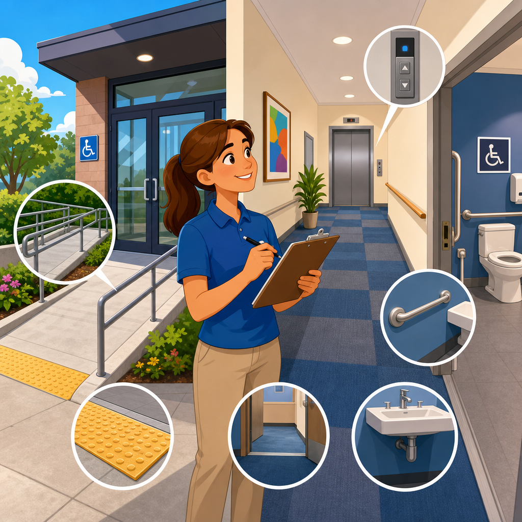
The most effective walkthroughs use a route based checklist instead of a room by room wander. Start where a first time visitor starts: arrival. Move from parking or passenger drop off to the primary entrance, then to reception, service counters, public circulation, restrooms, and one representative transaction such as a purchase, check in, or form completion. Take a tape measure, a digital level or slope app, a door force gauge if available, and a phone for photos. I also recommend bringing the property manager or department lead so issues can be verified on the spot and assigned immediately.
In thirty minutes, speed comes from checking the highest risk elements first. These are the items most likely to generate complaints or deny access outright: van accessible parking, curb ramps, door hardware, threshold changes, protruding objects, accessible seating or counters, restroom clearances, and communication access at key service points. If the site includes digital kiosks, online check in, QR code menus, or tablet signatures, include one quick functional test. A customer does not separate physical and digital accessibility, so your walkthrough should not either.
Documentation should be simple and decision oriented. For each issue, capture location, measurement, photo, user impact, likely standard, and recommended action. Separate maintenance fixes from capital projects. A missing sign, a blocked route, or a loose closer can often be corrected the same day. Re striping parking, modifying a restroom, or replacing a noncompliant transaction counter belongs in a scoped project plan. This hub article supports related implementation work such as parking compliance, restroom retrofits, signage programs, website remediation, staff training, procurement standards, and barrier removal planning.
Arrival, parking, and the exterior route
Start outside because access begins before the front door. Check whether the required number of accessible parking spaces is provided and whether van spaces include proper access aisles. In many properties the issue is not absence but deterioration: faded paint, missing signs, cracked pavement, ponding water, or access aisles used for storage. Slopes matter. Parking spaces and access aisles typically must not exceed 1:48 in any direction, and I have seen otherwise compliant layouts fail because resurfacing changed drainage and created excessive cross slope. A quick slope reading tells you whether a restriping project is enough or whether paving corrections are needed.
Next, follow the accessible route from parking and drop off to the entrance. Look for curb ramps with detectable warnings where required, abrupt level changes, narrow pinch points, overhanging branches, and objects that reduce width. Exterior routes often drift out of compliance through routine operations: sandwich boards, seasonal planters, hose reels, waste bins, and temporary signs. If a route crosses vehicle traffic, verify that markings and sightlines support safe crossing. At healthcare and hospitality sites, also check whether valet or security staff understand how to direct guests to the accessible entrance without delay or confusion.
Entrances deserve close attention because they combine geometry, hardware, and policy. Confirm there is at least one accessible public entrance on the main route or with equivalent convenience. Measure threshold height, look for maneuvering clearance, test whether hardware is operable without tight grasping, pinching, or twisting, and verify any automatic door is functioning properly. Revolving doors, intercom gates, and after hours entries are common failure points. If the only compliant entry requires a side door or staff assistance, the customer experience is already signaling exclusion, even if a technical defense might exist on paper.
Interior routes, service areas, and customer interaction points
Once inside, trace the path to the primary function of the space. In a restaurant, that means host stand, dining area, restrooms, and payment point. In a clinic, it means reception, waiting, exam access, and discharge. In an office, it means reception, conference rooms, and any public amenities. Check route width, turning space at key transitions, floor surface stability, and protruding objects such as wall mounted displays or fire extinguishers. Many interior barriers are created after occupancy by merchandising racks, furniture changes, or security devices rather than by original construction.
Service counters and transaction points are high priority because they affect independent use. Verify that at least one portion provides an accessible height and clear floor space, and that payment terminals can be reached and used. If there is queuing, confirm that stanchions leave a workable route. For self service areas, test one representative task. Can a customer complete check in, place an order, or sign a document without standing, stretching excessively, or relying on vision or hearing alone? In recent projects, the biggest misses were not doors or ramps but inaccessible signature pads, card readers mounted too high, and QR only menus with no alternative format.
Communication access belongs in every walkthrough. Review whether staff know how to handle requests for auxiliary aids, whether videos shown in public areas are captioned, whether printed forms are available in accessible digital formats on request, and whether service animal policies are correctly understood. Effective communication failures often produce complaints faster than dimensional barriers because they surface during time sensitive interactions. A deaf patient trying to understand discharge instructions or a blind customer unable to navigate a tablet waiver is experiencing a direct service breakdown, not a minor technical issue.
| Checkpoint | What to verify in minutes | Common failure | Typical action |
|---|---|---|---|
| Accessible parking | Count spaces, signs, aisle width, slope, condition | Faded markings or excessive slope | Restripe, regrade, replace signs |
| Entrance | Thresholds, hardware, clearances, automatic door function | Heavy door or round knob | Adjust closer, change hardware |
| Route inside | Width, turning space, protruding objects, floor condition | Merchandise blocking path | Reset layout, add operations rules |
| Service counter | Accessible height, clear floor space, payment reach | Terminal mounted too high | Relocate device, provide alternate station |
| Restroom | Clearances, grab bars, dispenser reach, faucet operation | Trash can blocking transfer space | Relocate accessories, adjust layout |
| Communication | Captions, alternate formats, staff response process | No procedure for aid requests | Train staff, publish protocol |
Restrooms, signage, alarms, and vertical access
Public restrooms routinely determine whether a site feels genuinely accessible. During a short walkthrough, check the approach, door maneuvering, clear floor space at fixtures, grab bar placement, toilet paper dispenser location, sink knee clearance, insulated pipes, mirror height, and faucet operability. Also look at the details people miss: coat hooks mounted too high, trash bins blocking turning space, diaper changing stations intruding into the route, and dispensers placed outside reach range. If a family or all gender restroom exists, confirm it is not being used as storage or kept locked without a clear access procedure.
Signage supports wayfinding and independent use. Verify permanent room signs at the latch side, tactile characters and braille where required, clear directional signs to accessible entrances and restrooms, and parking signs that remain visible above parked vehicles. Temporary paper signs taped to walls are not a substitute for compliant permanent identification. For life safety, review whether visual alarm notification is present in required public areas and whether refuge or evacuation procedures are understood in multistory settings. Accessibility is not complete if a person can enter the building but cannot receive emergency alerts or evacuate with assistance procedures defined.
If the facility has more than one level, include vertical access in the walkthrough. Elevators should have functioning call buttons, audible and visible signals, accessible controls, and enough clear floor space at entries. Platform lifts, where allowed, should be tested under normal operating conditions, not assumed to work because they passed an inspection months ago. I have repeatedly seen technically compliant equipment fail operationally because keys were missing, batteries were dead, or staff did not know the startup sequence. A compliance program lives or dies on operability and maintenance, not just installation.
Prioritizing findings and building an implementation plan
A walkthrough only creates value when findings turn into action. The best prioritization method uses three lenses: access impact, legal exposure, and implementation effort. Issues that block entry, restroom use, payment, or effective communication go first because they prevent core participation. Next come barriers that affect dignity and independence, such as requiring staff assistance for routine tasks. Lower priority items may still matter, but they can be sequenced into planned renovations if interim access is available. This approach aligns limited budgets with the places where accessibility changes the customer experience most.
Separate quick wins from scoped projects. Quick wins include removing obstructions, replacing noncompliant door hardware, lowering a mounted device, adding compliant signage, captioning standard video content, and training front line staff. Scoped projects include parking lot corrections, restroom reconfiguration, millwork replacement, elevator modernization, and website remediation beyond simple content fixes. For each project, assign an owner, target date, budget range, and verification method. If your organization manages multiple sites, normalize the checklist and scoring method so leaders can compare locations and fund the highest risk barriers first.
Implementation also depends on governance. Update design standards, lease exhibits, purchasing specifications, and maintenance work orders so the same problems do not return. Require accessible product criteria for kiosks, software, furniture, and signage packages. For digital assets, align procurement with recognized accessibility requirements and include testing before launch. In my experience, repeat findings usually trace back to fragmented ownership: facilities controls doors, operations controls layouts, marketing controls PDFs, and no one owns the whole accessible journey. A hub level ADA compliance process fixes that by assigning cross functional accountability.
Limits of a 30 minute walkthrough and what comes next
A 30 minute ADA compliance walkthrough is a triage tool, not a substitute for a full technical survey, legal opinion, or usability study with disabled participants. It will not capture every dimension, every scoping requirement, or every state and local overlay. Older facilities may involve safe harbor questions, program access analysis, landlord tenant allocation, or historic property constraints. Digital systems may require code level testing with screen readers, keyboard only navigation, color contrast analysis, and remediation across templates and documents. Those deeper reviews remain essential.
Still, the short walkthrough is the practical starting point because it creates momentum. It shows managers what accessibility looks like in the real environment, produces a photo based action list, and reveals whether problems are isolated defects or symptoms of a weak compliance system. Use it quarterly for high traffic sites, after renovations, before lease renewals, and whenever new service models introduce kiosks, mobile ordering, or self check in. If you want to improve practical implementation of ADA compliance, start with one site, one route, and one disciplined 30 minute review, then turn the findings into funded, verified corrections.
Frequently Asked Questions
What is an ADA compliance walkthrough, and what can you realistically check in 30 minutes?
An ADA compliance walkthrough is a short, structured review of the parts of a facility that most directly affect accessibility for customers, patients, visitors, and staff. The goal is not to replace a full architectural survey or legal analysis. Instead, it helps a team quickly identify obvious barriers, usability issues, and policy gaps that may create problems under the Americans with Disabilities Act and the 2010 ADA Standards for Accessible Design. In a 30-minute format, the walkthrough usually focuses on the highest-impact areas: parking or drop-off access, entrances, interior routes, counters and service points, restrooms, signage, digital touchpoints such as kiosks or check-in tablets, and a few basic operational practices.
That limited time can still be very productive if the review is organized. A strong walkthrough starts at the arrival point and follows the path a real visitor would take. Can someone using a wheelchair get from parking or the sidewalk to the entrance? Is the entrance usable without unnecessary force or awkward maneuvering? Are aisles, corridors, and waiting areas clear enough to allow travel? Can a person with limited reach, low vision, or hearing loss independently use the service counter, menu, registration station, or payment device? Is there at least one restroom that appears functionally accessible? Are signs understandable and placed where people can find them? These are practical questions that often uncover issues quickly.
The biggest advantage of a 30-minute walkthrough is speed. It gives owners and managers a repeatable method to spot problems before they become complaints, safety risks, customer service failures, or legal claims. It is especially useful for retailers, clinics, offices, restaurants, and similar public-facing spaces because it highlights the barriers people actually encounter in everyday use. The result is usually a prioritized action list: immediate fixes, items that need measurement or further review, and larger capital improvements that may require planning.
Which areas should be the top priority during a fast ADA walkthrough?
The top priority should always be the customer or visitor journey from arrival to service completion. In most facilities, that means starting outside and moving inward in a logical order. First, look at accessible parking, passenger drop-off areas, curb ramps, sidewalks, and the route to the entrance. If someone cannot reach the building safely and independently, the rest of the interior improvements matter far less in practice. Check for basic route continuity, tripping hazards, steep transitions, blocked access aisles, and entrances that are difficult to open or navigate.
Next, focus on the main entrance and interior route. During a short walkthrough, you want to know whether a person using a mobility device, walker, cane, or service animal can enter and move through the space without unreasonable difficulty. Watch for heavy doors, abrupt level changes, narrow pathways caused by displays or furniture, protruding objects, and waiting area layouts that force people into tight turns or dead ends. In service businesses such as clinics and offices, reception and check-in are critical. In restaurants and retail settings, counters, ordering points, seating options, fitting rooms, and payment devices often deserve immediate attention.
Restrooms are another high-priority area because they are frequent sources of complaints and often include multiple technical requirements. Even in a fast review, you can check whether there is a restroom on an accessible route, whether the door and maneuvering space seem usable, whether clear floor space is blocked, and whether dispensers, sinks, and accessories appear reachable. Finally, do not overlook communication access. Review signs, wayfinding, audible versus visual information, basic website or kiosk interactions, and staff practices such as reading forms aloud on request or offering assistance at inaccessible counters. A short walkthrough works best when it emphasizes real-world usability first and then flags technical items for follow-up measurement.
Do you need measurements and technical standards during a 30-minute walkthrough, or is it mostly a visual review?
A 30-minute ADA walkthrough is usually a combination of visual screening and selective measurement. It is not just a casual look around, because accessibility problems are often missed when teams rely only on general impressions. At the same time, it is not meant to be a full compliance audit where every element is measured and documented in detail. The most effective approach is to use a simple checklist based on the ADA and the 2010 ADA Standards for Accessible Design, then take a few targeted measurements where common failures tend to occur.
For example, it is smart to verify a small number of high-risk items rather than trying to measure everything. Teams often check door width, thresholds, counter height, aisle clearance, restroom maneuvering space, reach ranges for dispensers or controls, and the basic dimensions of accessible parking spaces and access aisles if those are part of the review. In digital or service settings, the equivalent “measurements” may be functional: can a check-in tablet be used while seated, can text be enlarged, can forms be completed without hearing instructions, and can payment devices be repositioned for access?
The key is to know the purpose of the walkthrough. If the objective is early issue spotting and prioritization, a structured visual review with a few measurements is often enough to identify meaningful barriers. If the objective is design validation, remediation planning, defense preparation, or final verification of a high-risk site, a more formal survey is usually necessary. In other words, the 30-minute walkthrough is best used as a practical screening tool that catches obvious and likely noncompliant conditions, creates a record of observed barriers, and helps determine where a deeper technical assessment is needed.
What are the most common accessibility issues teams find during quick ADA walkthroughs?
Some accessibility issues appear again and again across industries because they are tied to daily operations, not just building design. Blocked routes are one of the most common findings. Merchandise displays, seasonal fixtures, chairs, trash cans, portable signs, boxes, and cleaning equipment often reduce the clear width of accessible paths. The space may have been designed correctly at one point, but normal business activity gradually creates barriers. This is why walkthroughs are valuable even in buildings that are relatively new or recently renovated.
Entrances and service counters also generate frequent problems. Teams often find heavy doors, nonfunctioning automatic openers, inaccessible pull-side approach conditions, or thresholds that create difficulty for wheelchair users and people with mobility impairments. At counters, the issue is often that all transaction surfaces are too high, card readers are fixed out of reach, sneeze guards interfere with communication, or there is no practical way to serve a person who cannot stand for long periods. In healthcare and office environments, check-in clipboards, signature pads, and intake forms may be difficult to use for people with low vision, limited dexterity, or cognitive disabilities.
Restrooms remain a major problem area because small details can have a big impact. Common issues include doors that are hard to open, grab bars installed incorrectly, dispensers placed out of reach, inadequate clear floor space, pipes under sinks that are not protected, and turning areas blocked by trash bins or storage. Signage and communication barriers are also common. Missing or unclear accessible route signs, lack of tactile restroom signage, poor visual contrast, and staff who do not know how to assist customers with disabilities can all undermine access. In short, the most common findings are often simple, fixable conditions that affect usability every day, which is exactly why a quick walkthrough is so valuable.
What should happen after the walkthrough to reduce risk and actually improve accessibility?
The walkthrough only creates value if it leads to action. After the review, the first step should be to organize findings into clear categories: items that can be fixed immediately, items that require maintenance or operational changes, items that need measurement or professional evaluation, and items that may require budgeting as part of a longer-term barrier removal plan. This keeps the process practical and prevents teams from feeling overwhelmed. A simple door adjustment, relocated floor display, lowered payment terminal, or updated staff procedure can often resolve high-impact issues quickly.
Documentation is also important. Create a concise record of what was reviewed, what barriers were observed, where they were located, and what corrective actions were assigned. Photos, notes, and a target completion date help turn the walkthrough into an accountability tool. If the facility is part of a larger organization, a standard reporting format makes it easier to compare locations, identify recurring issues, and decide where to allocate resources. Good documentation also shows that accessibility is being managed proactively, which can be helpful from both an operational and risk-management standpoint.
Finally, treat ADA accessibility as an ongoing process, not a one-time event. Conditions change as layouts shift, equipment is replaced, websites are updated, and staff turnover occurs. The best organizations repeat short walkthroughs regularly, train frontline employees on basic accessibility practices, and escalate complex issues to qualified design, legal, or accessibility professionals when needed. That combination of quick inspections, prompt fixes, and periodic deeper review is what makes a 30-minute ADA walkthrough effective. It turns accessibility from a reactive concern into a manageable, repeatable part of operations.