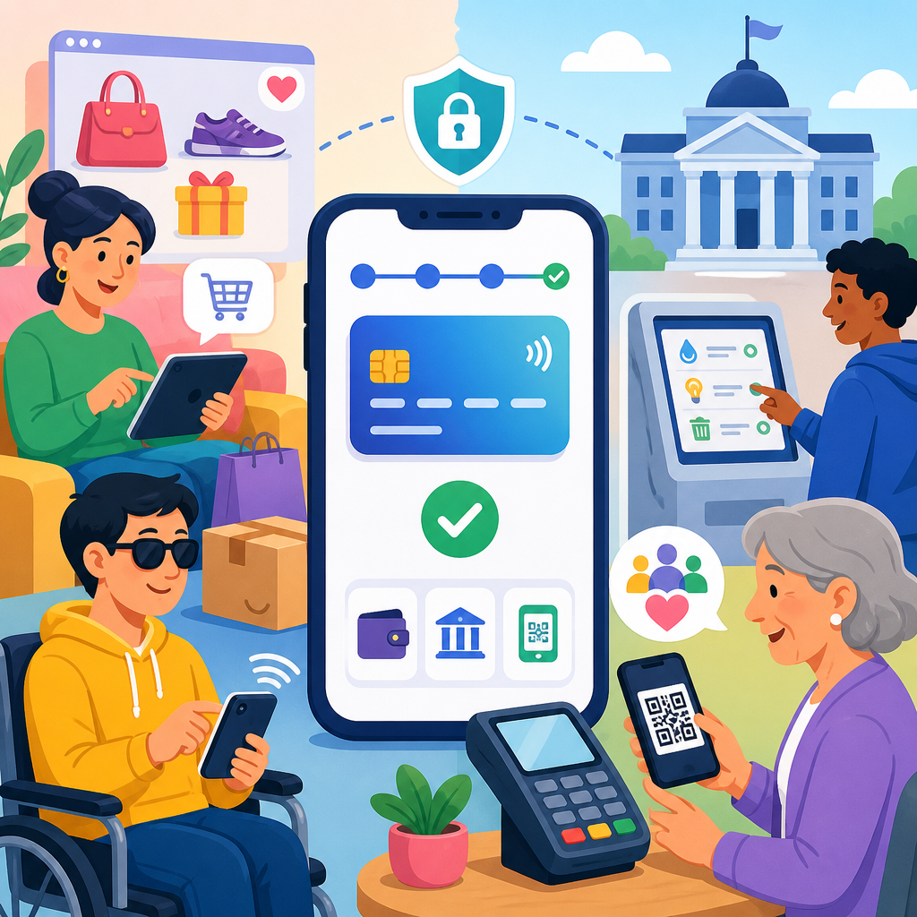
Accessible payment flows for e-commerce and public fees determine whether people can complete essential transactions independently, securely, and without unnecessary friction. A payment flow includes every step from selecting a product or service to entering billing details, authenticating the transaction, receiving confirmation, and accessing receipts or next actions. In practice, that means product pages, shopping carts, checkout forms, tax portals, utility bill interfaces, parking fine payments, school fee systems, and the payment gateways that connect them. When these journeys are not designed for people using screen readers, keyboard navigation, voice control, magnification, captions, plain language support, or alternative authentication methods, conversion drops and exclusion rises.
I have worked on checkout redesigns for retailers and payment steps for public-sector service portals, and the same pattern appears repeatedly: teams focus on PCI compliance, fraud prevention, and visual polish, yet overlook whether a user can find the total, correct a field error, or complete multi-factor authentication without seeing a tiny code timer. Accessibility in payment design matters because it affects revenue, legal risk, trust, and civic participation at once. It also sits at the center of broader innovation in technology and accessibility, where inclusive design, assistive technology support, secure identity verification, and resilient service delivery must work together instead of competing.
For e-commerce, accessible checkout improves cart completion, reduces support contacts, and lowers abandonment caused by hidden fees, inaccessible promo code fields, and broken focus order. For public fees, it has a wider social impact. A resident paying a permit renewal, transit citation, or water bill may have no practical alternative. If the portal fails with keyboard traps, inaccessible CAPTCHA, or PDF-only receipts, the result is not just inconvenience; it can mean late penalties, interrupted service, or lost confidence in government technology. That is why accessible payment flows should be treated as core infrastructure, not a cosmetic enhancement.
The standards and practices are established. WCAG 2.2 provides the baseline for perceivable, operable, understandable, and robust interactions. The Web Content Accessibility Guidelines intersect with EN 301 549 in public procurement, ADA and Section 508 obligations in the United States, and strong customer authentication requirements under PSD2 in Europe. Payment teams also need to consider PCI DSS, privacy law, fraud tooling, browser autofill behavior, mobile wallet APIs, and the constraints of third-party gateways. The challenge is not a lack of guidance. The challenge is integrating accessibility into a payment stack that often spans multiple vendors, embedded iframes, legacy forms, and security controls.
What makes a payment flow accessible
An accessible payment flow is one that lets users perceive the information, operate every control, understand what is required, and recover from mistakes without assistance. That definition sounds simple, but in checkout design it has concrete implications. Form labels must be programmatically associated and visible. Error messages must identify the field, explain the problem, and suggest a fix. Focus must move logically after actions such as applying a voucher, expanding address options, or failing card validation. Status changes like “payment processing” or “card declined” must be announced to assistive technologies. Timeouts need warnings and extension options. Totals, fees, taxes, discounts, and due dates must be presented clearly in text, not only through color or layout.
The most common failures are avoidable. I routinely see placeholder text used as the only label, address lookup widgets that cannot be navigated by keyboard, inaccessible calendar pickers for due dates, and CVV explanations hidden inside hover-only tooltips. Another recurring issue is embedded payment frames with poor title attributes or unlabeled fields, which makes card entry confusing for screen reader users. Public portals often add separate barriers: session expiration without warning, ID verification steps that require image uploads with no alternatives, and confirmation pages that disappear before a user can save the reference number.
Mobile adds another layer. Many users complete payments on phones using TalkBack, VoiceOver, switch control, zoom, or speech input. Numeric keyboards should appear for appropriate fields. Buttons need enough target size and spacing to prevent accidental taps. Wallet options such as Apple Pay or Google Pay can improve accessibility by reducing manual entry, but only if fallback methods are equally usable and the wallet button itself is correctly exposed to assistive technologies. Accessibility is not one feature; it is the quality of the entire transaction journey under real-world conditions.
Key barriers in e-commerce checkout and public fee portals
E-commerce checkout and public payment systems share technical patterns, but their failure modes differ. In retail, abandonment often starts with account creation walls, hidden shipping costs, or discount code interactions that disrupt screen reader flow. Guest checkout is usually more accessible because it removes password complexity, email verification loops, and preference prompts before the purchase is complete. Retailers also frequently introduce friction with dynamic upsells, accordions for delivery methods, and loyalty widgets inserted late in the DOM, all of which can confuse heading structure and reading order.
Public fee portals tend to inherit barriers from procurement choices and legacy integration. A city may use one platform for identity, another for case lookup, and a separate processor for the transaction itself. Users move across domains, encounter inconsistent interfaces, and sometimes lose context about what they owe or why. I have seen parking citation portals where the plate search results were announced poorly, then the payment page opened in a new window without warning, followed by a receipt available only as an untagged PDF. Each step individually seemed manageable to the project team, but together they created a brittle experience for keyboard and screen reader users.
Security controls are another common source of exclusion. Visual CAPTCHA remains a major barrier when no accessible alternative is provided. One-time passwords can fail users who rely on email clients that do not update quickly, who use screen readers with delayed app switching, or who cannot copy codes easily between devices. Some fraud tools block pasted card numbers or mask formatting in ways that disrupt dictation software. Strong security is necessary, but inaccessible security is simply poor system design.
Design principles that improve completion rates and usability
The best payment flows reduce cognitive load while preserving transparency. Users should always know three things: what they are paying for, how much they will pay, and what happens next. A persistent order summary or fee summary helps, provided it is available to screen readers and does not trap focus on smaller screens. Plain language matters more in payment than in many other digital tasks because users are balancing risk, urgency, and financial consequences. “Card security code” is clearer than “CSC,” and “You have ten minutes before this session expires” is better than a silent timer.
Progressive disclosure can help when used carefully. Hiding advanced options such as alternative billing addresses, promo code fields, or saved invoice references can simplify the interface, but expanding sections must announce state changes and remain keyboard accessible. Inline validation should not interrupt users on every keystroke. Validate on blur or on submission with helpful guidance, preserve entered data, and return focus to the first unresolved issue. For public fees, provide a review step that summarizes account identifiers, charge amount, convenience fees if any, and delivery method for the receipt. That review step prevents costly mistakes and reduces disputes.
Consistency is a major accessibility feature. If the “Continue to payment” button becomes “Next,” then “Submit,” then “Pay now,” users must keep reinterpreting intent. Consistent headings, controls, and error patterns help everyone, especially people with cognitive disabilities and those using assistive technology shortcuts. These practices also support better analytics because teams can isolate where users drop off instead of debugging multiple interaction styles for the same task.
| Payment flow element | Common accessibility failure | Better implementation |
|---|---|---|
| Contact and billing forms | Placeholder-only labels and vague errors | Visible labels, field hints, specific error text, preserved input |
| Address lookup | Keyboard-inaccessible suggestions | ARIA-compliant combobox with manual entry fallback |
| Authentication | Visual CAPTCHA or short OTP timeout | Accessible challenge alternatives and extendable time limits |
| Payment status | Silent processing spinner | Live region updates and clear retry guidance |
| Receipts | Image-based or untagged PDF only | Accessible web receipt plus tagged downloadable document |
Technology choices that support accessible transactions
Innovation in technology and accessibility is most valuable when it removes steps without removing control. Payment Request API, browser autofill, tokenized saved payment methods, and mobile wallets can all reduce form burden. In my experience, these tools improve completion rates most for users with motor impairments, fatigue, or limited dexterity because they minimize repetitive typing. However, they are not universal solutions. Browser support varies, enterprise environments may restrict wallets, and some public portals require fields that do not map cleanly to standard payment request schemas. The right approach is to use these technologies as enhancements, not mandatory paths.
Third-party payment gateways deserve special scrutiny. Teams often assume a reputable processor automatically delivers an accessible checkout. Sometimes it does; often it does not. Evaluate hosted fields, iframe labeling, tab order, error announcements, localization, and support for screen readers on desktop and mobile. Stripe, Adyen, Braintree, Worldpay, and government-oriented processors all offer different implementation models, and accessibility depends heavily on how the merchant or agency configures them. A technically compliant gateway can still produce a poor user experience if the surrounding page fails to explain fees, redirects unexpectedly, or mishandles confirmation states.
Assistive features should be built into the wider service ecosystem. Offer accessible receipts by email and on-page. Support digital wallets alongside bank transfer, card, and alternative local methods when relevant. Ensure customer service channels, including chat and phone, can reference transaction IDs generated in accessible formats. For recurring public payments, let users choose reminder channels and manage autopay with clear consent and cancellation flows. True accessibility extends beyond the pay button into account management, notifications, and dispute resolution.
Testing, governance, and measurement across the payment lifecycle
Accessible payment flows are not achieved through one audit at launch. They require continuous testing across releases, devices, and vendors. Automated checks with axe, Lighthouse, or WAVE can catch missing labels, contrast failures, and some structural issues, but they will not tell you whether a receipt makes sense in a screen reader, whether focus returns properly after a declined transaction, or whether a user can complete 3-D Secure authentication under time pressure. Manual testing with keyboard-only navigation, NVDA, JAWS, VoiceOver, TalkBack, zoom, and high-contrast modes is essential. Usability sessions with disabled participants are even more valuable because they reveal interaction debt that formal conformance reviews miss.
Governance matters as much as design. Procurement language should require accessibility evidence from gateway providers and civic technology vendors. Design systems should include payment-specific components such as amount summaries, error banners, OTP inputs, and receipt layouts that meet established patterns. Product teams need defect severity rules that treat blocked payments as urgent accessibility incidents, not backlog items. Analytics should track form error rates, timeout exits, authentication failures, and drop-off by device type, then pair those metrics with qualitative support data. A rising decline in one browser or one assistive path usually indicates a fixable implementation issue, not user error.
Documentation closes the loop. Publish accessible help content that answers practical questions: Which payment methods are accepted? Are convenience fees applied? How can someone request an alternative format receipt? What happens if a session expires? This content reduces anxiety and support calls while improving discoverability for related service pages within a technology and accessibility content hub. It also reinforces institutional trust, which is critical when the transaction involves taxes, fines, tuition, healthcare bills, or regulated commerce.
Building a hub strategy for innovative solutions in technology and accessibility
As a hub topic, accessible payment flows connect naturally to adjacent subjects: accessible authentication, form design, inclusive mobile UX, digital identity verification, assistive technology testing, document accessibility, and customer support accessibility. Organizations that treat these areas as separate projects usually create fragmented journeys. Organizations that connect them build stronger systems. For example, an accessible sign-in process supports saved payment methods, which reduces checkout effort; accessible document generation improves receipt usability; accessible notifications help users verify and track transactions without confusion.
The most effective roadmap starts with high-impact journeys. For retailers, begin with cart, checkout, account payment methods, and order confirmation. For public agencies, start with the top fee types by volume and consequence, then align payment improvements with case lookup, account recovery, and receipt access. Set measurable targets: lower checkout abandonment, fewer payment-related support tickets, better task completion in moderated accessibility testing, and reduced late-fee disputes tied to portal usability. These are operational outcomes, not abstract ideals.
Accessible payments are one of the clearest examples of innovation serving both equity and performance. The same decisions that help a screen reader user understand a declined card also help a rushed mobile user on a weak connection. The same receipt structure that works with magnification also improves audit trails and customer service. If your organization is building a technology and accessibility program, payment flows belong near the top of the roadmap. Audit your highest-volume transactions, test them with real users, and fix the blockers that stop people from paying with confidence.
Frequently Asked Questions
What is an accessible payment flow, and why does it matter for e-commerce and public fee payments?
An accessible payment flow is the complete payment journey designed so people with disabilities can complete a transaction independently, confidently, and without avoidable barriers. It covers every step: reviewing products or services, understanding fees, adding items to a cart, entering billing and contact information, choosing a payment method, completing any identity verification or authentication, receiving confirmation, and accessing receipts or follow-up instructions. In e-commerce, that might mean buying groceries, medicine, or household goods. In public services, it can include paying taxes, utility bills, parking fines, permit fees, tuition, or other essential charges.
Accessibility matters because payment is not a minor website feature; it is the point where a user must successfully act. If that path breaks for someone using a screen reader, keyboard navigation, voice control, magnification, captions, or other assistive technology, the user may be blocked from buying necessary items or paying legal or civic obligations on time. That can lead to missed deadlines, late fees, service interruptions, reputational damage for the organization, and avoidable customer support costs.
Well-designed accessible payment flows also improve usability for everyone. Clear labels, predictable navigation, visible error messages, mobile-friendly forms, readable instructions, and simple confirmation steps help users who are tired, distracted, using a small screen, dealing with low bandwidth, or unfamiliar with digital payments. In other words, accessibility strengthens completion rates, reduces abandonment, and supports trust. For both commercial and public-sector organizations, it is a practical business and service requirement as much as a compliance issue.
What are the most common accessibility barriers users encounter during checkout or online fee payment?
Some of the most common barriers appear in forms, timing, authentication, and confirmation screens. Payment forms often fail when fields do not have properly associated labels, placeholder text is used as the only instruction, required fields are not announced to assistive technology, or the tab order jumps unpredictably. Users navigating by keyboard may get trapped in date pickers, modal windows, promo code panels, or payment widgets. Screen reader users can struggle when error messages are vague, appear only in color, or are displayed visually without being announced programmatically.
Another major issue is cognitive overload. Many checkout experiences ask for too much information at once, use inconsistent wording, or interrupt the process with surprise upsells, forced account creation, or countdown timers. Public payment portals can add further complexity with legal references, account numbers, case IDs, jurisdiction-specific terminology, and multiple branching paths that are difficult to interpret. If a user makes a small mistake and the page refreshes without preserving entered data, the experience can become exhausting very quickly.
Authentication is another high-friction area. CAPTCHAs without accessible alternatives, one-time codes that expire too quickly, bank authentication windows that are not keyboard-friendly, and biometric-only verification methods can all prevent users from completing payment. Confirmation is often overlooked too. Some systems show a brief success message but do not provide a downloadable receipt, reference number, email confirmation, or clear next steps. For essential transactions such as utilities, taxes, or fines, that missing evidence can create real problems. Accessibility barriers rarely exist in one place; they tend to compound across the entire flow, which is why the full end-to-end journey must be reviewed.
How can organizations design payment forms and checkout steps to be more accessible?
Accessible payment design starts with structure and clarity. Each step should have a clear purpose, a logical heading hierarchy, and concise instructions written in plain language. Form fields need persistent labels, not just placeholders, and related fields should be grouped in meaningful ways. For example, billing address, payment details, and contact preferences should be visually and programmatically organized so users understand what belongs together. Required fields should be identified consistently, and input expectations such as date format or card number spacing should be explained before errors occur.
Keyboard access is essential. Every interactive element, including dropdowns, date selectors, expandable sections, and payment method controls, should be fully usable without a mouse. Focus states should be visible, and focus should move predictably, especially when a modal, authentication step, or inline error appears. Users should not lose their place in the process after correcting an issue. If there are multiple steps, a progress indicator can help users understand where they are and what remains, but it should be simple and accurately announced to assistive technologies.
Error handling should be specific and supportive. Instead of saying “invalid input,” explain what is wrong and how to fix it, such as “Enter a 5-digit ZIP code” or “The card expiration date must be in MM/YY format.” Error summaries at the top of the page can help users quickly locate problems, but each error should also be associated directly with the relevant field. Data should be preserved whenever possible so users do not have to re-enter entire forms. Finally, confirmation pages should clearly state that payment was successful, include the amount, date, payment method, reference number, and any next actions, and make receipts easy to view, download, print, or receive by email. Good accessibility is not only about passing checks; it is about reducing uncertainty at the exact moment users need confidence most.
What should public agencies and utilities pay special attention to when making fee payment systems accessible?
Public agencies and utilities handle payments that are often urgent, mandatory, or tied to essential services, so the stakes are especially high. Users may be paying under stress, on a deadline, or with limited digital experience. That means the payment journey must prioritize clarity above all else. Agencies should clearly identify what is being paid, the amount due, due dates, account or citation numbers, possible penalties, accepted payment methods, and whether partial payments, installment plans, or waivers are available. Ambiguous labels such as “reference ID” or “case code” should be replaced or supported with examples and explanations.
These systems also need to account for a wide range of real-world access conditions. Many users rely on mobile phones, older devices, public computers, or shared internet connections. Forms should be responsive, efficient, and resilient. Session timeouts should be reasonable, clearly communicated, and extendable where security rules allow. If a session expires, users should get an understandable explanation and an opportunity to recover rather than losing everything without warning. Contact options for assistance should be easy to find, and they should include accessible support channels, not just a phone number buried in the footer.
Public-facing payment portals should also think beyond the transaction itself. Receipts may need to serve as proof of compliance, so they should be accessible documents with readable text, not image-only files. Confirmation messages should explain what happens next, such as when a payment will post, whether processing takes time, and how a user can dispute or verify a charge. If the flow includes third-party processors, agencies are still responsible for the user experience in practice; inaccessible handoffs can break trust and expose users to confusion or abandonment. For essential civic and utility payments, accessibility is part of service delivery, fairness, and public accountability.
How can businesses and public organizations test and improve payment accessibility over time?
The most effective approach combines standards-based review, technical testing, and direct feedback from people with disabilities. Teams should evaluate payment flows against recognized accessibility requirements and then test real user journeys on desktop and mobile, including product selection, cart review, billing entry, authentication, confirmation, and receipt retrieval. Automated testing can catch some code-level issues, but it will not reliably uncover confusing instructions, broken focus management, poor error recovery, or inaccessible third-party payment widgets. Manual testing is essential.
Organizations should test with keyboards alone, screen readers, screen magnification, high zoom levels, voice input, color contrast settings, and reduced motion preferences. They should also test realistic edge cases: expired cards, failed submissions, invalid account numbers, two-factor authentication delays, interrupted sessions, and returning to complete a payment later. If a payment flow includes PDFs, emailed receipts, SMS confirmations, or support chat, those components should be reviewed too. Accessibility failures often appear at transitions between systems, especially where identity verification or payment processing is handled by external vendors.
Improvement should be ongoing, not a one-time audit. Payment systems change frequently due to promotions, fraud controls, policy updates, and platform redesigns, so regression testing matters. Teams should monitor abandonment points, support tickets, error patterns, and user complaints for accessibility signals. Just as important, they should involve disabled users early in research and after launches to validate whether changes actually reduce friction. When accessibility is treated as part of product quality, security, and customer service, organizations build payment experiences that are more reliable, inclusive, and effective for everyone who depends on them.