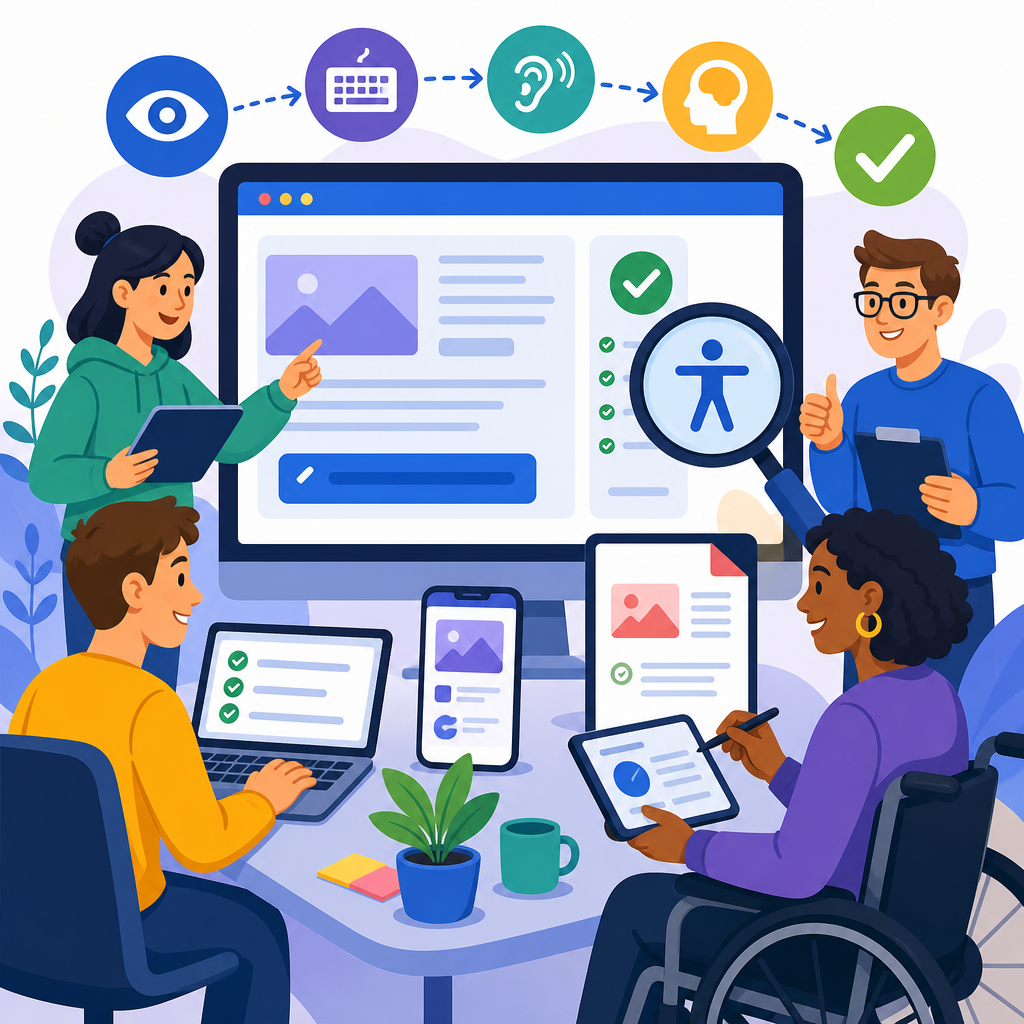
Accessibility QA workflows for websites, apps, and documents turn accessibility from a late-stage checklist into a repeatable quality practice. In practical terms, accessibility quality assurance means testing digital products so people with disabilities can perceive, operate, understand, and reliably use them with assistive technology such as screen readers, screen magnifiers, voice control, switch devices, captions, and keyboard navigation. I have built and audited release processes for product teams, design systems, and content operations, and the pattern is always the same: when accessibility is treated as an isolated audit, defects pile up; when it is built into requirements, design review, development, testing, and publishing, quality improves faster and costs less to maintain.
This matters because digital accessibility is both a user experience requirement and an operational risk issue. Standards such as the Web Content Accessibility Guidelines, PDF/UA for tagged PDFs, WAI-ARIA Authoring Practices, and platform guidance from Apple and Google give teams a common target. Legal exposure also drives urgency, but the stronger reason is product performance: accessible navigation improves task completion, captions increase comprehension, meaningful structure helps search and content reuse, and consistent semantics support automation. A modern accessibility QA workflow therefore covers websites, native and cross-platform apps, and documents such as PDFs, slide decks, and office files. It defines ownership, tools, test methods, evidence, remediation paths, and release gates so accessibility is verified continuously rather than guessed at launch.
As a hub for implementing and advancing accessible technology, this article explains the full workflow: governance, planning, design QA, code QA, manual testing, assistive technology testing, document testing, reporting, and continuous improvement. It also clarifies a key point teams often miss: no single scanner can prove accessibility, because many success criteria require human judgment. Good workflows combine automated checks with structured manual testing and realistic scenarios. The goal is not merely compliance language in a policy. The goal is dependable access for real users across browsers, mobile platforms, document formats, and assistive technologies, supported by a process teams can sustain release after release.
Build governance, scope, and acceptance criteria first
An effective accessibility QA workflow starts before anyone opens a testing tool. Teams need a defined standard, a severity model, and a decision on what assets are in scope. For most public digital products, WCAG 2.2 Level AA is the baseline standard, with additional platform-specific expectations for iOS, Android, and documents. In regulated sectors, I recommend writing accessibility acceptance criteria into product requirements and procurement language. That means user stories include statements such as keyboard operation, visible focus, name-role-value exposure, heading structure, color contrast thresholds, caption requirements, and document tagging expectations. Without explicit criteria, QA inherits ambiguity and accessibility defects are mislabeled as design preferences.
Ownership must also be clear. Product managers define scope and release risk, designers provide accessible interaction patterns, engineers implement semantics and behavior, content teams maintain readable structure and alternative text, and QA validates outcomes. Central accessibility specialists are valuable, but they should enable rather than replace delivery teams. A lightweight governance model works well: define policy, approved component patterns, escalation paths, and exceptions with expiry dates. If a modal dialog, carousel, date picker, or custom dropdown is known to be problematic, it should have a documented pattern, sample code, and test script. This reduces repeated defects across products and creates strong internal linking between your design system, coding standards, and accessibility issue library.
Release readiness also improves when teams define evidence expectations. A mature program asks for test artifacts: automated scan results, keyboard walkthrough notes, screen reader observations, screenshots of focus order, contrast measurements, and document accessibility checker outputs. That evidence supports triage and trend analysis. It also helps teams distinguish conformance bugs from usability risks. For example, a form may technically expose labels, yet still fail users if error messaging is delayed, inconsistent, or detached from the relevant field. A workflow that captures both standards-based defects and practical barriers produces better outcomes than a pass-fail checklist alone.
Test early in design and content production
The cheapest accessibility defect is the one prevented in design. During design QA, review information architecture, reading order, component choice, color tokens, responsive behavior, and motion patterns before engineering begins. Figma libraries and design system documentation should map components to accessible implementations, not merely visual variants. Designers should verify heading hierarchy, touch target size, focus indicators, error states, and plain-language labels. If a flow depends on color alone, hidden hover content, or gestures without alternatives, it should be corrected at this stage. In my experience, a one-hour accessibility design review can prevent weeks of rework on custom widgets and complex forms.
Content operations need the same discipline. Accessibility for documents and web content depends heavily on structure and authoring habits. Writers should apply true headings, lists, table headers, meaningful link text, transcript workflows, and concise alt text based on purpose. Document creators should use built-in styles in Word, Google Docs, or PowerPoint so structure survives export. When teams paste formatted text manually or draw fake tables with tabs and spaces, remediation becomes expensive later. Accessibility QA therefore belongs in editorial workflows, template creation, and publishing checklists, not only in software sprints. That is especially important for sub-pillar hubs, knowledge bases, support centers, and downloadable resources that are updated by many contributors over time.
Early review should also cover user journeys, not isolated screens. A purchase flow, account registration, patient intake form, learning module, or invoice download should be tested as a complete path. Accessibility often breaks at transitions: authentication timeouts, focus loss after validation, inaccessible CAPTCHAs, mislabeled controls in embedded content, or inaccessible attached PDFs. Mapping journeys exposes dependencies between website content, app interfaces, and documents. This hub topic, implementing and advancing accessible technology, depends on that systems view because users do not experience channels separately. They experience tasks, and QA workflows must reflect that reality.
Combine automated checks with targeted manual testing
Automation is essential, but it is only a first filter. For websites, use tools such as axe DevTools, WAVE, Lighthouse, and pa11y in local development, continuous integration, and staged environments. For mobile, use Accessibility Scanner on Android, Xcode Accessibility Inspector on iOS, and framework-level linters where available. For documents, use Microsoft Accessibility Checker, Adobe Acrobat accessibility tools, and PAC for PDF/UA validation. Automated checks reliably catch missing form labels, empty buttons, insufficient color contrast in many cases, duplicate IDs, missing document titles, and some ARIA misuse. They do not reliably judge task clarity, alt text quality, focus order logic, error prevention, or whether a component behaves predictably with assistive technology.
That is why manual testing needs a repeatable script. At minimum, test keyboard-only navigation, zoom at 200 percent, reflow at narrow widths, reduced motion settings, high contrast or increased contrast modes where supported, screen reader announcements for key tasks, and form error handling. For mobile apps, include dynamic text scaling, screen orientation changes, rotor or traversal navigation, touch target spacing, and gesture alternatives. For documents, verify tag trees, heading order, reading order, bookmarks for long files, table header associations, alt text on meaningful images, and export fidelity. The purpose of manual testing is not to wander through the interface. It is to validate user-critical behaviors against defined criteria.
| Asset type | Automated checks | Manual checks | Primary tools |
|---|---|---|---|
| Website | Labels, contrast flags, landmarks, ARIA errors, title presence | Keyboard flow, focus visibility, screen reader output, zoom, reflow, error recovery | axe DevTools, Lighthouse, WAVE, NVDA, JAWS, VoiceOver |
| Mobile app | Touch target warnings, labels, trait or role exposure, color issues | Screen reader gestures, dynamic type, orientation, announcement timing, custom control behavior | Accessibility Scanner, Accessibility Inspector, TalkBack, VoiceOver |
| Document | Missing tags, title, language, alt text flags, table issues | Reading order, heading logic, bookmark quality, link text, exported PDF behavior | Acrobat, PAC, Microsoft Accessibility Checker, screen readers |
A useful rule is to align manual test depth with risk. High-traffic flows, authenticated experiences, financial transactions, healthcare interactions, learning assessments, and legal documents deserve deeper scenario testing than a low-risk marketing page. Severity should reflect user impact, task blockage, frequency, and workaround availability. For example, an unlabeled payment field is critical because it blocks completion. A skipped heading level may be moderate if the page remains navigable. Consistent severity rules reduce debate and speed remediation.
Validate assistive technology behavior on real tasks
Assistive technology testing is where many accessibility programs either mature or stall. Teams often stop at semantic checks and assume usable behavior will follow. It does not always follow, especially in dynamic interfaces. Screen readers need accurate names, roles, values, state changes, focus management, and status announcements. Voice control users need controls with predictable labels. Switch and keyboard users need a logical tab sequence and no focus traps. Magnification users need stable layouts and visible context. These needs become critical in custom components, single-page applications, data visualizations, and document viewers.
For websites, a practical baseline is testing with NVDA and Firefox on Windows, JAWS and Chrome in environments where enterprise users depend on JAWS, and VoiceOver with Safari on macOS and iOS. For Android, test with TalkBack on current and one previous major version. I have seen defects that only appear in one pairing, such as duplicated announcements in custom comboboxes or focus landing on hidden elements after modal close. Real-task scripts surface these failures quickly. Example scripts include finding a policy page, filtering results, completing checkout, uploading a file, reviewing errors, and downloading a statement in accessible PDF format.
Documents deserve equal rigor. A tagged PDF can still be frustrating if the reading order is wrong, links are vague, or bookmarks are missing in a fifty-page report. Test documents with a screen reader, not only with Acrobat’s checker. Verify whether users can jump by heading, identify table headers, and understand figure descriptions without seeing the page. For slide decks, confirm reading order per slide and whether speaker notes or separate transcripts are required. For spreadsheets, verify sheet names, header identification, instructions, and color-independent meaning. Document accessibility is often the hidden backlog in large organizations because ownership is distributed; a workflow hub must explicitly include it.
Report findings clearly and drive continuous improvement
Accessibility QA only creates value when findings are actionable. Bug reports should identify the affected asset, exact location, reproduction steps, expected behavior, observed behavior, standard reference, severity, and a remediation hint. “Button inaccessible” is not enough. “Checkout page, gift card toggle, keyboard focus visible but Enter does not expand associated region; expected disclosure behavior with aria-expanded state updated and focus preserved” gives engineers something they can fix. Screenshots, DOM snippets, video captures, and short assistive technology transcripts reduce turnaround time. For documents, include page numbers, tag tree notes, and source-file recommendations, because editing the PDF directly is often the wrong long-term fix.
Teams should also track patterns, not just defects. If repeated issues involve headings, color contrast, modal focus management, or exported PDFs losing tags, that signals a training or tooling problem. The right response may be a design token adjustment, a reusable component fix, a CMS template change, or an authoring guide update rather than repeated page-level patching. Metrics that matter include defect density by release, percentage of issues found before production, mean time to remediation, component conformance status, and coverage of high-risk user journeys. These metrics show whether implementing and advancing accessible technology is becoming operationally normal, which is the real objective of this hub topic.
The most effective programs also include disabled users in testing and feedback loops. Structured usability sessions reveal barriers that standards-based QA can miss, such as confusing terminology, overloaded forms, or exhausting navigation. This does not replace conformance testing; it complements it. Close the loop by updating acceptance criteria, test scripts, templates, and components after each release. If you want accessibility QA workflows for websites, apps, and documents to scale, make them part of definition of done, release governance, procurement review, content publishing, and retrospectives. Start with your highest-risk journeys, document the workflow, and improve it every sprint. That is how accessible technology moves from policy statement to dependable everyday practice.
Frequently Asked Questions
What is an accessibility QA workflow, and how is it different from a one-time accessibility audit?
An accessibility QA workflow is a repeatable process for testing and improving accessibility throughout planning, design, development, content creation, release, and maintenance. Instead of waiting until the end of a project to run a single audit, the workflow builds accessibility checks into everyday quality assurance so issues are caught earlier, documented clearly, assigned to the right teams, and verified before release. This approach treats accessibility as part of product quality, not as a last-minute compliance task.
A one-time accessibility audit can be useful for identifying current problems, but by itself it does not prevent the same issues from returning in future updates. Teams often fix a set of defects after an audit, then reintroduce similar barriers when they add new features, redesign templates, publish documents, or change mobile interactions. A workflow solves that problem by creating standards, test cases, acceptance criteria, severity definitions, regression checks, and release gates that make accessibility measurable and sustainable over time.
In practice, a strong accessibility QA workflow includes automated scanning where appropriate, manual testing for keyboard access and screen reader behavior, review of semantic structure, color contrast verification, error handling checks, caption and transcript validation, mobile gesture testing, and document accessibility review for PDFs, Word files, and slide decks. It also defines who is responsible for what, how defects are reported, what evidence is required to close issues, and when re-testing happens. That is what turns accessibility from a checklist into an operational discipline.
What should be included in an effective accessibility QA process for websites, apps, and documents?
An effective process should cover people, standards, tools, environments, and release controls. Start with a clear baseline such as WCAG requirements, platform-specific guidance for web and mobile, and internal design and content standards. Then define test scopes for each product type. Websites may require checks for headings, landmarks, forms, focus order, keyboard access, dynamic content announcements, media alternatives, and responsive behavior. Mobile apps need additional attention to screen reader gestures, touch target size, orientation, platform accessibility APIs, and how controls are announced by VoiceOver or TalkBack. Documents need checks for tags, reading order, headings, alt text, table structure, link text, form fields, bookmarks, and export quality from source files.
The workflow should also specify when accessibility testing occurs. Ideally, testing begins before code is written by reviewing components, designs, content patterns, and requirements. During development, teams can use linting, component-level checks, and lightweight manual reviews. During formal QA, testers should run structured scenarios using keyboard-only navigation, screen readers, zoom or magnification, contrast checks, and error recovery tests. For documents, testers should inspect both the source file and the final exported format because accessibility can degrade during conversion.
Strong reporting is another essential element. Defects should identify the user impact, affected assistive technology or interaction mode, steps to reproduce, expected behavior, actual behavior, and the relevant standard or policy. Screenshots, screen recordings, code references, and assistive technology notes help developers and content owners resolve issues faster. Finally, the process should include regression testing and exit criteria so accessibility issues are not considered fixed until someone verifies the experience works in the target environment.
How much of accessibility QA can be automated, and what still requires manual testing?
Automation is valuable, but it only covers part of the picture. Automated tools are very good at finding certain detectable issues such as missing form labels, empty buttons, some color contrast failures, duplicate IDs, missing document language declarations, and basic structural problems. They can be integrated into CI pipelines, browser testing, component libraries, document creation workflows, and content publishing systems to catch common mistakes quickly and consistently. That makes automation an important first line of defense and a useful regression tool.
However, many of the most meaningful accessibility problems require human judgment and hands-on testing. Automated tools cannot reliably determine whether alternative text is actually useful, whether headings communicate page structure clearly, whether link text makes sense out of context, whether focus order matches the visual and functional flow, whether a custom control is understandable with a screen reader, or whether error messages help users recover successfully. They also cannot fully assess whether document reading order is logical in real-world assistive technology use, or whether captions accurately reflect spoken content and important audio cues.
Manual testing is especially important for keyboard navigation, modal dialogs, menus, drag-and-drop alternatives, live updates, mobile gestures, voice control compatibility, zoom and reflow behavior, and real interaction with screen readers such as NVDA, JAWS, VoiceOver, and TalkBack. The best accessibility QA workflows combine automation with manual verification. Automation improves coverage and speed, while manual testing validates actual usability and assistive technology support. Teams that rely only on scanning tools often miss the very issues that create the biggest barriers for users.
Who should own accessibility QA in a product team?
Accessibility QA should have clear ownership, but it should not belong to only one person or department. The most effective model is shared responsibility with defined roles. Product managers should ensure accessibility requirements are included in scope and acceptance criteria. Designers should create accessible interaction patterns, visual hierarchy, focus indicators, contrast-safe color systems, and content layouts that support real use. Developers should implement semantic markup, accessible components, platform APIs, and robust interaction behavior. QA testers should execute structured accessibility test cases and verify defect resolution. Content authors and document creators should produce accessible text, images, media, and downloadable files. Leadership should support timelines, tooling, training, and release expectations.
At the same time, there is real value in having a dedicated accessibility lead, specialist, or champion model. Someone needs to maintain standards, guide test strategy, review difficult issues, train teams, and help prioritize defects based on user impact. In larger organizations, this may be an accessibility practice lead or center of excellence. In smaller teams, it may be a QA lead, UX specialist, or developer with deeper expertise. What matters most is that responsibility is explicit and operational, not assumed.
If no one owns the process design, accessibility often becomes inconsistent. Issues get reported differently, teams argue about severity, mobile and document testing fall through the cracks, and release decisions become subjective. A mature workflow avoids that by defining who reviews, who approves, who fixes, who re-tests, and who can sign off on exceptions. Accessibility works best when it is built into team roles while still being supported by specialist oversight and organizational accountability.
How do teams make accessibility QA practical without slowing releases?
The key is to move accessibility earlier and make it routine. Accessibility slows releases most when it is deferred until the end, after design decisions, code patterns, and content structures are already deeply embedded. At that stage, even simple issues can require expensive redesign or rework. By contrast, teams that include accessibility in design reviews, component development, definition of done, and regular QA cycles usually find that fixes are smaller, faster, and less disruptive. The goal is not to add a giant separate testing phase, but to distribute accessibility checks across the existing delivery process.
Practical teams standardize what they can. They use accessible design systems, reusable components, documented test scripts, issue templates, and baseline assistive technology test matrices. They automate common checks in build pipelines, train testers to perform a core set of manual validations, and focus specialist review on higher-risk areas such as authentication, forms, checkout flows, media players, dashboards, and complex documents. They also prioritize by user impact, so critical blockers such as keyboard traps, unlabeled controls, inaccessible forms, or broken screen reader announcements are addressed immediately, while lower-risk improvements can be planned into upcoming sprints when appropriate.
It also helps to define realistic release gates. Not every issue has the same severity, and mature programs distinguish between critical barriers, serious usability defects, moderate issues, and cosmetic concerns. That makes decisions more credible and helps teams allocate effort wisely. Over time, accessibility QA becomes faster because teams stop repeating the same mistakes, component libraries improve, and defect patterns become easier to recognize. In other words, a good accessibility QA workflow does not slow delivery in the long run; it improves quality, reduces rework, and creates more reliable releases for everyone.