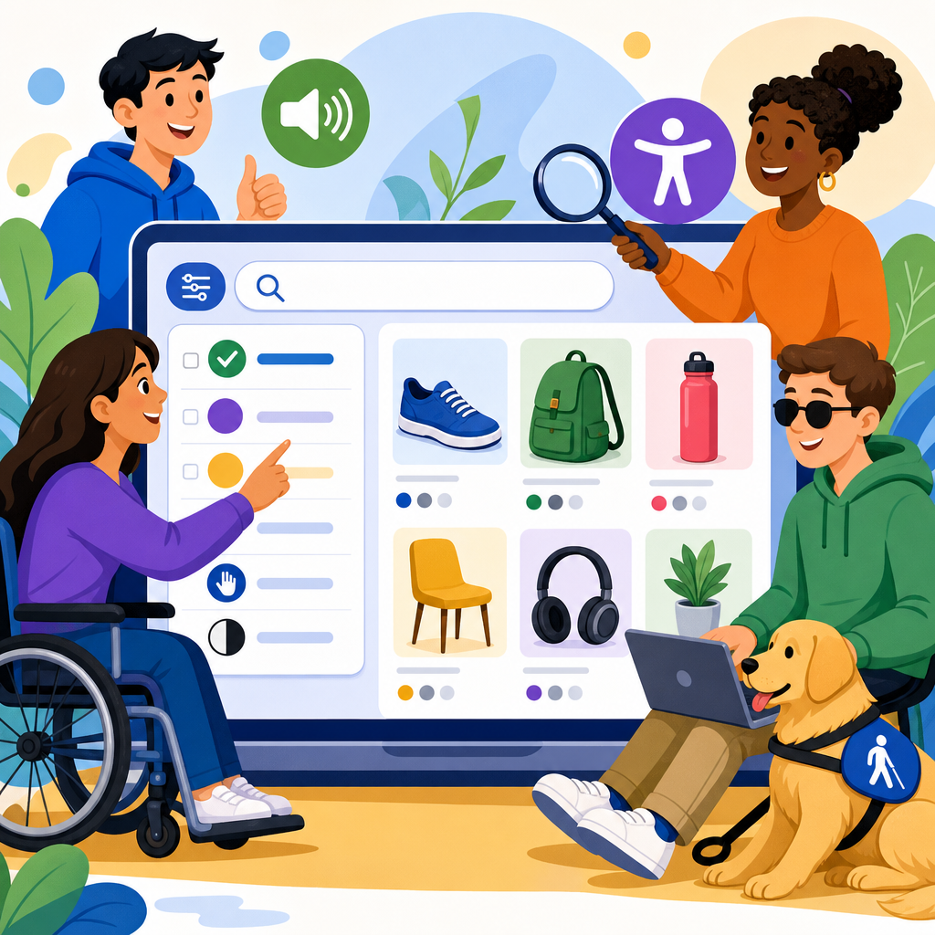
Accessible product filters and search are not optional convenience features in retail and e-commerce; they are core pathways to discovery, comparison, and purchase. When those pathways break for shoppers who use screen readers, keyboards, voice input, magnification, or captions, the entire buying journey breaks with them. An ADA guide to accessible product filters and search starts with a simple principle: if customers cannot find products efficiently, they cannot participate equally in online commerce. That has legal, commercial, and customer-experience consequences.
In practice, product filters include controls such as size, color, price, brand, rating, availability, delivery speed, or material. Search includes the search field, autosuggest, recent searches, spelling correction, results pages, sorting, and zero-results recovery. Accessibility means these functions are perceivable, operable, understandable, and robust across assistive technologies and input methods. In the United States, teams usually map this work to the ADA, Section 302 concerns about equal access in public accommodations, and the technical expectations commonly evaluated through WCAG 2.1 or 2.2 Level AA. I have worked on retail audits where a single inaccessible facet panel cut conversion from keyboard-only users to nearly zero, even though the catalog itself was well structured.
This matters because filtering and search are high-intent actions. A visitor using a category page may browse casually, but a visitor who searches “women’s waterproof hiking boots size 8” is close to buying. If the search input has no label, autosuggest steals focus, filter checkboxes are unlabeled, or applied facets are not announced to screen readers, the experience turns from friction to exclusion. Retail organizations also face practical risks: customer support volume rises, cart abandonment increases, merchandising data becomes less reliable, and legal exposure grows. The strongest retail teams treat accessible discovery as both compliance work and revenue protection.
As a hub for retail and e-commerce, this guide covers the full accessibility framework for filters and search: interface patterns, ADA and WCAG implications, merchandising edge cases, mobile behavior, testing methods, and governance. It also points naturally to deeper implementation articles on faceted navigation, accessible autocomplete, product listing pages, form labeling, keyboard interaction, and error handling. If you are responsible for a storefront, marketplace, DTC catalog, or B2B ordering portal, this is the baseline reference for making product discovery usable for every shopper.
ADA, WCAG, and the Retail Discovery Journey
The ADA does not prescribe HTML techniques, but retail accessibility disputes are usually evaluated through accepted technical standards, especially WCAG Level AA. For product filters and search, the most relevant success criteria typically include 1.3.1 Info and Relationships, 1.3.2 Meaningful Sequence, 2.1.1 Keyboard, 2.4.3 Focus Order, 2.4.6 Headings and Labels, 3.2.2 On Input, 3.3.2 Labels or Instructions, 4.1.2 Name, Role, Value, and in newer evaluations 2.4.11 Focus Not Obscured and 2.5.8 Target Size. These are not abstract checkpoints. They directly govern how a facet drawer opens, whether a checkbox exposes its state, and whether result counts update in a way assistive technology can interpret.
Retail discovery has a distinct flow: enter a category or search term, narrow by facets, sort results, inspect product cards, and revise choices. Each step needs explicit semantics and predictable behavior. A common failure is building visually polished facet chips and sliders with div elements and JavaScript handlers but no native controls or ARIA states. Another is dynamically refreshing product grids without announcing changes. A sighted mouse user sees the page update. A screen reader user hears nothing and may assume the action failed. In audits, I treat every result refresh as a status event that requires both visible and programmatic communication.
Accessible Product Filters: Structure, States, and Interaction
Good filters begin with native elements whenever possible. Checkboxes suit multi-select facets like brand or material. Radio buttons suit single-select options like condition when only one choice is permitted. Buttons can toggle disclosure panels, and a properly labeled range input may work for simple price adjustments, though dual-thumb sliders often create serious accessibility debt. The container should expose a clear heading such as “Filter products,” and each filter group needs a programmatic label, usually through fieldset and legend or an equivalent accessible name. Shoppers should know what the control is, what options exist, and what selecting an option will do.
State communication is critical. If a user selects “In stock,” that state must be exposed visually and to assistive technology. Applied filters should be easy to review and remove, ideally in a persistent summary near the results heading. I recommend explicit remove buttons labeled with the facet value, such as “Remove filter: In stock,” instead of relying on a tiny icon with ambiguous alt text. Clear-all actions must be keyboard accessible and should not trigger focus loss. When teams implement off-canvas mobile filters, focus should move into the dialog, remain trapped while open, and return to the triggering button when closed.
Retail teams often ask whether instant filtering is better than an Apply button. Both can be accessible, but each has tradeoffs. Instant filtering reduces clicks yet can create repeated page refreshes, moving focus or causing announcements to fire excessively. An Apply button gives users more control and is often easier on mobile and screen readers, especially when many facets exist. I generally favor immediate updates for small, stable lists and an Apply pattern for larger catalogs, price ranges, or dense mobile drawers. The deciding factor is not trendiness; it is whether the user can understand and control the result changes without confusion.
Accessible Site Search and Autosuggest
Search starts with a basic requirement that is still missed too often: the search field needs an explicit label. Placeholder text is not a sufficient label because it disappears and is inconsistently treated by assistive technology. The submit button also needs a descriptive name. If you support voice input, the visible label should match the accessible name closely so speech users can say what they see. Search is one of the most repeatedly used controls on a commerce site, which makes small labeling flaws disproportionately harmful.
Autosuggest can help shoppers recover from spelling errors, discover categories, and reach product pages faster, but it must be engineered carefully. The input should retain focus while suggestions appear, the suggestion list should expose its role and active option correctly, and arrow-key behavior must be consistent. Users need a reliable way to dismiss suggestions without triggering navigation. Announce the number of suggestions only when useful, not on every keystroke with verbose chatter. For retail, suggestions should distinguish between products, brands, and categories in plain language. “Nike running shoes in category Men’s Footwear” is better than an unlabeled string of nearly identical titles.
Search results pages also need accessible recovery paths. If a query returns no results, explain why in direct terms and offer alternatives: corrected spelling, broader categories, popular filters, or customer support. If the engine rewrites a query, disclose that clearly. Many enterprise platforms including Algolia, Elasticsearch, Adobe Commerce, and Salesforce Commerce Cloud support relevance tuning, synonyms, and typo tolerance, but accessibility depends on the interface wrapped around them. A powerful engine does not excuse an inaccessible results template.
Common Retail Patterns and Their Accessibility Risks
Some of the most problematic retail patterns are familiar because they are popular in design systems. Sticky filter bars can obscure keyboard focus at high zoom. Infinite scroll can hide the footer, disrupt orientation, and make it difficult to reach landmarks or understand the total number of results. Color swatches often appear without text alternatives, leaving screen reader users to hear “button” repeatedly with no color name. Price sliders may look elegant but frequently fail keyboard testing, have tiny drag targets, and expose values poorly to assistive technology. In many cases, a pair of minimum and maximum inputs is more usable and easier to validate.
Sorting controls deserve equal attention. “Featured,” “Best selling,” “Price low to high,” and “Newest” should be in a properly labeled select or a clearly grouped set of buttons. Changing sort order should preserve user context and announce the update. On product listing pages, result counts matter. “127 results” should be programmatically associated with the listing and updated after filtering or sorting. If filters cause substantial changes, place focus intentionally on either the results heading or a status message, not at the top of the page where users must start over.
| Pattern | Common Failure | Better Accessible Choice |
|---|---|---|
| Color swatches | No text label or selected state | Buttons or radios with visible and programmatic color names |
| Price slider | Poor keyboard control and unclear values | Min/max text inputs with validation and optional preset ranges |
| Infinite scroll | Loss of orientation and unreachable footer | Load more button with announced result updates |
| Off-canvas filters | Focus escapes drawer or close button unlabeled | Modal dialog pattern with trapped focus and named controls |
| Autosuggest | Focus jumps into list or cannot dismiss | Combobox pattern with stable input focus and escape support |
Mobile, Touch, and Responsive Commerce Considerations
Most retail traffic is mobile, so accessible filters and search must work on small screens, touch devices, and orientation changes. Mobile filter drawers need large touch targets, visible close controls, and enough spacing to prevent accidental activation. Fixed headers and sticky apply bars should not cover focused elements when users zoom to 200 percent or increase text size. iOS VoiceOver and Android TalkBack users also need a predictable swipe order; if visual order and DOM order diverge, navigation becomes exhausting.
Responsive design adds another layer. A filter set that appears inline on desktop may become a modal on mobile, which changes focus management, headings, and keyboard behavior for users with external keyboards. Search suggestions that feel manageable on a wide screen can overwhelm a phone if too many items appear before the results page. Keep suggestions concise, prioritize top intents, and ensure that touch and keyboard users can select an option without accidental submission. On mobile web and in-app webviews, test with browser zoom, dynamic type, reduced motion, and landscape orientation because retail sessions often happen in varied real-world conditions.
Testing Methods, Metrics, and Governance for E-commerce Teams
Accessible product filters and search require continuous testing, not a one-time audit. My standard workflow combines automated scanning with manual scenario testing. Automated tools such as axe DevTools, WAVE, Lighthouse, and Accessibility Insights catch missing labels, contrast issues, and some ARIA misuse. Manual testing finds the failures that matter most in commerce: keyboard traps in filter drawers, focus loss after sorting, duplicate labels in swatches, and broken announcements after AJAX updates. Screen reader checks should include NVDA with Firefox, JAWS with Chrome, and VoiceOver on Safari because retail customers use all three combinations heavily.
Create task-based scripts tied to revenue moments. Examples include: search for a product, apply three filters, remove one filter, sort by price, open a product, return to results, and continue filtering without losing state. Measure success rate, time on task, error frequency, and whether users understand system feedback. Pair these tests with analytics. If users who rely on keyboard navigation abandon after applying filters, that is not just an accessibility note; it is a funnel leak. Mature teams place accessibility acceptance criteria inside design tickets, component libraries, QA scripts, and vendor requirements. If your storefront uses third-party search, review, or merchandising widgets, contract language should require conformance evidence and remediation timelines.
Documentation matters because commerce changes constantly. Seasonal campaigns add new badges, facets, landing pages, and search rules. Without governance, teams reintroduce inaccessible patterns under deadline pressure. Maintain standards for naming conventions, focus behavior, result announcements, and component usage. Train merchandisers as well as developers; a well-built interface can still become confusing if facet labels are cryptic or redundant. Accessibility in retail succeeds when design, engineering, QA, content, legal, and merchandising all treat discovery as a shared responsibility.
Accessible product filters and search determine whether online retail is truly open to all shoppers. The legal driver may be the ADA, but the practical standard is a discovery experience that works with keyboards, screen readers, touch, zoom, voice input, and dynamic interfaces. For retail and e-commerce, that means labeled search, predictable autosuggest, structured facet groups, exposed states, announced result changes, mobile-safe dialogs, and testing tied to real purchase tasks.
The business case is straightforward. When shoppers can find products, understand options, and recover from errors, conversion improves and support burden falls. When they cannot, exclusion happens long before checkout. Use this hub as the starting point for your retail accessibility program, then extend the work into detailed implementations for product listing pages, faceted navigation, autocomplete, form controls, and mobile commerce patterns. Audit your current filters and search, fix the blockers first, and make accessible discovery a standing requirement for every release.
Frequently Asked Questions
Why are accessible product filters and search considered essential under the ADA?
Accessible product filters and search are essential because they directly affect whether a customer can independently locate, compare, and purchase products. In e-commerce, these tools are not secondary features; they are the main navigation system for large catalogs. If a shopper using a screen reader cannot identify filter categories, if a keyboard-only user cannot open and close filter panels, or if a person with low vision cannot read search suggestions due to poor contrast, the result is more than frustration. It is a barrier to equal participation. That is exactly why accessibility matters under the ADA: digital experiences must not prevent people with disabilities from accessing goods and services on equal terms.
From a practical compliance perspective, filters and search often sit at the center of the purchase journey. Customers rely on them to narrow choices by size, price, color, availability, brand, rating, and other attributes. When those controls are mislabeled, improperly coded, or dependent on mouse-only interactions, users can be blocked from reaching products that are otherwise available. Courts, regulators, and accessibility professionals increasingly view these kinds of barriers as serious because they interfere with core transaction functions, not just cosmetic elements. In short, if users cannot efficiently find products, they cannot meaningfully shop.
Accessible design also improves usability for everyone. Clear labels, predictable keyboard behavior, visible focus indicators, properly announced updates, and forgiving search interfaces benefit users on mobile devices, users with temporary injuries, older adults, and anyone navigating quickly. So while ADA risk reduction is a major reason to prioritize this work, the broader business case is just as strong: accessible product discovery supports customer satisfaction, conversion, retention, and brand trust.
What are the most common accessibility problems found in e-commerce filters and on-site search?
Some of the most common problems appear in custom filter widgets that look polished visually but are difficult or impossible to use with assistive technology. A frequent issue is missing or vague labels on controls such as checkboxes, toggles, sliders, and dropdowns. If a screen reader announces only “button” or “checkbox” without context, the shopper has no reliable way to understand what that control does. Another major problem is broken keyboard interaction. Users must be able to tab to each control, move through options logically, activate selections without a mouse, and close overlays or drawers without getting trapped.
Dynamic updates are another trouble spot. Many product grids refresh automatically when a filter is selected, but the page does not announce that results have changed. Screen reader users may not realize new products have loaded, how many results remain, or whether a selected filter was applied successfully. Similarly, search autocomplete can create serious accessibility issues when suggestion lists are not announced properly, cannot be navigated by keyboard, or disappear unexpectedly. If users cannot tell which suggestion is highlighted, whether results are grouped, or what happens after pressing Enter, search becomes unreliable.
Visual accessibility issues are also common. Low contrast text, tiny hit areas, unclear focus states, and layouts that break under zoom or magnification can make product discovery difficult for users with low vision or motor disabilities. In addition, some interfaces rely too heavily on color alone to indicate selected filters, availability, or validation errors. Others hide useful instructions behind hover interactions that touch and keyboard users may never encounter. These problems add friction and uncertainty at exactly the moment when customers are trying to make fast buying decisions.
Finally, many sites overlook the accessibility of “no results,” spelling correction, and recovery flows. Search needs to tolerate human variation by handling typos, synonyms, and alternate product names where possible. When no matches are found, the experience should explain what happened and offer next steps, such as suggested terms, category links, or the option to clear filters. Accessibility is not just about making controls technically operable; it is also about making the full discovery journey understandable, resilient, and fair.
How should accessible product filters be designed and coded so all shoppers can use them?
Accessible filters should begin with semantic structure and clear naming. Each filter group needs a meaningful label, such as size, brand, price, color, or availability, so users understand the purpose of the options inside it. Native HTML controls are usually the strongest starting point because they come with built-in accessibility support. Standard checkboxes, radio buttons, select menus, and buttons are typically more reliable than heavily customized controls that recreate basic functionality through JavaScript. When custom components are necessary, they should follow established WAI-ARIA patterns and be tested carefully with keyboard and screen reader users.
Keyboard usability is non-negotiable. Every filter must be reachable in a logical tab order, and users must be able to select, deselect, expand, collapse, and submit choices without a mouse. Focus should remain visible at all times, and it should move predictably, especially in mobile filter drawers or modal panels. If a filter panel opens as an overlay, keyboard focus should move into that panel, stay there while it is open, and return to the triggering control when it closes. Users should also have an easy way to clear individual filters and reset all filters without confusion.
State communication is just as important as operability. When a filter is selected, the interface should clearly indicate that state visually and programmatically. Screen reader users should be informed when results update, either through a well-implemented live region or another dependable method that announces changes such as “24 results” or “Filter applied: men’s shoes, size 10.” This feedback reduces guesswork and helps users maintain orientation. It is also helpful to present selected filters in a visible summary area so shoppers can review and remove them one by one.
Design details matter too. Touch targets should be large enough to activate comfortably, text should meet contrast requirements, and layouts should remain usable at high zoom levels or on small screens. Avoid relying on color alone to show selected states. Use text, icons, or explicit indicators in addition to color. Error prevention is also valuable, particularly for range filters like price or dimensions. If a user enters an invalid range, explain the issue clearly and offer a path to correct it. Strong accessible filter design is a blend of semantics, interaction design, responsive layout, and user feedback working together.
What makes an on-site search experience accessible, especially for screen reader and keyboard users?
An accessible on-site search experience starts with a properly labeled search field that clearly communicates its purpose. Users should know whether the field searches products only, the entire site, or a specific department. Associated labels, instructions, and submit buttons should be explicit and easy to identify with assistive technology. If search suggestions appear as users type, those suggestions must be implemented in a way that screen readers can understand and keyboard users can navigate. The user should be able to move through suggestions with arrow keys where appropriate, understand which option is currently active, and choose a suggestion or submit a raw query intentionally.
Predictability is critical. Search interactions should not surprise users by redirecting too early, replacing typed text unexpectedly, or changing focus without warning. If autocomplete is present, users must remain in control. Suggestions should supplement the search process, not hijack it. Search results pages should also be structured with clear headings, meaningful link text, and concise product information so users can scan efficiently. If sorting and filtering are available from the results page, those controls should be accessible using the same standards described for filtering interfaces.
For screen reader users, announcing result counts and updates can make a major difference. After a search is submitted, users should be informed how many results were found and what query was used. If zero results are returned, the page should explain that clearly and offer alternatives, such as corrected spellings, broader categories, or related products. For keyboard users, every important element on the results page should be reachable and operable, including pagination, sort menus, saved search features, and quick-view options if they exist. Avoid placing critical actions behind hover-only behavior.
Accessible search also includes content quality and language handling. Product names, metadata, and tags should be accurate and consistent so search returns useful results. Supporting common misspellings, abbreviations, and plain-language terms helps users who may use voice input, have cognitive disabilities, or simply describe products differently than your merchandising team does. In other words, accessible search is not only about technical compatibility. It is also about reducing friction, improving comprehension, and helping real people find what they mean even when their query is imperfect.
How can retailers test product filters and search for ADA accessibility and ongoing compliance?
Effective testing requires a combination of automated scanning, manual review, and real-world assistive technology testing. Automated tools can catch some issues quickly, such as missing form labels, low color contrast, empty buttons, or certain ARIA misuse. However, they cannot reliably determine whether a filter workflow makes sense, whether a search suggestion list is understandable, or whether focus behavior is truly usable. That is why manual testing is essential. Teams should test whether every filter and search function can be completed with a keyboard alone, whether focus remains visible, whether overlays behave correctly, and whether status updates are communicated clearly.
Assistive technology testing is especially important for high-value retail journeys. At minimum, retailers should evaluate filters and search with popular screen readers and modern browsers on desktop and mobile. Testing should cover opening filter panels, selecting and removing filter options, understanding result counts, interacting with autocomplete, handling empty-result scenarios


