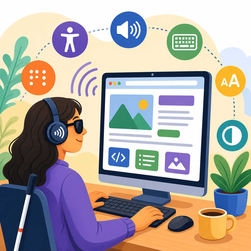
What makes a website accessible to screen reader users starts with one principle: information and actions must be available in a way software can understand and announce clearly. A screen reader is assistive technology that converts digital content into synthesized speech or braille output, allowing people who are blind, have low vision, or have certain cognitive or mobility disabilities to navigate websites without relying on sight. In practice, that means accessible websites are built with semantic structure, descriptive text alternatives, keyboard operability, predictable behavior, and compatible code. I have audited many sites where attractive layouts hid serious barriers: buttons with no labels, headings out of order, forms that announced only “edit blank,” and popups that trapped focus. These are not edge cases. They are common failures that block job applications, shopping, learning, banking, and healthcare tasks. Accessibility matters because it affects legal risk, customer reach, search visibility, and basic usability, but most importantly it determines whether real people can independently complete tasks online. This hub article explains the foundations of technology and accessibility through the lens of screen reader support, so teams can understand the basics before moving into deeper topics such as alt text, ARIA, captions, color contrast, accessible forms, and testing workflows.
Why screen reader accessibility is the foundation of inclusive web design
Screen reader accessibility is often the fastest way to judge whether a website exposes its meaning properly. If a page is coded so assistive technology can identify headings, links, landmarks, form fields, errors, buttons, tables, and status messages, the site usually becomes more robust for many other users as well. Semantic HTML is the base layer. A real button element tells software that an item performs an action. A real nav landmark tells users where site navigation begins. A real heading hierarchy lets someone jump from section to section instead of listening line by line. Standards from the World Wide Web Consortium’s Web Content Accessibility Guidelines, especially WCAG 2.1 and 2.2, define these expectations in testable terms such as perceivable, operable, understandable, and robust. Those principles are not abstract. They directly shape daily user experience. When a screen reader user lands on a page, they typically scan by headings, landmarks, links, or form controls. If those elements are missing or misused, navigation becomes guesswork. That is why accessible website design begins with structure, not with visual polish alone.
Technology and accessibility are inseparable because modern interfaces rely on layers of code. Browsers render the page, the accessibility tree exposes meaning to assistive technology, and the screen reader announces what it receives. If developers substitute generic div elements for interactive controls, the accessibility tree becomes thin or misleading. If they style headings to look right but skip heading levels or use bold text instead of actual heading tags, users lose the document outline. In one ecommerce audit I handled, product filters looked clean visually but were built from clickable span elements with no keyboard support, labels, or state announcements. A sighted mouse user could filter by brand in seconds; a screen reader user heard only unlabeled text and could not tell which filters were expanded or selected. Fixing that required proper buttons, fieldsets, legends, and live announcements for updated results. The lesson is simple: accessibility is created in the code users never see.
Core building blocks: semantics, names, roles, and values
The most important technical concept for screen reader compatibility is that every meaningful element needs a programmatically determinable purpose. Developers usually describe this as exposing an accessible name, role, and value. The role answers what something is, such as button, checkbox, dialog, or heading. The accessible name answers what it is called, such as “Search,” “Add to cart,” or “Email address.” The value or state communicates dynamic information, such as checked, expanded, required, invalid, or 50 percent complete. Native HTML provides much of this automatically, which is why using standard elements is more reliable than rebuilding controls from scratch. A properly associated label and input field, for example, allows a screen reader to announce both the field purpose and whether it is required. A custom control made only from styled containers often announces nothing useful at all.
Images also need semantic treatment. Informative images require concise alt text that communicates the same purpose the image serves visually. Decorative images should usually have empty alt text so they are skipped. Complex charts need a text summary nearby, not a paragraph crammed into an alt attribute. Links need meaningful text as well. “Read more” repeated ten times without context is frustrating because screen reader users often browse a list of links out of surrounding content order. “Read more about accessible checkout design” is far better. Tables must use proper headers so relationships between cells are announced correctly. Multimedia needs captions for deaf users and, when visual information is not otherwise conveyed, audio description or text alternatives for blind users. These practices form the wider basics of technology and accessibility because they ensure content survives translation across devices, browsers, and assistive tools.
How screen reader users actually navigate a website
Many teams assume users move through a page from top to bottom, but experienced screen reader users rarely do. They jump. On desktop, users of JAWS, NVDA, and VoiceOver often navigate by heading level, landmarks, form controls, tables, lists, or regions. On mobile, TalkBack and VoiceOver users swipe through the accessibility order, explore by touch, and use rotor or local context menus to move by headings, links, and controls. Good accessibility supports all of those patterns. A skip link lets keyboard users bypass repeated navigation. Landmarks such as banner, main, search, navigation, complementary, and contentinfo create quick orientation points. A consistent heading structure tells users what the page covers at a glance. Clear page titles identify where they have arrived. Breadcrumbs can add context when implemented semantically. These are not extras; they are navigational infrastructure.
The table below summarizes common components and what screen reader users need from them.
| Component | What users need announced | Common failure | Better implementation |
|---|---|---|---|
| Navigation menu | Landmark, labels, expanded or collapsed state | Clickable divs with no state | Buttons controlling lists with aria-expanded and clear labels |
| Search form | Field label, button name, result updates | Placeholder used as only label | Visible label, submit button, live status for results count |
| Product card | Unique link names, price, availability | Several identical “View details” links | Specific links like “View details for Men’s Trail Jacket” |
| Modal dialog | Dialog role, title, focus placement, close control | Focus remains behind overlay | Move focus into dialog and return it on close |
| Form errors | Error text, field association, summary | Red border only | Text errors tied to inputs and announced after submit |
Reading order is another major issue. Screen readers follow source order, not visual arrangement. If CSS places a sidebar before main content visually but the source code does the opposite, the spoken experience may still be fine. If the source order itself is illogical, users hear a scrambled page. Carousels, infinite scroll, sticky headers, and dynamically injected panels often cause confusion when focus moves unexpectedly or new content appears without announcement. I have seen single-page applications load new views while leaving the virtual cursor at the old location, making users think nothing changed. The fix is usually to set focus to the new page heading, update the document title, and announce status changes politely. That is why accessibility testing must include real interaction flows, not just static page checks.
Accessible forms, dynamic interfaces, and the limits of ARIA
Forms are where many critical tasks happen, and they are also where accessibility failures become expensive. Every input needs an explicit label. Grouped options such as radio buttons and checkboxes need a fieldset and legend so the question is announced with the choices. Required fields should be identified in text, not only by color or an asterisk with no explanation. Instructions must appear before the user needs them, and validation messages must identify the exact field in error and how to fix it. If a credit card form rejects a number format, the message should say so plainly. If password rules exist, list them up front and announce failed criteria after entry. Time limits, CAPTCHAs, and multi-step checkouts need especially careful design because they can create barriers quickly. Accessible forms are usually simpler, clearer, and more conversion friendly for everyone.
Modern web apps add another layer: dynamic state changes. Accordions, tabs, autocomplete widgets, dialogs, toasts, and drag-and-drop interfaces all require careful communication. This is where ARIA can help, but it is also where misuse creates noise or breaks native behavior. The rule I apply is straightforward: use native HTML first, then add ARIA only when necessary to expose relationships or state. A button that opens a section may need aria-expanded and aria-controls. A custom modal needs a dialog role, an accessible name, and managed focus. A live region may announce “5 results loaded” after filtering. But adding ARIA to a broken structure does not repair it. In fact, the W3C’s first rule of ARIA says that if native HTML can do the job, use it. Many accessibility bugs come from developers adding roles that conflict with built-in semantics, hiding visible text from assistive technology, or overusing live regions so the screen reader interrupts itself constantly. Good accessible coding is disciplined, not ornamental.
Testing methods, tools, and content practices that keep sites usable
No website becomes screen reader accessible by accident, and no single automated scanner can verify it fully. Automated tools such as axe DevTools, WAVE, Lighthouse, and Accessibility Insights are valuable because they catch detectable issues like missing form labels, color contrast failures, empty buttons, and ARIA misuse. However, these tools typically identify only part of the problem set. They cannot reliably judge whether link text is meaningful in context, whether focus order matches task flow, whether alt text is appropriate, or whether a custom date picker is understandable in real use. Manual keyboard testing is essential. So is screen reader testing with at least common combinations such as NVDA with Firefox, JAWS with Chrome, VoiceOver with Safari on macOS, and mobile testing on iOS and Android. Different browser and assistive technology combinations expose different issues because support varies at the platform level.
Content teams also shape accessibility more than they often realize. Plain language reduces cognitive load and improves speech output clarity. Descriptive headings improve scanability. Transcript quality affects discoverability and comprehension. Link text, button labels, file names, and PDF structure all matter. When teams publish downloadable documents, those files need tagged headings, reading order, alt text, and form accessibility too; otherwise the accessible webpage leads to an inaccessible dead end. Governance is what keeps progress from fading. Design systems should include tested accessible components. Definition-of-done checklists should require keyboard access, focus visibility, label checks, and screen reader verification. Training should cover authors, designers, developers, QA analysts, and procurement teams. Accessibility statements and feedback channels help organizations learn where barriers remain. The strongest programs treat accessibility as a quality requirement throughout planning, design, development, content creation, and maintenance, not as a patch applied before launch.
What makes a website accessible to screen reader users is not one feature but a chain of reliable decisions. Content must have structure that assistive technology can interpret. Controls must expose clear names, roles, states, and instructions. Navigation must support headings, landmarks, skip links, and logical focus movement. Images, media, tables, documents, and dynamic updates must all communicate their purpose in nonvisual ways. When these basics are in place, users can browse, compare, complete forms, and recover from errors independently. That is the real goal of technology and accessibility: equal access to information and function, not a thin layer of compliance language.
As the hub for exploring the basics of technology and accessibility, this page should guide your next steps. From here, go deeper into accessible forms, ARIA patterns, alt text, keyboard navigation, captioning, color contrast, and accessibility testing. If you manage a website, start with an audit of your templates, navigation, and top user journeys. If you build websites, review your component library and replace custom controls that fight native HTML. If you publish content, improve headings, link text, and document structure today. Small fixes remove real barriers, and consistent practice creates websites screen reader users can trust.
Frequently Asked Questions
What does it mean for a website to be accessible to screen reader users?
A website is accessible to screen reader users when its content, structure, and interactive features can be understood and operated through assistive technology without depending on visual cues alone. Screen readers interpret the underlying code of a page and announce headings, links, buttons, form fields, image descriptions, and other elements in a logical order. If a website is built with proper semantic HTML, clear labels, meaningful link text, and predictable navigation, the software can communicate the page accurately to the user.
In practical terms, accessibility means that important information is not hidden inside visuals, unlabeled icons, or custom components that assistive technology cannot interpret. A user should be able to move through headings, understand what each control does, complete forms, activate menus, and receive feedback about errors or updates. Accessible design also supports keyboard navigation, because many screen reader users navigate with a keyboard rather than a mouse. When all of these pieces work together, the website becomes usable, understandable, and efficient for people who rely on screen readers.
Why is semantic HTML so important for screen reader accessibility?
Semantic HTML is one of the most important foundations of screen reader accessibility because it gives meaning to content in a way software can interpret reliably. Tags such as headings, lists, buttons, links, tables, landmarks, and form labels tell a screen reader what each part of the page is and how it should be announced. For example, a real <button> element is understood as an interactive control, while a clickable <div> may not be announced properly unless a developer adds extra accessibility support. Using the correct element from the start creates a more consistent and dependable experience.
Semantic structure also helps users navigate quickly. Screen reader users often jump from heading to heading, browse by landmark regions such as navigation or main content, or pull up a list of links and form fields. If headings are used only for visual styling instead of page organization, the content becomes confusing and harder to scan. If lists, tables, and form controls are not marked up correctly, relationships between items may be lost. In short, semantic HTML turns a webpage from a visual layout into a structured interface that assistive technology can present clearly and efficiently.
How do headings, labels, and link text affect the screen reader experience?
Headings, labels, and link text are critical because they provide the context screen reader users need to understand where they are and what actions are available. Headings create the outline of a page, making it possible to skim content non-visually. A well-structured heading hierarchy lets users jump directly to major sections and understand how topics are organized. Without meaningful headings, a page can feel like one long block of text with no clear starting points or landmarks.
Labels and link text are just as important for interaction. Form fields need descriptive labels so users know what information to enter. Buttons should clearly state what will happen when activated, such as “Submit Order” instead of a vague “Go.” Links should make sense on their own, because screen reader users often review links out of context. Phrases like “click here” or “read more” become unhelpful when heard in a list, while text such as “Read our accessibility checklist” gives immediate meaning. Clear naming reduces confusion, speeds up navigation, and helps users complete tasks with confidence.
What common website problems make screen readers struggle or fail?
Several common issues can make a website frustrating or unusable for screen reader users. One of the biggest problems is missing or incorrect semantics, such as using generic containers for buttons, menus, or dialog boxes without proper accessibility coding. Another frequent issue is images that contain important text or information but have no useful alternative text. Poor heading structure, unlabeled form fields, empty links, and buttons identified only by icons can also leave users guessing about what content means or what an action will do.
Dynamic content creates additional challenges when it is not announced properly. For example, if an error message appears after a form submission but is not exposed to assistive technology, the user may not realize anything went wrong. Pop-ups, dropdown menus, carousels, and modal windows can become barriers if keyboard focus is not managed correctly. Inconsistent navigation, unexpected page changes, autoplaying media, and low-quality custom widgets are also common sources of confusion. These problems usually happen when websites are designed mainly for sighted mouse users and accessibility is treated as an afterthought instead of a core requirement.
How can website owners test whether their site works well with screen readers?
The best way to evaluate screen reader accessibility is to combine automated testing, manual inspection, and real-world assistive technology testing. Automated tools can quickly identify some issues, such as missing alt text, color contrast concerns, or empty form labels, but they cannot determine whether the overall experience makes sense. Manual review is essential for checking heading structure, landmark usage, keyboard access, focus order, visible and programmatic labels, error handling, and whether instructions depend only on sight, color, or position on the page.
Testing with actual screen readers gives the clearest picture of usability. Website owners should try navigating pages without a mouse and listen to how content is announced using common tools such as NVDA, JAWS, or VoiceOver. Useful questions include: Can the user understand the page structure? Can they move efficiently through headings and landmarks? Do links and buttons have clear names? Can forms be completed independently? Are alerts, validation messages, and pop-up dialogs communicated properly? For the most reliable results, organizations should also include people with disabilities in usability testing. Their feedback reveals practical barriers that technical checks often miss and helps ensure the website is genuinely accessible, not just technically compliant.