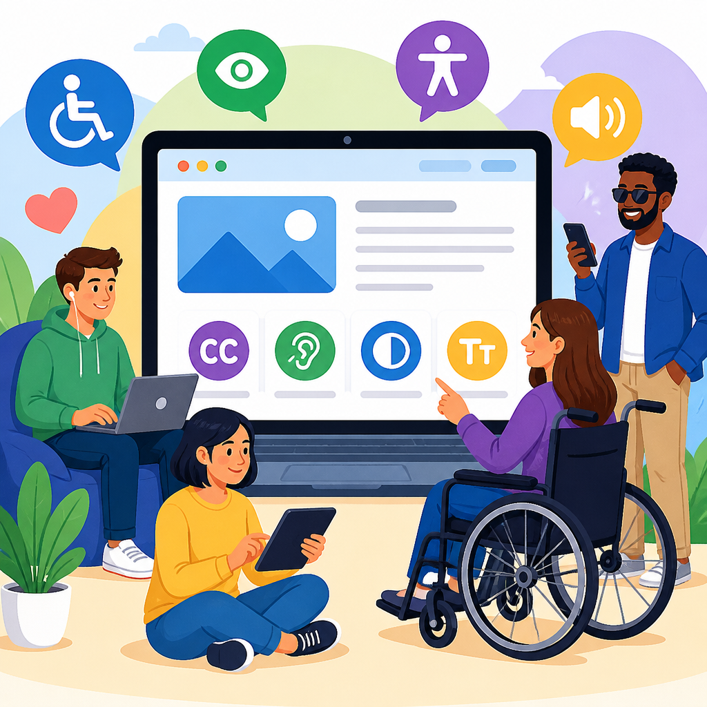
Digital accessibility basics for ADA-focused readers start with a simple idea: people with disabilities must be able to use websites, apps, documents, kiosks, and digital services with substantially equal ease. In practice, that means designing technology so users who are blind, have low vision, are Deaf or hard of hearing, have mobility limitations, speech disabilities, cognitive differences, or multiple disabilities can perceive information, operate controls, understand content, and complete tasks without unnecessary barriers. I have worked on accessibility reviews for public websites, online forms, PDFs, and software interfaces, and the same pattern appears every time: most barriers are not caused by advanced technology, but by basic decisions made without accessibility in mind.
For ADA-focused readers, the topic matters because digital services now function like front doors. People apply for jobs, request benefits, book medical visits, attend school, sign contracts, and pay bills online. When a button cannot be reached by keyboard, a video lacks captions, or a PDF is unreadable by screen readers, equal access breaks down. The Americans with Disabilities Act shapes expectations for nondiscrimination, while other standards and guidance help organizations translate legal obligations into practical design and development work. Understanding digital accessibility basics helps readers evaluate risk, improve usability, and build technology that works better for everyone.
The core concepts are straightforward. Accessibility means content and functionality are usable by people with disabilities. Assistive technology includes tools such as screen readers, screen magnifiers, refreshable Braille displays, voice control software, switch devices, and captioning systems. Reasonable accommodation often refers to adjustments for an individual, while accessible design aims to remove barriers for everyone from the start. Usability matters too: a technically compliant page can still be confusing if labels are vague, error messages are unclear, or navigation is inconsistent. Accessibility is not a niche feature set. It is a quality standard that affects customer service, procurement, legal exposure, search visibility, and trust.
This hub article explains the basics of technology and accessibility with an ADA lens. It covers the standards that guide implementation, the disability groups and barriers most often overlooked, the role of accessible websites, mobile apps, documents, multimedia, and software, and the practical steps organizations use to test and improve digital experiences. Use it as a starting point for deeper work on audits, remediation, policy, procurement, content operations, and training.
What Digital Accessibility Means in Everyday Technology
Digital accessibility is the practice of making technology usable by people with a wide range of disabilities, across devices, browsers, and assistive tools. The most widely used technical framework is the Web Content Accessibility Guidelines, usually called WCAG. WCAG organizes accessibility into four principles: content must be perceivable, operable, understandable, and robust. Those principles are not abstract. Perceivable means images need alternative text and videos need captions. Operable means users must be able to navigate without a mouse. Understandable means instructions, headings, and errors should be clear. Robust means code should work reliably with assistive technologies and modern user agents.
In daily work, accessibility shows up in routine interactions. A blind user may rely on a screen reader such as JAWS, NVDA, or VoiceOver to navigate headings, links, buttons, and form fields. A person with low vision may zoom text to 200 percent or use high contrast settings. A user with limited dexterity may tab through controls with a keyboard or use speech recognition like Dragon NaturallySpeaking. A Deaf user may need accurate captions and transcripts for video content. A user with a cognitive disability may depend on plain language, predictable navigation, sufficient time limits, and uncluttered layouts. Accessible technology supports all of these pathways without forcing users into separate, reduced experiences.
ADA-focused readers should also distinguish accessibility from compatibility. A site may technically open in a browser, but still fail if interactive elements are unlabeled, focus order jumps unpredictably, or status messages are never announced to assistive software. True accessibility is measured by task completion. Can a user log in, search, compare options, submit a form, download a statement, or contact support independently? If not, the barrier is material.
How the ADA Connects to Standards, Policies, and Risk
The ADA does not contain a line-by-line web coding manual, which is why organizations usually rely on recognized accessibility standards to define what good digital access looks like. In the United States, WCAG 2.1 Level AA is the benchmark most often referenced in settlements, procurement language, higher education guidance, and enterprise policies. Section 508 applies directly to federal agencies and influences many state contracts and vendor requirements. Some organizations now align with WCAG 2.2 because it adds criteria related to focus appearance, drag actions, target size, and authentication support.
From experience, the legal and operational risks are highest when essential services are blocked. Think of an inaccessible online job application that cannot be completed with a keyboard, a healthcare portal that posts lab results in unlabeled tables, or a city website that publishes emergency notices only in image-based PDFs. These are not minor defects. They directly affect access to employment, public services, healthcare, education, and civic participation. Plaintiffs, regulators, and advocacy groups tend to focus on barriers that prevent people from completing core tasks, especially when the issue is systemic across templates or platforms.
Good governance reduces risk. That means having an accessibility policy, assigning ownership across design, development, content, legal, procurement, and support teams, and adopting repeatable review processes. It also means documenting decisions. If a vendor product has limitations, record them, evaluate alternatives, and establish remediation plans. Accessibility is easiest to defend when it is treated as an ongoing program rather than a one-time statement on a footer page.
Common Barriers Across Websites, Apps, Documents, and Media
Most digital barriers fall into familiar categories. On websites, the frequent problems are missing alternative text, poor heading structure, low color contrast, empty links, inaccessible menus, missing form labels, modal dialogs that trap focus, and error messages that rely only on color. On mobile apps, common issues include unlabeled icons, controls that are too small, gestures with no alternative, content that does not reflow when text is enlarged, and screen reader focus that lands in the wrong place. In documents, especially PDFs exported from word processors or design tools, the biggest failures are missing tags, incorrect reading order, untagged tables, image-only scans, and link text like click here.
Multimedia has its own set of basics. Video needs synchronized captions for spoken content and meaningful sounds. Audio-only content needs transcripts. Instructional video often benefits from audio description when important visual information is not already explained in narration. Live events may require CART captioning or sign language interpretation depending on audience and context. Accessibility also extends beyond public-facing channels. Employee systems, internal training portals, HR forms, timekeeping tools, and collaboration platforms must be considered because equal access includes workplace technology.
When I triage issues, I separate them into blockers, severe friction, and quality improvements. A keyboard trap is a blocker because users may be unable to proceed. A decorative image with imperfect alternative text is usually lower priority. This distinction helps teams focus resources where access is actually broken while still building toward broader maturity.
Key Accessibility Basics by Technology Area
The table below summarizes the essentials ADA-focused readers should expect across major digital channels.
| Technology area | Accessibility basics | Typical failure example |
|---|---|---|
| Websites | Semantic headings, keyboard access, labels, contrast, alt text, error identification | Checkout form cannot be submitted without a mouse |
| Mobile apps | Screen reader labels, scalable text, touch targets, orientation support, gesture alternatives | Icon-only buttons are announced as unlabeled |
| PDFs and documents | Proper tags, reading order, bookmarks, table headers, meaningful links, searchable text | Scanned PDF has no readable text for screen readers |
| Video and audio | Captions, transcripts, audio description when needed, accessible players | Training video has auto-generated captions full of errors |
| Software and SaaS tools | Keyboard support, visible focus, status announcements, consistent navigation, accessible help | Dialog box opens but focus stays behind the overlay |
| Kiosks and touch systems | Reach range, tactile controls, audio output, privacy, timing adjustments | Self-service station requires drag gestures with no alternative |
These basics are not exhaustive, but they cover the majority of issues that affect real users. If a team addresses them early, later remediation costs drop significantly. In web projects, for example, adding semantic structure and accessible component patterns at the design-system level prevents the same defect from appearing on hundreds of pages.
Testing Methods, Tools, and the Limits of Automation
Accessibility testing works best when it combines automated scans, manual review, and user-centered validation. Automated tools such as axe DevTools, WAVE, Lighthouse, Accessibility Insights, and Siteimprove can quickly detect missing labels, contrast failures, empty buttons, duplicate IDs, and some structural problems. They are useful, but they only catch part of the picture. Industry estimates often place automated detection at roughly one third of common issues, because tools cannot reliably judge whether alternative text is meaningful, whether instructions are understandable, or whether a custom interaction makes sense with assistive technology.
Manual testing closes those gaps. A basic review should include keyboard-only navigation, screen reader spot checks, zoom and reflow testing, color contrast verification, form completion, modal dialog behavior, and error handling. For websites, I typically test with NVDA on Windows and VoiceOver on macOS or iOS because they reflect common user environments. For mobile apps, platform-specific screen readers like TalkBack and VoiceOver are essential. PDF testing usually involves Acrobat accessibility tools plus a screen reader pass to confirm reading order and tags behave as intended.
User testing with people with disabilities provides the strongest evidence of whether tasks are genuinely accessible. It reveals practical problems that conformance checks miss, such as confusing language, hidden time pressure, inconsistent controls, or support channels that break down when a user requests help. Teams do not need a massive lab to benefit. Even a small set of structured task tests can change product decisions quickly and credibly.
Building Accessibility Into Design, Content, and Procurement
The cheapest time to fix accessibility is before code is written. In design, that means using sufficient contrast, clear focus indicators, consistent navigation patterns, and components that support keyboard and screen reader behavior by default. Design systems should include accessible buttons, accordions, tabs, dialogs, alerts, tables, and form controls, with documented states and usage rules. If designers hand off inaccessible patterns, developers inherit unnecessary rework.
Content operations matter just as much. Editors should use real headings instead of bold text, write descriptive link text, avoid image-only flyers, and keep reading level appropriate for the audience. Alternative text needs context. A product image might need a concise description, while a chart may require a summary of the trend and key numbers. Captions should be edited for accuracy, especially in technical or legal content where automated captioning frequently mishears terminology.
Procurement is another major leverage point. Organizations often introduce accessibility risk by buying third-party platforms without evaluating them. Request a current VPAT, but do not stop there. A VPAT is a vendor self-disclosure, not proof of accessibility. Ask for live demos with keyboard and screen reader use, test critical workflows, review issue backlogs, and include accessibility obligations in contracts. If a platform powers hiring, benefits, customer portals, or learning management, inaccessible procurement decisions can lock in years of barriers.
Creating an Accessibility Program That Lasts
Sustainable accessibility requires process, not heroics. Start with an inventory of digital assets: public websites, intranets, mobile apps, PDFs, video libraries, software products, and third-party tools. Rank them by risk and importance. High-priority items usually include revenue paths, employment systems, healthcare services, education platforms, and customer support channels. Then define standards, assign owners, and create remediation timelines that distinguish urgent blockers from longer-term modernization work.
Training should be role-based. Developers need semantic markup, ARIA rules, focus management, and testing skills. Designers need color contrast, states, component behavior, and zoom considerations. Content authors need heading structure, links, tables, captions, and plain language. Procurement and legal teams need evaluation criteria and contract language. Support teams need scripts and procedures for accessible assistance, including alternate formats and escalation paths. When everyone sees accessibility as part of their job, quality improves faster and defects stop recycling.
Measurement also matters. Track defect trends, audit findings, turnaround time, training completion, and the percentage of high-traffic pages or core workflows that meet the target standard. Report outcomes in business terms: reduced legal exposure, broader customer reach, lower abandonment, stronger usability, and better cross-device performance. Accessibility is not separate from digital excellence. It is one of the clearest indicators of whether an organization can serve the public consistently and fairly.
Digital accessibility basics for ADA-focused readers come down to a practical truth: equal access in modern life depends on equal access to technology. Websites, mobile apps, PDFs, videos, software tools, and self-service systems all need to support people with disabilities in ways that are reliable, independent, and dignified. The core standards are established, the common barriers are well known, and the testing methods are mature. Organizations that treat accessibility as a design requirement, content discipline, engineering practice, and procurement standard are far more likely to meet both user needs and legal expectations.
The main benefit is not simply avoiding complaints or litigation. Accessible technology performs better for everyone. Clear structure improves navigation, captions help in noisy settings, keyboard support aids power users, plain language reduces confusion, and strong component patterns create more stable digital products. In my work, the teams that adopt accessibility early usually see gains in usability, quality assurance, and customer trust at the same time. Accessibility is one of the few improvements that strengthens inclusion and operational performance together.
Use this hub as your foundation for exploring the basics of technology and accessibility in greater depth. Review your highest-risk digital services first, compare them to recognized standards, test with real assistive technologies, and build accessibility into every future project. The sooner accessibility becomes part of everyday practice, the faster equal digital access becomes real.
Frequently Asked Questions
What does digital accessibility mean in an ADA-focused context?
Digital accessibility means creating websites, mobile apps, PDFs, online forms, self-service kiosks, videos, and other digital tools so people with disabilities can use them with substantially equal ease. In an ADA-focused context, the core idea is not just technical compliance for its own sake, but practical usability for real people. A person who is blind may rely on a screen reader to navigate a website. A person with low vision may need strong color contrast and the ability to zoom text without losing content. Someone who is Deaf or hard of hearing may need captions or transcripts to access audio content. A person with limited hand mobility may depend on a keyboard, switch device, or voice control instead of a mouse. If the digital experience blocks any of those users from accessing information or completing tasks, it is not meaningfully accessible.
Accessibility is often understood through four basic goals: content must be perceivable, operable, understandable, and robust. Perceivable means users can detect the information presented, whether through text, audio, captions, or assistive technology. Operable means users can interact with menus, buttons, forms, and navigation using different input methods. Understandable means content and workflows are clear, consistent, and predictable. Robust means the experience works reliably across browsers, devices, and assistive tools. For ADA-focused readers, this framework matters because it turns a legal and ethical obligation into concrete design and content decisions that improve equal access in everyday digital life.
Why is digital accessibility important for websites, apps, and online services?
Digital accessibility matters because digital spaces now function like front doors to education, employment, healthcare, government services, shopping, banking, and communication. When a site or app is inaccessible, the result is not merely inconvenience. It can prevent someone from applying for a job, scheduling a medical appointment, paying a bill, submitting a school form, or understanding important information. From an ADA-focused perspective, that creates barriers similar to inaccessible entrances, missing ramps, or unreadable printed materials in physical environments.
It is also important because accessibility benefits far more people than many organizations initially realize. Clear headings help screen reader users, but they also help everyone scan content more quickly. Captions help Deaf users, but they also support people in noisy environments or users who prefer to watch video without sound. Larger click targets help people with mobility disabilities, but they also improve mobile usability. Plain language helps users with cognitive disabilities, but it also improves comprehension for busy readers, older adults, and people reading in a second language. In other words, accessibility is both a civil rights issue and a quality issue. It reduces exclusion, lowers friction, and creates better digital experiences for all users while helping organizations reduce legal risk and strengthen trust.
What are the most common basics of accessible digital design?
The basics of accessible digital design start with structure, clarity, and input flexibility. Content should use proper headings in a logical order so users can understand the page layout and navigate efficiently with assistive technology. Images that convey meaning should have useful alternative text, while decorative images should not create noise for screen reader users. Links and buttons should clearly describe what they do rather than using vague phrases like “click here.” Color contrast should be strong enough for text and essential interface elements to remain readable. Text should also be resizable without breaking the layout or hiding content.
Keyboard accessibility is another essential basic. Users should be able to move through menus, links, buttons, form fields, and dialogs without a mouse. Focus indicators should remain visible so keyboard users always know where they are on the page. Forms should include properly associated labels, clear instructions, and understandable error messages that explain what went wrong and how to fix it. Videos should include captions, and audio-only content should provide transcripts. Content should avoid flashing effects that could trigger seizures, and interactions should be consistent and predictable rather than surprising or confusing. These may sound like small implementation choices, but together they determine whether users can successfully perceive information, operate controls, understand tasks, and complete transactions independently.
How can someone tell whether a website or document is accessible?
Determining accessibility usually requires more than one method, because no single test catches everything. A good starting point is a practical user review. Can you navigate the site using only a keyboard? Is it obvious where focus is located as you tab through the page? Are headings organized logically? Do form fields have visible labels and useful instructions? If images carry important meaning, do they appear to have text alternatives? If there are videos, are captions available and accurate? If you enlarge text or zoom the page, does the content remain usable without overlapping, disappearing, or requiring horizontal scrolling in common layouts?
For a more reliable assessment, automated tools can help identify issues such as missing alt text, low contrast, empty links, or structural problems, but automation is only part of the picture. Manual review is essential because tools cannot fully judge whether alternative text is meaningful, whether link text makes sense out of context, whether instructions are clear, or whether a complex workflow is understandable. Testing with assistive technologies such as screen readers, screen magnifiers, or voice input can reveal real-world obstacles. The strongest approach includes both technical evaluation and user-centered testing, especially by people with disabilities. For documents like PDFs, accessibility checks should also confirm reading order, tagged headings, selectable text, meaningful document titles, and properly labeled form fields. Accessibility is best measured by whether people can actually use the content successfully, not just whether a scanner reports a passing score.
What is the best way to improve digital accessibility over time?
The best way to improve digital accessibility is to treat it as an ongoing practice rather than a one-time project. Organizations often make the most progress when they build accessibility into planning, design, writing, development, procurement, publishing, and quality assurance from the beginning. That includes using accessible design systems, setting content standards, training teams, and choosing vendors or platforms that support accessible outcomes. If accessibility is added only at the end, problems are usually more expensive and time-consuming to fix.
A practical improvement plan often starts with an audit to identify the most serious barriers, followed by prioritizing high-impact fixes such as navigation, forms, color contrast, keyboard access, captions, and document remediation. Teams should then establish repeatable workflows: designers can review contrast and focus behavior, writers can use descriptive headings and link text, developers can use semantic HTML and ARIA appropriately, and testers can combine automated scans with manual checks. It is also wise to publish an accessibility statement and provide a way for users to report barriers. Most importantly, organizations should listen to disabled users and include them in testing whenever possible. Accessibility improves most effectively when it is guided by real user experience, supported by clear standards, and maintained as part of normal digital governance. That approach not only aligns with ADA-focused goals, but also creates more usable, inclusive, and trustworthy digital services over the long term.