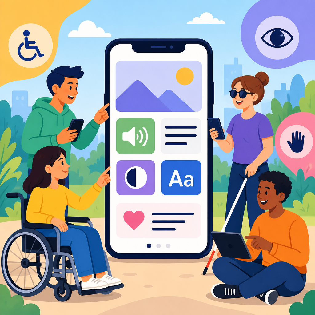
Mobile accessibility basics everyone should understand start with a simple idea: a phone, tablet, or wearable should be usable by people with different physical, sensory, cognitive, and situational needs. In practice, mobile accessibility means designing apps, websites, and device interactions so that someone can read content with a screen reader, enlarge text without breaking layouts, tap controls with limited dexterity, understand instructions under stress, and complete tasks even with low vision, hearing loss, temporary injury, or poor lighting. I have worked on mobile products where a checkout flow looked polished in design reviews but failed immediately when tested with VoiceOver, large text, and switch control. That gap is why this topic matters.
Within the broader field of technology and accessibility, mobile deserves special attention because it is now the primary computing environment for many people. Smartphones handle banking, school communication, telehealth, job applications, maps, and identity verification. When a mobile experience is inaccessible, the barrier is not minor inconvenience; it can block medication refills, bus tickets, emergency alerts, and wages. Accessibility also reaches beyond permanent disability. A parent using one hand, a commuter in bright sun, an older adult with reduced contrast sensitivity, or a nonnative speaker processing dense forms all benefit from accessible mobile design. Good accessibility is good interaction design under real conditions.
Several terms help frame the basics. Assistive technology includes tools such as screen readers like VoiceOver on iOS and TalkBack on Android, magnification, voice control, hearing device support, and switch access. Inclusive design means planning for human diversity from the start rather than retrofitting later. Usability is the ease with which a person can achieve goals efficiently and accurately. Accessibility overlaps with usability but focuses on removing barriers for disabled users and aligning with established requirements such as the Web Content Accessibility Guidelines, commonly called WCAG, and platform guidance from Apple and Google. For mobile teams, understanding these concepts is the foundation for building digital products that work for more people, more reliably, in more contexts.
This article is a hub for exploring the basics of technology and accessibility through the mobile lens. It explains what mobile accessibility includes, the most common barriers, the standards and platform features that shape implementation, and the practical habits that improve apps and mobile websites. If you understand the principles here, you will be ready to go deeper into related areas such as accessible forms, color and contrast, captions and transcripts, screen reader testing, semantic structure, and procurement requirements. The goal is not abstract compliance. The goal is a mobile experience that respects how people actually use technology.
What mobile accessibility includes in real use
Mobile accessibility covers the full path from unlocking a device to completing a task. On a phone, users depend on touch targets, gestures, orientation changes, haptics, audio cues, readable text, plain language, and compatibility with operating system settings. A screen reader user does not scan a page visually; they move through elements in sequence and need accurate labels, headings, states, and hints. A user with low vision may increase text size dramatically or enable display zoom, which exposes layouts that clip labels or hide controls. Someone with limited dexterity may rely on external keyboards, switch access, or voice control and cannot be forced into complex gestures such as drag-and-drop without an alternative.
I usually explain mobile accessibility by tying it to common tasks. Ordering groceries requires clear product names, accessible quantity controls, and error messages announced at the right time. A banking app needs focus order that follows the screen logically, secure authentication that works with assistive technology, and charts with text alternatives. A transit app must support high contrast map elements, readable disruption alerts, and live updates that do not steal screen reader focus. Accessibility is not a separate mode. It is the quality of the primary experience when users approach it with different tools and constraints.
Mobile also introduces technical differences from desktop accessibility. Screen sizes are smaller, touch interactions dominate, and users often switch between portrait and landscape. Network conditions may be unstable, increasing cognitive load when content shifts or errors appear. Native apps use platform components with accessibility APIs, while mobile websites depend on semantic markup, responsive design, and browser support. Hybrid frameworks such as React Native and Flutter can be accessible, but only when teams expose semantics correctly and test with real assistive technology. The basics remain consistent: perceivable content, operable controls, understandable interactions, and robust compatibility.
Core barriers users encounter on phones and tablets
The most frequent mobile accessibility problems are remarkably consistent across audits. First, unlabeled controls make apps unusable with screen readers. If an icon button announces only “button,” the user cannot know whether it opens search, filters, or payment. Second, poor contrast and tiny text reduce readability, especially outdoors or for users with low vision. WCAG contrast thresholds exist for a reason: text must stand out from its background enough to be read without strain. Third, small tap targets create errors for users with tremors, limited reach, or large fingers. Apple and Google both recommend minimum target sizes because precision should not be a prerequisite for basic actions.
Another major barrier is gesture dependence. Custom swipes, long presses, multi-finger interactions, and drag operations often fail when they are not paired with visible controls or accessible actions. A dismiss gesture without a close button is a common example. Time limits are another issue. Mobile checkouts, verification codes, and inactivity timeouts can lock users out before they finish reading or entering information, particularly when using screen readers or speech input. Motion effects can trigger vestibular discomfort, and autoplay audio can interfere with screen readers. Accessibility problems are often created by speed, animation, and novelty features that were never tested outside the default interaction path.
| Barrier | Typical Mobile Example | Better Practice |
|---|---|---|
| Unlabeled controls | Icon-only payment button read as “button” | Provide clear accessible names and states |
| Low contrast | Light gray text on white settings screen | Meet contrast requirements and test outdoors |
| Small targets | Tiny close icon in top corner | Use recommended touch target sizes and spacing |
| Gesture-only actions | Swipe to delete with no visible alternative | Add explicit buttons or menus for the same action |
| Text resizing failures | Labels clipped at large text sizes | Support dynamic type and responsive reflow |
| Poor error handling | Form error shown only in red text | Use text, programmatic alerts, and focus management |
Cognitive barriers deserve equal attention. Dense instructions, inconsistent navigation, unexplained icons, and multi-step forms increase abandonment. Error messages like “invalid entry” do not tell people what to fix. In mobile health and finance, I have seen users succeed only after teams replaced jargon with direct labels, split long forms into smaller sections, and surfaced examples inside fields. Clear language is an accessibility feature. So is predictable behavior. When controls move unexpectedly, labels change between screens, or confirmation messages disappear too quickly, users lose confidence and make more mistakes.
Standards, platform features, and why they matter
The strongest baseline for mobile accessibility is WCAG, currently used in procurement, policy, and legal evaluation across many sectors. Although WCAG was written to be technology agnostic, its principles apply directly to mobile apps and responsive websites: content must be perceivable, operable, understandable, and robust. On mobile projects, teams typically translate those principles into concrete checks such as text alternatives, heading structure, color contrast, focus visibility, keyboard support, status messages, and orientation flexibility. WCAG is not the whole story, though. Mobile teams also need platform-specific guidance because iOS and Android expose accessibility features through their own APIs and design systems.
Apple provides accessibility support through UIKit, SwiftUI, and system settings such as VoiceOver, Dynamic Type, Bold Text, Switch Control, Voice Control, Reduce Motion, and Increase Contrast. Google offers parallel capabilities with TalkBack, font scaling, display size, Switch Access, Live Transcribe, caption preferences, and accessibility scanner tools. Material Design and Apple Human Interface Guidelines both include practical direction on labels, targets, motion, and adaptive layouts. Using standard components usually improves accessibility because these controls inherit keyboard behavior, semantics, and state announcements. Problems increase when teams replace native elements with custom widgets that look unique but fail to expose roles and values correctly.
Testing tools help, but they do not replace human judgment. Automated scanners can catch missing labels, low contrast, and target size concerns. Browser tools, Accessibility Scanner on Android, Xcode’s Accessibility Inspector, Axe DevTools, and Lighthouse are useful starting points. Still, they will not reliably tell you whether a checkout flow makes sense in sequence, whether a calendar control is too verbose to navigate, or whether a CAPTCHA blocks screen reader users. The most reliable process combines standards review, automated checks, manual testing, and sessions with disabled users when possible. Accessibility quality comes from repeated validation, not a one-time scan before release.
How to build accessible mobile experiences from the start
Accessible mobile design begins before code. Content designers should write short labels, explicit instructions, and error messages that explain what happened and how to recover. Designers should choose color pairs that meet contrast requirements, support text enlargement, and avoid conveying meaning by color alone. Product managers should define accessibility acceptance criteria for user stories so teams do not debate basics at the end of a sprint. Developers should prefer native controls where possible, expose semantic labels and hints, support screen orientation changes unless a function truly requires one view, and make sure focus moves logically after dialogs, errors, and navigation events.
Forms deserve special care because they are where many mobile failures occur. Every field needs a visible label, not just placeholder text that disappears on entry. Input types should match the task, such as email keyboards for email fields and numeric keyboards for PIN entry, while still allowing assistive technology to interact normally. Validation should identify the exact field with the problem and announce the error in text. If a password rule requires eight characters, one number, and one symbol, state it before submission rather than after failure. For authentication, offer alternatives when biometrics, CAPTCHAs, or timed codes create barriers.
Media and motion also shape accessibility. Videos should have captions, and audio-only content should have transcripts. Animations should support reduced motion settings and avoid essential information conveyed only through movement. Haptics and sound can reinforce feedback, but neither should be the sole signal. In one app redesign I led, we replaced a shake animation used to indicate form errors with inline text, focus movement, and a persistent summary. Completion rates improved because users no longer had to infer what the animation meant. The lesson was simple: feedback must be perceivable in more than one way.
Making this page a hub for technology and accessibility learning
As a hub within technology and accessibility, mobile accessibility basics connect to several deeper topics. Screen reader support leads naturally to semantic structure, meaningful link text, and accessible naming patterns. Visual access expands into color contrast, dark mode, zoom, responsive typography, and icon clarity. Interaction design links to keyboard access, switch access, focus management, and alternatives to gestures. Content strategy connects to plain language, reading level, localization, and error prevention. Governance extends further into design system documentation, procurement language, VPAT review, training, and release checklists. Mobile is the entry point, but the discipline is organization wide.
The practical benefit of treating this article as a hub is consistency. Teams often learn accessibility in fragments: one developer learns ARIA, a designer learns contrast, a QA analyst learns screen reader gestures, and nobody sees how the pieces fit together. A stronger approach is to anchor everything to user tasks on real devices. Can someone discover content, understand options, enter information, recover from errors, and complete the goal with their preferred settings and assistive technology? If the answer is yes, the technology is serving accessibility rather than obstructing it. That standard applies to apps, mobile websites, kiosks, and the connected services behind them.
Mobile accessibility basics everyone should understand are ultimately straightforward: use clear structure, readable text, sufficient contrast, well-labeled controls, large targets, predictable navigation, and alternatives to gestures, motion, and audio-only cues. Build with platform components when possible, test with VoiceOver and TalkBack, respect user settings such as large text and reduced motion, and fix barriers where they occur most often: forms, authentication, navigation, and media. These steps improve access for disabled users and reduce friction for everyone using technology in the real world.
The broader lesson in exploring the basics of technology and accessibility is that accessibility is not a finishing pass. It is a way of defining quality. When teams integrate it early, they avoid expensive retrofits, reduce legal and reputational risk, and create products that work better across ages, devices, environments, and abilities. Just as important, they honor the fact that digital access now shapes participation in daily life. A mobile experience that excludes users is a business problem, a design problem, and often an equity problem at the same time.
If you are building or reviewing a mobile product, start with one real workflow today: opening the app, finding a task, completing a form, and confirming success using large text and a screen reader. Document what breaks, prioritize fixes, and use this hub as the foundation for deeper accessibility work across your technology stack.
Frequently Asked Questions
What does mobile accessibility actually mean?
Mobile accessibility means making sure apps, mobile websites, and device interactions can be used by as many people as possible, including people with physical, sensory, cognitive, and temporary or situational limitations. On a phone, tablet, or wearable, that includes supporting screen readers for people who are blind or have low vision, allowing text to resize without breaking the interface, providing enough color contrast for readable content, and creating controls that are easy to tap for people with limited dexterity. It also means writing clear instructions, using predictable navigation, and reducing unnecessary complexity so that users can complete tasks even when distracted, stressed, tired, or in a bright or noisy environment. In other words, mobile accessibility is not a niche feature. It is a practical design and development approach that improves usability for a wide range of real-world users.
Why is mobile accessibility so important for everyday users?
Mobile devices are often the primary way people communicate, shop, learn, work, and access essential services, so accessibility on mobile has a direct effect on independence and inclusion. A user may rely on VoiceOver or TalkBack to understand content, larger text to read comfortably, captions to consume video in public places, or bigger touch targets to avoid accidental taps. Others may not identify as disabled but still benefit from accessible design when they are using one hand, dealing with glare outdoors, recovering from an injury, carrying a child, or trying to complete a task under time pressure. Accessible mobile experiences also reduce frustration and abandonment because users can find what they need faster and with fewer errors. For organizations, that translates into stronger engagement, better customer satisfaction, broader audience reach, and reduced legal and reputational risk. Simply put, accessible mobile design supports both people and performance.
What are the most important mobile accessibility basics to get right first?
Start with the fundamentals that have the biggest impact across devices and user needs. Make sure text is readable by supporting dynamic text or text resizing and by avoiding layouts that break when fonts get larger. Ensure strong color contrast so text and icons remain visible in different lighting conditions and for users with low vision or color vision differences. Label buttons, links, form fields, and icons clearly so screen readers can announce them accurately and so sighted users understand what each control does. Provide touch targets that are large enough and spaced well enough to prevent accidental taps, especially on smaller screens. Keep navigation consistent and predictable so users do not have to relearn patterns on every screen. Use plain language for labels, instructions, and error messages, and explain how to fix mistakes rather than simply saying something went wrong. Finally, test your experience with built-in mobile accessibility features such as screen readers, zoom, switch access, voice control, and keyboard navigation where relevant. These basics form the foundation of a mobile experience that works better for everyone.
How do screen readers and text resizing affect mobile design?
Screen readers and text resizing change how people perceive and move through a mobile interface, so they should be considered early rather than treated as an afterthought. A screen reader reads content aloud and lets users navigate through headings, buttons, links, form controls, and landmarks. That means developers need to provide meaningful labels, logical reading order, descriptive button names, and proper semantic structure so the interface makes sense without visual context. For example, a button labeled “Submit payment” is far more helpful than one labeled “Button” or “Click here.” Text resizing introduces another set of challenges. Many users increase font size significantly, and if the layout is rigid, content can overlap, clip, or become impossible to use. Good mobile design allows text to reflow, containers to expand, and controls to remain usable at larger sizes. Designers should avoid relying on tiny text, fixed-height text boxes, or images of text. When a mobile experience works with screen readers and larger text, it becomes more robust, readable, and user-friendly overall.
How can teams test and improve mobile accessibility over time?
The best approach is to combine automated checks, manual testing, and real user feedback. Automated tools can quickly catch some common issues, such as missing labels, insufficient contrast, or structural problems, but they cannot tell you whether instructions are confusing or whether a checkout flow feels exhausting with assistive technology. Manual testing is essential. Teams should try common tasks using screen readers like VoiceOver on iOS and TalkBack on Android, increase system text size, enable zoom, test in portrait and landscape orientations, and verify that controls remain easy to tap and understand. It is also valuable to review forms, error messages, authentication flows, media playback, and gesture-based interactions, because these are often problem areas on mobile. Beyond testing, accessibility should be built into design systems, component libraries, content guidelines, and quality assurance processes so it is maintained release after release. Most importantly, involve people with disabilities in research and usability testing whenever possible. Their feedback reveals issues that checklists alone often miss and helps teams create mobile experiences that are not just technically compliant, but genuinely usable.