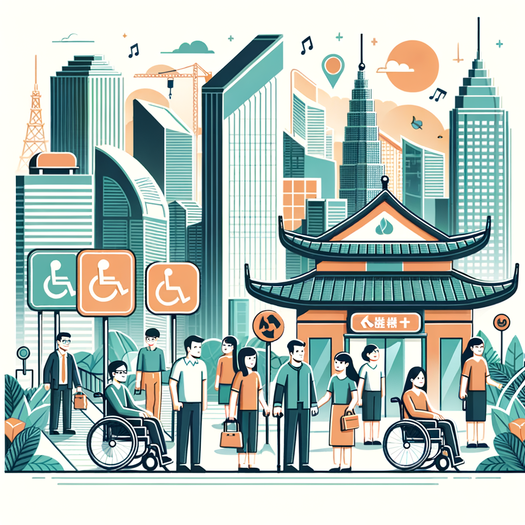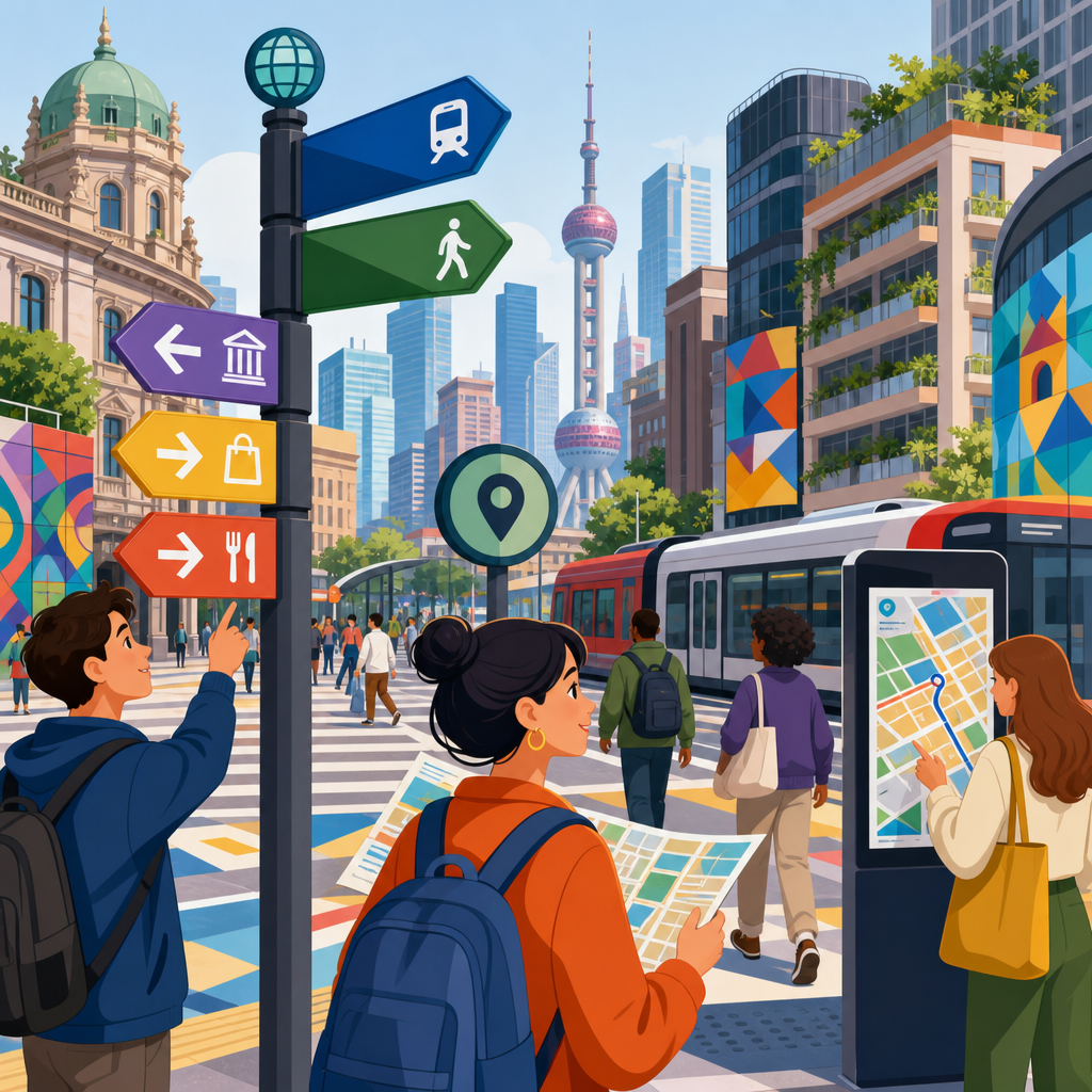
Wayfinding in dense urban environments is the discipline of helping people understand where they are, decide where to go, and move there confidently in places where streets, transit systems, buildings, and public spaces compete for attention. In accessibility practice, wayfinding goes beyond signs. It includes tactile paving, audible signals, landmark-based navigation, multilingual information design, digital routing, lighting, curb geometry, and the policies that make these elements consistent across a city. I have worked on audits of stations, civic campuses, and mixed-use districts, and the same pattern appears everywhere: when orientation fails, access fails. A ramp that is hard to find is almost as exclusionary as a ramp that does not exist.
Dense cities make wayfinding harder because they compress decisions. A traveler may need to interpret a subway interchange, cross a complex intersection, locate an elevator hidden behind retail frontage, and understand local conventions within minutes. For blind and low-vision pedestrians, people with cognitive disabilities, Deaf and hard-of-hearing users, older adults, tourists, and residents who do not read the dominant language, small design inconsistencies multiply into real barriers. Good international accessibility strategy treats wayfinding as core mobility infrastructure, not decorative graphics. It aligns transportation planning, street design, building codes, and digital information so a person receives clear cues before, during, and after every movement decision.
This matters because the global urban future is denser, older, and more multilingual. United Nations urbanization data shows most population growth is concentrating in cities, while many high-income and middle-income countries are aging rapidly. At the same time, transit agencies are digitizing passenger information and cities are redesigning streets for safety and climate resilience. That convergence creates a chance to build wayfinding systems that are inclusive from the start. The strongest international ideas share a simple principle: accessibility is not a special layer added later for a minority of users. It is the operating logic of a legible city, improving independence, safety, dwell time, and trust for nearly everyone.
Universal wayfinding starts with legibility, consistency, and sensory redundancy
International innovations in accessibility work best when they solve the same message through multiple senses. A clear route should be visible, audible, tactile, and cognitively simple. In practice, that means consistent pictograms, strong contrast ratios, standardized placement heights, tactile ground surface indicators, logical naming, and reliable spoken announcements. ISO 21542 on accessibility and usability of the built environment, along with national guidance such as the ADA Standards in the United States and Inclusive Mobility in the United Kingdom, all reinforce the same operational lesson: users should not have to relearn navigation rules at every block or building.
I have found that consistency is often more valuable than novelty. Cities sometimes invest in eye-catching maps but neglect the sequence of decisions that follows. A person exiting a train does not just need a station map; they need confirmation at the elevator, the fare gate, the sidewalk edge, and the crossing. Tokyo demonstrates this sequencing well. Despite extraordinary density, major rail operators use color coding, line symbols, numbered exits, platform markings, and repeated overhead guidance to break complex journeys into manageable steps. Even when a station is crowded, the rider can verify progress repeatedly rather than relying on memory alone.
Sensory redundancy also protects against real-world failure. Sun glare can wash out screens, construction can block desire lines, and noise can drown out announcements. Good accessible wayfinding anticipates those conditions. Raised maps, tactile handrail information, induction loops, beacon-triggered audio, and plain-language text create backup channels. The design goal is not to overwhelm users with information. It is to provide the same essential message in more than one way, at the right decision point, so that route confidence does not depend on perfect vision, hearing, language fluency, or familiarity.
Transit systems are the backbone of urban wayfinding accessibility
In dense urban environments, transit is usually the hardest and most important navigation ecosystem. A single trip can involve sidewalks, buses, rail platforms, mezzanines, elevators, ticketing, and street exits managed by different agencies. The best international systems reduce this fragmentation through standards. London’s Legible London program improved pedestrian maps, while Transport for London pairs that with consistent stop information, step-free journey data, and distinct line identities. The result is not just branding. It is a navigation grammar that helps locals and visitors predict where information will appear and how it will be expressed.
Singapore offers another strong model. The city-state integrates barrier-free access requirements into transit stations, public housing precincts, and pedestrian networks. Tactile guidance routes, sheltered walkways, audible crossing features, and wayfinding signage are planned as part of the journey chain. This matters because accessible travel breaks when one segment is missing. An elevator inside a station is useful only if a wheelchair user can reach the station entrance from the street and continue from the destination stop to the final building without encountering stairs, missing curb ramps, or unreadable detour notices.
For practitioners, the key strategy is to design around transfer anxiety. Riders are most likely to become disoriented during transitions: street to station, platform to platform, and station to exit. Real-time information can help, but only when paired with physical cues. A dynamic sign that says an elevator is out of service must be accompanied by a clearly marked alternative route. The same applies during maintenance. In cities such as Hong Kong and Seoul, where stations can resemble underground neighborhoods, temporary wayfinding during construction is not a minor operations issue. It is an accessibility requirement with direct consequences for trip abandonment and safety.
Street design determines whether wayfinding remains usable beyond the station
Many accessibility plans fail outside the transport node. Once people reach the street, clutter, inconsistent crossings, and unclear public-realm hierarchy can erase the benefits of a well-designed station. International best practice treats sidewalks as information corridors. Curb ramps should align with crossing direction, tactile warning surfaces should indicate hazards without sending conflicting messages, and pedestrian islands should preserve a straight, detectable path. Copenhagen, Barcelona, and Melbourne all show versions of this principle in districts where walking, cycling, and transit coexist under heavy demand.
Dense urban streets require disciplined information management. Every pole, café board, dockless vehicle, waste bin, and utility cabinet can become an obstacle, especially for blind pedestrians and wheelchair users. I have seen sidewalks technically compliant in width but functionally unusable because temporary objects destroyed the detectable route. That is why leading cities increasingly use streetscape manuals that specify furniture zones, clear walking zones, and placement rules for signs. When these rules are enforced, wayfinding improves because people can trust where the path will be and where information will appear.
Crossings deserve special attention. Accessible pedestrian signals, countdown timers, refuge islands, and reduced turning radii improve more than safety; they improve orientation. A person with low vision can infer street geometry from signal timing, curb alignment, and tactile cues. A person with cognitive disabilities benefits from simpler phasing and fewer ambiguous turning conflicts. Internationally, the strongest strategy is to make intersections self-explaining. If a crossing requires too much interpretation, it is already underperforming. The urban environment should communicate direction and priority through form, not only through signs.
International examples show how different cities solve similar accessibility problems
Different urban contexts produce different tools, but the underlying problems are surprisingly consistent: multilingual communication, vertical circulation, transfer complexity, and sensory overload. The table below summarizes several useful international approaches and why they work in dense settings.
| City | Wayfinding approach | Accessibility value | Practical lesson |
|---|---|---|---|
| London | Pedestrian mapping, consistent transit iconography, step-free trip information | Supports planning before movement and verification during movement | Use one visual language across street and transit networks |
| Tokyo | Numbered exits, line colors, platform order cues, repeated overhead signs | Reduces cognitive load in extremely complex stations | Break large environments into small decision steps |
| Singapore | Barrier-free route integration across stations, sidewalks, and public housing areas | Protects continuity of the journey chain | Audit accessibility from origin to destination, not by asset type |
| Barcelona | Tactile paving, redesigned superblock streets, clearer pedestrian priority zones | Improves route comfort and reduces conflicts in busy districts | Street hierarchy can make navigation easier without adding more signs |
| Seoul | Digital transit data, multilingual guidance, complex interchange management | Helps residents and visitors navigate dense multimodal nodes | Pair digital information with physical confirmation at every transfer |
These examples matter because no single city has solved everything. London still faces legacy station constraints. Tokyo’s complexity can challenge first-time users despite excellent systems. Barcelona must balance historic streets with modern accessibility upgrades. The point for planners is not to copy a surface feature. It is to identify the transferable principle. Numbered exits work because they convert place memory into a simple code. Legible pedestrian maps work because they align orientation with the user’s facing direction. Barrier-free route audits work because they reveal where agency boundaries create hidden breaks.
Digital tools, multilingual design, and emerging technology extend accessible navigation
Digital navigation is now inseparable from urban wayfinding, but it should extend physical systems rather than replace them. Apps such as Google Maps, Citymapper, Moovit, and specialized tools like Lazarillo or GoodMaps can provide turn-by-turn assistance, step-free filters, and live disruption alerts. Yet these tools depend on accurate data, maintained points of interest, and clear physical environments. If a mapped elevator is inaccessible behind a locked door, digital trust collapses quickly. The best cities treat open transit data, accessibility metadata, and asset maintenance records as part of customer information, not back-office administration.
Multilingual design is equally important in international cities. Plain language, pictograms, and standardized symbols reduce dependence on translation, but translation still matters for warnings, service changes, and emergency instructions. Airports have long understood this; urban transit and civic districts are catching up. In places with large visitor populations, such as Dubai, Paris, and New York, a multilingual wayfinding strategy can reduce staff burden while improving independence. The critical detail is prioritization: emergency and route-critical information must be translated first, and the hierarchy must remain readable even when text expands across languages.
Emerging tools are promising when applied carefully. Bluetooth beacons, computer-vision guidance, haptic prompts, and digital twins can improve orientation for blind and low-vision users and support remote auditing. I have seen beacon pilots fail because deployment was not maintained, batteries died, or app onboarding was too complex. Technology succeeds when it fits a reliable governance model. Cities need asset inventories, testing protocols with disabled users, procurement standards for interoperability, and feedback loops that capture where real journeys break down. Innovation without operations discipline rarely survives beyond a pilot phase.
How cities can build an accessibility-focused wayfinding strategy that lasts
A durable strategy starts with governance, not graphics. Cities need a single cross-agency framework covering naming conventions, sign placement, tactile standards, temporary works, digital data, and maintenance response times. Without that framework, each district, station, or building creates its own logic, and users pay the price. The most effective programs also involve disabled people early through co-design, ride-alongs, intercept interviews, and post-occupancy evaluation. Lived experience reveals failures that desktop reviews miss, such as echoing announcement systems, overcomplicated elevator routing, or maps placed where wheelchair users cannot approach them.
Measurement should be practical and continuous. Useful metrics include percentage of step-free trips, elevator uptime, time to repair audible signals, completion rates for accessible routes during construction, customer complaints by location, and independent navigation success during user testing. Tools such as GIS asset mapping, pedestrian network analysis, and station path-of-travel audits help teams prioritize investment. In my experience, small fixes often deliver outsized gains: aligning curb ramps, renumbering exits, improving contrast, relocating signs out of clutter, or standardizing temporary diversion boards. These interventions are cheaper than major reconstruction and immediately improve confidence.
Finally, wayfinding must be treated as a public service promise. Dense cities are stressful when information is fragmented, but they become remarkably navigable when routes are predictable, multisensory, and continuous. International innovations and strategies in accessibility show that success depends less on spectacular technology than on disciplined coordination across streets, stations, buildings, and data systems. Start with one corridor, one interchange, or one district, audit the full journey chain, fix the recurring breaks, and document standards that can scale. Cities that do this well create not only better access, but a more understandable urban experience for everyone.
Frequently Asked Questions
What makes wayfinding in dense urban environments different from wayfinding in simpler settings?
Wayfinding in dense urban environments is more complex because people are making decisions in places where many systems overlap at once. A person may be moving between sidewalks, intersections, transit stations, plazas, parking areas, building entrances, bike routes, and ride-share pick-up zones within a very short distance. In that setting, wayfinding is not just about posting more signs. It is about organizing information so people can quickly understand where they are, what choices are available, and which route is safest, most direct, and most comfortable for their needs.
Dense cities also create heavy visual and cognitive competition. Commercial signage, traffic signals, temporary construction notices, public art, lighting, and crowds can all distract from essential navigational information. For that reason, effective urban wayfinding relies on consistency across multiple touchpoints: map design, street naming, landmark visibility, tactile cues, audible information, lighting, curb geometry, and digital navigation tools. If these elements are not coordinated, users can receive conflicting messages that increase stress and reduce confidence.
Another important difference is that urban wayfinding must serve a much broader range of users at the same time. Residents, tourists, older adults, children, people with low vision, blind travelers, wheelchair users, non-native speakers, and people unfamiliar with local transit all interact with the same environment differently. International best practice recognizes that strong wayfinding systems provide layered information rather than one-size-fits-all directions. Visual, tactile, auditory, spatial, and digital cues should reinforce each other so that navigation does not depend on a single sense, device, or language.
How do international cities improve accessibility in wayfinding beyond standard signs and maps?
Leading cities increasingly treat accessibility as the foundation of wayfinding rather than as an add-on. That means designing navigation systems that can be understood through multiple senses and in multiple formats. Tactile paving helps indicate safe paths, platform edges, and crossing points for people who are blind or have low vision. Audible pedestrian signals communicate crossing phases and alignment information at intersections. High-contrast typography, legible icon systems, and predictable placement of information support people with low vision, cognitive disabilities, and visitors under stress.
Many international examples also emphasize landmark-based navigation. Instead of relying only on street names or technical transit instructions, systems refer to memorable buildings, public spaces, and visual anchors that people can recognize easily. This approach is especially helpful in complex districts where routes curve, intersect, or pass through multi-level spaces. When paired with tactile maps, accessible kiosks, and step-free routing data, landmark-based systems make navigation more intuitive for a wider audience.
Multilingual communication is another major component. Dense cities often serve international visitors and linguistically diverse residents, so information design must reduce dependence on long text blocks. Clear pictograms, universal symbols, plain language, and translated content can help users make quick decisions without slowing pedestrian flow. At the same time, digital tools such as mobile navigation apps, beacon-based guidance, and real-time transit updates can add valuable support when they are built with accessibility features like screen reader compatibility, voice guidance, and accurate curb-to-entrance routing. The strongest systems combine physical and digital navigation so people are not excluded if one channel fails.
Why are consistency and policy so important in successful urban wayfinding systems?
Consistency is what turns separate signs, crossings, maps, and digital tools into a reliable navigation experience. In a dense urban environment, people move across districts, agencies, and property lines without thinking about who controls each space. They simply expect the city to make sense. If one transit authority uses different symbols, map orientations, naming conventions, or accessibility treatments than the surrounding street network, users can become disoriented at the exact moments when they need clarity most, such as station exits, complex intersections, or shared public-private plazas.
That is why policy matters as much as design. Internationally, the best-performing systems are usually supported by standards that define typography, color contrast, icon use, tactile treatments, audible signal practices, map conventions, placement heights, and maintenance responsibilities. Policies can also require coordination between transportation departments, planning agencies, parks departments, private developers, and transit operators so that wayfinding remains coherent across the full journey rather than stopping at an agency boundary.
Consistency also improves equity and long-term usability. When a city adopts repeatable rules for curb ramps, tactile warnings, lighting levels, platform information, multilingual messaging, and digital data formats, users learn what to expect and gain confidence over time. This is especially valuable for people who rely on routine and predictability, including many disabled travelers. Strong policy frameworks also help cities adapt to change. During construction, special events, or transit service disruptions, temporary wayfinding can remain understandable if it follows the same basic system users already know.
How do digital tools fit into accessible wayfinding in crowded city centers?
Digital tools are increasingly important, but they work best when they support, rather than replace, the physical environment. In crowded city centers, mobile navigation apps, real-time transit data, indoor mapping, and location-aware guidance can help people plan routes, avoid disruptions, and receive turn-by-turn instructions. For users with disabilities, digital tools can provide information that static signs often cannot, such as elevator outages, steep grades, curb ramp locations, accessible entrances, platform changes, or alerts about construction detours.
However, digital wayfinding must be designed carefully to be genuinely accessible. Applications should work well with screen readers, voice control, magnification, and high-contrast settings. Instructions should be specific and meaningful in real urban conditions, using references such as crosswalk alignment, curb cuts, landmark entrances, and transit gate positions rather than vague prompts like “head east.” In multilingual cities, digital tools should also offer language options and plain-language instructions so they can serve visitors and residents alike.
At the same time, no city should assume everyone can or wants to navigate by smartphone. Battery failure, poor connectivity, unfamiliar interfaces, and cost barriers can all limit digital access. That is why the most resilient international approach is hybrid. Physical signage, tactile surfaces, audible signals, lighting, and legible spatial design should make the environment navigable on their own, while digital systems add personalization, live updates, and route customization. In other words, digital tools should enhance confidence and flexibility, not become the only path to independence.
What practical lessons can cities apply from international wayfinding ideas in dense urban environments?
One of the clearest lessons is to design the journey as a continuous experience. People do not think in separate categories such as street design, transit design, or building access. They think about getting from one place to another without confusion or unnecessary effort. Cities can learn from international practice by connecting sidewalks, crossings, transit stations, public spaces, and entrances through common wayfinding logic. That includes consistent naming, directional hierarchy, lighting, accessible routing, and decision-point information placed exactly where users need it.
Another practical lesson is to prioritize predictability over visual novelty. Beautiful graphic systems can help, but they are not enough if route information is hidden, inconsistent, or dependent on local knowledge. Cities should focus on legibility: clear sightlines, uncluttered sign placement, intuitive curb geometry, distinguishable landmarks, and tactile and audible cues that confirm a person is on the correct path. In very dense areas, reducing ambiguity is often more valuable than adding more information.
Finally, successful cities test wayfinding with real users and maintain it over time. International best practice often involves co-design or field testing with blind and low-vision travelers, wheelchair users, older adults, neurodivergent users, tourists, and people who speak different languages. That testing reveals problems professionals may miss, such as confusing acoustics, poor sign visibility in crowds, inaccessible app interactions, or misleading detour routes during construction. Maintenance is equally critical. Faded markings, broken audible signals, blocked tactile paths, outdated maps, and inconsistent temporary signs can undo an otherwise strong system. The most effective lesson is simple: wayfinding should be treated as public infrastructure, not decoration.