Door-side placement of ADA signs becomes complicated the moment a frame is tight, a sidelight interrupts the latch side, or a corridor leaves almost no clear wall area, yet the decision still matters because room identification signs are only useful when people can predictably find and read them. In ADA Accessibility Standards, “door-side placement” usually refers to mounting permanent room signs on the wall adjacent to the latch side of a door, at a consistent height, so people who are blind, have low vision, or use tactile reading can locate the sign without standing in a door swing. “Wall space is limited” can mean many things in practice: narrow mullions, back-to-back doors, glass sidelights, return walls shorter than required clearance, protruding trim, life-safety devices, or renovation constraints in older buildings. I have worked through all of those conditions on schools, clinics, multifamily housing, and tenant improvement projects, and the same lesson comes up every time: compliance is not just about hanging a plaque near a door; it is about preserving a reliable search pattern that matches how accessible signage is intended to be used.
This hub article covers Signage & Wayfinding within ADA Accessibility Standards, with special attention to what to do when standard latch-side wall space is missing or compromised. The topic matters because mistakes are common, corrections are expensive, and signage failures create daily friction for building users and liability for owners. The ADA Standards set the baseline, but state codes, ICC A117.1, fire and life-safety requirements, and brand standards often affect the final detail. Good accessible wayfinding also improves usability for everyone, not only people using tactile signs. Visitors under stress, patients in a hospital, hotel guests arriving late, and parents managing children all rely on predictable room identification, directional signs, and circulation cues. If your project team understands when a sign must be tactile, where it should be mounted, how to evaluate limited wall conditions, and when to use alternate compliant locations, you can solve tight conditions without creating a larger accessibility problem elsewhere.
What ADA room sign placement requires and why latch-side consistency matters
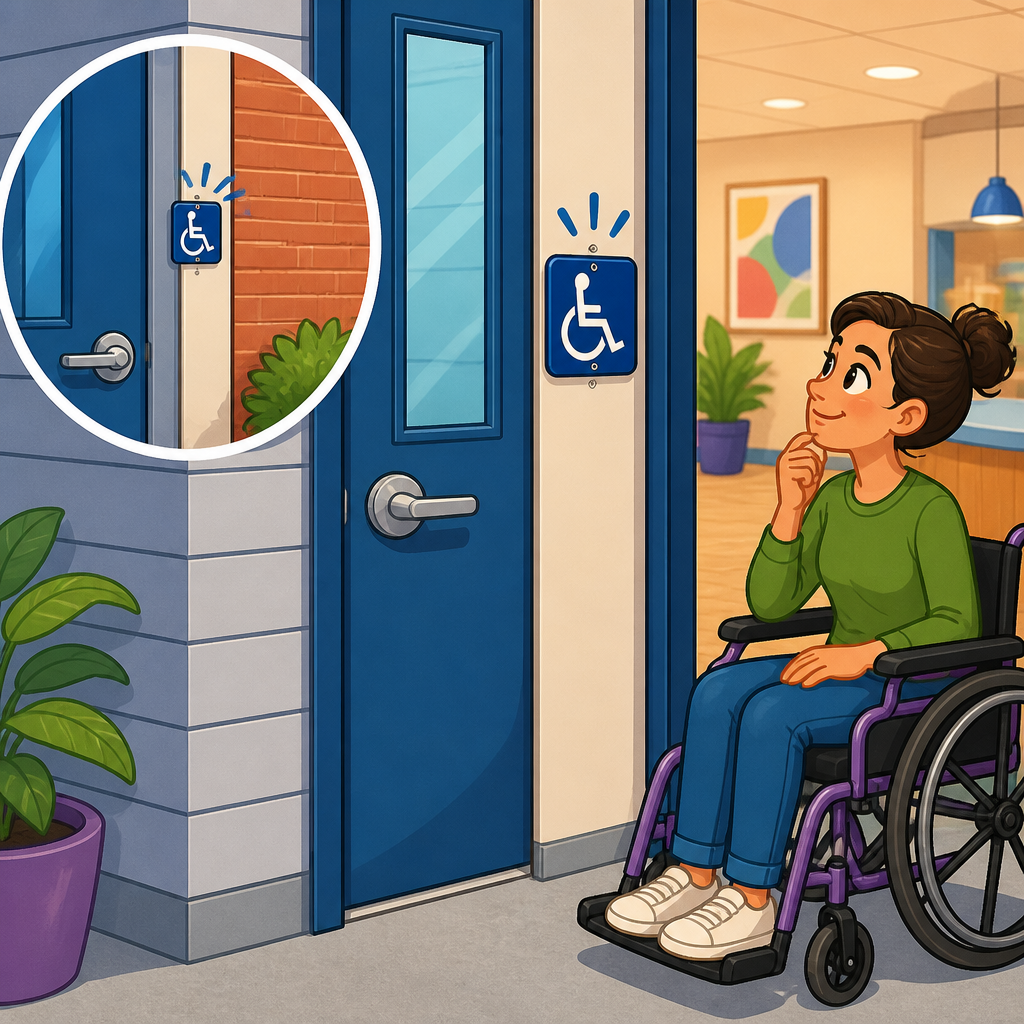
For permanent rooms and spaces, signs that designate the room—such as restrooms, exit stair enclosures, classroom numbers, offices, patient rooms, and electrical rooms—generally need tactile characters and Grade 2 Braille. The common rule designers remember is the latch side of the door. That shorthand exists for a reason: people locating tactile signs need a predictable place to search, and the wall next to the latch side typically lets a person stand clear of the path of a swinging door while reading by touch. The sign is mounted on the wall, not on the door, in most standard conditions because doors move, can be left open, and often have closers, vision panels, kick plates, or hardware that interrupt readability.
Placement also includes mounting height. Under the 2010 ADA Standards, the baseline is measured to the centerline of the tactile characters, typically 48 inches minimum to 60 inches maximum above the finish floor or ground. That range gives flexibility, but consistency across a facility matters more than many teams realize. When signs drift from 48 inches in one corridor to 60 inches in another, users cannot build a dependable tactile search pattern. In healthcare and education projects, I usually recommend selecting one standard centerline and applying it everywhere unless a site-specific condition forces an exception.
The standards also assume a person can approach close enough to read the sign without obstruction. That is why the “best” compliant location is not merely technically legal; it is practical. A sign squeezed behind a door in the fully open position, crowded by a fire extinguisher cabinet, or mounted over decorative wall protection may create functional barriers even if someone can argue dimensions on paper. Door-side placement therefore sits at the intersection of code text, field conditions, and human use. If a sign cannot be located predictably and approached safely, the installation is weak wayfinding even before an inspector raises a question.
When wall space is limited: field conditions that create placement conflicts
Limited wall space usually appears in renovation work, but it also shows up in new construction when architecture favors glass, narrow storefront systems, paired openings, or tight corridor modules. The most common conflict is a sidelight or borrowed lite on the latch side, leaving no solid wall area. Another frequent issue is two adjacent doors with almost no separation, common in schools where a classroom door sits near a storage room or in healthcare where exam rooms line a narrow corridor. Return walls can be too short because casework, corner guards, handrails, crash rails, or control joints consume the usable surface. In hospitality, decorative trim and wallcovering transitions often interfere with the clean mounting area tactile signs need.
There are also operational conflicts. Card readers, security keypads, thermostats, light switches, fire alarm pulls, nurse call devices, and automatic operator push plates often get assigned the same valuable wall strip next to the latch side. On paper, each item fits. In the field, the installer discovers there is no remaining clear zone that allows a tactile sign to be centered correctly and read comfortably. Existing conditions make this worse. Masonry joints, concealed backing, uneven stone, expansion joints, and historic finishes can eliminate locations the drawing set originally assumed were available.
Understanding the exact constraint is the first step to a compliant fix. If the problem is only aesthetics, the accessible location should win. If the problem is technical, such as no wall surface at all, then alternate placement options can be justified. Teams get into trouble when they skip the analysis and jump straight to “put it on the door.” That is sometimes allowed under limited exceptions for certain signs on doors that remain closed, but it is not the default answer for permanent room identification. Treat every constrained opening as a small wayfinding study, not a last-minute sign shop decision.
Best-practice decision path for compliant alternate placement
When standard latch-side wall space is unavailable, use a clear decision path that starts with preserving the intent of accessible wayfinding. First, confirm the sign type. Permanent room identification signs have different rules from directional signs, temporary notices, building directories, and overhead wayfinding. Second, verify whether a compliant latch-side wall location truly does not exist. Measure the available wall area, check door swing, and review nearby devices that may be relocated more easily than the sign. Third, test alternate wall locations in order of predictability: opposite jamb on the same wall, nearest adjacent wall in the path of travel, then other approved locations supported by applicable standards and local authority interpretation.
| Condition at Opening | Preferred Response | Reason |
|---|---|---|
| Standard solid wall at latch side | Mount tactile sign on latch-side wall | Most predictable, clearest accessible search pattern |
| Latch side blocked by sidelight or no wall surface | Use nearest compliant wall location on approach side | Maintains tactile readability without relying on moving door |
| Two doors share limited center wall | Separate signs clearly by room, keep consistent height, verify approach clearances | Prevents misidentification and crowding |
| Door stays normally closed and authority permits sign on door | Use door-mounted sign only after confirming code interpretation | Least preferred, but sometimes accepted in narrow cases |
In my experience, the most effective solution is often coordination rather than exception. Move the card reader six inches. Shift the fire extinguisher cabinet to the next bay. Reduce the decorative trim width. Re-center the sign package before finishes are ordered. Those minor revisions cost far less than replacing fabricated tactile signs after inspection. If no practical wall location exists, document the reason on the shop drawings and submit the alternate placement for review by the architect and, when needed, the authority having jurisdiction. A documented rationale protects the owner and prevents field improvisation.
Door-mounted signs, adjacent walls, and other alternatives: what works and what does not
Many people ask a direct question: can an ADA sign go on the door when wall space is limited? The safest answer is usually no, not as a first choice for permanent room identification. A door can be open, partly open, or moving. A person reading tactile characters may be placed in the swing path or may not be able to find the sign at all if the leaf is held open. That is why wall mounting remains the standard approach. However, some codes and project conditions allow carefully limited exceptions, especially where no wall space is available and the door has an automatic closer and stays closed except for passage. Even then, the decision should be validated against ADA, ICC A117.1, state code, and local interpretation.
Adjacent wall placement is usually the strongest alternate. If the latch-side wall is missing because of a full-height sidelight, placing the sign on the nearest available wall segment along the approach path is commonly more accessible than placing it on the door. For paired doors, a sign can often be centered relative to the room identity on a nearby return wall if the relationship is obvious. The critical point is that the sign must still be easy to associate with the correct room and easy to approach without stepping into hazards or congestion.
What does not work well? Mounting the sign behind a door in the fully open position is a classic failure. So is putting tactile room identification on glass, where contrast, reflections, and durability become problems. Another weak solution is installing one directory sign down the corridor and assuming it replaces room-by-room tactile identification. It does not. Directional signs help with wayfinding, but they are not a substitute for required permanent room signs at the destination. If your team is comparing alternatives, choose the one that best preserves predictability, physical access, and room association.
How this fits into the larger Signage and Wayfinding system
Door-side placement is one detail inside a much larger Signage & Wayfinding strategy. A building performs well when room identification, directional signs, overhead signs, floor directories, egress signs, and digital information all support the same navigation logic. In a hospital, for example, tactile room signs identify exam rooms and restrooms, while directional signs guide users to departments, and color or landmark cues confirm they are on the right route. In an office tower, suite numbers, elevator lobby directories, parking level markers, and amenity signs need consistent naming conventions and typography so users do not receive mixed signals.
This is why sub-pillar content under ADA Accessibility Standards should be coordinated rather than read in isolation. Sign placement connects directly to tactile character rules, Braille specifications, visual contrast, mounting height, protruding object limits, reach ranges, circulation clearances, and emergency egress requirements. It also connects to procurement. Sign schedules, message hierarchy, hardware coordination, and finish selections determine whether a compliant concept survives construction. I have seen well-designed wayfinding programs fail because the sign vendor received incomplete room names, the electrician installed push plates where signs belonged, or the owner changed door hardware after sign locations were approved.
The practical lesson is simple: treat accessible signage as a coordinated system from design development through punch list. The hub topics that usually deserve separate internal follow-up include tactile sign design, Braille accuracy, visual contrast and non-glare finishes, restroom signage, exit signage, projecting sign limitations, directories, campus wayfinding, and inspection checklists. When those pieces align, limited wall space becomes a solvable condition instead of a recurring source of noncompliance.
Project coordination, inspection, and common mistakes to avoid
Most ADA signage problems are preventable with earlier coordination. Start by reviewing door elevations, reflected ceiling plans, life-safety plans, security device layouts, and finish schedules together, not in separate silos. On renovations, field-verify every opening before fabrication. Do not assume existing dimensions match the record drawings. Ask the sign vendor to flag openings with sidelights, narrow returns, adjacent equipment, or unusual hardware. On large projects, create a signage placement matrix that lists each room, sign type, mounting height, side of door, nearby devices, and any approved exception. That single document saves time during submittals, installation, and final inspection.
Inspection should focus on use conditions, not only dimensions. Stand in the corridor and ask practical questions. Can a first-time visitor tell which sign belongs to which room? Can a person approach the sign without blocking a stair discharge or being struck by the door? Is the tactile text mounted at a consistent height? Is the Braille correct for the final room name after late numbering changes? I routinely find errors caused by last-minute renaming, especially in schools and clinics where departments shift near occupancy.
Common mistakes include centering signs on the door because it looks symmetrical, stacking multiple signs so high or low that the tactile line falls outside the required zone, and letting decorative wall panels dictate placement. Another frequent issue is relying on one code reference while ignoring stricter local accessibility provisions. California, Texas, New York, and other jurisdictions may involve additional rules or enforcement practices. The best safeguard is a documented review process with final field verification before occupancy. If your project has limited wall space at several doors, solve the pattern once, approve it formally, and apply it consistently.
Door-side placement of ADA signs is ultimately a wayfinding problem with code consequences. The right approach is to preserve the accessible search pattern first, then work through dimensional and architectural constraints with documented logic. Standard latch-side wall mounting remains the benchmark because it is predictable, readable, and safer than relying on a moving door. When wall space is limited, the best solutions usually come from coordinated adjustments—relocating adjacent devices, using the nearest practical wall area, and confirming any exception with the applicable standards and local authority. Door-mounted signs should be treated as a narrow fallback, not routine practice.
As the hub for Signage & Wayfinding within ADA Accessibility Standards, this page should guide every related decision: tactile room identification, Braille, visual contrast, directories, restroom signs, exit signs, and inspection planning all connect back to predictable placement. If you are designing, renovating, or auditing a facility, walk the openings early, map every constrained condition, and resolve exceptions before fabrication. That one step will improve compliance, reduce rework, and make the building easier for everyone to navigate.
Frequently Asked Questions
What does “door-side placement” mean for ADA room identification signs?
In practical terms, door-side placement means installing a permanent room identification sign on the wall next to the door, typically on the latch side, where users can reliably expect to find it. This matters because tactile ADA signs are meant to be located consistently, not placed wherever there happens to be open space. People who are blind or have low vision often approach a doorway and use the adjacent wall area to locate the sign by touch without standing in the path of a swinging door. That predictable location is one of the most important usability principles behind ADA-compliant placement.
For permanent rooms and spaces, the goal is not simply visibility from a distance. The sign must also be readable up close by touch and by sight. That is why standard practice centers on the wall adjacent to the latch side rather than the face of the door itself. Mounting on the wall helps keep the sign in a stable, discoverable location even when the door is open, moving, or equipped with hardware that makes access awkward. When people talk about “door-side placement,” they are usually referring to this consistent wall-mounted location and the required mounting height and clear floor space that allow the sign to be approached and read safely.
Why is the latch side preferred for ADA signs instead of the hinge side or the door itself?
The latch side is preferred because it gives users a more dependable place to search for the sign. When someone approaches a doorway, the latch side wall is generally the side least likely to create conflicts with the swing of the door. A person reading a tactile sign needs to be able to stop, face the sign, and explore it with their hands without being forced into the arc of an opening door. That is one reason the standards and common industry guidance emphasize placement adjacent to the latch side whenever possible.
Placing signs on the door itself is usually a poor solution for permanent room identification because the sign moves with the door, can become inaccessible when the door is open, and may put the user in an unsafe or awkward position. The hinge side can also be less intuitive and less consistent, especially in corridors where users expect signs to be near the latch side. While site conditions sometimes require alternate placement, the latch-side wall remains the preferred location because it supports predictability, safe access, and a better tactile reading experience. In short, the latch side is not just a convention; it is the placement that most directly supports the functional purpose of ADA room signs.
What should you do when there is not enough wall space on the latch side of the door?
Limited wall space is one of the most common challenges in ADA sign placement, especially with narrow frames, sidelights, glazing, corner conditions, or very tight corridors. When the ideal latch-side wall area is not available, the first step is to evaluate whether there is still enough adjacent wall surface to mount the sign within the proper height range and with adequate approach space. In some cases, what appears to be a tight condition can still accommodate a compliant placement with careful layout and sign sizing.
If the latch side truly does not provide usable wall space, the next step is to look for the nearest practical adjacent wall location that preserves consistency and usability as much as possible. Depending on the door configuration, that may mean placing the sign on the nearest available wall beside the doorway, including the hinge side in certain cases, provided the sign remains discoverable and can be approached without obstruction. The key is not to default automatically to the door face or to an arbitrary distant location. Instead, choose the closest logical wall placement that allows the sign to function as a tactile identification sign.
Because unusual conditions can be interpreted differently depending on the layout, it is wise to review the specific opening, circulation path, and local code enforcement expectations before fabrication and installation. In difficult conditions, the best answer is usually a documented judgment call based on the standards, the architectural constraints, and the user’s actual ability to find and read the sign safely. Good ADA sign placement is not only about technical compliance; it is about preserving a predictable user experience when ideal conditions are not available.
Can ADA signs ever be mounted on glass, doors, or other nontraditional surfaces when wall space is limited?
They can sometimes be mounted on alternative surfaces, but that does not mean those surfaces are automatically appropriate for permanent tactile room signs. Glass, moving doors, and other nontraditional surfaces often create functional problems even if they seem convenient from a design standpoint. Tactile signs are intended to be located and read consistently, and surfaces that move, reflect heavily, lack visual contrast, or place the user in a circulation path can undermine that purpose. For example, a sign mounted directly on a door may disappear when the door is open, and a sign on glass may present contrast, durability, or discoverability concerns depending on the material and installation method.
That said, there are project conditions where alternative mounting approaches are considered because conventional wall space simply does not exist. In those cases, the decision should be made carefully, with attention to the sign type, the room function, the mounting height, tactile readability, and whether the placement allows safe, predictable use. If a sign is required to provide tactile room identification, preserving usability is critical. Designers and facility managers should be cautious about treating any available surface as equivalent to proper adjacent-wall placement. An alternative surface may solve a space problem, but if it makes the sign harder to find or read, it may fail the practical intent of ADA accessibility even if it appears to solve the installation issue.
What are the best practices for staying compliant and user-friendly in tight door-side sign locations?
The best approach is to think beyond the single dimension of “Will the sign fit?” and instead evaluate the full user experience. Start by confirming whether the sign is for a permanent room or space, since tactile identification signs have different placement expectations than directional or informational signs. Then assess the latch-side wall first, because that is still the preferred and most intuitive location. Check for usable wall area, correct mounting height, nearby obstructions, door swing conflicts, protrusion issues, and whether a person can comfortably approach and read the sign.
In constrained conditions, consistency becomes even more important. If several similar doors in a facility have limited wall space, develop a logical placement strategy that users can learn and rely on. Avoid scattering signs unpredictably from one opening to the next. Keep the sign as close to the expected latch-side location as conditions allow, and avoid placing it where the reader must stand in a hazardous or congested area. Coordination with architects, contractors, and signage fabricators early in the project can prevent many field conflicts, especially where sidelights, borrowed lites, or narrow partitions are involved.
It is also smart to document placement decisions for unusual openings. Photos, elevations, and written rationale can help if questions arise during inspection or future renovations. Most importantly, remember that ADA sign placement is not merely a box-checking exercise. The real objective is to ensure that people can independently locate and read room identification signs in a predictable, safe, and dignified way. When wall space is limited, the strongest solutions are the ones that preserve that objective while adapting thoughtfully to the realities of the built environment.