Pictograms on ADA signs must meet strict field height and text requirements because they are not decorative extras; they are regulated wayfinding tools that affect whether people can identify restrooms, exits, assistive listening systems, and other permanent spaces independently. In ADA signage, a pictogram is a standardized graphic symbol placed on a sign face, usually paired with tactile text and Grade 2 Braille when the sign identifies a permanent room or space. The rules that govern these signs come primarily from the 2010 ADA Standards for Accessible Design, especially sections covering visual characters, tactile characters, Braille, mounting, and pictograms. I have specified, fabricated, and reviewed hundreds of compliant signs, and the same problems appear repeatedly: pictogram panels made too small, labels placed inside the pictogram field, and designers confusing wayfinding graphics with room-identification signs. Getting these details right matters because noncompliant signage can fail inspection, create usability barriers, and force expensive rework late in construction. This hub explains how pictograms fit into ADA signage requirements, what field height means, when text is required, and how these standards connect to broader signage and wayfinding decisions across a facility.
What ADA pictogram requirements actually say
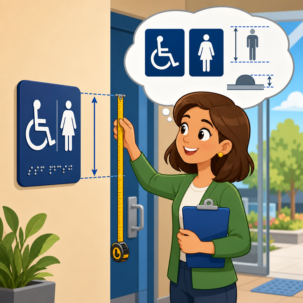
For room-identification signs that include a pictogram, the ADA requires a dedicated pictogram field at least 6 inches high. That rule is often misunderstood. The 6-inch dimension applies to the field containing the symbol, not necessarily the symbol alone. The symbol can be smaller, but it must sit within a clear area reserved for the pictogram. No raised characters or Braille may appear inside that field. If text descriptors are needed, they must be placed directly below the pictogram field, not inside it. This distinction is central to compliance because many attractive sign layouts fail specifically on field organization rather than on the symbol itself.
The reason for the separate field is practical. Pictograms are intended to be visually recognizable at a glance, while tactile text and Braille are intended to be read by touch. Mixing these functions in one crowded area reduces legibility for both audiences. On a compliant restroom sign, for example, the male, female, or unisex symbol appears in the upper field, while the tactile word “RESTROOM” and Braille sit below. The sign can still carry brand colors or architectural finishes, but the regulated content must stay in the required relationship. In the field, I see installers assume that if a symbol is large enough, the layout passes. Inspectors usually look first for the dedicated field and the separation of tactile information.
Another key point is scope. The pictogram field rule applies when a pictogram is provided on an ADA sign identifying a permanent room or space. It does not mean every directional sign in a corridor must use the same layout. Directional and informational signs follow visual character rules, but they generally do not require tactile text or Braille unless they identify a permanent room, area, or functional space. That is why a wall-mounted restroom identification sign by the latch side has different requirements than an overhead directional sign pointing toward the restroom down the hall. Good wayfinding programs use both correctly rather than treating all signs as one category.
Field height, symbol sizing, and layout planning
Field height sounds simple, but it affects nearly every fabrication decision. A minimum 6-inch-high pictogram field establishes the vertical zone reserved for the symbol. Designers then need enough additional space below that field for raised text and Braille, while preserving margins and mounting compliance. In practice, this usually pushes the full sign height beyond 8 inches, depending on copy length, type size, and Braille spacing. A compact plaque can work for a one-word label such as “EXIT STAIR,” but longer room names may require wider or taller formats. The most reliable approach is to treat the pictogram field as a locked compliance zone first, then build the typography below it.
Symbol sizing within the field should prioritize recognition, balance, and contrast. The ADA does not prescribe one universal symbol size, but it does require the field itself to be at least 6 inches high. A tiny icon floating in a large field may technically pass yet function poorly. On the other hand, a symbol enlarged until it nearly touches the field edges often looks cramped and can be distorted by manufacturing tolerances. In projects I have managed, a symbol that occupies roughly two-thirds to four-fifths of the field height usually reads well, though exact proportions depend on the symbol geometry. Restroom icons, elevator symbols, and assistive listening marks each have different visual density and need different spacing.
Layout planning also must account for the tactile baseline rules. Raised characters are typically placed below the pictogram field with enough clear separation that users can locate the text consistently. Braille then sits directly below the corresponding tactile copy. If the text line wraps awkwardly or sits too close to the field, users can miss the beginning of the label when reading by touch. This is where prototype review matters. I always recommend printing the sign at full scale, marking the 6-inch field, and physically testing the text area before releasing artwork. Many compliance issues are obvious once the sign is viewed at actual size instead of on a screen.
Text requirements below pictograms
When a pictogram is used on an identification sign, any verbal descriptor must be located directly below the pictogram field. The descriptor is often essential because many symbols are not universally understood on their own. The International Symbol of Accessibility and the symbol for volume control telephones are widely recognized, but custom wellness-room icons, lactation-room graphics, or stylized all-gender restroom symbols may not be immediately clear. The text label below the field provides certainty, and if the sign identifies a permanent room or space, that text must be tactile and accompanied by contracted Grade 2 Braille under the ADA Standards.
Tactile text has its own technical requirements. Characters must be raised 1/32 inch minimum, use uppercase sans serif or simple serif forms, avoid italic, script, highly decorative, or compressed styles, and maintain stroke proportions that support touch reading. Character height generally ranges from 5/8 inch to 2 inches based on the uppercase “I,” though this is separate from visual wayfinding letter sizing based on viewing distance. The text must also contrast with its background, because the same sign usually serves low-vision users visually as well as blind users tactually. Contrast failures are common on premium architectural signs, especially when designers choose brushed metal on slightly darker brushed metal.
Braille placement is another frequent source of mistakes. Braille should be directly below the corresponding tactile text, not off to the side or centered independently for graphic balance. Domed or rounded Braille beads, proper spacing, and accurate translation matter. Grade 2 Braille is required under the ADA for these signs, and translation should be verified using reliable software and an experienced fabricator, especially when abbreviations, punctuation, or bilingual content are involved. If a restroom sign says “FAMILY/ASSISTED USE,” that exact wording and line break choices can affect translation and readability. Compliance is not just about adding Braille; it is about matching the tactile message to the intended room identification.
Where pictograms fit in a complete signage and wayfinding system
Pictograms are one part of a larger signage and wayfinding system, and treating them in isolation often produces inconsistent results. A facility usually needs identification signs, directional signs, informational signs, overhead signs, floor directories, parking signs, and code-required life-safety signs. Each category has different readability rules, mounting conventions, and user expectations. Identification signs at doors serve close-range confirmation. Directional signs in corridors support decision-making at intersections. Directories provide route planning. Pictograms work best when they reinforce these layers rather than replacing text across the entire building.
In healthcare, for example, pictograms can quickly identify restrooms, elevators, stairs, and accessible features, but few hospitals rely on symbols alone for clinics, imaging suites, or specialty departments. Patients under stress need explicit wording, strong color contrast, and consistent terminology. In education projects, residence halls and student centers often use pictograms successfully for restrooms, laundry, and exits, while classrooms and offices still depend on tactile room signs with plain-language labels. Airports and transit systems make heavier use of standardized symbols because they serve multilingual audiences, but even there, text remains critical at ticketing, security, baggage claim, and platform changes.
As the hub for signage and wayfinding within ADA Accessibility Standards, this topic connects directly to sign mounting height, latch-side location, character contrast, finish glare, viewing distance, Braille accuracy, and maintenance policies. A compliant pictogram on a mis-mounted sign still fails users. Likewise, a beautifully mounted sign with poor wording weakens navigation. The strongest programs define sign types in a standards manual, assign each type a purpose, and document compliant layouts before bidding. That process reduces change orders and keeps architects, interior designers, sign fabricators, and inspectors working from the same assumptions.
Common compliance mistakes and practical fixes
Most ADA pictogram violations fall into a short list of recurring errors. The first is placing tactile text inside the pictogram field. The second is making the field smaller than 6 inches high. The third is using decorative or brand-driven typefaces for the tactile descriptor. The fourth is omitting Braille or translating it incorrectly. The fifth is applying the room-identification layout to directional signs, or doing the reverse and leaving tactile requirements off a permanent room sign. These errors happen because teams copy sign families across multiple uses without separating what is mandatory from what is optional.
| Issue | Why it fails | Practical fix |
|---|---|---|
| Text inside pictogram field | Raised characters and Braille cannot be in the pictogram field | Move descriptor directly below the 6-inch field |
| Field under 6 inches | Minimum dedicated pictogram area is not met | Increase sign height and redraw layout at full scale |
| Low contrast finishes | Visual readability drops for low-vision users | Use light-dark contrast and avoid subtle metallic pairings |
| Incorrect Braille | Tactile information becomes unreliable | Verify Grade 2 translation and production proofs |
Fixes are usually straightforward when caught early. During design development, create separate templates for identification signs, directional signs, and informational signs. During submittals, review full-scale elevations, not thumbnail PDFs. During fabrication, request material samples under actual project lighting because glare and contrast change dramatically between showroom and corridor conditions. During punch lists, check mounting location at the latch side and confirm that protruding objects do not create hazards along accessible routes. These steps are inexpensive compared with replacing an entire sign package after occupancy, which I have seen happen on more than one rushed project.
Specifications, standards, and procurement guidance
Project teams should specify ADA pictogram requirements in writing rather than assuming the fabricator will resolve them. A strong specification calls for a dedicated pictogram field at least 6 inches high where pictograms are used on identification signs, tactile descriptors below the field, Grade 2 Braille, non-glare finishes, and contrast between characters and background. It should also distinguish ADA-regulated room signs from decorative donor plaques, temporary notices, and branded graphics. Referencing the 2010 ADA Standards for Accessible Design is essential, and many teams also coordinate with ICC A117.1 because it is widely adopted through building codes and helps align accessibility review with code enforcement.
Procurement matters because not all sign vendors have the same depth of accessibility expertise. Ask fabricators how they handle Braille translation, bead formation, tactile raster depth, and proofing for field height compliance. Request photos of installed healthcare, higher education, or municipal projects rather than only polished studio samples. If a vendor cannot explain the difference between a pictogram field and a symbol size, that is a warning sign. The best partners catch issues before production, especially when architects introduce custom icons or multilingual naming conventions that create spacing conflicts below the pictogram field.
Maintenance should be part of the standard as well. Signs get replaced after renovations, room renumbering, or departmental moves, and that is when compliance drifts. A facilities team should keep a sign schedule, approved templates, and mounting diagrams so replacement orders match the original accessible intent. This is especially important on campuses and in hospitals where projects are phased over years and different contractors handle separate areas. Consistency is what turns individual compliant signs into a usable wayfinding system.
Pictograms on ADA signs work best when they are treated as regulated wayfinding elements, not interchangeable graphics. The critical rule is simple: if a pictogram appears on a permanent room or space identification sign, provide a dedicated field at least 6 inches high and place the tactile text descriptor directly below it, with Grade 2 Braille beneath the text. From there, success depends on disciplined layout, strong contrast, accurate translation, proper mounting, and clear separation between identification signs and directional signs. Those details determine whether a sign package merely looks coordinated or truly performs for real users.
For teams managing ADA Accessibility Standards across signage and wayfinding, this hub should serve as the starting point. Use it to align architects, interior designers, code consultants, facilities staff, and sign fabricators around the same technical requirements. Then build outward into related topics such as mounting heights, tactile character rules, Braille production, restroom signage, directional sign design, and accessible routes. If you are reviewing a project now, audit your sign types, confirm where pictograms are used, and correct field height and text placement before fabrication starts.
Frequently Asked Questions
What is a pictogram on an ADA sign, and when is it required?
In ADA signage, a pictogram is a graphic symbol used to communicate the function of a room, space, or feature without relying only on words. Common examples include symbols for restrooms, exits, accessibility, and assistive listening systems. These symbols are not treated as decorative artwork when they appear on signs that identify permanent rooms or spaces. Instead, they are regulated elements of wayfinding, which means their design, placement, and accompanying text must follow ADA standards.
A pictogram is typically required or used when a standardized symbol helps people recognize a space quickly and consistently. On signs identifying permanent rooms and spaces, the pictogram often appears alongside tactile characters and Grade 2 Braille so the sign can be understood by people with different visual abilities. The key point is that the pictogram does not replace the required tactile information. If a room identification sign must include raised characters and Braille, those elements still have to be present even if the pictogram clearly shows the room’s purpose.
This is why pictograms matter so much in ADA compliance. They support independent navigation, reduce confusion, and create consistency across a building. A properly designed restroom sign, for example, should allow a visitor to recognize the symbol visually while also providing tactile text and Braille for someone reading the sign by touch. In short, pictograms are regulated communication tools, not optional extras.
What does ADA require for pictogram field height?
When a pictogram appears on an ADA-compliant sign that identifies a permanent room or space, it must be located within its own defined field, and that field must be at least 6 inches high. This is one of the most commonly misunderstood ADA sign rules. The requirement applies to the pictogram field itself, not just the symbol floating on the sign face. In other words, the symbol needs a dedicated area with sufficient height so it is visually distinct and presented in a consistent, readable format.
The 6-inch minimum field height helps ensure the pictogram is large enough to be recognized easily by building users approaching the sign. It also preserves layout clarity by separating the graphic symbol from the tactile text area. That separation is important because ADA standards treat visual symbols and tactile identification as different communication functions that must work together without interfering with one another.
Designers sometimes make the mistake of shrinking the pictogram field to fit a narrow plaque or combining the symbol too tightly with text. That can create compliance problems. The safer approach is to plan the sign around the required field from the start. If a restroom, stairwell, exit, or other permanent space is being identified with a pictogram, the sign should be sized so the symbol sits comfortably within a field at least 6 inches high, with tactile text and Braille placed separately in the required format below or otherwise outside the pictogram field.
Can text or Braille be placed inside the pictogram field?
No. ADA rules are very clear that the pictogram field itself must not contain raised characters, Braille, or other tactile elements. The pictogram area is reserved for the graphic symbol alone. Any required tactile text and Grade 2 Braille must be placed outside that field, typically below it, where they can be located and read by touch without interference from the symbol.
This separation serves an important usability purpose. People who read signs tactually need a predictable layout. If Braille or raised text were embedded inside or crowded into the pictogram field, the sign would be harder to interpret by touch and less consistent from one location to another. ADA signage is based heavily on predictability, because consistency helps users find information quickly and confidently in unfamiliar environments.
From a design standpoint, this means you should think of the sign as having distinct communication zones. One zone is the pictogram field, which presents the visual symbol. Another zone contains the raised text and Braille required for room identification. Keeping those areas separate is not just a technical rule; it is part of making the sign function properly for all users. If a sign includes a restroom symbol, for example, the tactile wording such as “Men,” “Women,” or “All-Gender Restroom,” along with Braille, should be placed outside the pictogram field rather than layered into the symbol area.
What text requirements apply when a sign includes a pictogram?
If the sign identifies a permanent room or space, the presence of a pictogram does not eliminate the need for compliant tactile text. ADA standards still require raised characters and Grade 2 Braille for the room identification. The tactile text must meet applicable requirements for character style, case, height, spacing, and finish, and it must be positioned so a person can locate and read it by touch. In practical terms, that means the pictogram supports the message visually, but the official identification still depends on the required tactile wording and Braille.
This is one of the biggest compliance issues with custom sign programs. A business may assume that a restroom icon or exit graphic says everything necessary, but under ADA rules, standardized tactile information is still essential when the sign identifies a permanent space. For example, a conference room sign with a decorative symbol but no raised room name and Braille would not satisfy the identification requirements simply because the symbol looks intuitive.
There is also an important distinction between signs that identify spaces and signs that provide direction or information. The strict tactile requirements apply particularly to room and space identification signs. Directional signs and informational signs may follow different rules depending on their function. That is why the intended use of the sign matters so much. If the sign is identifying a permanent room, then the text requirements remain in force whether or not a pictogram is included on the face.
What are the most common mistakes businesses make with ADA pictogram signs?
The most frequent mistake is treating the pictogram as a decorative feature rather than a regulated accessibility element. When that happens, designers may use symbols without providing the required 6-inch minimum pictogram field, or they may choose layouts that look attractive but do not comply with ADA structure and readability rules. Another common problem is placing tactile text or Braille inside the pictogram area, which is not allowed and can interfere with usability.
Businesses also often assume that a visual symbol alone is enough. It is not. If the sign identifies a permanent room or space, tactile text and Grade 2 Braille are still required. A restroom sign, for instance, must do more than display a familiar icon. It must also provide the proper tactile wording and Braille in a compliant location. Failing to include those elements can leave a sign noncompliant even if the symbol itself appears clear and recognizable.
Another mistake is using nonstandard or overly stylized graphics that reduce immediate recognition. While ADA standards address the pictogram field and related text requirements, the underlying goal is still effective communication. Symbols that are abstract, inconsistent, or overly branded may weaken wayfinding even if the sign appears modern or creative. The best ADA sign programs balance compliance with clarity by using well-recognized symbols, maintaining the required field height, and keeping tactile information properly separated and readable.
To avoid these issues, it helps to evaluate every sign by function first. Ask whether it identifies a permanent room or space, whether a pictogram is being used, whether the field is at least 6 inches high, and whether the tactile text and Braille are provided outside that field. That simple review process catches many of the errors that lead to costly replacements and accessibility problems later.