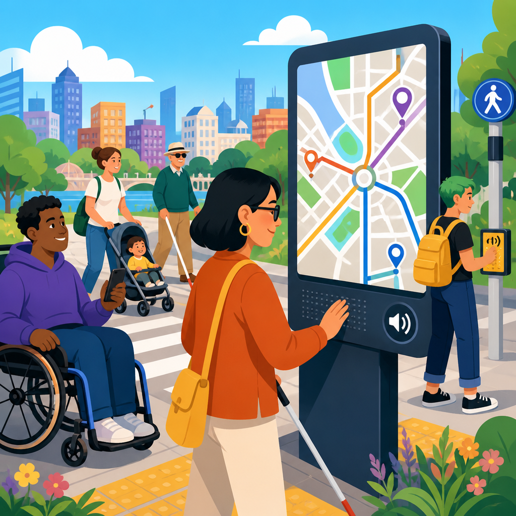
Public maps and wayfinding systems are no longer judged only by visual clarity, placement, or brand consistency; they are increasingly evaluated by how well they serve people with disabilities across physical and digital environments. In practice, that means accessibility expectations now extend from tactile directories in transit stations to mobile campus maps, kiosk interfaces, QR-linked navigation, and the structured data behind them. For organizations responsible for public-facing spaces, understanding the changing accessibility expectations for public maps and wayfinding is essential because legal requirements, user needs, and technology standards are moving together.
Wayfinding refers to the methods people use to orient themselves, understand a place, and move from one point to another. Public maps include static signs, printed guides, kiosks, web maps, and app-based navigation used in settings such as airports, hospitals, parks, museums, universities, downtown districts, and government buildings. Accessibility in this context means that people with vision, hearing, mobility, cognitive, and dexterity disabilities can obtain equivalent location information and complete navigation tasks with dignity and independence. That includes readable visual design, tactile and audible options, keyboard access, screen reader compatibility, plain language, logical routes, and reliable alternative formats.
I have worked on wayfinding audits where a venue technically offered an accessible entrance but buried that information three clicks deep in a web map and omitted it from the lobby directory. That gap is common. The standard is no longer “some access somewhere.” The expectation is coordinated access across the entire user journey, from planning a trip at home to reaching a room, counter, or service point on site. This shift matters because inaccessible wayfinding creates practical barriers: missed appointments, unsafe rerouting, dependence on staff assistance, and exclusion from public life. It also exposes operators to complaints, remediation costs, and avoidable reputational harm.
Recent developments in accessibility technology have raised the bar. Mobile operating systems now offer stronger screen reading, voice control, magnification, haptic feedback, and indoor positioning integrations. Digital teams are expected to follow established web and app accessibility standards, while facilities teams must think beyond mounting height and contrast ratios. The most effective organizations treat maps and wayfinding as connected information systems. When that happens, a tactile map, a website directory, a kiosk, and a turn-by-turn mobile experience reinforce each other instead of contradicting each other. That is where public expectations are headed, and it is why this topic has become central within updates and developments in accessibility.
Why accessibility expectations for public maps are rising
Accessibility expectations are rising because users now compare every experience with the best tools they already use elsewhere. A visitor who can get spoken walking directions in a smartphone app expects similar support in a hospital campus map. A blind commuter who uses screen reader-friendly transit tools expects station directories and disruption notices to be equally usable. A wheelchair user expects route guidance to distinguish between the shortest path and the accessible path. These are not niche requests. They are baseline functional needs, and modern technology has made them more achievable, which in turn makes poor implementation harder to justify.
Legal and policy developments are another driver. In the United States, the Americans with Disabilities Act remains the central framework for equal access in public accommodations and state and local government services, but enforcement has increasingly focused on digital barriers alongside physical ones. The Department of Justice has signaled repeatedly that online services can create access barriers when they are not usable with assistive technology. For public maps and wayfinding, that means a compliant building entrance is not enough if the digital tools that explain how to reach it are inaccessible. Courts, settlement agreements, and procurement requirements have reinforced this practical interpretation.
There is also a design maturity issue. Ten years ago, many organizations treated accessibility as a post-production fix. Today, more teams understand that route logic, naming conventions, map layers, icon systems, and content governance determine accessibility long before final visual design. For example, if a campus uses three different labels for the same entrance across print, web, and kiosk systems, screen reader users and first-time visitors alike face avoidable confusion. Rising expectations reflect a broader recognition that wayfinding accessibility is not a specialty add-on. It is information architecture, service design, and facilities planning working together.
What accessible public wayfinding now includes
Accessible wayfinding now includes far more than braille on a room sign. At a minimum, an effective system should provide equivalent information through multiple sensory channels and support the full navigation task: orientation, route selection, confirmation, recovery from mistakes, and arrival. In real projects, I look for six fundamentals. First, visual readability: high contrast, legible type, consistent symbols, and glare control. Second, tactile and braille support where fixed orientation information is critical. Third, digital compatibility with screen readers, keyboard navigation, and zoom. Fourth, route data that identifies accessible entrances, elevators, curb cuts, ramps, rest areas, and temporary closures. Fifth, plain-language instructions that avoid unnecessary jargon. Sixth, consistent naming across physical and digital touchpoints.
Indoor mapping has become especially important because many destinations are complex interiors rather than simple street addresses. Airports, medical centers, convention venues, and higher education campuses routinely include multi-level buildings, connectors, checkpoints, and service detours. A map that merely shows “you are here” is often inadequate. Users need route descriptions that account for elevators, automatic doors, security restrictions, and floor changes. The best systems describe these features directly. For example, instead of saying “Proceed to Clinic B,” an accessible route might say, “Enter through the east accessible entrance, continue 120 feet to the bank of elevators, take Elevator 3 to Level 2, and turn right toward Clinic B.”
Cognitive accessibility is also receiving overdue attention. Public wayfinding fails many users not because information is absent, but because it is overloaded, inconsistent, or written from the operator’s viewpoint instead of the visitor’s. People with intellectual disabilities, dementia, brain injuries, limited English proficiency, or stress-induced processing challenges benefit from simpler decision points, recognizable landmarks, predictable color coding, and fewer unnecessary choices. These improvements help everyone. In user testing, concise directional language and clear route segmentation consistently outperform dense map legends and abstract naming schemes, especially in unfamiliar or high-pressure environments.
How ADA-related technology developments are reshaping implementation
Technology developments have changed both what is possible and what stakeholders now expect. Screen readers such as VoiceOver, TalkBack, and NVDA can handle complex navigation content when the underlying structure is properly coded, but many map experiences still fail because labels are missing, controls are unlabeled, focus order is broken, or route instructions are trapped inside inaccessible graphics. Modern accessibility work therefore starts with semantic structure, text alternatives, form labeling, and keyboard operation, then extends to mapping-specific needs such as announcing floor level changes, route hazards, and alternative accessible paths.
Location technologies have improved as well. Bluetooth beacons, Wi-Fi positioning, ultra-wideband, GPS augmentation, and QR-triggered wayfinding can support more independent navigation, particularly indoors where satellite signals are weak. These tools are promising, but they are not universal solutions. Beacon systems drift if they are not maintained. QR experiences fail when lighting is poor or cellular service is weak. Kiosks break. Mobile apps are forgotten or deleted. That is why the strongest accessible wayfinding programs use layered redundancy: physical signs, accessible digital maps, staff protocols, and route data governance all working together.
| Wayfinding component | Common accessibility failure | Current expectation | Useful standards or tools |
|---|---|---|---|
| Interactive kiosk | Touch-only interface with low contrast | Keyboard or tactile controls, screen reader support, audio output | WCAG 2.2, platform accessibility APIs |
| Web-based map | Routes shown only visually | Text directions, labeled controls, accessible route metadata | ARIA practices, screen reader testing |
| Printed directory | Small type and ambiguous symbols | Readable typography, plain labels, consistent landmarks | ADA sign guidance, user testing |
| Indoor navigation app | No accessible entrance or elevator data | Step-free routing, floor-change guidance, closure alerts | GIS governance, mobile accessibility reviews |
Procurement has become a major pressure point. Organizations now ask vendors for conformance documentation, testing evidence, and remediation timelines before buying kiosks, map platforms, or digital directory software. A Voluntary Product Accessibility Template is not enough on its own, but it is often the starting document. Serious buyers also request keyboard test results, screen reader videos, color contrast reports, and known issue logs. This is an important development because public maps are often assembled from third-party products, and inaccessible vendor components can undermine otherwise thoughtful accessibility planning.
Practical design standards for physical and digital map systems
Accessible public maps work best when physical and digital design standards are aligned from the start. In the physical environment, that means appropriate mounting heights, unobstructed reach ranges, non-glare finishes, tactile readability where required, and consistent placement at decision points. It also means sign families that use predictable hierarchy: site overview, directional confirmation, room identification, and emergency information each serving a distinct purpose. In digital environments, equivalent discipline is needed. Headings must be structured, controls must be operable without a mouse, zoom must not break layouts, and every icon, layer switch, and route option must expose a meaningful accessible name.
Color and contrast are often discussed, but they are only one part of the picture. I have seen maps pass contrast checks yet remain unusable because the legend relied on subtle hue differences, the route line was too thin at 200 percent zoom, or landmark labels disappeared on smaller screens. Accessible map design requires redundancy. If a route is marked in blue, it should also have a unique pattern, label, or shape. If an accessible entrance is important, it should not be hidden behind a tiny wheelchair icon with no text label. Redundant coding improves comprehension for low-vision users, color-blind users, and people under time pressure.
Data quality is another overlooked standard. An accessible route engine is only as good as the GIS and facilities data beneath it. If elevator outages are not reflected quickly, a blind user or wheelchair user may be sent into a dead end. If door widths, slopes, automatic operators, or curb ramp locations are missing, route recommendations become unreliable. High-performing institutions assign ownership for map data updates, tie changes to maintenance workflows, and review route outputs after renovations. Accessibility fails when map content is treated as a static marketing asset instead of a maintained operational system.
Real-world sectors where expectations have changed fastest
Healthcare has seen some of the fastest change because inaccessible wayfinding directly affects care access. Large medical campuses now commonly publish web directories with clinic-specific entrance instructions, parking guidance, elevator details, and printable accessible routes. This is not cosmetic. Patients may be navigating while in pain, under medication, or carrying medical equipment. Missing an accessible drop-off point or mislabeling an elevator bank can cause serious delays. The strongest hospital systems combine plain-language route content, multilingual support, and live updates for construction detours, then mirror that information in lobby kiosks and staff scripts.
Transit is another high-pressure environment. Riders need real-time, trustworthy instructions that account for platform changes, broken elevators, temporary shuttle stops, and accessible boarding points. Agencies that once focused primarily on station signage now also invest in app alerts, accessible web service updates, and trip-planning tools that incorporate step-free routing. When done well, this reduces uncertainty for riders with disabilities and improves resilience for everyone during disruptions. When done poorly, the result is compounded exclusion because the rider may not be able to improvise an alternative path safely or independently.
Higher education, museums, civic campuses, and public parks are also evolving quickly. Universities are moving toward centralized map platforms that integrate accessible parking, entrance grades, restrooms, and event-specific route changes. Museums increasingly provide multimodal visitor guides with captioned, audio-described, and text-based navigation support. Parks departments are beginning to publish trail accessibility details such as surface type, slope, width, and rest interval, which is far more useful than simply labeling a trail “easy.” Across these sectors, expectations have shifted from generic compliance statements to specific navigational detail that supports decision-making before and during a visit.
How organizations can build an accessible wayfinding program
Organizations should treat accessible wayfinding as an ongoing program, not a one-time sign package or website refresh. Start with a journey-based audit: how does a first-time visitor with different disabilities discover, choose, approach, enter, and move through the site? Review the public website, parking guidance, transit connections, entrances, lobbies, elevators, room identification, temporary closures, and staff escalation procedures. Then test with assistive technology and, ideally, with disabled users. Automated scanners can catch missing labels and contrast issues, but they cannot tell you whether a route description is actually understandable in a stressful environment.
Governance matters as much as design. Assign responsibility across facilities, digital, communications, security, and customer service teams. Create naming conventions for places and entrances. Define how construction updates reach maps and signs. Require accessibility review in procurement and renovation workflows. Measure performance using task-based metrics such as successful route completion, time to destination, and support requests, not just page views or kiosk uptime. The organizations that make the most progress are the ones that stop treating accessibility as a specialist checkpoint and start managing it like a core service quality issue.
The main benefit of meeting changing accessibility expectations for public maps and wayfinding is simple: more people can navigate independently, safely, and confidently. That outcome supports compliance, but it also improves customer experience, operational efficiency, and public trust. The trend is clear. Public spaces are expected to provide coordinated, multi-format navigation that works across signs, kiosks, websites, and mobile tools. Technology has expanded what is possible, and users now notice quickly when accessible information is missing, inconsistent, or unreliable.
For teams planning updates and developments in accessibility, this topic should anchor the broader conversation about technology, service design, and inclusive operations. The most effective approach combines sound standards, accurate data, user testing, and cross-department ownership. Start by auditing one visitor journey end to end, fix the highest-friction barriers, and build from there. Accessible wayfinding is no longer optional polish for public environments. It is a practical requirement for equal access, and organizations that act now will be better prepared for the next wave of accessibility expectations.
Frequently Asked Questions
Why are accessibility expectations for public maps and wayfinding changing so quickly?
Accessibility expectations are changing because public wayfinding is no longer limited to a printed map on a wall or a sign at a building entrance. Today, people move between physical and digital touchpoints constantly. A visitor may begin with a parking map on a website, continue with a mobile navigation tool, scan a QR code at a kiosk, and then rely on interior signage or a tactile directory to complete the journey. As a result, accessibility is now evaluated across the entire experience, not just within one format.
There is also broader awareness that people with disabilities interact with environments in very different ways. Someone who is blind or has low vision may need tactile, audio, or screen-reader-friendly guidance. Someone with limited mobility may need route details that distinguish between stairs, ramps, elevators, slopes, and door widths. A person with cognitive disabilities may benefit from simplified layouts, consistent symbols, and step-by-step navigation. Public-facing organizations are increasingly expected to anticipate these needs rather than treat them as exceptions.
Another major factor is that accessibility is now seen as part of usability, risk management, and public trust. If a map is visually attractive but does not help a broad range of users navigate safely and independently, it is often viewed as incomplete. In many settings, especially transit, healthcare, education, civic, and cultural spaces, organizations are recognizing that accessible wayfinding supports inclusion, improves visitor confidence, and reduces staff intervention. That shift has raised the standard from basic compliance to more thoughtful, end-to-end accessibility planning.
What does an accessible public map or wayfinding system actually include?
An accessible wayfinding system usually includes multiple layers of access rather than a single feature. In physical environments, that may mean high-contrast signage, readable typography, logical placement heights, non-glare surfaces, tactile elements, braille where appropriate, and clear indications of accessible routes, entrances, restrooms, elevators, and service points. It also means making sure signs are placed where people expect them, with consistent terminology and symbols throughout the site.
In digital environments, accessibility expands further. Mobile maps, kiosks, web-based directories, and QR-linked route tools should work with screen readers, support keyboard navigation where relevant, use descriptive labels, provide sufficient color contrast, and avoid interactions that depend only on gestures, color, or small touch targets. Route content should be structured so users can understand it in more than one way, such as by reading text directions, listening to audio guidance, or following visual steps. For many users, the difference between a usable and unusable system comes down to whether the route information is clearly organized and semantically labeled.
Accessible wayfinding also depends on the quality of the underlying information. If structured data does not accurately describe entrances, elevator locations, curb cuts, accessible parking, or temporary closures, even a well-designed front-end interface can fail users. That is why accessibility must include data governance, regular updates, and coordination between facilities teams, designers, developers, and operations staff. In practice, the most effective systems combine physical signage, digital tools, and reliable location data into one coherent experience.
How do digital tools like kiosks, mobile maps, and QR codes affect accessibility expectations?
Digital tools raise expectations because they promise flexibility and convenience, but they also introduce new barriers if they are not designed carefully. A kiosk may provide more information than a static sign, but if the touch targets are too small, the interface times out too quickly, the screen is mounted at an inaccessible height, or the content cannot be used by someone with low vision, then the added technology does not improve access. In some cases, it makes navigation harder.
Mobile maps and QR-linked wayfinding can be highly valuable when they provide route personalization, live updates, and detailed navigation options. For example, users may want to choose a step-free route, locate an accessible entrance, confirm the presence of automatic doors, or avoid long walking distances. However, these benefits only materialize if the experience is accessible on common devices, compatible with assistive technologies, and easy to understand under real-world conditions such as glare, noise, time pressure, and unfamiliar surroundings.
Organizations should also avoid assuming that a digital layer can replace physical accessibility. QR codes are useful supplements, but not everyone can scan them easily, and not every environment supports reliable connectivity or phone use. The best approach is to treat digital tools as part of a multimodal system. A visitor should be able to access critical wayfinding information through more than one path, whether that means reading a sign, using a tactile directory, listening to audio instructions, or reviewing a mobile route. Accessibility expectations increase when digital tools are added because users rightly expect those tools to expand access, not narrow it.
What are the most common accessibility mistakes organizations make with public wayfinding?
One of the most common mistakes is focusing too narrowly on appearance while overlooking functional access. A map may be beautifully branded and visually clean, but if important details rely only on color, text is too small, routes are difficult to interpret, or accessible features are missing from the legend, the system can fail many users. This often happens when accessibility is treated as a visual design checklist instead of a navigation and decision-making issue.
Another frequent mistake is separating physical and digital planning. Teams may invest in accessible signage without ensuring the website map reflects the same route logic, or they may launch a digital campus map that does not match current building conditions. Inconsistency creates confusion, especially for users who plan ahead and then encounter conflicting information on site. Accessibility depends heavily on continuity. People need route information to be accurate, consistent, and available across touchpoints.
Organizations also commonly underestimate the importance of user testing. Internal teams may assume a route is clear because they know the space already, but real users often reveal overlooked barriers such as poor sign placement, inaccessible kiosks, unclear terminology, difficult transitions between outdoor and indoor navigation, or missing details about elevator access. Finally, many systems are not maintained well enough over time. Temporary closures, construction changes, relocated entrances, and updated circulation patterns can quickly make wayfinding inaccurate. Accessible design is not just a launch milestone; it requires active maintenance and operational accountability.
How can organizations improve accessibility in public maps and wayfinding without starting from scratch?
Improvement usually starts with an accessibility audit of the full wayfinding journey. Rather than reviewing only a sign family or a website in isolation, organizations should examine how a person plans a trip, arrives, orients themselves, moves through the space, and reaches key destinations. That process often reveals practical gaps quickly, such as missing accessible route details, inconsistent naming conventions, insufficient contrast, inaccessible kiosks, poor placement of directional signs, or digital maps that do not expose critical information to assistive technologies.
From there, it helps to prioritize high-impact upgrades. Updating route data to clearly identify accessible entrances, elevators, ramps, and restrooms can improve both digital and physical experiences. Revising map legends, typography, color contrast, and symbol consistency can make existing signage easier to understand. Improving screen-reader support, keyboard access, and semantic structure in digital maps or directory pages may significantly increase usability without requiring a full platform rebuild. In many cases, the most meaningful gains come from better information architecture and clearer operational processes, not just from new hardware.
Organizations should also involve disabled users and accessibility specialists early and continuously. Feedback from people who rely on accessible navigation in daily life is essential for identifying what matters most in actual use. Finally, accessibility should be built into procurement, design standards, content updates, and facilities coordination so improvements are sustained over time. When wayfinding is treated as an evolving service rather than a one-time installation, organizations can make steady, practical progress toward systems that are more inclusive, reliable, and effective for everyone.


