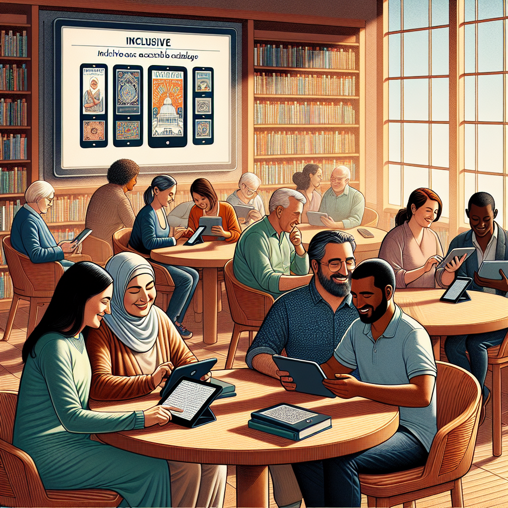
Tactile graphics technology for the visually impaired turns visual information into touch-readable formats, allowing maps, charts, diagrams, interfaces, and educational materials to be understood through the fingertips. In accessibility work, tactile graphics are not simply raised pictures. They are carefully designed representations that translate shape, texture, spatial relationships, and labels into a form a blind or low-vision person can interpret efficiently. I have seen the difference this makes in classrooms, transit systems, museums, and workplaces: when tactile graphics are implemented well, users gain access to information that would otherwise remain locked behind vision-dependent design.
The term covers both traditional and digital methods. Traditional tactile graphics include embossed paper diagrams, swell paper images, thermoformed maps, Braille-labeled signs, and tactile wayfinding surfaces. Newer systems include refreshable tactile displays, haptic tablets, dynamic pin arrays, and software that converts vector images into tactile-friendly layouts. For many users, tactile graphics sit alongside Braille, audio description, screen readers, and orientation tools rather than replacing them. A line graph may be explored tactually while a teacher or app provides spoken values. A tactile map may be paired with GPS navigation. Accessibility succeeds when tools work together.
This topic matters because visual information dominates modern life. School textbooks rely on diagrams. Public buildings use printed maps. Data dashboards present trends visually. Consumer devices use icons and touchscreens. Without tactile alternatives, visually impaired users face barriers in education, employment, civic participation, and independent travel. Standards such as the Americans with Disabilities Act, Section 508, Web Content Accessibility Guidelines, and Braille signage requirements establish important expectations, but compliance alone does not create usable tactile access. Good implementation requires design judgment, testing with users, and awareness of the strengths and limits of each technology.
As a hub within technology and accessibility, this article covers the full landscape of implementing and advancing accessible technology through tactile graphics. It explains how tactile graphics are produced, where they are used, which tools and standards shape quality, and what innovations are changing the field. It also connects tactile graphics to related accessibility systems such as Braille literacy, digital publishing, assistive hardware, inclusive product design, and multimodal user experience. If an organization wants to make complex information genuinely accessible, tactile graphics technology is one of the most practical and most overlooked places to start.
Core technologies and how tactile graphics are produced
Tactile graphics production begins with translation, not decoration. A designer first decides what information is essential: boundaries, symbols, direction, scale, hierarchy, and labels. Then the source image is simplified so touch can resolve it. Fingertips cannot parse the same density of detail that eyes can. Thin visual lines may disappear tactually, decorative shading becomes noise, and overlapping objects create confusion. In my experience reviewing museum panels and school worksheets, the biggest quality problem is overloading a page with too much untouched visual complexity. Effective tactile design removes nonessential detail and strengthens meaningful contrast through line weight, texture, spacing, and consistent symbols.
The most common production methods are embossing, swell paper, and thermoforming. Embossers such as Index Braille and ViewPlus devices raise dots and lines directly onto heavy paper, often combining Braille text with graphic elements. Swell paper, sometimes called microcapsule paper, uses heat to raise black printed areas, making it useful for quick classroom diagrams and labeled illustrations. Thermoforming creates durable plastic copies from a master, which is valuable for repeated use in schools, transit hubs, and public facilities. Each method has tradeoffs. Embossing is flexible but can be limited in texture richness. Swell paper is fast but less durable. Thermoforming lasts longer but requires more setup and a carefully prepared mold.
Software matters as much as hardware. TactileView, Tiger Software Suite, Adobe Illustrator with tactile design workflows, and specialized Braille translation tools help convert diagrams into tactile-ready files. For STEM content, Nemeth Braille and tactile math conventions are essential. For maps, GIS layers often need manual editing before they become legible by touch. Automated conversion can help, but it rarely produces publication-quality tactile graphics without human review. A transit map generated directly from a visual PDF may contain too many intersections, labels, and route symbols to be usable. Skilled tactile transcribers and accessibility specialists still provide the interpretation layer that makes technology effective.
Where tactile graphics create the greatest impact
Education is the clearest example. Science, technology, engineering, and mathematics all depend on diagrams, spatial relationships, and data visualization. Students need tactile access to geometric figures, biology illustrations, laboratory layouts, charts, and maps. The Individuals with Disabilities Education Act supports accessible educational materials, yet schools still vary widely in delivery quality. When teachers plan ahead and work with Teachers of Students with Visual Impairments, accessible graphics can arrive on time and align with instruction. When they do not, blind students receive simplified verbal summaries instead of equal access to the actual content. That difference directly affects achievement, confidence, and career pathways in technical subjects.
Wayfinding is another high-value area. Tactile maps in transportation centers, hospitals, campuses, and government buildings support orientation before movement begins. A good tactile wayfinding map shows entrances, elevators, stairs, restrooms, major corridors, landmarks, and a clear “you are here” reference. It does not attempt to include every room or decorative architectural detail. Standards from the U.S. Access Board and best practices in universal design support consistent placement, readable Braille, and manageable information density. I have seen the strongest results when tactile maps are installed near decision points and paired with audible beacons or mobile navigation apps, giving users both overview and turn-by-turn support.
Museums and cultural institutions increasingly use tactile replicas and interpretive graphics to open visual collections to blind visitors. Raised line drawings of paintings, tactile floor plans, 3D printed artifacts, and multisensory exhibits provide more than compliance; they improve engagement. The same principle applies in workplaces and public communication. Emergency egress maps, equipment diagrams, voting instructions, and product manuals often remain inaccessible unless organizations deliberately create tactile versions. Accessibility programs that treat tactile graphics as part of core information architecture, not as occasional accommodation, deliver stronger results across every setting.
Design principles that determine usability
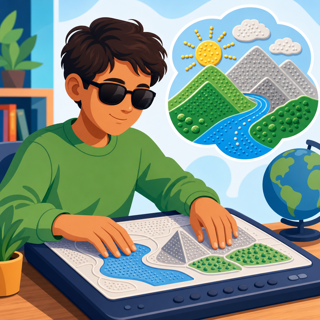
Usable tactile graphics follow a few consistent rules. First, simplify aggressively. Second, maintain enough spacing that adjacent elements can be distinguished by touch. Third, use a small, repeatable vocabulary of textures and symbols. Fourth, place Braille labels predictably and avoid collisions with graphic features. Fifth, test with actual users because assumptions made by sighted designers often fail under tactile exploration. A tactile page is read sequentially, often with both hands, and users build a mental model piece by piece. Layout therefore matters as much as content.
Scale and orientation are especially important. If a map is too small, streets merge. If a diagram is too large, users lose context and must hunt across disconnected sections. In accessible product reviews, I often recommend splitting complex images into overview and detail sheets. One page presents the whole structure; another presents a magnified section. This mirrors how experts handle complex tactile atlases and advanced textbook graphics. Consistency also reduces learning time. If dotted texture means water on one map, it should not mean vegetation on the next page.
| Design element | Good tactile practice | Common failure |
|---|---|---|
| Line styles | Use clearly distinct widths and patterns | Too many similar lines that feel identical |
| Textures | Limit to a small set with strong contrast | Dense textures that mask boundaries |
| Braille labels | Keep short, consistent, and well spaced | Overlong labels crowding the graphic |
| Page layout | Separate overview from detail when needed | Entire visual compressed into one sheet |
| User testing | Validate with blind readers before release | Assuming visual clarity equals tactile clarity |
Standards and guidelines reinforce these practices. The Braille Authority of North America has published detailed guidance on tactile graphics, and national libraries and specialist producers have refined workflows for decades. The principle is straightforward: tactile graphics should communicate the same meaningful information as the original, but not necessarily in the same form. Faithful accessibility is about preserving purpose, not copying every visual feature.
Digital innovation, refreshable displays, and future direction
The most exciting advances are happening in dynamic tactile output. Refreshable Braille displays have long handled text, but newer devices are expanding into graphics through multi-line Braille cells, pin matrices, and haptic surfaces. Companies and research labs are developing tactile tablets that can raise patterns on demand, letting users pan across charts, inspect interfaces, and interact with educational content without printing each page. This matters because static tactile graphics are costly to produce, difficult to update, and limited in distribution. Digital tactile displays promise reusable, connected access to changing information.
However, the technology is still maturing. Resolution, refresh speed, affordability, durability, and software support remain significant constraints. A dynamic display that represents a bar chart well may still struggle with dense engineering diagrams. Schools and public agencies also need content pipelines, not just hardware. Source files must be structured accessibly, labels must translate into Braille or speech, and authors must understand how touch exploration differs from visual scanning. In other words, innovation succeeds only when procurement, content design, training, and maintenance are planned together.
Artificial intelligence is starting to help with image simplification, object recognition, and description generation, but tactile translation still requires human oversight. AI can identify a trend line, classify a floor plan, or suggest a simplified layout, yet it does not reliably know which details a blind user needs for a specific task. The future is therefore multimodal. Expect systems that combine tactile output, speech guidance, computer vision, and personalized interaction. A student may load a graph on a tactile tablet, hear axis labels through text-to-speech, and request a summary of the steepest slope segment. A traveler may use a tactile station map while a navigation app announces nearby platform changes.
Implementing tactile graphics in an accessibility strategy
Organizations that want real progress should treat tactile graphics as part of a broader accessible technology program. Start with an audit: identify where visual information is mission critical, who needs access, and which formats are currently missing. Prioritize high-impact assets such as educational diagrams, public maps, onboarding materials, safety instructions, and data communications. Then establish production workflows, quality criteria, and user testing practices. Accessibility cannot depend on one staff member improvising files at the last minute.
Procurement is equally important. When buying kiosks, exhibit systems, educational platforms, or signage, require support for Braille labeling, tactile wayfinding, accessible file export, and compatibility with assistive technology. Include tactile deliverables in contracts. Train designers to create source graphics that can be adapted cleanly. Build internal links between accessibility, IT, facilities, communications, and content teams so tactile access is considered from the start. The best programs also work with blind users, advocacy groups, and specialist vendors during design and review. That collaboration catches failures early and improves trust.
Tactile graphics technology for the visually impaired is one of the most effective ways to implement and advance accessible technology because it unlocks information that audio alone cannot fully replace. When tactile graphics are planned well, they support education, navigation, culture, safety, and independent decision-making. The core lessons are clear: simplify visual content for touch, choose the right production method, follow established standards, test with users, and integrate tactile access into broader digital and physical accessibility efforts. As this subtopic hub shows, accessible technology works best when organizations move beyond minimum compliance and design for real use. Review your highest-value visual information today and make tactile access part of your accessibility roadmap.
Frequently Asked Questions
What is tactile graphics technology, and how does it help people who are blind or have low vision?
Tactile graphics technology is the process of converting visual information into touch-readable formats so that maps, charts, diagrams, illustrations, interfaces, and instructional materials can be explored through the fingertips. Instead of relying on color, line weight, or visual layout alone, tactile graphics use raised lines, textures, symbols, spacing, and braille or large-print labels to communicate meaning. The goal is not to create a literal raised copy of an image, but to design a version that preserves the most important information in a form that can be understood efficiently through touch.
This matters because a great deal of information in school, work, travel, and daily life is visual. Think about a science diagram, a building map, a seating chart, a geometry figure, or a transit route. Without a tactile equivalent, a blind user may have to depend entirely on verbal explanation, which can be slower, less precise, and harder to review independently. Well-designed tactile graphics give users direct access to spatial relationships, patterns, proportions, and structure. That independence can make a major difference in learning, navigation, confidence, and participation.
For people with low vision, tactile graphics can also be combined with high-contrast print, enlarged labels, and simplified layouts. In practice, this means tactile graphics technology supports a range of users and use cases. It is one of the most important tools in accessible communication because it allows visual content to be translated into a format that is both meaningful and usable rather than merely decorative.
How are tactile graphics created, and what technologies are commonly used?
Tactile graphics can be created using several different production methods, and the right choice depends on the content, the level of detail required, the number of copies needed, and the user’s reading experience. One of the most common methods is swell paper, sometimes called microcapsule paper. In this process, black printed areas on special paper are heated and expand upward, creating raised lines and shapes. It is popular because it is relatively fast and works well for classroom diagrams, worksheets, and simple maps.
Another widely used approach is embossing, where a machine presses raised dots and lines into paper or plastic. Embossers are especially useful when tactile graphics need to include braille labels and consistent production quality. Vacuum forming, also called thermoforming, is often used for higher-volume reproduction. A master tactile graphic is created first, and then heated plastic is formed over it to make durable copies. This can be a strong option for repeated classroom use or public information materials that need to withstand handling.
More advanced workflows may involve digital design software, vector illustration tools, braille translation programs, and specialized tactile graphics software that helps prepare content for production. Increasingly, 3D printing is also being explored for complex educational models, topographic maps, and objects where layered depth helps communicate meaning. However, more detail is not always better. Effective tactile design depends on simplification, clarity, and tactile readability. A graphic that looks impressive visually may fail completely if the textures are confusing, the labels are crowded, or the elements are too small to distinguish by touch. That is why the best tactile graphics are produced through a combination of technology, accessibility expertise, and user-centered design.
What makes a tactile graphic effective and easy to understand?
An effective tactile graphic is clear, organized, and intentionally simplified. The most important principle is that touch works differently from vision. A person reads tactile information sequentially rather than all at once, so the layout must support exploration. Elements should be distinct enough to tell apart by fingertip, with consistent textures and line styles used to represent different categories of information. For example, roads, rivers, borders, and pathways should not all feel the same. If they do, the user has to guess instead of interpret confidently.
Good tactile graphics also prioritize only the information that truly needs to be included. In visual design, a chart or map may contain many layers, decorative elements, subtle color differences, and dense labeling. In tactile form, too much detail quickly becomes overwhelming. Strong tactile design removes visual clutter, emphasizes key relationships, and presents information in a logical hierarchy. Titles, orientation cues, legends, and labels should be easy to locate. Braille must be placed where it can be read without interfering with the graphic itself, and where appropriate, companion text or audio descriptions can provide additional context.
User familiarity is another major factor. Experienced tactile readers may be comfortable with more complex symbols and multi-part diagrams, while beginners often need simpler layouts and guided instruction. The context matters too. A tactile map for emergency evacuation needs to be immediately understandable, while a classroom diagram may allow more time for exploration. In every case, testing with actual blind or low-vision users is essential. The most effective tactile graphics are not just technically raised; they are intentionally designed, reviewed, and refined so that the information can be interpreted accurately and efficiently.
Where are tactile graphics used most often in education, workplaces, and public spaces?
Tactile graphics are used in a wide range of environments wherever visual information needs to be made accessible. In education, they are especially important. Students may need tactile versions of math graphs, geometry figures, science illustrations, anatomy diagrams, historical maps, musical notation, and technical drawings. Access to these materials supports more equal participation in STEM subjects, geography, art appreciation, and many other areas where visual diagrams traditionally carry key information. When tactile graphics are available at the same time as standard classroom materials, students can engage more independently and keep pace with instruction.
In workplaces, tactile graphics can support orientation, safety, training, and task performance. This may include floor plans, equipment diagrams, organizational charts, workflow visuals, accessible signage, or interface layouts. For professionals who are blind or have low vision, tactile access to visual information can improve efficiency and reduce reliance on coworkers for interpretation. It can also make onboarding and training more inclusive by ensuring that nonvisual access is built into the materials from the beginning rather than added later as an afterthought.
In public spaces, tactile graphics are commonly used in transportation systems, museums, government buildings, campuses, hospitals, parks, and visitor centers. Tactile maps can help people understand building layouts, routes, entrances, exits, and landmarks. Museums may use tactile exhibits and interpretive diagrams to make displays more inclusive. Public kiosks and wayfinding systems can also incorporate tactile elements, braille, and accessible interface design. In all of these settings, tactile graphics serve the broader goal of accessibility: giving people direct, usable access to information so they can navigate, learn, and participate with greater independence.
What are the biggest challenges in tactile graphics design, and how can organizations improve accessibility?
One of the biggest challenges in tactile graphics design is the mistaken assumption that visual content can simply be converted into a raised version without redesign. In reality, tactile access requires interpretation and adaptation. Visual materials often depend on color coding, tiny labels, perspective, overlapping elements, and dense detail that do not translate well to touch. If an organization treats tactile graphics as an automatic production task instead of a design discipline, the result may be technically raised but practically unusable.
Another common challenge is lack of standards awareness and user testing. Designers, educators, and content creators may not know how much spacing is needed, which textures are distinguishable, how braille placement affects readability, or when a graphic should be split into multiple panels. Time pressure can also lead to inaccessible outcomes, especially when tactile materials are produced late and delivered after the visual materials are already in use. For students and professionals alike, delayed access can be just as limiting as no access at all.
Organizations can improve by planning for tactile accessibility from the start. That means identifying which visual materials are essential, using accessible design workflows, consulting tactile graphics specialists, and involving blind or low-vision users in review and testing. Staff training is also important. Educators, UX teams, museum professionals, and public-facing institutions benefit from understanding not only how tactile graphics are produced, but how they are read and used in real situations. It is also helpful to combine tactile graphics with braille, large print, audio description, and digital accessibility tools when appropriate. The strongest accessibility strategies are multimodal, practical, and responsive to user needs. When organizations approach tactile graphics thoughtfully, they move beyond compliance and create materials that genuinely expand access, independence, and inclusion.