ADA signage rules determine how people find rooms, follow routes, identify exits, and use building features independently. For buildings and campuses, these requirements are not decorative details; they are communication standards that support equal access under the 2010 ADA Standards for Accessible Design. When teams misunderstand signage, they create barriers that are easy to miss during design review but obvious the moment a student, visitor, patient, or employee cannot locate a restroom, stair, office, assembly space, or accessible entrance. I have worked on signage audits for schools, clinics, offices, and mixed-use campuses, and the same pattern appears repeatedly: owners focus on colors, branding, and wayfinding graphics, while compliance failures usually come from placement, character style, tactile requirements, and missing signs at doors that must be identified permanently.
Chapter 7 of the ADA Standards addresses communication elements and features, with signage covered primarily in Section 703 and connected provisions in Sections 216 and 219. Those references matter because the rules are not just about how a sign looks; they also define when a sign is required and where it must be installed. In practical terms, compliant ADA signage usually means a sign that can be read visually and, where required, tactually by touch. Key terms include tactile characters, which are raised letters and numbers; Grade 2 Braille, the standardized contracted Braille used in the United States; pictograms, which are graphic symbols such as restroom icons; and finish and contrast, which affect readability under varying light conditions. Buildings and campuses must also distinguish between room identification signs, directional signs, informational signs, and overhead signs, because each category follows different technical criteria.
This topic matters because signage errors affect daily usability, construction closeout, and legal exposure. A university can spend millions on an accessible renovation and still fail users if classroom signs are mounted on the wrong side of the latch, if stair level identification is missing, or if accessible parking and entrances are inconsistently marked across campus. A hospital can meet route requirements but still confuse patients if directional signs omit accessible paths to imaging, elevators, and toilet rooms. Understanding ADA signage rules helps architects, facilities teams, sign fabricators, and campus planners coordinate design intent with enforceable standards, reducing rework and making navigation clearer for everyone.
How Chapter 7 fits into ADA signage compliance
Chapter 7 is the technical chapter for communication elements and features, but signage compliance starts by asking a simpler question: which signs are required in the first place? Section 216 answers that by identifying where signs must be provided, including designations for permanent rooms and spaces, directional and informational signage where inaccessible routes exist, signs at entrances, and signs for means of egress in certain conditions. Section 703 then explains how those signs must be designed, including character height, fonts, case, tactile depth, Braille position, mounting height, and visual contrast. Section 219 adds requirements for assistive listening signs in assembly areas. On campuses, that means compliance is spread across room identification, route information, emergency circulation, and event spaces, not just a plaque next to an office door.
The distinction between permanent and temporary spaces is critical. If a room has a permanent function, such as Room 210, Registrar, Mechanical, Electrical, Toilet, or Conference Room A, it typically needs tactile characters and Braille. If a sign simply provides direction, such as “Library this way” or “Accessible Entrance around corner,” it generally does not require tactile text, but it still must meet visual character rules if intended to be read by sight. This is one of the most common mistakes on buildings and campuses: teams apply one sign standard to every sign type. In reality, the ADA treats room identification signs differently from directional signs, overhead signs, and temporary notices.
Where ADA signs are required in buildings and campuses
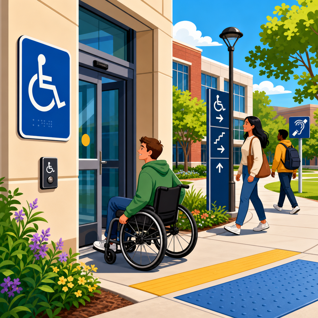
Permanent rooms and spaces must be identified with compliant signs. That includes restrooms, classrooms, offices, residence hall rooms with permanent designations, storage rooms, mechanical rooms, stairwells, exit enclosures, faculty suites, and many amenity spaces. Signs are also required where a building has inaccessible entrances, inaccessible toilet or bathing facilities, or inaccessible elevators; those locations must direct users to the nearest accessible alternative. Campuses often overlook exterior-to-interior transitions, especially when an older historic entrance remains open but is not accessible. In those cases, directional signage to the accessible entrance is essential, and the route must be clear, continuous, and consistent.
Room signs are usually required at the door or adjacent to it, but not every door gets one. If a sign is mounted directly on a door that may be held open, the sign may become unreadable or impossible to locate. The standard mounting approach is on the wall at the latch side of the door. Double doors, doors without enough latch-side wall space, and glass doors all create special conditions that should be resolved during design, not after installation. On large campuses, one missed condition in the sign schedule can be repeated across dozens of buildings.
| Sign type | Typical campus example | Tactile/Braille required? | Key rule |
|---|---|---|---|
| Permanent room identification | Restroom, classroom, office, stair | Yes | Raised characters and Grade 2 Braille |
| Directional sign | Accessible entrance arrow | No, unless it also identifies a permanent space | Must clearly direct to accessible location |
| Informational sign | Building hours or visitor policy | No | Visual readability still matters |
| Overhead sign | Exit or concourse direction | No tactile text | Higher visual character height required |
| Assistive listening sign | Auditorium receiver availability | Symbol required | Must identify listening system where provided |
Technical rules for tactile characters, Braille, fonts, and contrast
Tactile characters must be raised at least 1/32 inch above the background and must be uppercase, sans serif or simple serif, not italic, not oblique, and not highly decorative. Characters must have a width-to-height ratio between 55 percent and 110 percent and a stroke thickness between 10 percent and 15 percent of character height. These details sound minor, but they are exactly where custom branded sign packages often fail. A condensed corporate font, a script typeface in a donor building, or laser-etched characters with no measurable raise can make a sign noncompliant even if it looks polished.
Braille must be contracted Grade 2 and positioned directly below the corresponding text. Domed or rounded Braille dots are required, and spacing is controlled. Fabricators that specialize in ADA signage know these tolerances, but general sign shops sometimes do not. I have seen campus replacement programs order room plaques online without checking whether the Braille was compliant or whether the text matched the room schedule. A wrong room name in Braille is not a minor typo; it is a direct usability failure.
Visual characters must contrast with their background, though the federal standard does not set a numeric contrast ratio. In practice, high contrast matte finishes work best. Glare is expressly addressed: signs must have a non-glare finish. Brushed metal, polished acrylic, and glossy laminate can look sophisticated in renderings yet perform poorly in bright corridors or daylight-filled lobbies. Character height also depends on viewing distance and whether the sign is wall-mounted or overhead. Directional and informational signs read from farther away need larger letters, and overhead signs require even larger characters because readers view them at distance and angle.
Mounting height, location, and installation details that cause failures
For tactile signs identifying permanent rooms and spaces, the baseline of the lowest raised character must be at least 48 inches above the finish floor, and the baseline of the highest raised character must be no higher than 60 inches. Mounting location is equally important. The standard location is on the wall adjacent to the latch side of the door. If there is no wall space on the latch side, the sign can be placed on the nearest adjacent wall. This allows a person using the sign tactually to approach it safely without standing within a door swing.
Door conditions complicate this rule. At pairs of doors with one active leaf, teams need to consider the active leaf and available approach space. At doors with closers and narrow sidelites, there may be no compliant surface where the sign was first drawn. On campuses, retrofit work often creates conflicts with fire alarm devices, card readers, light switches, or donor plaques. The fix is coordination. Signage should be laid out alongside hardware, security, and electrical devices during construction documentation, not left to field improvisation.
Exterior signs also require judgment. A building identification sign at the roadside may support wayfinding but is not the same as a compliant room sign. However, if an accessible entrance is not the main public entrance, signs at inaccessible entrances must direct users to the accessible one. That requirement often applies to older lecture halls, chapel entries, field houses, and alumni buildings where stairs dominate the front facade. The sign should not merely say “use other entrance.” It should give a clear direction, ideally with an arrow and concise wording.
Pictograms, symbols, and common campus sign types
Pictograms are permitted, and in some cases expected, but they come with rules. If a pictogram is used to identify a permanent room or space, it must have a field at least 6 inches high, and the tactile characters and Braille cannot be placed inside that field. Restroom signs are the classic example. The familiar male, female, all-gender, or accessibility pictogram may appear visually, but the tactile text and Braille must still be provided separately on the sign. A pictogram alone is not enough for compliance.
Campuses use many repeated sign types beyond restrooms: stairwell identification, elevator jamb signs, parking identification, accessible route signs, evacuation area signs, and assembly space notices. Stairwell signs are especially important in multistory buildings because they help users identify the floor level and exit discharge information during normal use and emergencies. Assembly spaces such as auditoriums, lecture halls, arenas, and performing arts centers may require signage for assistive listening systems using the International Symbol of Access for Hearing Loss. If receivers are available at a service desk, that location should be clearly identified.
Symbols must be accurate and recognizable. The International Symbol of Accessibility should mark accessible entrances, parking, seating where applicable, and certain equipment or spaces. Misuse is common. I have seen campuses apply the symbol to any renovated entrance, even when the route beyond still included a heavy manual door or an abrupt threshold. A symbol is a representation of actual accessibility, not an aspirational graphic.
How to manage ADA signage on projects and across portfolios
The most effective way to manage ADA signage is to treat it as a coordinated system, not a finish selection at the end of construction. Start with a room-by-room sign inventory tied to floor plans, door numbers, room functions, and accessibility features. Then classify every sign: permanent identification, directional, informational, regulatory, egress, parking, and assistive listening. This prevents over-ordering tactile signs where they are not needed and under-specifying them where they are mandatory. On campuses with multiple buildings, create a standards manual covering typography, mounting details, contrast, nomenclature, abbreviations, and replacement procedures so one department does not introduce a noncompliant sign family that conflicts with the rest.
Field verification is essential. I have seen accurate sign schedules fail because the installed door hardware changed handing, a wall was furred out, or a card reader occupied the intended sign location. A punchlist should include tactile verification, Braille proofreading, mounting heights, and directional accuracy from accessible parking and transit stops to principal entrances and key destinations. Teams commonly use Bluebeam for sign schedule review, Revit or AutoCAD for elevations and location plans, and facility databases such as ARCHIBUS or Maximo to track room data. The strongest results come when facilities, accessibility consultants, architects, and fabricators review a full-size sample before production.
ADA signage rules are precise because building communication must be dependable, not improvised. Chapter 7 gives owners and design teams the framework for signs that people can read by sight and touch, while Sections 216 and 219 define when those signs must appear. For buildings and campuses, the essentials are consistent: identify permanent rooms and spaces with raised characters and Grade 2 Braille, mount tactile signs in the correct location and height range, use non-glare finishes with strong contrast, and provide clear direction wherever an accessible route or entrance differs from the obvious path. These are technical standards, but their purpose is practical independence.
The biggest compliance problems are rarely dramatic. They are the restroom sign mounted on the push side instead of the latch side, the inaccessible historic entrance with no directional sign, the glossy plaque that washes out under daylight, or the custom font that looks elegant but cannot be read tactually. Those mistakes multiply on large campuses because standards are applied inconsistently from building to building. A clear sign program, coordinated early and verified in the field, prevents rework and gives students, patients, staff, and visitors a predictable navigation experience.
If you manage facilities, design projects, or campus standards, use this page as your hub for Chapter 7 and then review each connected subtopic in detail, from tactile sign specifications to assistive listening and accessible route wayfinding. Audit a building entrance, one restroom core, and one stair today. You will quickly see whether your signage system supports access or only appears to.
Frequently Asked Questions
What do ADA signage rules actually require in buildings and campuses?
ADA signage rules are meant to make navigation and room identification usable for people with a wide range of disabilities, including individuals who are blind, have low vision, or need clear, consistent wayfinding information. Under the 2010 ADA Standards for Accessible Design, compliant signs are not simply attractive labels. They are part of the building’s accessibility system. In practice, this means certain permanent rooms and spaces must be identified with signs that include tactile characters and Grade 2 Braille, mounted in consistent locations, and designed with readable contrast and non-glare finishes. These rules commonly apply to spaces such as restrooms, stairwells, exits, floor levels, and permanent room numbers or names.
On campuses and in larger facilities, ADA signage also supports route decisions, emergency egress, and independent use of shared spaces. While not every sign in a building must have tactile text and Braille, signs that identify permanent rooms and spaces generally do. Directional and informational signs have their own readability expectations, especially when they provide critical guidance to accessible features. The broader goal is simple: a student, employee, patient, or visitor should be able to find key destinations and understand the built environment without relying on guesswork or assistance. That is why ADA signage must be considered early in design, renovation, and facility planning rather than added as an afterthought.
Which signs typically need Braille and tactile lettering, and which ones do not?
The clearest rule of thumb is that signs identifying permanent rooms and spaces usually need tactile characters and Braille. Examples include restroom identification signs, room numbers, stairwell identification, floor level designations, and labels for permanent offices, classrooms, conference rooms, electrical rooms, and similar spaces. If a room has a permanent function or a permanent number, the identification sign generally falls into the tactile-sign category. Exit doors may also require compliant identification depending on the sign type and what exactly is being communicated. These signs are intended to be read by touch and located predictably, which is why the ADA includes both content and mounting requirements.
By contrast, many temporary, changeable, or purely directional signs do not require Braille and raised characters in the same way. Examples can include wall directories, overhead directional signs, event notices, and digital displays with changing content. However, that does not mean these signs are exempt from accessibility thinking. Visual signs still need to be readable, understandable, and useful, especially where they direct people to accessible entrances, restrooms, elevators, exits, or service points. In a campus environment, this distinction is important because there may be hundreds of signs serving different functions. Teams should classify signs by purpose at the beginning of a project so they know which signs must meet tactile requirements and which signs must meet visual communication requirements without tactile features.
Where should ADA-compliant signs be mounted, and why does placement matter so much?
Placement matters because even a perfectly fabricated sign can fail if people cannot reliably find it. For tactile room identification signs, the ADA generally requires mounting on the wall adjacent to the latch side of the door whenever possible. This location helps users know where to expect the sign and allows a person reading by touch to approach it without standing in the door swing. If there is no wall space on the latch side, special conditions may call for another nearby location, but consistency is still critical. The goal is to place the sign where it can be reached and read safely and predictably.
On buildings and campuses, placement errors are one of the most common compliance problems. Signs are often installed too high, placed on doors that remain open, blocked by furniture, hidden behind decorative finishes, or mounted where readers must stand in circulation paths. Those mistakes turn compliant sign content into an unusable experience. In busy educational, healthcare, and commercial environments, people need to locate restrooms, exits, departments, classrooms, and support spaces quickly and independently. Proper mounting height, clear floor space, and predictable location all contribute to that independence. Good placement also reduces confusion during emergencies, improves wayfinding for first-time visitors, and supports a more consistent experience across an entire facility or campus.
Do ADA signage rules apply differently in large campuses, multi-building sites, or complex facilities?
The core ADA signage standards do not disappear just because a site is larger or more complex. In fact, large campuses often need more disciplined signage planning because users are navigating multiple buildings, entrances, parking areas, pedestrian routes, elevators, departments, and shared services. The basic rules for permanent room identification, tactile lettering, Braille, contrast, and mounting still apply, but campuses usually need a layered wayfinding strategy that goes beyond minimum code compliance. That includes exterior directional signs, building identification, accessible route guidance, parking signage, maps, and clear transitions between site signage and interior signage.
Complex environments such as universities, hospitals, corporate campuses, and civic centers also face practical challenges like phased renovations, multiple departments ordering signs independently, and inconsistent naming conventions across buildings. These issues can create accessibility barriers even when individual signs appear technically compliant. For example, if one building uses room numbers, another uses department names, and a third has outdated directional signs that do not match the actual accessible route, users can become disoriented quickly. The best approach is to develop a campus-wide signage standard that aligns ADA requirements with branding, terminology, and wayfinding logic. That helps ensure consistency across new construction, remodels, and maintenance replacements while making the site easier for everyone to use.
What are the most common ADA signage mistakes, and how can building teams avoid them?
Some of the most common mistakes are surprisingly easy to make: missing Braille on permanent room signs, using poor contrast, selecting reflective materials that create glare, installing signs on doors instead of adjacent walls, mounting them at inconsistent heights, or using decorative fonts that reduce readability. Another frequent issue is assuming that a sign package is compliant because it looks professional or matches a brand standard. A polished appearance does not guarantee ADA compliance. Teams also run into trouble when they treat signage as a late-stage procurement item rather than part of accessibility coordination. By the time the mistake is discovered, room functions may have changed, wall space may be limited, and replacement costs may be avoidable but substantial.
The best way to avoid these problems is to create a clear sign schedule early, classify each sign by function, and verify ADA requirements before fabrication. Architects, interior designers, facilities teams, contractors, and sign vendors should all work from the same standards. It is also wise to conduct a field review before installation to confirm actual door swings, latch locations, wall conditions, and final room names or numbers. For campuses and public-facing buildings, post-occupancy audits are equally valuable because they reveal real-world navigation problems that drawings may not show. When signage is planned carefully, reviewed systematically, and installed with accessibility in mind, it does more than satisfy a regulation. It helps people move through a building with confidence, dignity, and independence.