Skip to content

KNOW-THE-ADA

Resource on Americans with Disabilities Act

  • Overview of the ADA
  • ADA Titles Explained
  • Rights and Protections
  • Compliance and Implementation
  • Legal Cases and Precedents
  • Technology and Accessibility
  • Updates and Developments
  • Toggle search form

Accessible Forms: Labels, Errors, and Timeouts Explained

Posted on By

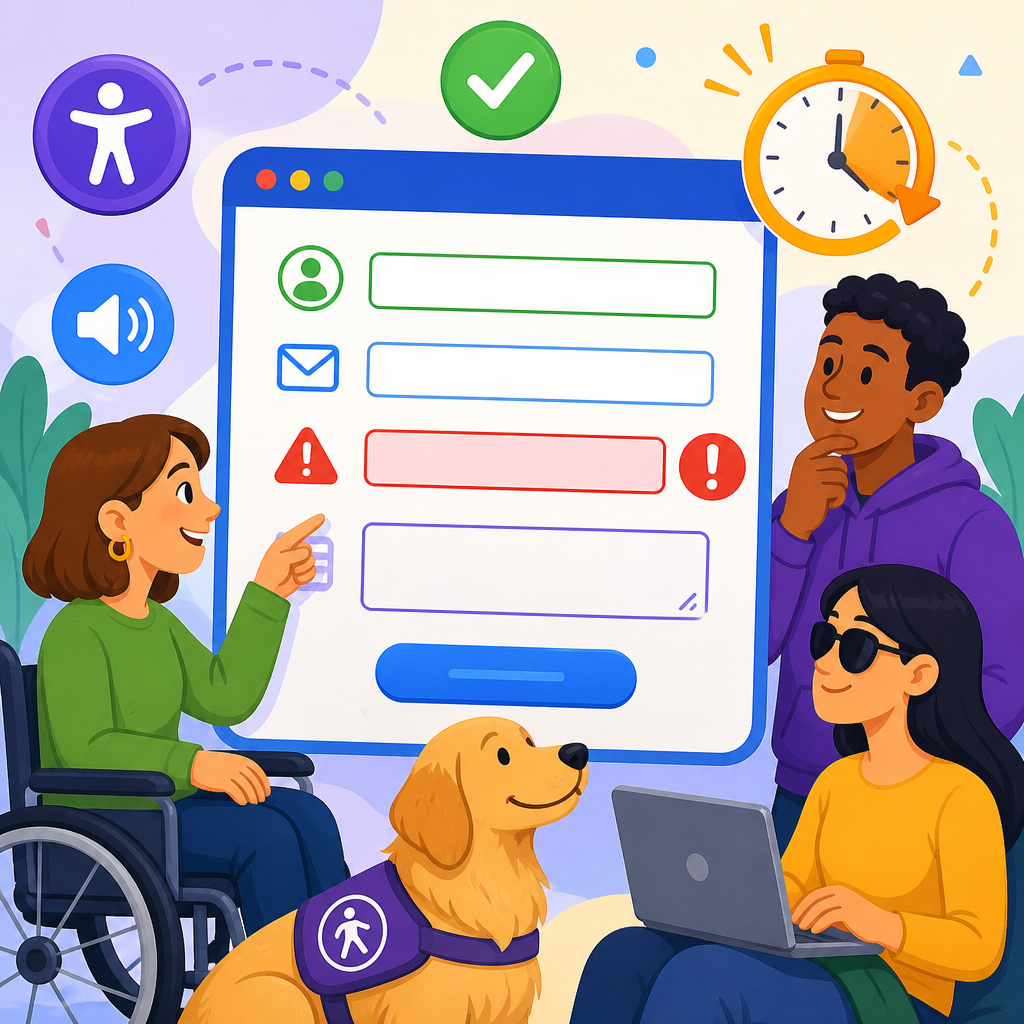
Accessible forms are where technology and accessibility become practical, measurable, and deeply human, because forms are the moments when people must act: sign in, pay, apply, consent, register, report, and ask for help. In accessibility work, a form is not just a layout of fields and buttons. It is an interaction pattern that must be perceivable, understandable, operable, and robust for people using screen readers, screen magnifiers, voice control, switch devices, captions, keyboards, mobile browsers, and cognitive support strategies. When labels are missing, errors are vague, or time limits expire without warning, users are blocked from completing essential tasks. That is why accessible forms sit at the center of any serious discussion about technology and accessibility.

I have seen this repeatedly in audits and remediation projects. A team may believe its website is usable because the colors pass contrast checks and the navigation works by keyboard, yet the highest abandonment happens inside checkout, appointment booking, enrollment, and account recovery forms. The problem is usually not one dramatic failure. It is a chain of small barriers: placeholder text used instead of labels, required fields marked only by color, error messages placed far from the field that caused them, and session timeouts that silently erase completed work. Fixing forms often produces the fastest improvement in both inclusion and conversion because forms are where intent becomes completion.

This hub article explains the basics of technology and accessibility through the lens of forms, with special focus on labels, errors, and timeouts. These three topics matter because they map directly to common user questions. What is this field asking for? What went wrong and how do I correct it? How much time do I have before my progress disappears? Clear answers reduce user effort for everyone, but they are essential for disabled users who may process information differently, navigate sequentially, or need more time to complete a task. Standards such as the Web Content Accessibility Guidelines, especially requirements around information relationships, error identification, instructions, and timing adjustability, provide the baseline. Good implementation goes beyond compliance and creates forms that respect real people under real conditions.

As a hub within Technology and Accessibility, this article also frames the larger subject. Accessible technology is the practice of designing digital tools so people with different sensory, motor, speech, and cognitive abilities can use them without avoidable barriers. In forms, that means semantic markup, programmatic associations, predictable behavior, and recovery support. It also means understanding assistive technology behavior, browser defaults, and the tradeoffs introduced by modern component libraries. The basics are not simplistic. They are foundational engineering decisions that influence usability, legal exposure, customer trust, and service access across every digital product.

Why accessible forms are the foundation of digital access

Forms matter because they are transactional. A user can tolerate some friction while reading a blog post, but not when filing taxes, requesting medication refills, applying for a job, or paying a utility bill. If a form fails, the service fails. That is why accessible form design belongs in product requirements, design systems, content standards, quality assurance, and procurement reviews. It is not a final polish task. It is infrastructure.

Accessibility in forms also reveals the broader principles of accessible technology. A label demonstrates whether information is exposed to code and assistive tools, not just presented visually. An error state demonstrates whether the interface supports comprehension and recovery, not just validation. A timeout demonstrates whether the product respects user pace and memory load. In other words, labels, errors, and timeouts are practical test cases for the entire discipline.

There is also a strong business case. Baymard Institute has long documented that checkout usability problems contribute to abandonment, and unclear form requirements are a recurring factor. Government services, healthcare portals, banking apps, and education platforms face even higher stakes because failed forms can mean lost benefits, missed deadlines, or delayed care. Teams that remediate forms often see fewer support calls, cleaner submitted data, and lower completion time because users no longer guess what the system wants.

Labels: the first accessibility requirement every form must satisfy

A label is the text that tells users what data a control requires, and in accessible implementation it is programmatically tied to the form field. The most reliable pattern is a native

Placeholder text is not a substitute for a label. Placeholders disappear when users type, often have weak contrast, and are inconsistently announced by assistive technologies. They also increase memory burden because users can no longer see the instruction after entering data. Use placeholders only for optional examples, such as “name@example.com,” while keeping a visible label like “Email address.” This distinction seems small, but in testing it consistently improves accuracy and confidence.

Good labels are specific, concise, and familiar. “Card security code” is better than “CVV2/CVC/CID” for general audiences, though supplementary help text can mention card-specific names. “Apartment, suite, or unit” is clearer than “Address line 2.” “Legal first name” may be necessary in government and insurance contexts where identity matching matters. The label should reflect the user’s mental model and the data requirement, not internal database terminology.

Complex forms often need grouped labels. Radio buttons and checkboxes should use

and

so users hear the question before the choices. For example, a legend reading “Preferred contact method” gives context to options such as email, phone, and text message. Date inputs, segmented phone fields, and address blocks also benefit from explicit grouping and instructions. If the interface requires a format, say so near the field and expose that guidance programmatically with aria-describedby when needed.

Form issue Common bad pattern Accessible pattern User benefit
Text input naming Placeholder only Visible label tied with for and id Screen readers announce purpose clearly
Required status Red border only Text such as “Required” plus programmatic indication Users do not rely on color alone
Choice groups Loose radio buttons Fieldset and legend Question and options are read together
Help text Instruction in tooltip only Persistent text linked with aria-describedby Guidance remains available while typing
Custom components Div styled as input Native control or fully accessible widget pattern Keyboard and assistive technology support improves

Errors: how to make validation understandable and recoverable

Accessible error handling answers three questions immediately: what happened, where it happened, and how to fix it. The minimum requirement is that the error message identifies the field and uses plain language. “Enter a valid email address, such as name@example.com” is useful. “Invalid input” is not. Error text should appear near the field, be exposed to assistive technology, and not depend solely on color, iconography, or motion.

There are two main validation moments: inline validation while users interact with a field, and submission validation after users activate the submit button. Inline validation can reduce rework when used carefully, especially for format checks like postal code length or password criteria. However, premature validation is disruptive. Triggering an error before a user has finished typing a phone number creates noise and anxiety. In practice, the best rule is to validate on blur for many fields, reserve live feedback for genuinely helpful checks, and always confirm issues again on submission.

Error summaries are important on longer forms. A summary placed at the top after submission can announce that several errors need attention and provide links to each problematic field. This pattern helps keyboard and screen reader users who might otherwise have to hunt for issues one by one. GOV.UK Design System uses this approach effectively, and it has become a strong reference pattern because it combines a clear page-level explanation with field-level specifics.

Programmatically, teams often use aria-invalid on fields with errors and connect messages using aria-describedby. For dynamic updates, an aria-live region can announce that errors have appeared, but it should be used judiciously to avoid repetitive speech. Native browser validation can help, yet default messages are inconsistent across browsers and may not match product language. Many teams therefore disable default validation UI and implement custom messages while preserving semantic controls and focus management.

The most common failure I encounter is focus loss after submission. Users press submit, the page rerenders, and keyboard focus remains on the button or jumps unpredictably. If there is an error summary, focus should move to it or to a clear heading that states the form has errors. Then each error link should take the user to the relevant field. This is not just a convenience. It is what makes recovery efficient for people navigating sequentially through spoken output or keyboard tab order.

Timeouts: timing rules that do not punish users

Timeouts are often treated as a security or infrastructure setting, but they are also a major accessibility issue. People with low vision may need more time to read enlarged content. Screen reader users navigate linearly and often review instructions more than once. People with mobility impairments may type slowly or use alternative input devices. Users with attention, memory, or language-processing differences may need pauses. If a session expires without warning, the barrier is not just inconvenience. It is lost effort.

Accessible timing starts with disclosure. If a form has a time limit, tell users early, in plain language, and explain what happens when time runs out. Better still, avoid strict limits unless they are essential for security or business rules. When limits are necessary, provide a warning before expiration, allow users to extend time easily, and preserve entered data whenever feasible. A banking session may need a security timeout, but an extension dialog and autosave can still protect the user.

WCAG timing guidance generally expects users to be able to turn off, adjust, or extend time limits unless the limit is essential, such as real-time auctions or certain security contexts. In practical product terms, this means engineering should separate authentication lifetime from form draft lifetime when possible. A healthcare intake form, for example, can maintain encrypted local draft data or server-side draft saves even if the authenticated session must refresh. The user may need to confirm identity again, but they should not have to restart twenty questions from the beginning.

Warning dialogs must themselves be accessible. The modal should take focus, clearly state remaining time, provide obvious action labels, and be keyboard operable. Avoid countdowns that update too aggressively in screen readers. A simple message such as “Your session will expire in two minutes. Select Extend session to continue” is usually enough. After extension, return focus logically and do not interrupt users with repeated warnings too early.

Building accessible forms in modern design systems

Most teams no longer hand-code every form from scratch. They use React, Vue, Angular, Web Components, and design systems built on libraries such as Material UI, Chakra UI, or internal component sets. This speeds delivery, but it also hides accessibility defects inside reusable code. A single broken input component can spread hundreds of times across an organization. For that reason, the hub lesson for Technology and Accessibility is clear: accessibility must be built into primitives, not patched at page level.

Start with native controls whenever possible. The browser already knows how to expose labels, focus, state, and keyboard behavior for input, select, textarea, checkbox, and radio elements. Custom widgets should be the exception, not the default. If a custom combobox or date picker is necessary, follow the WAI-ARIA Authoring Practices carefully and test across browser and assistive technology combinations. Complex widgets frequently fail because they mimic appearance without reproducing interaction semantics.

Testing should combine automated and manual methods. Axe, WAVE, Lighthouse, and browser accessibility panes can catch missing labels, low contrast, and some ARIA misuse. They cannot determine whether label wording is clear, whether timeout warnings are understandable, or whether error recovery is smooth with a screen reader. Manual keyboard testing, zoom testing at 200 percent or more, and checks with NVDA on Windows and VoiceOver on Apple devices remain essential. In my experience, short task-based tests uncover more useful issues than long checklist sessions.

Content design also matters. Accessible forms are written, not only coded. Required instructions should appear before users begin. Error text should avoid blame. Confirmation messages should state what happened next, such as “Your application was saved and a confirmation email was sent.” Accessible technology succeeds when code, content, design, and QA operate as one system rather than separate specialties.

How this hub connects the basics of technology and accessibility

Labels, errors, and timeouts explain the broader field because they combine structure, language, behavior, and user support. A good label shows semantic relationships. A good error state shows inclusive feedback design. A good timeout policy shows respect for varied pace and context. Together they illustrate the basics of accessible technology better than abstract definitions alone.

Use this hub as the starting point for deeper work across related topics: semantic HTML, keyboard accessibility, focus management, color and contrast, assistive technology testing, form patterns in mobile apps, and accessibility in design systems. If you review your own forms this week, start with three checks. Every control needs a real label. Every validation issue needs a specific fix message and focus path. Every time limit needs warning, extension, or preservation. Those basics prevent the most common barriers and improve completion for everyone. Audit one important form, fix the biggest blockers, and build those patterns into your standard components.

Frequently Asked Questions

What makes a form truly accessible, beyond just looking simple or clean?

An accessible form is not defined by visual simplicity alone. It is defined by whether people with different disabilities can successfully understand, complete, review, correct, and submit it using the tools and input methods they rely on. That includes people using screen readers, screen magnifiers, keyboard-only navigation, voice control, switch access, captions, and mobile assistive technology. A form may appear minimal and modern but still fail if labels are unclear, focus order is confusing, required fields are not identified properly, or errors are announced only visually.

In practice, accessible forms must be perceivable, understandable, operable, and robust. Users need persistent labels that clearly identify each field and remain available while typing. Instructions must be easy to find and written in plain language. Keyboard users must be able to move through fields and controls in a logical order without getting trapped. Screen reader users need properly associated labels, fieldsets, legends, and error messaging that is announced at the right time. People with cognitive disabilities benefit from predictable layouts, helpful examples, and clear recovery paths when something goes wrong.

A truly accessible form also supports successful completion, not just technical compliance. That means reducing unnecessary friction, grouping related questions, minimizing memory load, preserving user input if an error occurs, and giving people enough time to finish. It is where accessibility becomes measurable and deeply human: can a person sign in, apply, pay, consent, report, or ask for help without confusion, exclusion, or avoidable delay? If the answer is yes for a wide range of users and assistive technologies, the form is genuinely accessible.

Why are labels so important in accessible forms, and what are the most common labeling mistakes?

Labels are essential because they tell users what each form control is for. For someone using a screen reader, the label is often the primary cue that explains the purpose of a text field, checkbox, radio button, select menu, or textarea. For users with cognitive disabilities, clear labels reduce ambiguity and make tasks easier to follow. For users with motor impairments or magnification, properly associated labels can also improve usability by enlarging the clickable or tappable target area in some form patterns.

The strongest approach is to use visible, persistent labels that are programmatically associated with their controls. In HTML, that usually means a <label> connected to a form field through the for and id attributes, or by wrapping the control inside the label. This ensures assistive technologies can reliably announce the label. Related inputs, such as radio button groups or checkbox sets, should also use <fieldset> and <legend> so users understand the shared question or category.

One of the most common mistakes is relying on placeholder text as the only label. Placeholders often disappear when users start typing, which removes context at exactly the wrong moment. They can also have poor contrast and may not be announced consistently across assistive technologies. Another mistake is using vague labels like “Enter here,” “Field 1,” or “Details,” which do not clearly describe what information is needed. Some forms visually place text near a field but fail to associate it in the code, leaving screen reader users without the same context sighted users receive. Others hide labels completely in pursuit of a minimalist design, creating unnecessary barriers.

Good labels should be specific, concise, and familiar. “Email address” is better than “Contact info,” and “Card security code” is better than “Code.” If formatting matters, include instructions near the field rather than forcing the label to do too much. The goal is simple: every user should know what to enter, where to enter it, and how to do it correctly without guesswork.

How should accessible forms handle errors so users can understand and fix them quickly?

Accessible error handling is about helping users recover efficiently and with confidence. When a person submits a form and something is wrong, the form should identify the specific problem, explain how to fix it, and guide the user back to the relevant field without forcing them to hunt through the page. This is especially important for screen reader users, keyboard users, users with cognitive disabilities, and anyone completing high-stakes tasks such as payment, applications, healthcare requests, or legal consent.

The most effective error patterns combine multiple cues. First, the problematic field should be identified programmatically and visually. Second, an error message should be presented in text, not by color alone. Third, that message should be associated with the field so assistive technology can announce it. For example, if a user enters an invalid email address, the message should say something specific like “Enter a valid email address in the format name@example.com,” rather than a vague message like “Invalid input.” If a required field is empty, say “First name is required,” not just “This field is required,” especially when several fields are involved.

Forms should also provide a clear error summary when appropriate, especially for long or multi-section forms. A summary at the top can tell users how many issues need attention and link directly to each affected field. This helps users orient themselves quickly after submission. Just as important, focus management must be handled carefully. After a failed submission, focus may need to move to the error summary or the first invalid field so keyboard and screen reader users are not left wondering what happened.

Common accessibility failures include showing errors only in red, placing error text too far from the field, clearing previously entered data, or using generic alerts that are not announced by assistive technology. Another frequent issue is validating too aggressively while the user is still typing, which can create confusion and interruptions. Inline validation can be useful, but it should be timed thoughtfully and written in a supportive, non-punitive tone. Good error design does not blame the user. It explains the issue clearly, preserves their progress, and makes the next step obvious.

What should website owners know about form timeouts and session expiration accessibility?

Timeouts are one of the most overlooked accessibility issues in forms, yet they can create major barriers. Many users need more time to read instructions, enter information, retrieve documents, verify details, use assistive technology, or navigate with limited dexterity. People with cognitive disabilities, screen reader users, users with motor impairments, and users completing forms on mobile devices are especially affected when a session ends without warning. If a form times out suddenly, the result can be lost work, missed deadlines, financial errors, or an inability to complete essential tasks.

An accessible form should provide adequate time by default whenever possible. If a timeout is necessary for security reasons, the user should be warned before time expires and given a simple way to extend the session. The warning should be noticeable visually, announced to assistive technologies, and usable from the keyboard. It should explain what is happening, how much time remains, and what action the user can take. A message that appears only as a disappearing toast or a visually subtle banner is often not enough.

Just as important, forms should preserve user-entered data whenever possible. If a session expires, users should not be forced to re-enter everything from the beginning unless there is a strict security reason that makes this impossible. Saving progress, allowing draft states, or restoring non-sensitive data can significantly improve accessibility and reduce frustration. For longer forms, progress indicators and section-based saving can also make completion more manageable.

Website owners should remember that accessibility and security are not opposites. It is entirely possible to protect user accounts and sensitive data while still giving people warnings, extension options, and recovery paths. The key is to design expiration behavior around real user needs rather than assuming everyone can complete a complex task quickly. If a person cannot finish because the system ran out of patience before they did, that is a design problem, not a user problem.

What are the best practices for testing form accessibility in real-world conditions?

Testing accessible forms well requires more than running an automated checker. Automated tools are useful for catching missing labels, color contrast issues, and some structural problems, but they cannot tell you whether instructions are understandable, whether error recovery is smooth, or whether the form makes sense when navigated step by step with assistive technology. Real-world testing should combine code review, manual interaction, and cross-device checks.

Start with keyboard testing. Can every field, button, checkbox, radio group, help element, date picker, and submission control be reached and operated without a mouse? Is the focus order logical? Is the visible focus indicator clear at every step? Next, test with a screen reader such as NVDA, JAWS, VoiceOver, or TalkBack. Listen to how labels, instructions, required states, groupings, hints, and errors are announced. Make sure custom components expose the same information and behavior as native form controls. If a user encounters an error, verify that the message is announced and that focus is managed appropriately.

You should also zoom the page, increase text size, test on mobile, and review the form in both portrait and landscape orientations where relevant. Check whether labels remain visible, whether error messages reflow well, and whether controls remain usable without horizontal scrolling in common scenarios. For users with cognitive disabilities, review the language itself: are questions straightforward, is jargon limited,

Technology and Accessibility

Post navigation

Previous Post: Why Captions, Transcripts, and Audio Description Serve Different Needs

Related Posts

Enhancing Accessibility Through Technology Technology and Accessibility
Assistive Tech’s Impact on ADA Compliance Technology and Accessibility
Accessible Web Design Principles Explained Technology and Accessibility
Smartphone Accessibility Features Guide Technology and Accessibility
Empowering the Disabled Through Voice Recognition Technology and Accessibility
Accessibility and E-Readers – Advancing Reading for All Technology and Accessibility

Archives

  • September 2026
  • August 2026
  • July 2026
  • June 2026
  • May 2026
  • April 2026
  • March 2026
  • February 2026
  • December 2025
  • October 2025
  • September 2025
  • August 2025
  • July 2025
  • June 2025
  • May 2025
  • April 2025
  • March 2025
  • February 2025
  • January 2025
  • December 2024
  • November 2024
  • October 2024
  • September 2024
  • August 2024
  • July 2024
  • June 2024
  • May 2024
  • April 2024

Categories

  • ADA Accessibility Standards
  • ADA Titles Explained
  • Chapter 1: Application and Administration
  • Compliance and Implementation
  • Global Views on Disability Rights
  • Industry Specific Guides
  • International Perspective
  • Legal Cases and Precedents
  • Overview of the ADA
  • Resources and Support
  • Rights and Protections
  • Technology and Accessibility
  • Uncategorized
  • Updates and Developments
  • ADA Accessibility Standards
  • ADA Titles Explained
  • Chapter 1: Application and Administration
  • Compliance and Implementation
  • Global Views on Disability Rights
  • Industry Specific Guides
  • International Perspective
  • Legal Cases and Precedents
  • Overview of the ADA
  • Resources and Support
  • Rights and Protections
  • Technology and Accessibility
  • Uncategorized
  • Updates and Developments
  • Accessible Forms: Labels, Errors, and Timeouts Explained
  • Why Captions, Transcripts, and Audio Description Serve Different Needs
  • The Basics of Alt Text for Public Information Websites
  • Keyboard Access, Focus Order, and Why They Matter
  • What Is Assistive Technology and How Does It Interact With Design?

Helpful Links

  • Title I
  • Title II
  • Title III
  • Title IV
  • Title V
  • The Ultimate Glossary of Key Terms for the Americans with Disabilities Act (ADA)
  • ADA Accessibility Standards
  • ADA Titles Explained
  • Chapter 1: Application and Administration
  • Compliance and Implementation
  • Global Views on Disability Rights
  • Industry Specific Guides
  • International Perspective
  • Legal Cases and Precedents
  • Overview of the ADA
  • Resources and Support
  • Rights and Protections
  • Technology and Accessibility
  • Uncategorized
  • Updates and Developments

Copyright © 2025 KNOW-THE-ADA. Powered by AI Writer DIYSEO.AI. Download on WordPress.

Powered by PressBook Grid Blogs theme