Braille on ADA signs is one of the most misunderstood parts of accessible wayfinding, yet it is also one of the most regulated. In the field, I routinely see beautiful sign systems fail inspection because the braille is the wrong grade, mounted at the wrong height, placed on the wrong side of the door, or paired with visual characters that do not meet contrast and finish requirements. For architects, facility managers, sign fabricators, and business owners, understanding braille on ADA signs is not just about compliance. It is about usability, risk reduction, and creating a built environment that people can navigate independently.
Within ADA accessibility standards, tactile signage refers to signs with raised characters and braille that identify permanent rooms and spaces. Wayfinding signage is broader. It includes directional signs, overhead signs, exit signs, informational directories, parking signs, restroom signs, stair signs, and code-required life-safety signs. Not every sign needs braille, and that distinction matters. The 2010 ADA Standards for Accessible Design, especially sections 216 and 703, set the baseline for when tactile characters and braille are required, how they must be formatted, and where signs must be installed. Many projects must also coordinate with ICC A117.1, state building codes, and local amendments.
The key braille requirement is straightforward: where braille is required on ADA signs, it must be contracted braille, commonly called Grade 2 braille. It must be domed or rounded, positioned directly below the corresponding text, and separated from raised characters by specific spacing. California and a few other jurisdictions add separate requirements, including the use of California Title 24 rules and, in many cases, tactile exit signage conventions that go beyond federal baseline standards. That is why signage and wayfinding cannot be treated as a late-stage decorative package. It must be coordinated from programming through installation.
This hub article explains the core rules for braille on ADA signs, when braille is required, how placement works, and which mistakes most often cause remediation. It also connects braille to the wider signage and wayfinding system, because accessible navigation depends on consistency across an entire facility, not on a single plaque by a door.
When ADA signs need braille and when they do not
The first question clients ask is simple: which signs actually need braille? The answer is permanent room identification signs. If a sign designates a permanent room or space, such as a restroom, room number, stairwell, exit stair, electrical room, conference room, classroom, exam room, or employee office, it generally needs raised characters and braille. The sign must identify the space itself, not merely provide direction to it. For example, a plaque reading “Room 214” at the latch side of the room door needs tactile characters and braille. A ceiling-hung sign with an arrow pointing toward Room 214 does not.
Signs that are temporary, changeable, or purely directional usually do not require braille under the federal standard. Typical examples include menu boards, digital directories, event schedules, tenant listings with replaceable inserts, and directional arrows in corridors. Overhead signs are another common source of confusion. If characters are mounted overhead and intended to be read at a distance, they are not tactile signs and do not include braille. They still must meet visual character rules for legibility, but they serve a different function.
In practice, I advise teams to sort signage into three buckets early in design: identification signs, directional/informational signs, and code or egress signs. That classification controls fabrication, mounting, and budget. It also helps prevent the common mistake of adding braille everywhere, which can waste money without improving usability, or worse, omitting braille from the exact signs that require it.
Braille requirements apply to the permanent sign, not to every message associated with a room. A conference room may have a compliant tactile room ID at the wall and a separate scheduling display outside the door. The display itself does not need braille if the permanent identification sign is present and compliant. This is a frequent best-practice arrangement in offices, hospitals, and universities.
Grade 2 braille rules and how tactile text should be formatted
ADA signs that require braille must use contracted braille, historically known as Grade 2 braille. Contracted braille uses abbreviations and character combinations to increase reading efficiency for braille readers. It is not optional. Uncontracted Grade 1 braille is not acceptable where the federal standard requires braille on permanent room signs. The only time teams get into trouble here is when someone sends a text file to a fabricator without verifying translation, or when an inexperienced vendor uses software defaults incorrectly.
Accuracy matters as much as the braille grade. Braille translation is not simple letter substitution. Room names, punctuation, abbreviations, symbols, and numbers all have specific conventions governed by Braille Authority of North America guidance and fabrication standards. I have seen “Women” translated incorrectly, room numbers with improper numeric indicators, and bilingual signs where only the English line was translated. Every one of those errors undermines usability and can trigger replacement.
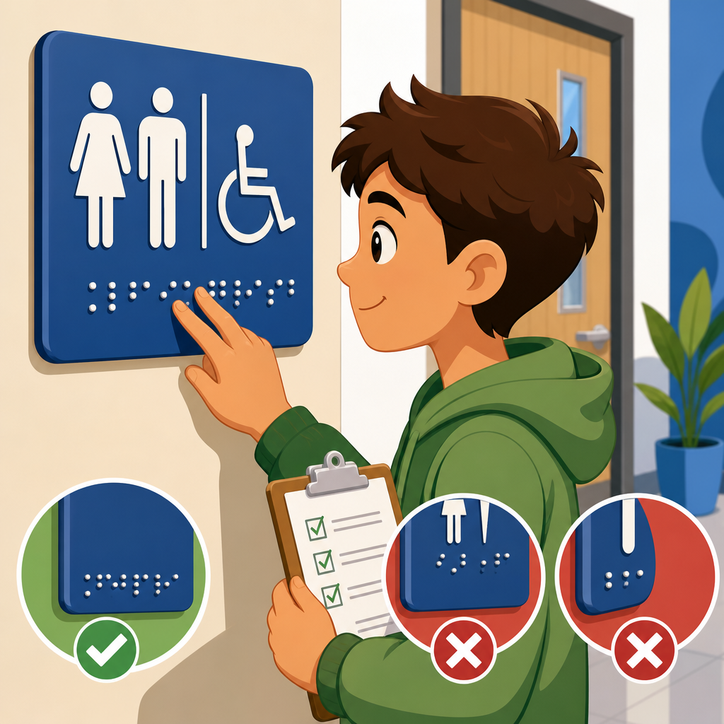
Raised characters have their own rules. They must be uppercase, sans serif or simple serif, and accompanied by braille directly below the text. Characters must be raised at least 1/32 inch, and the finish should be non-glare. Visual contrast is also essential. While braille readers use touch, many users of ADA signs have low vision rather than blindness, so the sign must support both tactile and visual reading. A matte dark plaque with light raised lettering, or the reverse, is usually safer than brushed metal with low contrast.
The spacing between raised text and braille is not arbitrary. The standards specify clear separation so users can distinguish the lines by touch. Dot geometry also matters: braille dots must have a domed or rounded shape and specific base diameter, height, and spacing. Cheap UV-printed “braille” that feels flat or sharp often fails both usability and inspection. Reputable manufacturers test tactile output carefully because tiny dimensional errors make a big difference to readers.
| Sign type | Braille required? | Typical example | Common mistake |
|---|---|---|---|
| Permanent room identification | Yes | Restroom, room number, stairwell | Using Grade 1 braille or no tactile text |
| Directional sign | No, usually | Arrow to lobby or elevators | Adding braille but omitting visual legibility |
| Overhead sign | No | Ceiling-hung exit direction sign | Treating it like a tactile wall plaque |
| Temporary or changeable sign | No, usually | Meeting schedule insert | Assuming every insert needs braille |
| Code and egress sign | Sometimes, depends on function and jurisdiction | Exit stair identification | Ignoring local code amendments |
Placement rules: mounting height, latch side location, and reach range
Correct placement is where many otherwise compliant signs fail. Under ADA standards, tactile signs identifying permanent rooms and spaces are generally mounted on the wall adjacent to the latch side of the door. This location allows a person who is blind or has low vision to approach the sign without standing in the door swing. If there is no room on the latch side, the nearest adjacent wall may be used. On double doors with one active leaf, placement is tied to the active door. On pairs with two active leaves, wall conditions and approach clearance have to be evaluated carefully.
Mounting height is measured to the baseline of the lowest tactile character and the baseline of the highest tactile character. The lowest tactile character must be at least 48 inches above the finish floor, and the highest tactile character must be no higher than 60 inches above the finish floor. This is not measured to the top or bottom of the sign panel. Installers regularly get this wrong by centering the plaque at 54 inches without checking where the characters actually fall.
There must also be a clear floor space allowing a person to approach within range of the sign without encountering protruding objects or unsafe door swing conditions. On narrow corridors, recessed alcoves, or healthcare projects with equipment parked near doors, this becomes a real coordination issue. A compliant sign placed where no one can safely stand to read it is a design failure even if the plaque itself is fabricated correctly.
Placement also affects consistency across a campus or facility. In schools, hotels, and hospitals, standardized sign location reduces search time for all users, including staff and visitors under stress. I have worked on projects where every floor had a different installer and signs wandered from eight inches off the frame to two feet away. People notice that inconsistency immediately, and inspectors do too.
Common braille and signage mistakes that lead to violations
The most frequent mistake is using the wrong braille translation. The second is installing the sign in the wrong location. After that come low contrast finishes, missing tactile characters, incorrect pictogram fields, and signs placed directly on doors that can swing open while someone is reading them. Another repeated issue is fabricating room-name signs before the architectural room schedule is final. Late programming changes then create inaccurate signs, especially in medical offices and higher education buildings where room functions evolve quickly.
Restroom signage is a classic problem area. Teams often focus on the pictogram and forget that if the sign identifies a permanent room, the tactile text and braille rules still apply. The International Symbol of Accessibility, gender pictograms where permitted, and specialty symbols may appear, but the sign still needs compliant raised text and braille if it serves as the room identification sign. Decorative logos and novelty typography are another trap. Script fonts, all-lowercase raised text, glossy acrylic surfaces, and weak color contrast can all compromise compliance.
One costly mistake is assuming local sign shops understand accessibility details automatically. Some do; many do not. A capable ADA sign fabricator will ask for room lists, door handing, mounting conditions, and jurisdiction. They will confirm whether the project follows federal standards only or must also meet stricter state requirements. They will also provide tactile proofs before production. If a vendor does not discuss braille translation, dot dimensions, or mounting criteria, that is a warning sign.
Maintenance creates another layer of risk. Signs get replaced after renovations, tenant turnover, repainting, and security upgrades. A facility may start compliant and drift out of compliance over time when replacement plaques are ordered ad hoc. The fix is a signage standards manual with approved materials, type styles, mounting diagrams, and naming conventions.
Building a complete accessible wayfinding system beyond braille
Braille is essential, but accessible wayfinding is larger than braille alone. A strong sign program uses a hierarchy: exterior site signs guide arrival, parking signs direct accessible parking and routes, lobby directories orient first-time visitors, directional signs confirm paths to major destinations, and tactile room signs identify final locations. Stair and floor-level signs support emergency egress and everyday circulation. In complex buildings, maps, color zoning, landmarks, and consistent naming reduce cognitive load for everyone.
Hospitals illustrate this well. Patients may arrive stressed, medicated, or late, and many are unfamiliar with medical terminology. The best systems pair plain-language destination names with consistent symbols and repeated confirmation points. Instead of one giant directory at the entrance, there are multiple decision-point signs, elevator lobby identifiers, department names at each threshold, and tactile room signs at final destinations. Braille plays a specific role at the point of identification, while visual wayfinding supports movement between decision points.
For this reason, signage and wayfinding should be coordinated with lighting, interior design, and architecture. Sign visibility changes dramatically under poor lighting or reflective finishes. Door hardware, wall protection, and trim can interfere with sign placement. Even acoustics matter in transit stations and healthcare settings where spoken directions are common. The most successful ADA accessibility standards projects treat signage as part of user experience planning rather than a procurement item at the end.
If you manage multiple facilities, build a repeatable audit process. Inventory all permanent room signs, verify tactile and braille content, check mounting heights and latch-side placement, and document exceptions created by field conditions. That audit becomes the foundation for phased remediation and for future articles on restroom signs, stairwell signs, directional signage, and campus wayfinding within this Signage and Wayfinding hub.
Braille on ADA signs is not a niche detail. It is a core part of compliant signage and wayfinding under ADA accessibility standards. The rules are clear once you separate permanent room identification from directional and temporary signage: use contracted Grade 2 braille where required, pair it with compliant raised characters, mount the sign in the correct latch-side location, and keep tactile text within the 48-inch to 60-inch character height range. Most failures come from translation errors, poor placement, low-contrast materials, or treating accessibility as an afterthought.
The larger lesson is that braille works best inside a complete wayfinding strategy. Visitors do not experience signs one at a time. They experience routes, decisions, landmarks, and destinations across an entire building. A compliant restroom plaque matters, but so do the parking signs, corridor arrows, stair identification signs, directories, and naming conventions that lead someone there independently. When those elements are coordinated, accessibility improves, staff spend less time giving directions, and owners reduce expensive rework.
If you are planning a new facility, renovation, or signage refresh, start by auditing your permanent room signs and your placement standards. Then review the full Signage and Wayfinding system so braille, tactile text, visual contrast, and navigation logic all work together. That step will prevent the most common mistakes and create a building people can use with confidence every day.
Frequently Asked Questions
What type of braille is required on ADA signs, and is Grade 2 always mandatory?
For most permanent room identification signs covered by the ADA Standards, the required braille is contracted braille, commonly called Grade 2 braille. This is one of the most important compliance points because many noncompliant signs are produced with uncontracted, letter-for-letter braille, sometimes called Grade 1 braille, when Grade 2 is the standard expectation for tactile room signs. Contracted braille uses abbreviations and character combinations recognized by braille readers, which allows information to be read more efficiently and consistently.
That said, the rule is not simply “add braille and you are done.” The braille must correspond directly to the tactile text on the sign, and it must follow the applicable braille standards in effect for ADA signage production. In practice, that means using the correct contractions, spacing, formatting, and translation conventions rather than relying on visual spelling alone. If the tactile copy says “Conference Room,” the braille translation must accurately reflect that wording in contracted braille, not an improvised or machine-generated shortcut.
It is also important to understand where braille is required and where it is not. ADA braille is typically required on signs that identify permanent rooms and spaces, such as restrooms, stairwells, exit enclosures, electrical rooms, offices, and conference rooms. It is generally not required on every directional sign, informational plaque, or temporary notice. Knowing that distinction helps prevent both overproduction and undercompliance. When in doubt, the safest approach is to review whether the sign identifies a permanent space and whether tactile characters are required; if they are, Grade 2 braille is usually part of that requirement.
Where exactly should braille be placed on an ADA sign?
Braille placement is tightly regulated, and small layout mistakes can create major compliance issues. On an ADA tactile sign, braille must be positioned directly below the corresponding tactile text. It should not be separated from the wording it represents by decorative elements, oversized logos, or large gaps that make the sign difficult to interpret by touch. Readers expect a logical relationship between raised text and braille, and inspectors look for that same consistency.
The braille itself must be domed or rounded, not flat-topped, sharp, or irregular. The dots must be properly spaced and produced to the required dimensions so they can be read reliably by touch. Placement is not just about where braille appears on the panel, but whether it is located in a predictable reading zone and fabricated with the correct tactile profile. A beautifully engraved sign can still fail if the braille dots are too low, too close together, poorly formed, or detached from the text they identify.
Layout discipline matters as well. Designers sometimes place braille at the bottom corner of a sign for aesthetics, or split it across multiple visual elements to fit a brand standard. That is a common mistake. The ADA prioritizes usability over graphic styling on tactile signs. If a sign includes both visual and tactile information, the tactile message and its braille translation should remain clearly organized and easy to locate by touch. The best practice is to design the tactile copy first, place braille directly beneath it, and then build the visual composition around those compliance requirements rather than treating braille as an afterthought.
On which side of the door should ADA signs with braille be installed, and what mounting height is correct?
For most room identification signs, the standard rule is to mount the sign on the wall adjacent to the latch side of the door. This is one of the most commonly missed field conditions because installers often center signs on the door itself or place them on whichever side has open wall space. In many cases, that will not pass inspection. The latch-side location gives users a predictable place to find the sign without standing in the path of the door swing or searching around the opening.
When there is no wall space on the latch side, the standards provide alternatives, but those exceptions must still preserve accessibility and consistency. For example, if a pair of doors or a narrow sidelight condition makes latch-side mounting impossible, the nearest adjacent wall location may be acceptable. The key is that the sign must be positioned where a person can approach close enough to read tactile characters without encountering hazards or obstruction. Mounting on a moving door is usually a bad idea for tactile identification because open doors change the sign location and can make the sign inaccessible.
As for height, ADA tactile signs are measured so that the baseline of the lowest tactile character is at least 48 inches above the finished floor, and the baseline of the highest tactile character is no more than 60 inches above the finished floor. This is another area where people make avoidable mistakes by measuring to the top of the plaque, the edge of the frame, or the centerline of the sign rather than the tactile text itself. Installers should always verify final field conditions after fabrication, especially if the sign includes headers, icons, or decorative margins that make the overall panel taller than expected. Correct side, correct clearance, and correct character height all work together to create a compliant installation.
Do visual text, contrast, and surface finish rules matter if the sign already includes compliant braille?
Absolutely. Braille compliance alone does not make an ADA sign compliant. Permanent room signs with tactile characters must also meet requirements for raised text, character style, case, stroke, spacing, contrast, and non-glare finish. This is where many sign programs fail: the braille may be technically correct, but the visual and tactile lettering does not meet ADA standards. Inspectors evaluate the sign as a whole, not as separate independent features.
Visual contrast is especially important. The characters and their background must have a strong contrast, typically interpreted as light-on-dark or dark-on-light, so people with low vision can distinguish the information. While the ADA does not prescribe a single mathematical contrast formula in the same way some other standards do, weak tonal contrast is a frequent cause of rejection in the field. Trend-driven palettes such as brushed silver on gray, frosted acrylic over patterned walls, or glossy clear coatings over metallic text often look sophisticated but perform poorly in real use.
Finish matters too. Sign surfaces must be non-glare so the message remains readable under changing lighting conditions. Highly reflective laminates, polished metal, mirrored backgrounds, and glossy acrylic faces can create enough glare to undermine accessibility even if the text color appears acceptable in a showroom. The raised characters themselves must also be uppercase and sans serif in the traditional ADA tactile context, with proportions and spacing that allow tactile reading. In short, braille is only one component of a compliant sign. If the sign fails on contrast, finish, or tactile lettering, it can still fail inspection despite having the right braille translation.
What are the most common mistakes people make with braille on ADA signs?
The most common mistake is using the wrong braille grade or an incorrect translation. This usually happens when a sign is produced by a general print shop, trophy engraver, or online template service that does not specialize in ADA compliance. If the provider is not fluent in contracted braille conventions, it is easy to end up with literal spelling, missing contractions, improper abbreviations, or translation software errors. That kind of mistake is often invisible to sighted reviewers, which is why it can slip through design approval and only surface during inspection or user feedback.
The next major problems are installation related: signs mounted on the wrong side of the door, installed on the door leaf instead of the adjacent wall, placed too high or too low, or located where a person cannot approach them safely because of door swings, protruding objects, or furniture. These are field errors more than design errors, but they are just as serious. A perfectly fabricated sign becomes noncompliant if it is mounted in the wrong location. That is why final installation should never be treated as a routine handyman task without clear ADA placement instructions.
Other frequent mistakes include placing braille too far from the tactile text, using poor-quality dots that are flat or fragile, choosing low-contrast color combinations, specifying glossy finishes, and assuming every sign in a building must have braille. Another issue is trying to merge branding with compliance in ways that compromise readability, such as decorative fonts, mixed-case tactile lettering, or logo-heavy layouts that crowd the tactile message. The best way to avoid these mistakes is to treat ADA signage as a technical discipline, not just a graphic design exercise. Confirm the required sign types, use experienced fabricators, verify braille translation, review tactile layouts carefully, and inspect mounting locations in the field before installation is finalized.