ADA room sign requirements determine which spaces in a building must have tactile signs, where those signs must be mounted, and how their characters must be designed so people who are blind or have low vision can identify rooms independently. In practice, this means more than ordering plaques with raised text and Braille. It requires knowing the difference between permanent rooms and temporary spaces, understanding the mounting rules in the 2010 ADA Standards for Accessible Design, and coordinating signage with life safety, wayfinding, and interior construction documents. I have worked through these details on office, healthcare, hospitality, school, and multifamily projects, and the same confusion appears every time: teams know tactile signs are required somewhere, but they are not sure exactly which doors, which rooms, and which signs fall under the rule.
The topic matters because signage errors are common, expensive, and avoidable. A door moved a few inches can throw off mounting clearances. A room name changed late in construction can leave permanent tactile signs inconsistent with the final floor plan. A well-meaning owner may order directional signs with Braille even though the standard does not require it, while missing the actual room identification signs that inspectors check first. Beyond compliance, correct signage supports dignity and independent navigation. Someone should be able to find a restroom, conference room, classroom, exam room, or electrical closet entrance without asking for assistance if that room is intended to be identified. For facility managers, architects, sign fabricators, and contractors, learning the logic behind ADA room sign requirements prevents rework and creates a more coherent wayfinding system across the entire building.
At the core of the rule is a simple principle: tactile signs are generally required to identify permanent rooms and spaces. Under the ADA Standards, signs that designate permanent rooms and spaces must include raised characters and Grade 2 Braille. “Permanent” refers to a room or space whose function is not likely to change often, such as a restroom, stairwell, exit enclosure, lobby, mechanical room, patient room, classroom, or office with a stable designation. By contrast, temporary signs, building directories, menus, promotional graphics, and many directional signs do not have to be tactile, although visual readability rules may still apply in some cases. Knowing that distinction is the starting point for every signage and wayfinding decision, and it is the foundation for the broader hub of accessibility guidance covered here.
Which Spaces Need Tactile Signs Under ADA Rules
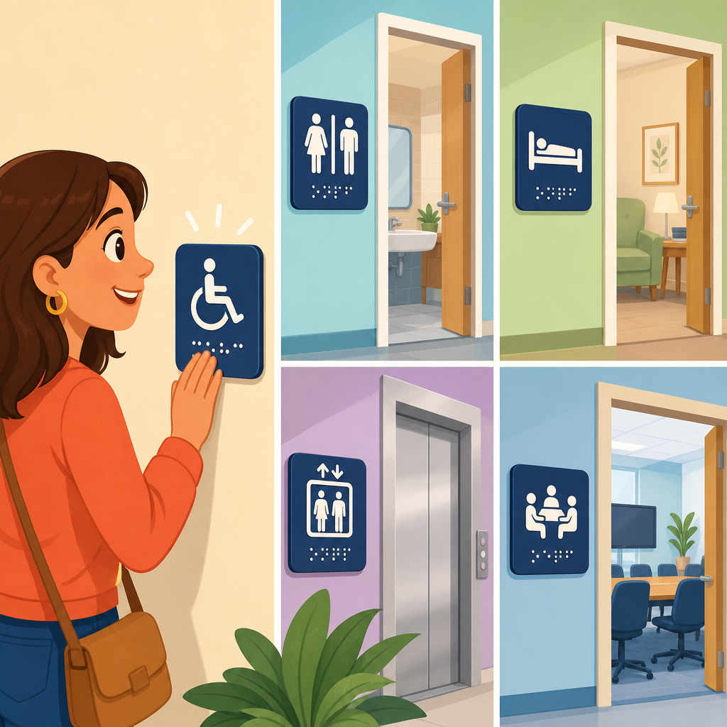
The clearest answer is this: if a sign identifies a permanent room or space, that sign usually needs tactile characters and Braille. Common examples include restrooms, room numbers, exit stair doors, employee break rooms, mail rooms, conference rooms, hotel guest rooms, classrooms, fitting rooms, patient treatment rooms, and utility spaces with fixed functions. On projects I have reviewed, inspectors almost always expect compliant tactile identification at these locations because the sign names the space a person is entering. The sign is not merely decorative or directional; it is the official room identifier.
Doors are often where the requirement is applied, but the rule is about the room or space designation, not the door itself. If a room has no door and is still intended to be permanently identified, tactile signage may still be required at the entrance. Think of a permanently labeled reception area in an open plan clinic or a library reading room with an open entrance. The deciding factor is whether the space is a permanent, designated destination. If the answer is yes, provide tactile identification where a user can locate it consistently.
Spaces that usually do not need tactile identification signs include temporary meeting rooms identified only for an event, open office benching areas without individual permanent names, seasonal retail displays, and purely directional signs such as “Restrooms this way” with an arrow. That said, those signs still need good visual contrast, clear language, and consistent placement to support wayfinding. Many owners overfocus on Braille while underinvesting in basic navigational clarity. The best signage programs do both: they satisfy the technical tactile requirements and create a visual system that helps everyone orient quickly.
Rooms, Areas, and Sign Types Commonly Included or Excluded
Because teams often ask for a checklist, it helps to separate tactile room signs from other sign categories. Identification signs name the space itself. Directional signs point toward a destination. Informational signs explain policy or use. Overhead signs are often read from a distance. Only some of these categories trigger tactile requirements. The most reliable method is to review each sign message against the room’s permanence and the sign’s purpose.
| Sign or Space Type | Tactile Sign Usually Required? | Typical Example | Why |
|---|---|---|---|
| Permanent room identification | Yes | Restroom, Room 204, Electrical Room | Identifies a permanent room or space |
| Permanent exit stair identification | Yes | Stair A, Level 3 | Permanent life-safety destination |
| Hotel guest room numbers | Yes | Room 512 | Permanent room designation |
| Directional signs | Usually no tactile requirement | Restrooms → | Points to a destination rather than identifying the space |
| Building directory | Usually no tactile requirement | Lobby tenant list | Informational, not permanent room identification at the entrance |
| Temporary event signage | No | Training today in Oak Room | Temporary message subject to frequent change |
| Menus and promotional graphics | No | Café menu board | Not a permanent room sign |
| Open office neighborhoods | Case by case | Team area names | Depends on whether the area is permanently designated and bounded |
This breakdown resolves many disputes during design review. For example, a conference room sign reading “Maple Conference Room” requires tactile characters if that room name is permanent. A freestanding sign in the corridor saying “Conference Rooms 101–104” does not serve the same function and is typically not required to be tactile. Likewise, an evacuation map posted on the wall is important, but it is not a tactile room identification sign under the same provision. Different standards may still affect those elements, especially in state codes or fire regulations, but they should not be confused with room identification signage.
Technical Requirements for Tactile Characters, Braille, and Finish
Once a space qualifies, the sign itself must meet specific technical criteria. Raised characters must be uppercase sans serif or simple serif forms, accompanied by Grade 2 Braille placed directly below the corresponding text. Characters must be raised at least 1/32 inch. The finish must be non-glare, and there must be contrast between characters and background, either light-on-dark or dark-on-light. In fabrication meetings, this is where product substitutions often fail. A visually attractive acrylic plaque can still be noncompliant if the text is not sufficiently raised, the Braille dots are poorly formed, or the face is glossy under corridor lighting.
Readability depends on more than Braille presence. Character proportions, stroke width, spacing, and mounting height all affect usability. Condensed fonts, script faces, and decorative type should be avoided on tactile room signs because tactile reading relies on simple, legible forms. Braille translation also needs oversight. I have seen room names, abbreviations, and bilingual signs translated incorrectly when the fabricator relied on automated software without human review. For healthcare and education projects especially, technical terminology should be checked carefully before release for production. A compliant substrate cannot rescue incorrect content.
Symbols may also be required. The International Symbol of Accessibility, restroom pictograms, and other standard symbols are common examples, but symbols follow their own rules. If a pictogram field is used, it must have a minimum clear area, and the tactile text and Braille belong below the pictogram, not inside that field. This detail is missed regularly in custom sign packages. The result looks polished but fails inspection because the room name is embedded within the symbol area rather than separated as required.
Mounting Location, Height, and Door-Side Placement
Correct mounting is as important as sign content. ADA room signs are typically installed on the wall adjacent to the latch side of the door so a person can approach, locate the sign, and read it without standing in the path of the door swing. Where there is no wall space on the latch side, the nearest adjacent wall location may be used. Double doors, push-side conditions, and narrow sidelights create exceptions that need field judgment, but the principle remains consistent: place the sign where it can be reached safely and located predictably.
The standard measurement most teams use is 48 inches minimum to 60 inches maximum above the finished floor to the baseline of the lowest and highest tactile characters, respectively. Installers often simplify this by centering sign programs around a consistent mounting height, but exact placement should still be checked against the character lines on the final approved shop drawing. On renovation projects, existing millwork, access control devices, light switches, and fire alarm pulls can conflict with ideal mounting zones. Resolving those clashes early avoids the common last-week scramble when signs arrive and there is no compliant wall space left.
Door hardware and maneuvering clearance also matter. If a sign is mounted behind an open door, too close to the frame, or in an area blocked by furniture, the sign may technically exist but function poorly. In the field, I advise teams to stand where a user would stand, open the door fully, and confirm the sign can be found by touch without hazard. That practical test catches mistakes drawings miss.
Wayfinding Strategy Beyond Basic Room Compliance
Room identification signs are only one part of accessible signage and wayfinding. A building can pass a narrow room-sign review and still be difficult to navigate. Effective programs combine tactile room signs with logical directories, consistent naming, floor numbering, overhead directional signs, landmark cues, and plain language. In hospitals, for example, people rarely travel to “Room 3B-217” first. They follow a sequence: parking to lobby, lobby to elevator, elevator to department, department to check-in, then check-in to room. Each link in that chain should use consistent terminology. If the lobby directory says “Cardiology,” corridor signs say “Heart Center,” and the room plaque says “Clinic Suite B,” visitors lose confidence quickly.
This is why signage should be coordinated with architectural naming conventions early. For schools, that may mean matching room numbers across life-safety plans, door schedules, and campus maps. For hotels, it means aligning tactile room numbers, elevator jamb markings, amenity signs, and emergency egress information. For multifamily properties, it means treating leasing offices, amenity rooms, trash rooms, and accessible residential common areas as part of one navigational system rather than isolated sign orders. Compliance works best when signage is planned as an integrated wayfinding network, not purchased as an afterthought package at the end of construction.
Project-Specific Scenarios, Mistakes, and Best Practices
Different building types create recurring edge cases. In office buildings, the biggest question is usually whether individual offices need tactile signs. If the offices are permanently designated by room number or function, yes. If they are hoteling rooms booked dynamically and identified only in software, the analysis may differ. In restaurants, restrooms and permanent back-of-house rooms need tactile signs, but changing menu boards do not. In apartment buildings, dwelling unit numbers and common amenity rooms generally require tactile identification, while a temporary leasing promotion sign does not. In schools, classrooms, toilet rooms, administrative offices, and support rooms are standard tactile locations. In healthcare, exam rooms, imaging rooms, laboratories, clean utility rooms, and staff support rooms are commonly included because their functions are fixed and critical.
The most frequent mistakes are predictable: mounting on the door instead of the adjacent wall where the door moves; using all-lowercase or decorative lettering; omitting Braille on room numbers; placing signs too high; ordering reflective metal finishes; and forgetting signs for rooms that are not public but are still permanently designated, such as janitor closets or electrical rooms. Another common problem is inconsistent naming. If construction documents say “Women,” the owner says “Women’s,” and the sign schedule says “Ladies,” someone must reconcile the message before fabrication. Accessibility depends on consistency as much as on dimensions.
The best practice is to build signage review into design development, not punch list. Create a sign location plan, a message schedule, mounting details, and a responsibility matrix that identifies who verifies code, who approves content, and who confirms field conditions. Then walk the site before fabrication. That single step prevents most reorders. If you are updating or specifying signs, audit your building now, compare every permanent room sign to the current standard, and fix the gaps systematically.
ADA room sign requirements are manageable once the underlying rule is clear: tactile signs are required for signs that identify permanent rooms and spaces, and those signs must meet detailed standards for characters, Braille, finish, and mounting location. Everything else in signage and wayfinding builds from that base. Directional signs, directories, and informational graphics still matter, but they serve different functions and are governed differently. When project teams separate those categories, compliance decisions become faster and more accurate.
The main benefit of getting signage right is independence. People can move through a building with less confusion, less delay, and less reliance on staff assistance. Owners benefit too through smoother inspections, fewer change orders, and a wayfinding system that feels intentional rather than patched together. For a sub-pillar hub on ADA accessibility standards, this is the key takeaway: room identification, visual communication, and navigation should be planned as one coordinated accessibility strategy.
If you manage facilities, design interiors, or oversee construction, review your permanent room signs first. Confirm which spaces need tactile identification, verify the technical details, and align the signage package with the rest of your wayfinding system. Then use that foundation to strengthen every other accessibility decision in the building.
Frequently Asked Questions
Which rooms and spaces are required to have ADA tactile signs?
Under the 2010 ADA Standards for Accessible Design, tactile room identification signs are generally required for permanent rooms and permanent spaces. In simple terms, that means areas whose function is not expected to change frequently and whose identity needs to be independently understood by people who are blind or have low vision. Common examples include restrooms, stairwells, exit stair doors, mechanical rooms, electrical rooms, storage rooms, conference rooms, classrooms, employee work rooms, janitor closets, laundry rooms, and hotel guest rooms. In many buildings, enclosed offices and tenant spaces with fixed identities also fall into this category.
The key idea is permanence. If a room or space has a stable designation, it typically needs a sign with raised characters and Braille. By contrast, spaces that are identified only for wayfinding or operational convenience may not always require tactile signage. For example, a temporary meeting room assignment posted on paper, a seasonal use area, or a room whose name changes often may be handled differently. However, building owners should be careful not to assume that a space is “temporary” simply because its occupancy changes. If the room itself is permanently built and consistently serves a defined purpose, tactile identification is often still required.
Because sign requirements can vary depending on the type of facility, local code adoption, and whether International Building Code or fire code provisions also apply, the safest approach is to evaluate each enclosed room and each exit-related space individually. A practical rule is this: if a person needs to identify that specific room at the door, and the room’s function or number is permanent, a tactile sign is usually required.
Do all signs in a building need raised text and Braille?
No. One of the most common misunderstandings is that every sign in an ADA-compliant building must include raised characters and Braille. The ADA does not require tactile features on every sign. Tactile signs are primarily required for signs that designate permanent rooms and spaces. Other types of signs, such as directional signs, informational signs, maps, directories, menus, and temporary notices, usually follow different accessibility rules.
For example, a hallway sign with arrows pointing toward restrooms or elevators is typically considered a directional sign. It may need visual accessibility features such as good contrast and legibility, but it does not automatically require Braille or raised lettering. Likewise, a conference room schedule displayed on a screen or printed insert usually does not need tactile characters if it is a temporary or changeable message. Occupant names on office signs can also create confusion. If the insert with the employee name changes frequently, that changeable portion generally does not need to be tactile, while the permanent room number or room designation may still need to be.
This distinction matters because ADA sign compliance depends on the sign’s function, not just its location. Room identification signs, directional signs, overhead signs, and life-safety signs can each have different design and installation standards. Treating every sign the same can lead to unnecessary cost in some places and compliance gaps in others. A good sign program separates permanent identification signs from directional and temporary signage so each category is designed correctly.
Where must ADA tactile room signs be mounted?
Mounting location is just as important as the sign content. ADA-compliant tactile room signs are generally mounted on the wall adjacent to the latch side of the door, rather than directly on the door itself. This placement allows a person who is blind or has low vision to approach the sign safely, locate it consistently, and read it by touch without standing in the path of a swinging door. If there is no wall space on the latch side, the standards allow alternatives, but the goal remains the same: the sign should be placed where it can be found and read without obstruction.
The installation height also matters. The baseline of the lowest tactile character must be at least 48 inches above the finished floor, and the baseline of the highest tactile character must be no more than 60 inches above the finished floor. These measurements are often misunderstood, especially when signs include logos, decorative elements, or multiple lines of text. What controls is the position of the tactile characters themselves, not necessarily the overall plaque size.
In addition, the sign must be located so a clear floor space is available for a person to approach within reach range. If the sign is placed behind an open door, too close to trim, or on a narrow return wall that prevents approach, the installation can fail even if the sign itself has correct Braille and raised text. In double-door situations, outswinging doors, and recessed entries, careful field coordination is especially important. That is why ADA room signage should be planned during design and verified during installation, not treated as a last-minute accessory order.
What design features must ADA tactile room signs include?
ADA tactile room signs must do more than display raised letters and Braille. The characters identifying the room must be raised and meet requirements for uppercase style, stroke thickness, character spacing, and legibility. Braille must be Grade 2 and positioned directly below the corresponding raised text. The visual presentation also matters: signs must have non-glare finishes and contrast between characters and background so they can be used by people with low vision as well as by touch readers.
The standards separate tactile requirements from visual requirements, which is where many compliance mistakes happen. Raised characters are intended to be read by touch, so they must be simple and clean in form. Decorative, overly stylized fonts can create problems. At the same time, visual contrast is critical for people who do not read Braille but rely on residual vision. A beautifully branded sign can still be noncompliant if the finish is reflective, the contrast is too weak, or the text layout makes the tactile content difficult to locate.
There are also differences between signs mounted at doors and signs viewed from a distance. Overhead exit signs, directional signs, and large wall graphics may follow visual character rules rather than tactile ones. That is why sign specifications should identify exactly which signs are tactile room identification signs and which are not. The most reliable approach is to work from the ADA technical criteria, not from assumptions based on appearance alone. Compliance depends on details such as character type, Braille placement, finish, and readability, all working together.
How can building owners and project teams avoid common ADA room sign compliance mistakes?
The biggest mistakes usually happen when sign compliance is addressed too late or treated as a simple purchasing decision instead of a code coordination issue. Owners, architects, contractors, and sign vendors should first create a room-by-room sign schedule that identifies which spaces are permanent and therefore require tactile signage. That schedule should distinguish permanent room names or numbers from temporary inserts, occupant names, and directional messages. Without that early classification, projects often end up with missing tactile signs in some locations and unnecessary Braille on the wrong sign types in others.
Another common problem is incorrect placement. Even a perfectly manufactured sign can become noncompliant if it is mounted on the wrong side of the door, too high, too low, or where a person cannot approach it safely. Field conditions matter. Door swings, sidelights, borrowed lites, narrow wall space, and last-minute hardware changes can all affect sign placement. Teams should verify actual site conditions before installation and confirm that the tactile character height and approach clearances meet ADA requirements.
Finally, project teams should remember that the ADA is often only one part of the compliance picture. State accessibility codes, building codes, and fire codes may impose additional requirements, especially for exit identification, stairwell signage, and areas of refuge. The most effective process is to coordinate signage during design development, confirm code interpretations before fabrication, and review installation in the field. When signage is integrated into the project early, buildings are far more likely to achieve accessibility, avoid rework, and provide a consistent experience for all users.