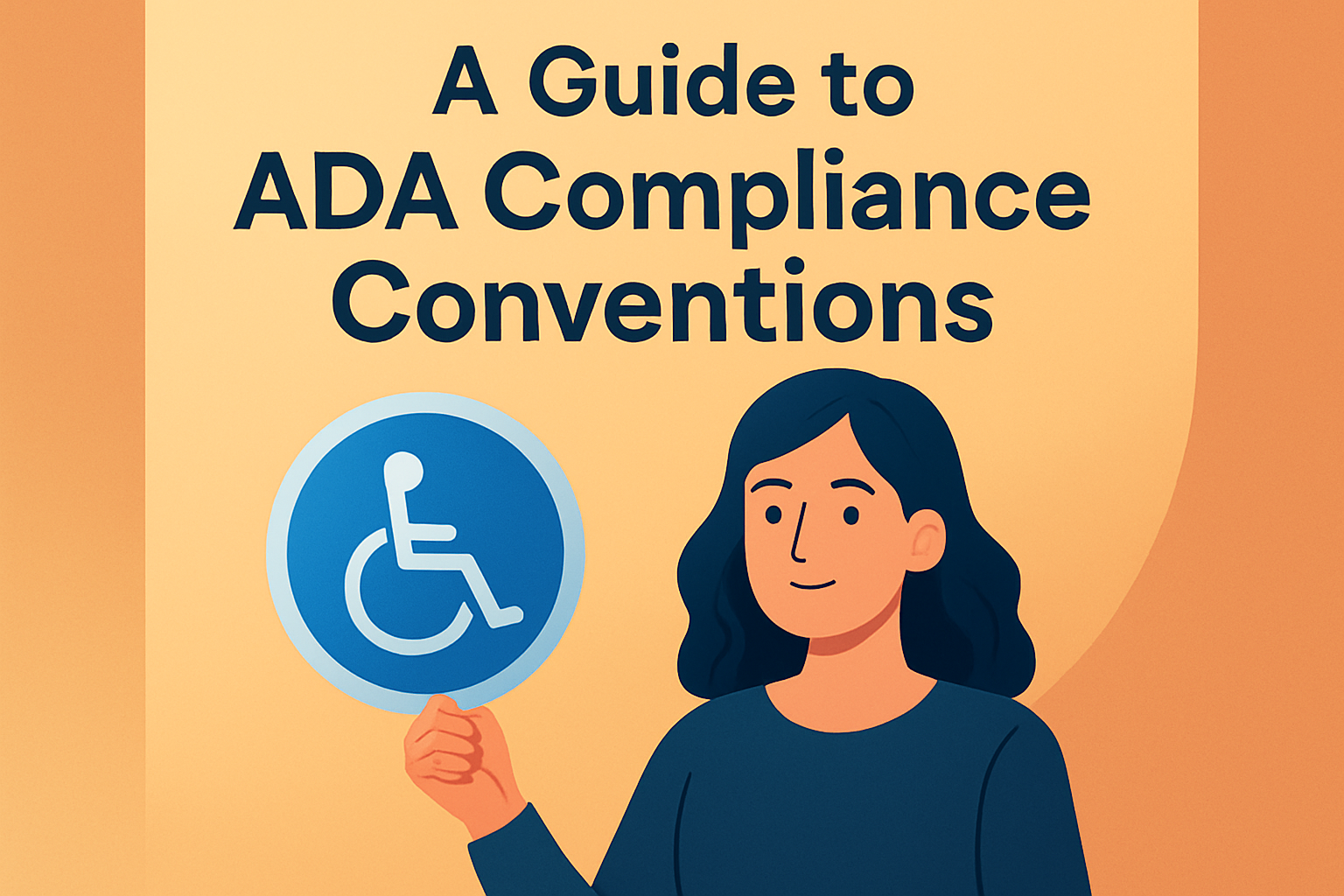
Understanding the Importance and Core Concepts
When it comes to the design of public spaces, inclusivity and accessibility should always be at the forefront of decision-making processes. The Americans with Disabilities Act (ADA) is a landmark piece of legislation aimed at ensuring that individuals with disabilities have equal access to public spaces and services. One crucial aspect of ADA compliance is the proper use of signage, which includes considerations of font legibility and the non-glare finish on signs, allowing everyone, regardless of ability, to navigate public spaces efficiently.
The focus is on making sure that signs can be easily read and detected by those who have vision impairments, ensuring that they can receive the same information as everyone else. Two critical elements in the design of ADA-compliant signs are the fonts used and the finishes applied to the sign surfaces.
The ADA sets out specific requirements for what constitutes legible fonts and non-glare finishes. These components are essential for aiding people with disabilities, particularly those with visual impairments, as they navigate through public buildings and spaces. This article delves into the specifics of these requirements, explaining why they are necessary, how they can be implemented properly, and examining the benefits they offer.
Detailed Specifications for Fonts on ADA Signs
Font legibility is a fundamental component of ADA signage. The ADA guidelines specify that characters on signage should be in sans serif font. A sans serif font lacks the small projecting features called “serifs” at the ends of strokes, making these fonts straightforward and easier to read. Some examples of sans serif fonts include Arial, Helvetica, and Verdana.
The size and style of the font are also regulated. The guidelines state that the characters shall have a height of between 5/8 inches and 2 inches based on the viewing distance. The character spacing should be between 10% and 35% of the character height, which ensures that characters are neither too spread out nor too close together, which can help with readability.
Another important factor is the contrast between the characters and the background of the sign. Letters must have a contrast of at least 70% with their background, meaning that there should be a clear visual differentiation between the text and its backdrop to make it easier for those with vision impairments to perceive the information. Contrasting colors like black and white are often employed to meet these requirements effectively.
Real-world Illustration: Public Restrooms in Shopping Malls
An example of proper implementation of these font guidelines can be seen in public restrooms in shopping malls. The signage for restrooms often uses clear, bold sans serif fonts to ensure visibility and compliance. The characters are usually large enough to be seen from a distance, fulfilling the minimum and maximum height requirements. Additionally, these signs frequently employ high contrast, with white lettering on a dark blue background or vice versa. This color scheme not only meets ADA contrast requirements but also provides a sleek, professional look suitable for busy environments.
Non-Glare Finish and Its Necessity for ADA Compliance
The second essential component of ADA signs is the implementation of non-glare finishes. A glare finish can make a sign difficult to read, particularly under bright lighting conditions, thereby severely affecting those with vision problems. To counteract this, the ADA mandates that signs have a non-glare finish.
Non-glare finishes are especially vital for tactile signs, which are defined as having raised characters or Braille for those who are blind or have significant vision impairments. Ensuring that these signs have a non-glare finish maximizes visibility and readability under various lighting conditions, making the content accessible to all.
Common non-glare finishes include matte or eggshell finishes. These finishes scatter light rather than reflecting it, reducing glare and resulting in a sign that is readable from multiple angles and lighting conditions.
- Matte finish: Absorbs light, providing a smooth-looking surface that doesn’t reflect light sharply.
- Eggshell finish: Offers a slightly textured surface that diffuses light, balancing readability and aesthetic appeal.
Real-world Illustration: Directional Signage in Airports
Think of directional signs in high-traffic areas like airports. These signs often feature a non-glare matte finish, ensuring that travelers, regardless of the time of day or orientation to light sources, can easily read them. As passengers look at signage from varying distances and angles, the matte finish effectively prevents glare from overhead lighting or natural sunlight. This is a critical element in aiding swift, clear navigation throughout large, busy spaces like airports.
Integrating ADA Signage Specifications with Modern Design
While the ADA provides clear requirements, there is ample room for creativity and design innovation within those guidelines. Sign designers and businesses can explore various materials and technologies to enhance both the functionality and the aesthetic appeal of ADA-compliant signs. The aim is to harmonize the building’s or business’s overall design theme while ensuring complete accessibility.
Materials like acrylic, wood, or metals can be used creatively while maintaining compliance. Also, integrating technology like LED lights behind non-glare surfaces can enhance visibility in low-light conditions. Even tech-forward designs using sensors to provide auditory instructions can be built within ADA parameters. However, these tools should always ensure they serve to enhance, not complicate, accessibility.
| ADA Requirement | Suggested Material/Technology | Advantages |
|---|---|---|
| Sans Serif Fonts | Arial, Helvetica, Verdana | Clear and Legible at Distances |
| Non-Glare Finish | Matte, Eggshell | Reduces Glare, Enhances Visibility |
| High Contrast | Black & White, Navy & White | Ensures Text Stands Out |
| Tactile Elements | Raised Text/Braille | Accessible for Visually Impaired |
Real-world Illustration: Hotels and Hospitality Industry
The hospitality industry provides an excellent example of ADA compliance paired with aesthetic design. Hotels often have diverse signage requirements in areas like lobbies, elevators, and guest rooms. By using sleek materials like brushed metals with non-glare finishes, and sans serif fonts that fit with the hotel’s brand aesthetic, these establishments can provide an elegant design that remains entirely functional for guests with disabilities. Moreover, incorporating LEDs can illuminate signs subtly, ensuring visibility, especially in ambient-lit spaces.
Key Takeaways and Final Thoughts
The ADA mandates for signage are fundamentally about accessibility, ensuring that everyone, regardless of physical ability, can navigate spaces safely and independently. Understanding the requirements for font styles and non-glare finishes is critical in designing compliant signage. These considerations not only meet legal requirements but also enhance the overall user experience by making environments more inclusive to all individuals.
Implementing these requirements isn’t just about compliance; it’s about exercising a commitment to inclusivity that reflects positively on businesses and public institutions alike. By prioritizing accessible signage, institutions signal their dedication to serving all individuals equitably.
The next step for businesses, designers, and architects is to review existing signage or plan new projects with these ADA standards at the core. Consultation with accessibility experts or ADA compliance specialists can offer invaluable insights and ensure that every aspect of signage aligns with legal and ethical standards.
In conclusion, ADA signage is a vital part of accessibility infrastructure, where attention to the finer details such as font choice and sign finish can make a world of difference. These features encapsulate a blend of compliance, functionality, and aesthetics that benefits everyone, encouraging inclusive access throughout shared spaces.
Frequently Asked Questions
1. What are the specific font requirements for ADA-compliant signage?
When it comes to ADA-compliant signage, the goal is to ensure maximum readability for individuals with various visual impairments. The guidelines specify that the font chosen for signs must be sans-serif, which means that it should not have the small projecting features called “serifs” at the end of strokes. This includes fonts like Helvetica, Arial, and Univers. The use of serif fonts, such as Times New Roman, is discouraged because they can be more challenging for people with vision problems to read. Furthermore, the text on ADA signs should be in all uppercase letters to enhance readability. It is also important that the font size be adequate, generally recommended as a minimum of 5/8 inch height, depending on the sign’s location and viewing distance. The character spacing must also be sufficient so that individual letters are clear and distinct. Overall, the objective is clarity and legibility to ensure that everyone, regardless of vision capability, can access and comprehend the information provided by the signage.
2. Why is a non-glare finish important for ADA signs and what does it entail?
A non-glare finish on ADA signs is crucial because glare can obscure the text and make it difficult for individuals with visual impairments to read the signage. Glare can occur due to reflections from overhead lighting, direct sunlight, or other light sources that can bounce off the surface of a sign. This can be particularly problematic for individuals with vision conditions such as macular degeneration, cataracts, or other forms of low vision, as their eyes do not adjust to glare as effectively. To comply with ADA standards, signs must have a matte or other non-glossy finish to minimize reflections. This means choosing materials and coatings for the signs that diffuse light rather than reflecting it straight back at the viewer. By addressing these factors, sign designers ensure that the information on the sign remains visible and legible under various lighting conditions, thus providing equal access to all individuals.
3. How do font size and contrast play a role in ADA signage requirements?
Font size and contrast are pivotal in creating ADA-compliant signs because they directly impact the sign’s legibility and visibility. The ADA guidelines require that fonts on signs be of an appropriate size to be easily readable from the intended viewing distance. Generally, the characters should have a minimum height of 5/8 inch; however, it should be adjusted depending on the specific environment and distance at which the sign is to be read. Another critical factor is the contrast between the text and the sign’s background. The ADA specifies that there should be a contrast in lightness, also known as LRV (Light Reflectance Value), between the text and its background. A high level of contrast ensures that the text stands out clearly, making it more readable especially for those with impaired vision. For instance, a white font on a dark background or vice versa is generally more visible than low-contrast color combinations. Proper use of font size and contrast makes sure that all individuals, regardless of their visual capabilities, have equal access to the information displayed on the signage.
4. Are there requirements for the positioning and mounting of ADA signs?
Yes, the positioning and mounting of ADA signs are governed by specific requirements that ensure they are accessible to all individuals, including those using wheelchairs or with limited reach. According to ADA guidelines, signs containing tactile characters such as braille should be mounted 48 inches minimum and 60 inches maximum above the floor or ground surface to the baseline of the lowest tactile character. This height range accommodates individuals of various heights and those using wheelchairs. Furthermore, signage should be placed on the latch side of doors to ensure that they are visible, and in a position where a person can approach within three inches of the tactile characters without encountering obstructions such as open doors or freestanding objects. These guidelines ensure that ADA signage is placed in a manner that is convenient and accessible to all potential users, promoting inclusivity across different public spaces.
5. What kinds of spaces require ADA-compliant signage?
ADA-compliant signage is required in a wide range of public spaces to ensure equal access and usability for all individuals, including those with disabilities. This includes but is not limited to government buildings, schools, hospitals, transportation facilities, hotels, retail establishments, and any other places of public accommodation. Essentially, any area open to the public or where a public service is provided must consider ADA requirements for signage. This includes both exteriors and interiors of buildings and covers a myriad of signs such as those used for room identification, directional signs, informational signs, and regulatory signs. Whether directing someone to a restroom or providing emergency evacuation routes, ADA signage plays a critical role in ensuring all users can navigate these spaces safely and efficiently. Each of these signs must adhere to the ADA guidelines for readability, visibility, and accessibility, promoting a more inclusive environment for everyone.