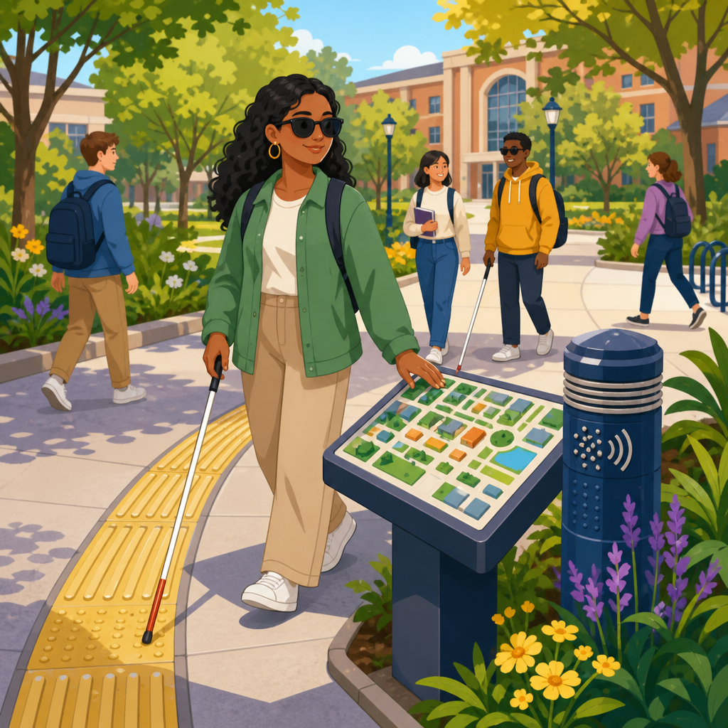
Campus wayfinding for blind and low-vision visitors requires far more than meeting minimum signage rules, because navigation succeeds only when people can move independently, safely, and with confidence from the sidewalk to the classroom, clinic, stadium, or residence hall. In accessibility work, wayfinding means the full system that helps a person understand where they are, decide where to go, and follow a usable route. Signage is one part of that system, but so are maps, tactile cues, lighting, digital directions, staff practices, building numbering, transit stops, landmark consistency, and the continuity of accessible paths. Blind visitors may rely on screen readers, canes, guide dogs, orientation and mobility skills, and auditory or tactile information. Low-vision visitors often depend on high contrast, predictable layouts, glare control, larger type, and clear spatial organization. When campuses focus only on code-minimum room signs beside doors, they leave major gaps at entries, intersections, plazas, parking lots, and outdoor circulation where most navigation decisions actually happen.
I have audited higher education campuses where interior identification signs technically complied, yet visitors still got lost between the parking deck and the admissions office because exterior routes had weak landmarks, inconsistent numbering, and no reliable arrival cues. That pattern is common. The Americans with Disabilities Act establishes baseline obligations, while related standards such as the 2010 ADA Standards for Accessible Design and guidance from the U.S. Access Board address tactile characters, Braille, mounting height, and visual contrast principles. Those requirements matter, but they are the floor, not the finish line. A campus is a small city with layered destinations, temporary detours, mixed transportation modes, and first-time users under stress. Prospective students, patients, conference guests, and parents need wayfinding that works on day one, without local knowledge.
This hub page explains signage and wayfinding comprehensively for the ADA accessibility standards context, with a focus on blind and low-vision visitors. It covers the core components of an effective system, where minimum signage falls short, how to assess an existing campus, and what improvements produce the biggest gains. The central principle is simple: accessible wayfinding is not a single sign package. It is an operational system that combines compliant signs, orientation planning, route design, digital content, and maintenance. Campuses that build that system reduce missed appointments, improve safety, support inclusion, and make every future capital project easier to navigate.
Why minimum signage fails on real campuses
Minimum signage requirements usually concentrate on permanent room identification, selected exits, and accessible features inside buildings. Those elements are necessary, but they do not solve the wider campus journey. A blind visitor arriving by rideshare still needs to identify the correct drop-off point, confirm the building entrance, distinguish the public door from a service door, and locate the reception desk after entering a large lobby. A low-vision visitor may be able to read a compliant room sign at close range but still struggle to find the sign if lighting is uneven, the corridor lacks visual hierarchy, or directional information is placed too late for decision-making.
Campuses are especially difficult because they evolve over decades. Building names change after donors, departments relocate, and temporary construction reroutes pedestrian traffic. I frequently see three naming systems at once: a historic building name on the façade, a short abbreviation on printed maps, and a newer donor name in event materials. That inconsistency creates preventable confusion for every visitor, and it is magnified for people who cannot rely on distant visual confirmation. Minimum signage does not address governance, naming discipline, or route consistency, yet those factors directly determine whether a person can arrive independently.
Another common failure is the assumption that Braille equals accessibility. Braille on a room sign is important, but Braille helps only when the visitor has already reached the correct door. It does not guide someone across a quadrangle, through a complex student union, or around a closed path. Effective campus wayfinding therefore starts earlier, at trip planning and arrival, and continues through every decision point until the destination is reached.
The building blocks of accessible campus wayfinding
An accessible wayfinding system has five linked layers: pre-arrival information, arrival cues, route guidance, destination confirmation, and recovery support when something goes wrong. Pre-arrival information includes accessible websites, event directions, parking instructions, and digital maps that work with screen readers. Arrival cues include audible transit announcements, identifiable building addresses, consistent drop-off zones, and entrance markers. Route guidance covers directional signs, tactile indicators where appropriate, landmark-based instructions, and logical circulation patterns. Destination confirmation means the user can verify, with tactile and visual information, that they have reached the right building, floor, suite, or service point. Recovery support means a visitor can reorient after a wrong turn through help points, staff training, or reliable mobile directions.
These layers must align. If a website tells visitors to enter through the “north lobby,” but exterior signs say “main entrance” and staff say “front desk entrance,” users lose confidence immediately. Consistency is more important than cleverness. The best campus systems use the same building names, route terms, and landmark descriptions across maps, signs, parking instructions, and verbal directions. They also prefer plain language over institutional shorthand. “Turn right after the library café” is more usable than “proceed eastbound to the humanities connector.”
Low-vision usability depends heavily on visual ergonomics. Sans serif typefaces, strong contrast, non-gloss finishes, disciplined placement, and avoidance of visual clutter are practical necessities. Blind usability depends on detectable structure, predictable paths, and information available through touch or audio at the right moment. In both cases, timing matters. A sign placed after an intersection is far less useful than one placed before the decision point.
Core design priorities for signs, maps, and routes
Good signage and wayfinding programs prioritize decisions, not decoration. Directional signs should appear where a person must choose between paths, not simply where there is empty wall space. Exterior signs need legible scale, especially on large campuses where viewing distances are long and lighting changes throughout the day. Maps should orient users clearly with a “you are here” marker, simple landmark labeling, and accessible digital equivalents. Tactile maps can be valuable at major hubs such as visitor centers, transit stations, and medical complexes, but they must be current, durable, and paired with verbal or digital support.
Route design matters as much as sign design. If the accessible path is indirect, crosses service areas, or changes unpredictably between outdoor and indoor segments, visitors experience cognitive overload. Whenever possible, campuses should align the accessible route with the primary route rather than hiding it at the back. This is both more dignified and easier to explain. Landmarks should be intentional and stable: a fountain, sculpture, reception desk, elevator bank, or textured paving edge can all anchor mental mapping if they are consistently described.
| Wayfinding element | Minimum approach | Better campus practice | Visitor benefit |
|---|---|---|---|
| Building identification | Name on façade only | Name, street address, and consistent map label at main approach | Confirms arrival before entry |
| Room signs | Tactile sign beside door | Tactile sign plus advance directional signs at decision points | Reduces wrong turns in corridors |
| Campus maps | Decorative print map | High-contrast map with accessible digital version and landmark cues | Supports both low-vision and screen-reader users |
| Accessible entrances | Small symbol at side door | Primary entrance access or clear guidance from main arrival zone | Improves dignity and route clarity |
| Construction detours | Temporary paper notice | Accessible rerouting plan with updated digital and on-site directions | Keeps routes usable during change |
Applying ADA accessibility standards without stopping there
ADA accessibility standards set essential technical expectations for permanent room signs, tactile characters, Braille, mounting location, and the identification of accessible features. Teams should also reference the U.S. Access Board, applicable building codes, and state requirements, especially on public university campuses. Compliance reviews should verify character height, contrast, finish, and placement consistency. However, compliance alone does not measure navigability. A campus can pass a sign schedule review and still fail a visitor trying to find disability services from the bus stop.
That is why I recommend evaluating performance in addition to compliance. Can a first-time blind visitor independently travel from parking to admissions? Can a low-vision parent find the correct arena entrance during an evening event? Can a patient reach an after-hours clinic when standard reception points are closed? These are operational questions, not just design questions. The answers often reveal missing links such as poor website directions, unlabeled exterior paths, or staff who give visual-only instructions like “go over there.”
Standards should therefore anchor procurement and design, while user testing shapes the final system. Orientation and mobility specialists, disability services staff, blind students, low-vision faculty, and community members can identify barriers that drawings miss. Their input often changes placement, wording, or route descriptions in practical ways that improve the entire campus experience.
Digital wayfinding, mobile access, and pre-arrival planning
For many visitors, wayfinding begins online. If the campus website is inaccessible or vague, the trip is already harder. Every major destination page should include a plain-language directions section with parking information, transit options, exact entrance guidance, and a phone number answered by trained staff. PDF maps alone are not enough. Provide structured web content that screen readers can parse, with headings, descriptive links, and text alternatives for map features. If you offer an interactive map, test keyboard access, focus order, labeling, and mobile usability.
Mobile wayfinding tools can help, but only when data is accurate and routes are curated. Generic GPS often struggles with dense campuses, stacked pathways, or entrances set back from roads. Some institutions have improved outcomes by creating landmark-based walking directions for key destinations and integrating them into event confirmations. For example, a message might state: “From the accessible drop-off on College Avenue, follow the straight sidewalk 150 feet to the glass atrium entrance. Reception is directly ahead. Elevators are on the right.” That level of specificity reduces uncertainty more than a pin on a map.
Audio description and turn-by-turn tools are promising, yet they should supplement, not replace, physical improvements. Batteries die, signals drift, and visitors may not want to download an app for a one-time appointment. The most resilient strategy pairs digital guidance with strong on-site cues.
Operations, maintenance, and construction detours
Even excellent wayfinding systems break down when campuses treat them as one-time installations. Signs fade, landscaping obscures sightlines, directories go out of date, and temporary events block accessible routes. Construction is the biggest recurring failure point. A closed walkway that is easy for sighted pedestrians to improvise around can become a dead end for a blind traveler if no accessible detour is clearly established and communicated in advance.
Every campus should maintain a wayfinding governance process. That includes a naming authority, sign standards manual, update schedule for maps and directories, and a detour protocol requiring accessible rerouting before barricades go up. Facilities, communications, transportation, disability services, and campus police all need roles. Frontline staff should know how to give concise, landmark-based directions and how to summon assistance without taking over unnecessarily. Independence is the goal; respectful support is the backup.
Routine audits are essential. I advise checking major visitor paths at least annually and after every capital project. Test in daylight and after dark. Review seasonal issues such as snow storage, leaf cover on tactile cues, and glare from low winter sun. Small maintenance lapses often create disproportionate barriers for low-vision users.
How to assess and improve an existing campus
Start with the highest-impact journeys rather than trying to fix everything at once. Typical priority routes include parking or transit to admissions, student services, health centers, libraries, residence halls, athletic venues, and event spaces. Map each journey step by step: pre-arrival instructions, arrival, entry, vertical circulation, and destination confirmation. Then conduct walkthroughs with blind and low-vision participants, orientation and mobility professionals, and facilities staff. Record where people hesitate, ask for help, or miss a turn.
Next, categorize findings into quick wins, capital improvements, and policy changes. Quick wins might include rewriting web directions, increasing contrast on key signs, or adding directional signs before intersections. Capital improvements could involve reworking entrances, lighting, or path alignments. Policy changes often have the longest reach: standardizing building names, requiring accessible event directions, or mandating detour review for every construction project. Measure success through reduced escort requests, fewer late arrivals, better visitor feedback, and smoother special events.
This signage and wayfinding hub should connect to deeper resources on tactile signage, Braille specifications, accessible maps, exterior path design, digital accessibility, and construction detour planning. As the central page in the signage and wayfinding cluster, it establishes the core idea that accessible navigation is a campus-wide system. When institutions move beyond minimum signage and design for real journeys, blind and low-vision visitors gain what accessibility is supposed to provide: independent, reliable access. Review your highest-traffic routes, test them with actual users, and make wayfinding a standing operational priority.
Frequently Asked Questions
Why isn’t minimum ADA-compliant signage enough for campus wayfinding?
Minimum compliant signage is important, but it does not, by itself, create a complete wayfinding experience for blind and low-vision visitors. Signage standards generally address specific characteristics such as tactile text, braille, contrast, mounting height, and placement at certain doors or permanent rooms. Those requirements help identify destinations once someone is already at the correct location, but they often do very little to help a person travel from a bus stop, parking area, campus entrance, or sidewalk to that location in the first place. On a large campus, the real challenge is not just reading a room number; it is understanding the overall environment, choosing a logical route, recognizing decision points, avoiding hazards, and confirming arrival with confidence.
Effective campus wayfinding therefore has to function as a system rather than a checklist. A visitor may need accessible pre-visit directions, a digital or tactile map, predictable pedestrian pathways, clear landmarks, consistent building entrances, audible or tactile cues at key transitions, and lighting that supports low-vision travel. If any one of those elements is missing, the user may still become disoriented even when the building technically has compliant signs. In practice, independent navigation depends on continuity of information before, during, and after the trip. That is why campuses that want to be truly welcoming must move beyond minimum signage rules and design for the entire journey.
What elements make up a strong wayfinding system for blind and low-vision visitors?
A strong wayfinding system combines environmental design, communication tools, and operational consistency. At the environmental level, people need routes that are clear, direct, and easy to follow, with stable pedestrian paths, detectable edges, logical intersections, and cues that distinguish one area from another. Tactile ground indicators, cane-detectable features, consistent sidewalk alignments, changes in texture used appropriately, and well-defined entrances can all support orientation and mobility. For low-vision users, lighting quality, glare control, color contrast, legible typography, and easy-to-recognize landmarks are especially important. Good wayfinding also reduces unnecessary complexity by minimizing ambiguous route choices and ensuring that important access points are easy to identify.
At the information level, the best systems provide guidance in multiple formats. That can include accessible web directions, downloadable campus maps that work with screen readers, tactile maps at major gateways, straightforward verbal directions from staff, and signage that is both tactile and highly visible. Many campuses also benefit from mobile-friendly wayfinding information that describes entrances, curb ramps, accessible drop-off zones, elevator access, and route disruptions. Just as important is consistency: if naming conventions, building identifiers, entrance locations, or directional messages change from one part of campus to another, users must work harder to interpret the environment. A strong system is one that helps a person answer three questions at every stage: Where am I, where do I need to go, and how do I know I am still on the right route?
How do tactile cues, maps, and landmarks improve navigation on a campus?
Tactile cues, maps, and landmarks help transform a large and often visually complex campus into an environment that can be understood and remembered. Tactile cues can provide nonvisual information about path edges, intersections, platform boundaries, stairs, ramps, or important transitions between outdoor and indoor spaces. When designed carefully, they help users maintain direction, detect hazards, and identify decision points without relying solely on sight. The key is thoughtful placement and consistency. Tactile information should communicate meaningful changes in the route, not create clutter or confusion through overuse.
Maps and landmarks add the orientation layer that many campuses are missing. A tactile map near a main entrance, transit stop, medical center, or student services hub can give users an overview of building relationships, route options, and major destinations before they begin moving. Memorable landmarks such as a fountain, textured wall, distinctive entry canopy, sculpture, sound source, or consistent planting edge can help people build a mental map and confirm location along the way. For low-vision visitors, visually prominent landmarks with strong contrast and clear silhouettes are especially helpful. Together, these tools allow navigation to become more than trial and error. They support route planning, reinforce confidence, and reduce the cognitive load of traveling through an unfamiliar campus.
What common campus wayfinding problems create barriers for blind and low-vision visitors?
Some of the most common barriers arise when campuses assume that people can fill in missing information visually. For example, a route may look obvious on a printed visitor map but offer no detectable cues in the real environment. Entrances may be architecturally dramatic but difficult to identify from the sidewalk. Pedestrian paths may split without clear differentiation, or accessible routes may be indirect, poorly maintained, or interrupted by temporary obstacles such as sandwich boards, planters, parked scooters, construction detours, or outdoor seating. In many cases, signage appears only at the destination rather than at the points where a traveler actually needs guidance, such as street crossings, path intersections, transit stops, plaza edges, and building approach zones.
Lighting is another frequent issue, especially for low-vision users. Glare, deep shadows, inconsistent illumination, and low-contrast materials can make stairs, doors, and route edges difficult to detect. Interior transitions can also be problematic when lobbies are oversized, echoing, crowded, or visually busy, with no clear path to reception, elevators, or stairs. In addition, campuses often overlook the importance of accurate digital information. A website may list an address without clarifying which entrance is public, accessible, or easiest to locate. These barriers are not just inconveniences; they can undermine independence, increase stress, and create safety risks. Identifying and correcting them requires evaluating the campus from the user’s perspective rather than from a purely code-based perspective.
How can campuses evaluate and improve wayfinding for blind and low-vision visitors?
The most effective improvements begin with a user-centered assessment. Campuses should review the full visitor journey, from trip planning to arrival, building entry, interior circulation, and return travel. That means looking at websites, parking instructions, transit connections, maps, sidewalks, crossings, exterior landmarks, door hardware, lobby layouts, elevator identification, and room-finding information as parts of one connected experience. A technical code review is valuable, but it should be paired with real-world route testing. The best insights often come from orientation and mobility specialists, blind and low-vision users, disability services staff, facilities teams, and visitor-facing departments working together to identify gaps.
Improvement usually involves both physical and operational changes. Physical upgrades may include clearer and more consistent signage, tactile maps at key locations, better path definition, improved lighting, reduced glare, higher-contrast finishes, more legible entrance identification, and removal of protruding or temporary obstacles. Operational improvements may include staff training on giving useful verbal directions, accessible online route descriptions, temporary wayfinding plans during construction, and regular maintenance standards so accessible paths remain usable. The goal is not simply to add more signs. It is to create a dependable, layered wayfinding system that works across different abilities, times of day, weather conditions, and visit types. When campuses take that broader approach, they make navigation more intuitive, safer, and more dignified for everyone.