Accessible exit signs and areas of refuge are core parts of compliant wayfinding because they help every occupant, including people with vision, hearing, cognitive, and mobility disabilities, locate a safe path during daily use and emergencies. In ADA Accessibility Standards work, signage and wayfinding cover far more than putting words on a wall. They include sign location, tactile characters, Braille, visual contrast, illumination, mounting height, symbol use, directional information, and coordination with life safety systems. Areas of refuge add another critical layer. These protected locations, typically associated with stair enclosures in multistory buildings, give people who cannot use elevators or stairs independently a place to wait for assisted evacuation and to communicate with responders. When I review buildings, problems usually come from fragmentation: the architect addresses aesthetics, the code consultant addresses egress, and the sign vendor addresses fabrication, but no one verifies the entire user journey from occupied room to final exit discharge.
That is why this subject matters. A wayfinding system that works only for people who read small print, move quickly, or already know the building is not truly accessible. Good exit signage and refuge identification reduce hesitation, support code compliance, and improve life safety under stress. They also connect several regulatory frameworks. The ADA Standards govern accessible signs in many permanent rooms and spaces. The International Building Code and NFPA 101 address means of egress, exit signs, and areas of refuge. ICC A117.1 supplies technical accessibility criteria referenced by many jurisdictions. Fire alarm standards and emergency communication requirements also affect how people receive instructions. A practical hub article must explain how these layers fit together. The goal is simple: create signage and wayfinding that people can perceive, understand, and trust when seconds matter, while also supporting everyday navigation in schools, offices, hospitals, hotels, transportation facilities, and multifamily common areas.
What accessible exit signs include and where designers get tripped up
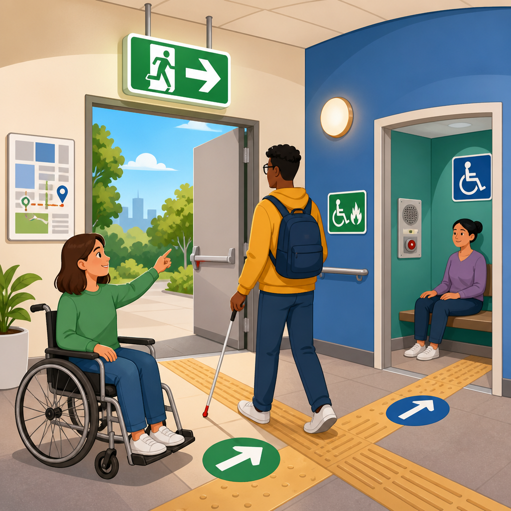
Accessible exit signs are not just the illuminated red or green signs over doors. In practice, wayfinding for exits includes the internally or externally illuminated sign identifying the exit, directional signs that route occupants toward the nearest accessible means of egress, signs identifying stair levels and reentry conditions, tactile room identification signs at exit stair doors where required, and maps or directories that support orientation before an emergency begins. The ADA side of the equation mostly governs permanent room and space identification signs with tactile characters and Braille, while model building and fire codes govern the illuminated exit marking system. Designers often confuse these categories and either over-specify tactile features where they are not required or omit accessibility features from signs that users need for independent navigation.
A common example is the exit stair door in a multistory office building. The door may need a stair identification sign with floor level, roof access information, and stair reentry details under the life safety code adopted by the jurisdiction. If that door serves as a permanent room or space, tactile characters may also be required on the latch side under accessibility standards. Another recurring issue is directional signage at inaccessible exits. If a building has exits that are not part of an accessible means of egress, occupants must be directed to the nearest accessible route. I routinely see renovated facilities with beautiful new lobby signs but no accessible egress directional signs in rear corridors, parking levels, or service areas. That omission is not merely technical; it leaves wheelchair users, people with walkers, and visitors unfamiliar with the building without clear guidance during an emergency.
Areas of refuge explained in plain terms
An area of refuge is a protected location where a person who cannot immediately use stairs can wait for assistance during an emergency evacuation. In modern codes, areas of refuge are often provided within or adjacent to a smokeproof enclosure, interior exit stairway, or horizontal exit, though some buildings use other approved assisted rescue locations depending on occupancy, sprinkler protection, and the specific code edition. The concept is straightforward: provide separation from fire and smoke, enough space for mobility devices without reducing required egress width, and a reliable method to communicate with emergency personnel. Signage is essential because a refuge area that occupants cannot identify quickly does not function as intended.
These spaces are especially important in buildings where evacuation elevators are not provided or where occupants may need phased evacuation. Hospitals, higher education buildings, government facilities, arenas, and high-rise offices all benefit from clearly identified refuge strategy, though the exact technical requirements differ by occupancy and code. In my field reviews, the most successful installations pair code-compliant signs with intuitive placement. People should encounter directional information before they reach a dead end or a locked cross-corridor door. They should also see confirmation signage at the refuge location itself, along with communication instructions stated in simple language. If a two-way communication system connects to a central control point, the sign should tell the user what will happen after pressing the call button. Reducing uncertainty is part of accessibility, especially for people with cognitive disabilities or heightened anxiety in emergencies.
Core signage and wayfinding requirements that shape compliant design
Several technical rules drive accessible signage performance. For tactile room identification signs, raised characters must be uppercase sans serif or simple serif, accompanied by contracted or Grade 2 Braille where required by the applicable standard. Character height, stroke width, spacing, and mounting location matter because a sign can have the right words and still be noncompliant if the tactile text is too high, too low, or placed on the wrong side of the door. Visual characters need non-glare finishes and contrast with the background, whether the sign is photopolymer, engraved acrylic, ADA raster bead, or another durable method. Mounting is typically on the latch side of the door, but double-leaf doors, doors with sidelites, and narrow frame conditions require careful interpretation so the sign remains reachable and predictable.
For exit wayfinding, illumination, letter size, placement, and directional arrows follow building and fire code criteria rather than the tactile sign rules. The key planning principle is consistency. Occupants should not have to decode different symbols, colors, or arrow logic from one floor to another. If your facility uses the International Symbol of Accessibility to identify accessible routes to exits or refuge areas, it should be applied consistently and only where accurate. Overlabeling creates mistrust. Another important detail is finish and reflectance. I have seen brushed metal signs with low contrast installed in dim corridors because they matched interior design palettes. They photographed well but were hard to read for older adults and people with low vision. Durable matte surfaces with strong contrast outperform fashionable low-contrast aesthetics every time in a life safety context.
How exit signs, refuge signs, and accessible means of egress work together
Occupants do not experience codes in separate chapters; they experience one path of travel. That path starts at a workstation, classroom seat, hotel room, patient area, or retail aisle and continues through corridors, intersections, doors, stairs, and exit discharge. Accessible means of egress signage ties this sequence together. If an accessible route to an area of refuge or an exit stair exists, the directional signs should begin early enough to influence decisions, not merely confirm them after the person has already committed to a route. In large facilities, this often means placing direction signs at elevator lobbies, major corridor intersections, and transitions between public and staff-only circulation zones.
Facilities teams should also coordinate signage with emergency plans and staff training. If signs direct people to an area of refuge but staff are trained to move them elsewhere, users will receive conflicting information. The best projects align architecture, code analysis, operations, and emergency management. Universities often do this well when they integrate refuge locations into campus emergency maps, mobile wayfinding apps, and resident assistant training. By contrast, many existing commercial buildings have compliant components but poor system logic: an exit sign above a door, no directional sign at the prior intersection, an area of refuge call box hidden behind the door swing, and no visible instructions after arrival. Compliance should be measured by user success, not by counting plaques.
| Wayfinding element | Main purpose | Typical governing source | Common field mistake |
|---|---|---|---|
| Illuminated exit sign | Marks the exit door or path | IBC, IFC, NFPA 101 | Wrong placement or poor visibility around corners |
| Accessible egress directional sign | Routes users to an accessible exit or refuge | IBC with accessibility coordination | Missing at inaccessible exits and major intersections |
| Area of refuge identification sign | Confirms protected waiting location | IBC, NFPA 101, ICC A117.1 references | No clear instructions or communication notice |
| Stair identification sign | Provides floor, stair name, and reentry data | IBC, fire code, local amendments | Information omitted after renovation |
| Tactile door sign | Identifies permanent room or space | ADA Standards, ICC A117.1 | Mounted on the door instead of latch-side wall |
Designing for different disabilities, not a single average user
Accessible wayfinding fails when it assumes one type of disability. A blind user may rely on tactile signs at doors, predictable placement, and verbal assistance from staff. A low-vision user may depend on large, high-contrast visual text, even lighting, and reduced glare. A deaf or hard-of-hearing occupant may need visible communication devices and text instructions instead of audio-only announcements. A wheelchair user needs routes that remain usable all the way to the refuge area, including maneuvering clearances near the sign and call station. People with cognitive disabilities often benefit from short wording, familiar symbols, and consistent route logic. These needs overlap but are not identical.
In airports and hospitals, I have seen effective systems use layered communication: overhead directional signs for long-distance guidance, wall-mounted signs at decision points, tactile identification at doors, and emergency instructions beside communication devices. That layering matters because no single sign serves everyone equally well. Color coding can help frequent users but should never be the only cue. Audible systems can support some users but cannot replace visual and tactile information. During emergencies, smoke, crowding, stress, and power transitions degrade perception for everyone, which is another reason to favor simple messaging and redundant cues. Accessibility standards set minimums, but a strong wayfinding strategy goes beyond minimum compliance to improve comprehension under real conditions.
Installation, maintenance, and retrofit strategy for existing buildings
Most signage failures happen after design. Signs are mounted too high by field crews, placed on the hinge side because furniture blocks the latch side, covered by temporary notices, or replaced piecemeal after tenant improvements. Existing buildings present extra challenges because legacy code conditions, narrow walls, decorative finishes, and phased renovations can produce inconsistent signage across floors. The solution is a documented sign location plan, a message schedule tied to life safety drawings, and a final punch walk focused specifically on accessibility and egress wayfinding. I always recommend checking signs in low-light conditions and from multiple approach angles, not just against elevation drawings.
Retrofit projects should start with a gap assessment. Inventory all exits, stairs, refuge areas, inaccessible egress points, communication devices, and permanent room identification signs. Then compare them to the currently adopted ADA-related and life safety requirements in your jurisdiction. Prioritize corrections that affect emergency decision-making first: missing accessible egress directionals, unidentified refuge locations, unreadable stair signs, and absent instructions at two-way communication stations. After that, standardize visual design, materials, and naming conventions. Facilities with multiple buildings should also harmonize terminology. If one building says “Area of Refuge,” another says “Assisted Rescue,” and a third labels the same concept only on evacuation maps, users and staff will hesitate. Consistent language saves time when stress is high.
Best practices for a signage and wayfinding hub within ADA Accessibility Standards
As a hub topic, signage and wayfinding should connect exit signs and areas of refuge to adjacent accessibility subjects: door clearances, stair design, alarms and notification appliances, emergency evacuation plans, elevator communication, parking-to-entry routes, and tactile room identification. In practice, the strongest programs create a standards manual that defines typography, contrast ratios, mounting details, message hierarchy, approved pictograms, and coordination checkpoints with fire protection, security, and interiors teams. Tools like Bluebeam for field verification, Revit sign schedules, and digital asset databases help maintain consistency over time. For owners with large portfolios, annual life safety audits should include sign condition and message accuracy, not just extinguisher tags and alarm tests.
The central benefit of accessible exit signage and clearly marked areas of refuge is confidence. People move more safely when the building communicates clearly before and during an emergency. The technical details matter because they shape real outcomes: whether a visitor finds the accessible egress route without asking, whether a stair door sign confirms reentry, whether a refuge call station is obvious and understandable, and whether responders receive reliable location information. If you manage, design, or renovate facilities, treat signage and wayfinding as a life safety system, not a decorative afterthought. Audit what exists, correct the gaps, and build a coordinated standard your team can apply consistently across every project.
Frequently Asked Questions
1. What makes an exit sign or area of refuge sign “accessible” under ADA-related wayfinding requirements?
An accessible exit sign or area of refuge sign does much more than simply display a label. In ADA-related wayfinding, accessibility means the sign is designed, placed, and presented so people with a wide range of disabilities can independently find, identify, and understand the route or location being marked. That includes people who are blind or have low vision, people who are deaf or hard of hearing, people with mobility disabilities, and people with cognitive or processing disabilities.
In practice, accessible signage often involves multiple elements working together. Visual features such as strong contrast between text and background, readable letterforms, non-glare finishes, and adequate lighting help users with low vision read the sign more easily. Tactile characters and Braille are essential where permanent room or space identification is required, allowing users who are blind or have significant vision loss to confirm they are at the correct location by touch. Mounting height and placement also matter because a sign that is technically compliant in content can still fail in real-world use if it is installed too high, hidden behind an open door, or placed in a location that cannot be reached or approached safely.
For exit routes and areas of refuge specifically, accessible wayfinding also depends on clarity. Occupants need directional information that is easy to follow under stress, especially during an emergency. That means consistent terminology, arrows that clearly point toward the route, recognizable symbols where appropriate, and placement at key decision points such as corridor intersections, stair doors, elevator lobbies, and refuge locations. The overall goal is not just code compliance on paper, but practical usability: the sign should help every occupant quickly understand where to go and how to reach safety.
2. When are tactile signs and Braille required for exit-related locations and areas of refuge?
Tactile signs and Braille are generally associated with identifying permanent rooms and spaces, and that principle is highly relevant in exit access and refuge planning. If a space is intended to be identified as an area of refuge, or if a door leads to a permanent space that must be located and confirmed independently, tactile characters and Braille are often part of the compliant signage approach. Their purpose is to allow a person who is blind or has low vision to verify the location without relying only on visual cues or assistance from others.
It is important, however, to distinguish between signs that identify a permanent location and signs that provide direction. Directional signs that guide people toward exits, stairs, or refuge areas are typically handled differently from identification signs. A wall-mounted sign that identifies an actual area of refuge location may need tactile text and Braille, while a directional sign down the corridor pointing users toward that refuge may focus primarily on visual communication, contrast, legibility, and strategic placement. This distinction is one of the most commonly misunderstood parts of ADA wayfinding design.
For building owners and designers, the safest approach is to look at the role of each sign in the user journey. If a person arrives at a door or designated refuge location and needs to confirm by touch that it is the correct place, tactile characters and Braille are critical. If the sign is intended to guide someone from one point to another, then visual clarity, arrow accuracy, and placement at decision points become the priority. In many facilities, both types are needed to create a complete wayfinding system. That is why exit and refuge signage should never be planned as isolated products; it should be designed as part of a coordinated path of travel and emergency communication strategy.
3. Where should accessible exit signs and area of refuge signs be located for effective wayfinding?
Location is one of the most important parts of accessible wayfinding, because even a perfectly designed sign is ineffective if users do not encounter it when they need it. Accessible exit signs and area of refuge signs should be placed where occupants naturally make navigation decisions. That usually includes points where a corridor changes direction, where multiple route options are available, at stair and exit doors, near elevator lobbies when elevators are not part of the accessible means of egress, and directly at the entrance to an area of refuge.
For identification signs, placement relative to the door is especially important. Signs identifying permanent rooms or spaces are commonly mounted on the wall adjacent to the latch side of the door so a person can approach the sign, read it visually or tactilely, and do so without standing in the path of a swinging door. This predictable placement helps users know where to look and improves independent use. If the door configuration prevents standard placement, equivalent accessible placement still needs to be provided.
For directional signs, visibility from the route of travel is key. They should appear before a user reaches a decision point, not after. In a long corridor, for example, a directional sign to an accessible exit route or area of refuge should be seen in time for someone to turn, continue, or change course without backtracking. Sign placement should also account for obstructions such as open doors, furniture, decorative features, or low lighting. In emergency planning, redundancy is wise: if one sign is missed, another should reinforce the route at the next logical point. Effective placement turns individual signs into a usable system, which is exactly what accessible wayfinding is supposed to achieve.
4. How do visual contrast, illumination, symbols, and readable design affect compliance and safety?
These design factors are central to both compliance and real-world safety because they directly affect whether people can locate and understand signage quickly. Visual contrast helps letters, numbers, arrows, and symbols stand out from the background, making the sign easier to read for people with low vision and for anyone navigating in poor lighting or stressful conditions. Non-glare surfaces reduce reflections that can wash out text or make signs difficult to read from certain angles. Clear, simple typefaces and logical layouts improve legibility, especially when someone has only a few seconds to interpret information.
Illumination is equally important. A sign that is compliant in daylight but unreadable in dim corridors or emergency conditions does not fully support accessible wayfinding. Exit-related signage should remain visible and understandable whenever the building is occupied, and emergency lighting strategies should complement sign placement. In some cases, code requirements related to egress illumination, internally illuminated exit signage, or photoluminescent markings may intersect with ADA-oriented accessibility goals, reinforcing the need for a coordinated design review rather than treating each requirement separately.
Symbols can improve comprehension when used correctly, especially for users with limited English proficiency or cognitive disabilities who may process a familiar icon faster than text alone. But symbols should support clarity, not replace it blindly. A symbol that is too small, unfamiliar, or used inconsistently can create confusion rather than solve it. The best signage systems use a combination of readable text, consistent arrows, recognizable symbols, and straightforward wording. In emergency egress and refuge situations, that clarity can reduce hesitation, support faster decision-making, and help occupants find a safe route with less dependence on staff assistance.
5. What are the most common mistakes building owners make with accessible exit signs and areas of refuge?
One of the most common mistakes is assuming that compliance begins and ends with installing an exit sign over a door. Accessible wayfinding is broader than that. Owners often overlook the need for coordinated directional signage leading to accessible exits or areas of refuge, especially in larger or more complex buildings where the accessible route differs from the general circulation pattern. If a person can see an exit sign but cannot tell whether that route is accessible, the system may still fail the user.
Another frequent problem is improper mounting or placement. Signs are sometimes installed too high, placed on the wrong side of the door, blocked by furniture or security equipment, or hidden when doors are open. Even high-quality signs lose their value when users cannot find or reach them. Owners also commonly miss the difference between identification signage and directional signage, resulting in refuge locations that are not properly marked with tactile and Braille features, or corridors that lack the visual directional cues needed to guide occupants there.
Maintenance is another major issue. Renovations, repainting, lighting changes, reconfigured floor plans, and tenant improvements can all undermine a previously compliant signage system. A sign may remain on the wall while the accessible route has changed, the contrast has been reduced, or the route now leads to a locked or inaccessible door. Finally, many owners fail to evaluate signage from the perspective of actual users, particularly people with disabilities. The strongest approach is to treat exit and refuge signage as part of an ongoing life-safety and accessibility program: review the route, verify the messages, inspect the mounting and lighting, and confirm that the system still works clearly and consistently for everyone who may need it.