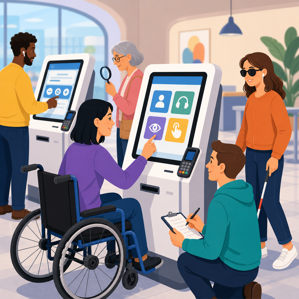
Self-service kiosks now handle airline check-in, hospital registration, grocery self-checkout, ticketing, banking, and government services, so testing them for accessibility is no longer a niche compliance task; it is essential service design. A self-service kiosk is any public-facing device that lets a customer complete a transaction, request information, or verify identity without direct staff assistance. Accessibility testing is the structured process of verifying that people with disabilities can perceive, understand, navigate, and operate that kiosk with comparable privacy, independence, and success. In practice, that means evaluating hardware, software, content, placement, and support procedures together, because a perfectly coded interface still fails if the card reader is too high, the speech output is unintelligible, or the touchscreen times out before a user can respond.
I have worked on kiosk rollouts where teams focused heavily on payment security, uptime, and queue reduction, then discovered late in pilot testing that blind users could not start audio guidance privately or wheelchair users could not reach the receipt slot. Those failures are common because kiosks combine digital accessibility, industrial design, acoustics, environmental lighting, and operational policy. They sit in noisy, bright, crowded spaces, and they are often expected to serve every customer quickly. That combination raises the stakes. Poor kiosk accessibility can block access to transportation, health care, food, voting information, or financial services. Strong kiosk accessibility improves usability for everyone, reduces staff intervention, lowers abandonment rates, and supports legal compliance under standards such as the Americans with Disabilities Act, Section 508, EN 301 549, and the Web Content Accessibility Guidelines where software interfaces apply.
This hub article explains how to test self-service kiosks for accessibility in a way that supports broader work on implementing and advancing accessible technology. It covers what to test, how to build a repeatable methodology, which standards matter, how to include disabled participants, and how to turn findings into procurement, design, engineering, and maintenance decisions. Treat this page as the starting point for deeper work on accessible hardware, inclusive UX research, assistive technology compatibility, and digital service operations. If a kiosk cannot be used independently by real people in real environments, it is not accessible, regardless of how polished the interface looks in a lab.
Start with standards, scope, and use cases
Effective kiosk accessibility testing begins by defining scope before any device is powered on. Teams need an inventory of kiosk models, peripherals, software versions, transaction types, deployment locations, and maintenance constraints. A grocery self-checkout and a hospital wayfinding kiosk may share a touchscreen, but they present very different risks. One involves scanning items, bagging, and payment under time pressure. The other may involve multilingual navigation, privacy, and high-stress users who are sick or accompanying patients. Testing must reflect those realities. I recommend creating task-based scenarios first: start a session, authenticate, complete the core transaction, review information, print or receive output, correct an error, cancel, and get help.
Standards provide the baseline. In the United States, the 2010 ADA Standards include specific requirements for operable parts, clear floor space, and reach ranges, while the 2017 federal refresh aligned Section 508 with WCAG 2.0 Level AA for ICT. Internationally, EN 301 549 is the most practical procurement reference because it addresses software, hardware, and support documentation. WCAG remains highly relevant for kiosk software because principles like perceivable content, keyboard operability, readable text, predictable navigation, and error identification still apply. However, kiosks are not just websites in a box. Teams also need to evaluate tactile controls, private listening, speech output, physical stability, glare, force required to operate controls, and whether users can plug in personal headsets without assistance.
One mistake I see repeatedly is limiting scope to the on-screen flow. A complete test plan covers the entire service envelope: signage that directs users to the kiosk, queue barriers, floor approach, lighting conditions, ambient noise, the physical location of scanner glass, NFC tap points, PIN pads, cameras, printers, and cash modules, plus recovery paths when hardware jams or software freezes. It also covers support. If staff are trained to take over a transaction instead of enabling independent use, the kiosk is still failing. Accessibility means a person can use the service with dignity and reasonable privacy, not merely complete the transaction somehow.
Evaluate the physical kiosk as seriously as the interface
Physical accessibility is where many kiosk programs fail because decisions are locked in by enclosure manufacturing and site installation long before usability testing starts. Begin with approach and reach. Measure clear floor space, forward and side reach ranges, knee and toe clearance where relevant, and whether a wheelchair user can align with the screen, card reader, and printer without twisting awkwardly. Confirm that operable parts require limited force and can be used with one hand, without tight grasping, pinching, or twisting of the wrist. If the kiosk has a privacy hood, document whether it obstructs line of sight for shorter users or causes reflections for standing users wearing bifocals.
Screen angle, height, and glare matter more than teams expect. In a transit station with overhead lighting and daylight spill, glossy displays can become unreadable for users with low vision even when contrast ratios technically pass. I have seen devices with compliant font sizes fail because critical prompts appeared low on the screen, below the natural viewing angle of a seated user. Audio components also deserve rigorous checking. Headphone jacks should be easy to locate tactually, not hidden under trim, and speech output should begin through a simple, discoverable action. Volume must be adjustable, and the default voice should remain intelligible in noisy environments. If the kiosk relies on a handset, test cord length, hygiene procedures, and storage placement.
Peripheral placement frequently determines success or failure. On payment kiosks, users may need to interact with touchscreen, barcode scanner, chip reader, contactless target, cash slot, and receipt bin in rapid sequence. When those components are spread too widely or positioned at inconsistent heights, users with limited mobility, short stature, or low vision lose orientation. In testing, map each interaction point and watch for unnecessary reach, crossing movements, or guesswork. The kiosk should communicate location clearly through visual labels, tactile indicators, and, where available, synchronized audio prompts.
Test the software flow for perception, operation, and recovery
Kiosk software should be tested with the same rigor applied to websites and mobile apps, but with kiosk-specific constraints. Start with visual presentation. Verify text size, contrast, spacing, focus indicators, plain language, icon clarity, and consistency of control placement. Users often have seconds to understand each screen, so clutter and weak visual hierarchy create real barriers. Motion, animations, and auto-advancing content should be minimized or controllable. Time limits require careful review. If a session expires quickly, users with cognitive disabilities, low vision, or motor impairments may be locked out repeatedly. The system should provide warnings, extensions, and safe restart paths.
Operability goes beyond touchscreen taps. Accessible kiosks should provide an alternative input method such as tactile keys, a physical keypad, or another non-visual control mechanism that works across the entire journey. Audio guidance must mirror on-screen changes and explain context, not just read visible labels. If a user enters a form field, the system should announce the field name, requirements, current value, errors, and available actions. Error prevention is especially important for payments, medical check-in, and legal attestations. Users need confirmation screens, edit options, and clear explanations when information is missing or invalid. Generic messages like “transaction failed” are not acceptable when the problem is unreadable scan data, a network timeout, or card removal at the wrong step.
Recovery testing is one of the most valuable exercises. Simulate scanner failures, declined cards, disconnected headphones, printer jams, and interrupted sessions. Then observe whether the kiosk preserves progress, gives understandable instructions, and returns the user to a safe state. In one deployment I reviewed, inserting headphones after the welcome screen did nothing because audio mode could only start on the first screen. Blind users had no way to recover independently. That is precisely why end-to-end testing matters: accessibility is not a feature screen; it is the resilience of the whole interaction.
Use a repeatable test matrix and document evidence
A structured test matrix keeps kiosk accessibility work from becoming subjective. Build cases around user goals, environments, and disabilities, then capture measurable results. Include standing and seated access, low-vision use at different brightness levels, non-visual use with audio and tactile controls, hearing-related scenarios, speech-free operation, one-handed use, limited reach, tremor, cognitive load, multilingual content, and interrupted transactions. Test both first-time and returning users, because discoverability issues often appear on the first attempt while efficiency issues appear later.
| Test area | What to verify | Example evidence |
|---|---|---|
| Physical access | Reach ranges, floor space, operable force, peripheral placement | Measurements, photos, obstruction notes |
| Visual access | Contrast, text size, glare resistance, focus visibility | Screen captures, lux readings, contrast checks |
| Non-visual use | Audio start, speech quality, tactile navigation, private listening | Task success rates, audio transcripts, control maps |
| Motor access | Alternative input, target size, timeout flexibility | Video review, timing logs, input error counts |
| Cognitive access | Plain language, step clarity, error recovery, consistent flow | Moderated observations, confusion points, completion time |
| Operations | Staff assistance process, maintenance state, offline behavior | Support scripts, incident records, failover test results |
Evidence should be concrete enough for engineering, procurement, and legal review. A note that says “hard to use” will not drive change. A note that says “receipt slot positioned at 1450 mm above finished floor; seated participants could not retrieve receipt independently” will. Pair findings with severity, affected tasks, standards references, and recommended remediation. I also advise recording whether issues are universal usability defects or disability-specific blockers. Both matter, but blockers should be prioritized because they directly prevent equal access.
Include disabled users in realistic environments
No kiosk accessibility program is credible without testing with disabled participants. Automated tools, heuristic reviews, and conformance checks find many issues, but they do not reveal how a real user orients to a payment terminal in a crowded lobby, how fast speech output can be understood over train noise, or whether a person with low dexterity can manage bagging while dismissing prompts. Recruit participants with diverse lived experience: blind and low-vision users, Deaf and hard-of-hearing users, wheelchair users, people with limited reach or dexterity, users with speech disabilities, and people with cognitive or learning disabilities. Include participants who use screen readers, hearing aids, switch devices, magnification, and personal headphones where relevant.
Environmental realism matters. A kiosk that tests well in a quiet conference room may fail in a retail store with reflective lighting, lines forming behind the user, and intermittent staff interruptions. Run sessions at representative sites and times of day. Observe queue pressure, social privacy, and whether users feel rushed when the kiosk announces information aloud. For health care and financial services, privacy is a core accessibility issue. If audio prompts expose personal data or require staff to read sensitive screens aloud, the design is not providing equivalent service.
Moderation should focus on task outcomes, not participant accommodation workarounds. When users invent strategies to cope with the kiosk, document the workaround as evidence of friction, not user resilience. Compensate participants fairly, obtain consent for recordings, and build enough time for setup and debriefing. The best studies combine qualitative observation with quantitative metrics such as completion rate, time on task, error rate, restart frequency, and assistance requests. Those metrics help teams compare versions over time and validate whether fixes actually improved access.
Turn testing into procurement, remediation, and continuous improvement
The strongest accessibility programs treat kiosk testing as an ongoing operational discipline, not a one-time certification event. Procurement is the first leverage point. Require vendors to map conformance to WCAG, Section 508, EN 301 549, and relevant hardware criteria, then validate claims independently. Ask for VPAT documentation, but never accept it as proof of usability. A detailed VPAT can help identify scope and known gaps; it cannot replace hands-on testing with real users. Contracts should require remediation timelines, software update obligations, spare accessible components, and change-control procedures so accessibility is retested after interface revisions, payment terminal swaps, or enclosure redesigns.
Remediation should be prioritized by blocked tasks and service criticality. If blind users cannot begin a transaction independently, that outranks a minor label inconsistency. If wheelchair users cannot access the payment terminal, the enclosure or mount may need redesign rather than software tweaks. Some fixes are fast, such as increasing timeout flexibility, rewriting error text, or improving audio prompts. Others require capital planning, like repositioning hardware modules, adding tactile controls, or changing display technology to reduce glare. Be honest about those tradeoffs and create phased roadmaps with interim mitigations that preserve dignity as much as possible.
Finally, connect kiosk findings to the wider goal of advancing accessible technology across channels. The same design system principles that improve kiosk flows often improve websites, mobile apps, and assisted-service tools. Error language, multilingual terminology, authentication patterns, and privacy practices should be aligned across the service ecosystem. Build internal links between kiosk guidance, accessible procurement policies, usability research protocols, and support training so teams can reuse knowledge instead of rediscovering the same barriers in every project. Accessible kiosks are achievable when organizations test early, test broadly, and keep testing after launch. Start by auditing one high-traffic kiosk journey, documenting real barriers with evidence, and assigning owners for the fixes that restore independent access.
Frequently Asked Questions
1. What does it mean to test a self-service kiosk for accessibility?
Testing a self-service kiosk for accessibility means evaluating whether people with disabilities can independently use the kiosk to complete the same essential tasks as everyone else. That includes actions like starting a session, reading instructions, entering personal information, verifying identity, making selections, completing payment, printing or receiving confirmations, and exiting the workflow without confusion or assistance. In practice, accessibility testing is not limited to checking font size or adding headphones. It is a structured review of the full user experience across physical hardware, software interface, audio output, timing, input methods, environmental conditions, and error recovery.
A thorough accessibility test looks at multiple disability-related access needs. For example, a blind user may need a screen reader, private audio output, tactile controls, and a predictable navigation order. A low-vision user may need high contrast, large text, zoom support, and glare-resistant design. A wheelchair user may need appropriate reach ranges, clear floor space, and a screen angle that works from a seated position. A user with limited dexterity may need larger touch targets, enough time to respond, and alternatives to gestures that require precise movement. A Deaf or hard-of-hearing user may need all audio instructions presented visually. A person with cognitive disabilities may need plain language, consistent navigation, and clear feedback when something goes wrong.
Effective kiosk accessibility testing also includes realistic task-based scenarios. Instead of asking only whether a feature exists, testers ask whether a person can successfully complete real transactions under real-world conditions. Can a traveler check in for a flight without vision? Can a patient register privately at a hospital kiosk with limited hand mobility? Can a grocery shopper complete self-checkout if they cannot hear prompts? Those are the kinds of questions accessibility testing is designed to answer. The goal is not simply compliance on paper, but usable, equitable service design in public spaces.
2. Which accessibility standards and guidelines should be used when testing self-service kiosks?
Self-service kiosk testing should be grounded in recognized accessibility standards, but it is important to understand that kiosks sit at the intersection of digital accessibility, physical accessibility, and public accommodation requirements. In many organizations, the first reference point is WCAG because it provides a strong framework for software interface accessibility, including text alternatives, color contrast, keyboard operability, focus order, clear labels, predictable navigation, and error identification. However, kiosks are not just websites on a screen. They are physical products used in public settings, so testing should also account for hardware access, reach ranges, operable parts, privacy, audio access, and environmental usability.
Depending on the country and industry, legal and regulatory requirements may also apply. In the United States, that can include ADA-related obligations, Section 508 in certain government contexts, and procurement or sector-specific requirements. Transportation, healthcare, banking, and government services may face additional expectations because kiosks in these sectors often provide essential access to services that people cannot reasonably avoid. Internationally, teams may also look to EN 301 549 and other regional procurement standards that address ICT accessibility. The exact legal framework varies, but the practical takeaway is consistent: testing should cover both software conformance and physical usability.
In a mature testing program, standards are used as a baseline rather than a finish line. Teams typically build a test matrix that maps applicable requirements to actual kiosk tasks, hardware components, and user needs. For example, contrast requirements should be tested on the live screen in the actual kiosk enclosure, not just in design files. Keyboard or keypad operability should be tested with the exact navigation model users will encounter. Audio instructions should be assessed for clarity, privacy, synchronization, and whether equivalent visual information is provided. Using standards this way helps teams move beyond checklist compliance and toward meaningful accessibility in real deployment conditions.
3. How should a team practically test a self-service kiosk for accessibility?
A practical kiosk accessibility testing process starts by identifying the most important user journeys and then evaluating each one end to end. Begin with common tasks such as login or identification, service selection, data entry, payment, confirmation, receipt delivery, and session timeout or cancellation. Then test each task across different user needs and interaction modes. This should include screen-only interaction, tactile controls, audio-guided workflows, external assistive technology where supported, and fallback methods when one mode fails. The best testing programs combine expert review, standards-based inspection, hands-on functional testing, and usability testing with people with disabilities.
Teams should test both the physical kiosk and the interface in context. On the hardware side, review screen height and angle, clear knee and toe space, reach to card readers and printers, force required for buttons, headphone jack placement, tactile markers, and whether critical components are obstructed. On the software side, assess focus order, reading order, consistency of labels, timeout warnings, error messaging, visual hierarchy, and whether the interface supports completion without reliance on color, sound, or precise gestures. If the kiosk includes biometrics, barcode scanning, signature capture, or PIN entry, those features need accessibility-specific testing as well, because they often become failure points for real users.
Real-world conditions matter. A kiosk that appears accessible in a quiet lab may fail in a noisy airport, bright grocery store, or crowded hospital lobby. Testers should evaluate glare, ambient noise, privacy of spoken information, crowded positioning, one-handed operation, interrupted sessions, and cleaning or maintenance states that may affect tactile features or ports. It is also essential to test error recovery: if a user makes a mistake, skips a field, inserts a card incorrectly, or times out, can they understand what happened and continue without starting over? A practical process ends with documented findings, severity ratings, remediation guidance, and retesting after fixes so accessibility improvements are verified, not assumed.
4. What are the most common accessibility problems found in self-service kiosks?
Some of the most common kiosk accessibility failures happen because teams focus heavily on the touch interface and overlook the full range of user needs. A frequent issue is lack of nonvisual access. A kiosk may have a beautiful visual interface but no screen reader, no private audio output, no tactilely discoverable controls, or no clear way for a blind user to begin an accessible session. Another common problem is poor physical access, such as screens mounted too high, payment terminals placed out of reach, receipt printers positioned awkwardly, or insufficient floor space for wheelchair users to approach the kiosk properly.
Visual design issues are also widespread. These include low color contrast, small text, screens that wash out under bright lighting, tiny touch targets, and interfaces that rely on color alone to convey status or errors. Time limits are another major barrier. Many kiosks move too quickly, log users out without warning, or make people re-enter information after a short delay. This can be especially difficult for users with mobility, cognitive, or vision-related disabilities. Audio-related problems are equally serious: spoken instructions may be too fast, too quiet, unavailable through headphones, or not matched by equivalent on-screen guidance for users who cannot hear.
Complex workflows often create barriers even when individual elements appear compliant. For example, a kiosk may technically offer large text but still use confusing language, inconsistent navigation, or vague error messages that leave users stuck. Signature pads, ID scanners, document feeders, CAPTCHA-like verification steps, and payment devices often break accessibility if they are not tested as part of the whole transaction. Another common issue is assuming staff assistance solves the problem. In many environments, staff may not be immediately available, and requiring help undermines privacy, independence, and equal access. The most effective teams treat these recurring issues as design risks to eliminate early, not defects to excuse later.
5. Why is accessibility testing for self-service kiosks so important for businesses and public service providers?
Accessibility testing for self-service kiosks is important because these devices increasingly control access to essential services. People use kiosks to check in for flights, register for medical appointments, pay for groceries, buy tickets, manage financial transactions, and interact with government systems. When a kiosk is inaccessible, the impact is not minor inconvenience. It can mean missed travel, delayed care, inability to make a purchase, loss of privacy, or exclusion from a public service. Testing helps organizations verify that customers with disabilities can use the kiosk independently, reliably, and with dignity.
There is also a strong operational and business case. Accessible kiosks reduce support burden, lower abandonment rates, improve transaction completion, and create a more consistent customer experience across locations. They can reduce the need for staff intervention in situations where users should be able to complete a task privately on their own. In sectors like healthcare, banking, and government, accessibility failures can also create reputational risk, complaints, procurement problems, and legal exposure. Testing early and often is generally far less expensive than retrofitting hardware, redesigning software, or replacing deployed units after problems surface in the field.
Most importantly, accessibility testing helps organizations build better services, not just safer compliance positions. Kiosks are often introduced to improve convenience and efficiency, but those goals only hold if the system works for the full range of people who need it. A kiosk that excludes some users is not truly self-service. By testing accessibility as a core part of design, development, and deployment, organizations make their services more inclusive, more resilient, and more effective in the real world. That is why kiosk accessibility testing is