ADA signage requirements shape how people move through buildings, understand spaces, and access essential services without unnecessary barriers. The Americans with Disabilities Act, passed in 1990, established civil rights protections for people with disabilities, and signage standards became one practical way to turn those protections into daily access. In offices, schools, hotels, hospitals, apartment buildings, and retail stores, compliant signs help visitors identify permanent rooms, exits, restrooms, elevators, and emergency information quickly and independently. For business owners and facility managers, understanding these rules is not just a matter of avoiding complaints or liability. It is part of creating a safer, more usable environment for everyone, including people who are blind, have low vision, are deaf or hard of hearing, or have mobility limitations.
When professionals talk about ADA signage, they usually mean signs that follow the 2010 ADA Standards for Accessible Design, often alongside relevant International Building Code and local rules. Important terms include tactile characters, which are raised letters or numbers read by touch; Braille, which must accompany many permanent room signs; contrast, which affects readability; and mounting height, which determines whether a sign can be found consistently. Not every sign in a building falls under the same standard. A restroom identification sign outside a door has different requirements from a directional sign in a lobby or a temporary paper notice taped to a wall. That distinction causes frequent confusion, especially during renovations, tenant improvements, and rebranding projects.
Compliance matters because signage failures are easy to spot and common in accessibility lawsuits. A beautifully renovated building can still create barriers if signs are mounted on the wrong side of doors, use decorative fonts, lack Grade 2 Braille, or provide too little contrast between text and background. The good news is that the rules are manageable when broken into categories. By understanding which signs require tactile features, how visual characters must be designed, where signs should be installed, and how to review a property systematically, organizations can meet legal expectations and improve the visitor experience at the same time.
Which Signs Must Comply With ADA Requirements
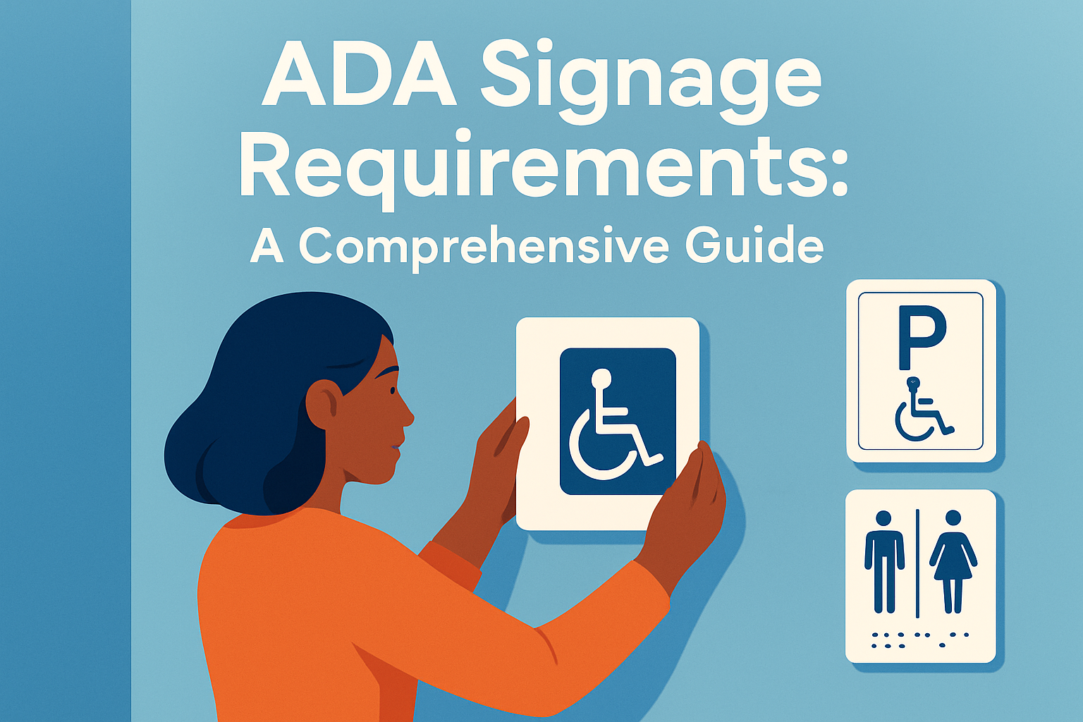
The first step is knowing which signs are covered. ADA requirements apply most clearly to signs that identify permanent rooms and spaces. Examples include restroom signs, room numbers, stairwell identification signs, exit doors, electrical rooms, conference rooms, patient rooms, classrooms, employee break rooms, and mechanical spaces that are intended to be identified for users. These signs generally need raised characters and Braille because people must be able to locate the space independently without relying only on sight.
Directional and informational signs are treated differently. A hallway sign with an arrow pointing to reception, for example, usually does not need tactile lettering, but if it includes visual text for wayfinding, that text still must be legible. Overhead signs such as gate numbers in airports or department markers in hospitals follow visual character rules instead of tactile requirements because they are meant to be read from a distance. Temporary signs, including event notices, seasonal promotions, and printed meeting schedules, typically are not required to include Braille or raised text. However, facilities still benefit from presenting temporary information clearly, using large fonts and good contrast.
In practice, many compliance problems happen because owners assume every sign needs Braille or, just as often, assume almost none do. A hotel is a useful example. Room number signs, restroom identifiers, elevator floor designations, stairwell levels, and permanent amenity room signs usually require tactile features. A breakfast-hours sign in the lobby does not. A corporate office follows the same logic: conference room names and restroom markers need tactile text, while a framed mission statement in reception does not. Understanding the sign’s purpose prevents both undercompliance and unnecessary spending.
Technical Standards for Tactile Lettering, Braille, and Readability
Once a sign is identified as tactile, the technical details matter. Raised characters must be uppercase sans serif or simple serif fonts, accompanied by Grade 2 Braille positioned directly below the corresponding text. Characters usually must be raised at least 1/32 inch. The ADA also sets rules for stroke thickness, character spacing, and proportions so letters can be recognized by touch and sight. Fonts with excessive flourish, compressed shapes, or highly stylized forms can fail even if the words themselves seem readable to a designer.
Braille errors are one of the most costly signage mistakes because they often require full replacement. The standard calls for contracted Grade 2 Braille, not uncontracted Grade 1 in most cases. Dot base diameter, spacing within Braille cells, and separation between lines must follow established measurements. Reputable manufacturers use specialized translation software and quality-control reviews because automatic conversions can produce mistakes with abbreviations, punctuation, room numbering formats, or custom names. For example, a sign reading “Mgr. Office” may create ambiguity in translation unless carefully proofed.
Visual contrast is equally important. ADA standards do not mandate a specific color pair such as white on black, but they do require light-on-dark or dark-on-light contrast. In the field, many fabricators aim for at least 70 percent contrast because it supports legibility for people with low vision. Matte finishes are strongly preferred since glare from glossy acrylic, polished metal, or bright overhead lighting can make compliant lettering effectively unreadable. A brushed aluminum sign may look modern, but if silver text sits on a gray background, it can fail users in real conditions. Clear, simple wording also improves performance, especially in emergency egress routes and healthcare settings.
Mounting Location, Height, and Installation Rules
Proper installation is just as important as design. ADA-compliant tactile signs that identify rooms generally must be mounted on the wall adjacent to the latch side of the door. This placement allows a person to approach the sign without standing in the swing path of an opening door. If there is no wall space on the latch side, the nearest adjacent wall can be used. Mounting directly on a door is usually discouraged for tactile room identification, especially when the door is not always in the same position.
The baseline rule for height is that the lowest raised character must be at least 48 inches above the finished floor, and the highest raised character must be no more than 60 inches above the finished floor. That range creates a consistent search zone. In a busy school corridor or medical office, consistency matters because users rely on predictable placement, not guesswork. Signs also need clear floor space so a person using a wheelchair can approach closely enough to read them.
Door configuration can complicate otherwise straightforward rules. Double doors with one active leaf, outswing doors opening into narrow corridors, and glass entrances with minimal wall area often require careful interpretation. Architects and sign vendors usually review these conditions during submittals, but field verification remains essential. A common problem appears after construction crews relocate a sign to avoid trim, card readers, light switches, or decorative wall panels. That small change can place the sign outside the required zone. Final punch-list inspections should always include signage placement checks, with measurements taken after all hardware and finishes are installed.
Common Sign Types and Practical Compliance Examples
Different building types produce different signage priorities. In offices, the most common ADA signs include reception identifiers, restroom markers, stairwell levels, room names, suite numbers, and exit path signs. In multifamily housing, leasing offices, amenity rooms, accessible parking designations, mail rooms, and evacuation information may all come into play. Healthcare adds another layer: diagnostic imaging, exam rooms, nurse stations, pharmacy counters, and wayfinding to specialized departments must be clear because visitors are often stressed, unfamiliar with the layout, or navigating urgent situations.
The table below shows how common sign categories are typically treated under ADA-focused review. Local code, fire code, and project-specific conditions can add requirements, so teams should verify details during design and installation.
| Sign type | Typical ADA requirement | Example |
|---|---|---|
| Permanent room identification | Raised characters, Grade 2 Braille, compliant mounting | Restroom, Room 204, Electrical Closet |
| Directional sign | Visual legibility, good contrast; tactile usually not required | Arrow to reception or elevators |
| Overhead sign | Visual character sizing based on viewing distance | Lobby sign for conference center |
| Exit and stair identification | Often tactile plus code-specific life-safety content | Stair A, Level 3, EXIT |
| Temporary notice | Usually not tactile, but should remain readable | Event room change printed on paper |
Consider a renovated restaurant as a real-world example. The owner may install attractive menu boards and wall graphics, yet overlook the permanent restroom signs near the dining room. If those signs use script lettering, insufficient contrast, or no Braille, the project is exposed. By contrast, a hospital wayfinding project might include hundreds of signs, where a single inconsistent room-number template can multiply across every floor. Standardized sign schedules, approved shop drawings, and mockups help reduce such errors before fabrication begins.
Design, Procurement, and Ongoing Compliance Management
Successful ADA signage programs start before fabrication. Architects typically define sign types in construction documents, interior designers coordinate appearance with finishes, and sign manufacturers produce shop drawings showing dimensions, text, Braille, colors, materials, and mounting details. Facility managers should review these documents carefully rather than treating signage as a last-minute decorative purchase. Tools such as Bluebeam, Procore, Revit schedules, and cloud-based punch-list apps make it easier to track sign locations and approvals across large projects.
Vendor selection matters because not all sign companies understand accessibility equally well. Experienced fabricators can explain ADA sections, recommend non-glare materials, verify Braille translation, and identify risky design choices before production. Asking for samples is smart. A small prototype lets teams test contrast under actual lighting, confirm tactile depth, and check whether room names are understandable. For national brands rolling out signage across multiple sites, a master standards manual can prevent inconsistent layouts that create compliance issues from location to location.
Ongoing management is just as important as initial installation. Spaces change constantly: departments move, room functions shift, and tenants reconfigure suites. Each change can trigger a signage update. A practical annual audit should compare the existing sign inventory against current room uses, measure mounting heights, inspect damaged plaques, and verify that temporary paper signs have not replaced permanent compliant ones. Training maintenance staff also helps. If a wall is repainted in a similar but lower-contrast color, or if a sign is reinstalled after repairs without measurement, compliance can quietly disappear. Regular review protects both users and the organization.
ADA signage compliance is ultimately about predictable, independent access. The rules cover more than Braille plaques on restroom walls; they create a coordinated system of identification, direction, and safety that people can trust in unfamiliar environments. Organizations that understand which signs require tactile features, how lettering and contrast must perform, and where signs should be mounted can avoid common violations while making buildings easier to use. The best approach is systematic: classify sign types, confirm technical standards, inspect installation conditions, and audit the property whenever spaces change. If you are planning new construction, a renovation, or a portfolio-wide rebrand, review your signage now and correct weak points before they become expensive problems or barriers for visitors.
Frequently Asked Questions
1. What are ADA signage requirements, and why do they matter so much?
ADA signage requirements are rules that help make buildings easier to use for people with disabilities. These standards come from the Americans with Disabilities Act, or ADA, which was passed in 1990 to protect the civil rights of people with disabilities and reduce barriers in public life. In simple terms, ADA signs are designed to make sure people can identify spaces, move through buildings, and find important areas like exits, restrooms, elevators, stairwells, lobbies, and permanent rooms without confusion or unnecessary difficulty.
These requirements matter because signage is one of the most practical parts of accessibility. A building may have ramps, elevators, and accessible entrances, but if someone cannot find the correct room, read the sign, or understand where to go next, the space is still harder to use than it should be. ADA-compliant signage supports independence. It allows visitors, employees, patients, students, residents, and customers to navigate with more confidence and less reliance on staff or companions.
ADA signage is especially important in places such as office buildings, schools, colleges, hospitals, medical clinics, hotels, apartment complexes, government buildings, retail stores, restaurants, and other public-facing facilities. In these environments, people need clear and consistent signs to identify permanent rooms and spaces. That includes room names and numbers, exits, accessible entrances, restrooms, stairwells, and directional information that helps guide people through the property.
Another reason ADA signage matters is that accessibility is not only about convenience. It is about equal access. Someone with low vision, blindness, or another disability should be able to get the same basic information from a building sign that others receive visually. That is why ADA standards often include tactile characters, braille, proper mounting heights, readable fonts, non-glare finishes, and strong contrast between text and background. These details are not decorative extras. They directly affect whether a sign can actually be used by the people it is meant to help.
There is also a legal and operational side to this. Businesses and property owners that do not meet applicable ADA standards may face complaints, legal disputes, delays in inspections, costly rework, or reputational damage. On the other hand, when signage is planned correctly from the start, it helps create a more inclusive experience, shows attention to detail, and reduces confusion for everyone, not only people with disabilities. Good ADA signage tends to improve wayfinding across the board because clear signs benefit all building users.
In a broader sense, ADA signage requirements matter because they turn the idea of access into something tangible. They help transform civil rights protections into real-world usability. A compliant sign on a restroom, conference room, patient room, or exit route may seem small, but it plays a major role in helping people understand a space and move through it safely and independently.
2. Which signs are required to be ADA compliant in a building?
Not every sign in a building follows the exact same ADA requirements, which is where many people get confused. Generally, ADA-compliant signs are most commonly required for permanent rooms and spaces. A permanent room is one whose function is not likely to change often. Examples include restrooms, stairwells, exit doors, electrical rooms, mechanical rooms, storage rooms, conference rooms, classrooms, hotel room identification, patient rooms in certain settings, and office spaces with fixed designations. If a room has a permanent purpose or a permanent label, there is a strong chance that ADA-compliant identification signage is required.
These signs usually need tactile text and braille so people who are blind or have low vision can identify the room. For example, a restroom sign, stairwell sign, or room number plaque outside a hotel room typically falls into this category. These are not just visual labels. They must be designed and installed according to ADA standards so they can be read both visually and through touch.
Directional signs can also be important, especially when they point toward accessible features that are not obvious. For example, if the accessible entrance is not the main entrance, signage may be needed to direct people to it. The same idea applies to accessible restrooms, elevators, parking areas, or routes. In those cases, signs help people locate the accessible option without unnecessary detours or confusion.
Exit-related signage is another area to pay close attention to. Buildings often need signs that identify exits, exit stairwells, and accessible means of egress where required by code and accessibility standards. Safety signage may overlap with building code rules, fire code rules, and ADA considerations, so it is important not to assume one type of compliance automatically covers the other. A sign may need to satisfy multiple standards at once depending on its purpose and location.
Accessible parking signs are commonly associated with ADA compliance as well. These signs are essential for identifying designated accessible parking spaces and van-accessible spaces. However, parking signage also often involves local and state rules in addition to federal standards. That means a property owner should not only look at ADA guidance but also verify local code requirements for things like height, wording, penalties, and symbol display.
There are also signs that usually do not require tactile characters and braille, such as temporary signs, menus, promotional displays, directories in some cases, and informational signs that are not identifying a permanent room or space. That said, these signs still need to be accessible in a broader sense. Visual readability matters. Contrast matters. Placement matters. Even when tactile requirements do not apply, poor sign design can still create confusion and reduce accessibility.
One of the most useful ways to think about it is this: signs that identify where you are often have the strictest ADA requirements, while signs that simply give information or directions may follow different rules. Because the details can vary by sign type, building use, and local code, many property managers and business owners review all signage as part of a complete accessibility and life-safety plan rather than treating each sign in isolation.
3. What features make a sign ADA compliant?
An ADA-compliant sign is not defined by one feature alone. It is the result of several design and installation elements working together. The exact requirements depend on the type of sign, but many compliant identification signs include tactile characters, braille, strong contrast, readable typefaces, proper sizing, non-glare finishes, and correct mounting location. Every one of these details contributes to whether the sign is actually usable.
Tactile characters are raised letters and numbers that can be felt by touch. These are required on many signs that identify permanent rooms and spaces. The characters must be raised to a certain depth and formed in a style that is easy to read by touch. The text must also be uppercase in many tactile applications. This is one of the features people most often associate with ADA signage because it directly supports users who read signs through touch rather than sight.
Braille is another core feature. ADA signs typically use Grade 2 braille, also called contracted braille, on applicable room identification signs. Braille must be placed in the correct position relative to the tactile text and must be properly translated and formatted. This is one area where mistakes can be costly. A sign may look fine visually but still fail if the braille is incorrect, placed improperly, or produced poorly. That is why qualified fabrication and proofreading are so important.
Visual contrast is a major part of compliance and usability. In general, characters should contrast strongly with the background so they are easier to see. Light text on a dark background or dark text on a light background is common. The goal is readability, not decoration. If the sign blends into the wall or if the lettering is hard to distinguish, it may not serve its purpose well even if the wording itself is correct.
Finish matters too. ADA signs should typically have a non-glare finish so lighting does not create excessive reflection. A glossy sign might look attractive in a showroom, but if it catches overhead lights and becomes hard to read, that creates a problem. Matte and low-glare surfaces are usually preferred because they improve visibility in a wider range of lighting conditions.
Typography also plays a bigger role than many people expect. Fonts need to be simple and readable. Overly decorative, condensed, or highly stylized fonts can make signs harder to read. Character spacing, stroke width, and letter proportions all affect legibility. A compliant sign should prioritize clarity first. The same goes for pictograms, such as restroom symbols. When pictograms are used, they often need to appear on a defined background field, and the sign may also require accompanying tactile text describing the space.
Mounting location is just as important as sign design. A perfectly manufactured sign can still be noncompliant if it is installed in the wrong place or at the wrong height. ADA signs for permanent rooms are commonly mounted on the wall adjacent to the latch side of the door, where a person can approach closely and read the sign without standing in the path of the swinging door. Height placement matters because users need to be able to locate and read the sign consistently.
Consistency is another feature that should not be overlooked. A facility with signs that all follow a similar logic is easier to understand than one with random layouts, mixed terminology, and inconsistent placement. Compliance is not just about isolated measurements. It is also about creating a predictable system that helps people move through the building with confidence.
In short, an ADA-compliant sign is usable by design. It is readable visually, understandable quickly, touch-accessible where required, and placed where people can actually find it. When all of those elements come together, the sign does what it is supposed to do: provide access to information without creating another barrier.
4. Where should ADA signs be installed, and does placement really affect compliance?
Yes, placement absolutely affects compliance. This is one of the most common areas where otherwise well-made signs fail. ADA signage is not only about the content and the materials. It is also about where the sign is mounted and how easily a person can approach and read it. If a sign is too high, too low, hidden behind an open door, placed on the door itself when that is not appropriate, or installed in a spot with poor access, it may not meet requirements even if the sign itself looks correct.
For many permanent room identification signs, the standard practice is to mount the sign on the wall next to the door, usually on the latch side. This location allows someone to find the sign consistently and read it without having to stand directly in the door swing area. That is especially important for someone using touch to read tactile text and braille. If a sign is mounted on a moving door, the sign may be harder to locate, may shift position, or may create safety and usability issues.
There are some cases where mounting on the nearest adjacent wall may be necessary, such as when there is no adequate wall space on the latch side. The goal is still the same: the sign should be in a location that is predictable, reachable, and usable. Placement should not force someone into an awkward position or a hazardous area just to identify a room.
Height is another critical issue. ADA standards specify mounting ranges so tactile signs can be located consistently. This consistency matters because users should not have to search randomly at different heights from one room to another. Proper installation creates a more reliable experience throughout the building. When every room sign follows the same logic, wayfinding becomes much easier.
Clear floor space also matters. A person should be able to approach the sign closely enough to read it, including by touch if needed. If furniture, decor, trash cans, planters, vending machines, or other obstacles block access to the sign, that can reduce usability and create compliance concerns. This is why accessibility reviews should include not only sign fabrication and installation but also the surrounding environment.
Placement also affects directional and informational signs. A directional sign does not help much if it is hidden at the wrong angle, placed after the decision point instead of before it, or mounted where glare makes it unreadable. The most effective signs appear where people need the information, not several steps later. For example, if a building has an inaccessible public entrance and a separate accessible entrance, the directional sign should be placed where a person first encounters the inaccessible route, giving them immediate guidance to the accessible one.
Hotels, hospitals, schools, and large office buildings especially benefit from thoughtful sign placement because visitors are often unfamiliar with the layout. In these settings, room identification, directional guidance, elevator signage, stairwell signage, and exit information all need to work together. If one piece of the system is placed poorly, the overall navigation experience suffers.
So yes, placement is a major part of ADA signage compliance. It is not a minor technicality. A compliant sign must be designed correctly and installed correctly. Building owners who focus only on ordering the right signs but ignore installation details often end up having to reposition signs later, which adds cost and delays. Planning sign placement from the beginning is one of the smartest ways to avoid that problem.
5. How can businesses and property owners make sure their ADA signage is correct and up to date?
The best way to make sure ADA signage is correct and up to date is to approach it as part of a larger accessibility strategy rather than as a last-minute purchase. Many compliance issues happen when signs are ordered after construction is finished, after rooms have been renamed, or after someone notices missing plaques during an inspection. A much better approach is to review signage early, verify requirements by sign type, and coordinate with designers, contractors, code consultants, and sign professionals before fabrication begins.
Start by identifying all permanent rooms and spaces in the building. Make a complete list of room names, numbers, restrooms, exits, stairwells, mechanical areas, storage rooms, offices, classrooms, amenity spaces, and any other locations that may need identification signage. Then determine which of those signs require tactile text and braille, which ones require pictograms, and which ones are directional or informational. This early inventory helps prevent omissions and reduces the chance of ordering signs twice.
It is also important to verify current federal standards and compare them with any state or local code requirements. ADA rules form the baseline, but some jurisdictions have additional accessibility signage rules or building code provisions that affect wording, installation, pictograms, exit signage, and parking signage. Assuming that one generic sign package will work everywhere can be a mistake. Local review matters.
Working with an experienced ADA signage manufacturer or consultant can make a big difference. Professionals in this area understand details like tactile character specifications, braille translation, contrast, finish, mounting location, and code coordination. They can often spot issues that a general purchaser might miss, such as inconsistent room naming, incorrect braille placement, or noncompliant fonts. This can save time, money, and frustration later.
Businesses should also inspect their existing signage regularly, especially after renovations, tenant improvements, departmental moves, rebranding, or changes in room use. A building may have once been compliant, but if a conference room becomes a staff office, a storage room becomes a treatment room, or a tenant changes suite numbering, the signage may need to be updated. Accessibility is not a one-time task. It needs periodic review as the space evolves.
Another practical step is to check installation after the signs go up. Even the best sign package can be undermined by poor field placement. Verify heights, wall locations, sign orientation, and clearance around each sign. Make sure nothing blocks access and that every sign is easy to locate. This post-installation review is where many hidden problems are caught before they become larger issues.
Training internal teams can help too. Facility managers, maintenance teams, office administrators, and property managers should understand that ADA signage is not interchangeable with ordinary decor signage. If someone replaces a tactile room sign with a stylish but noncompliant plaque from a local print shop, that can create a problem immediately. Staff should know which signs are accessibility-related and why they cannot be changed casually.
It is also wise to document the signage plan. Keep records of approved room names, sign schedules, installation locations, specifications, and vendor details. This makes future updates much easier, especially in larger buildings, campuses, or multi-site operations. Good documentation helps maintain consistency and reduces confusion when spaces change over time.
At the end of the day, keeping ADA signage correct and current comes down to planning, expertise, and follow-through. Review the building carefully, understand which signs are required, use qualified professionals, confirm installation details, and revisit signage whenever the space changes. That process not only supports compliance but also creates a building that is easier, safer, and more welcoming for everyone who uses it.


