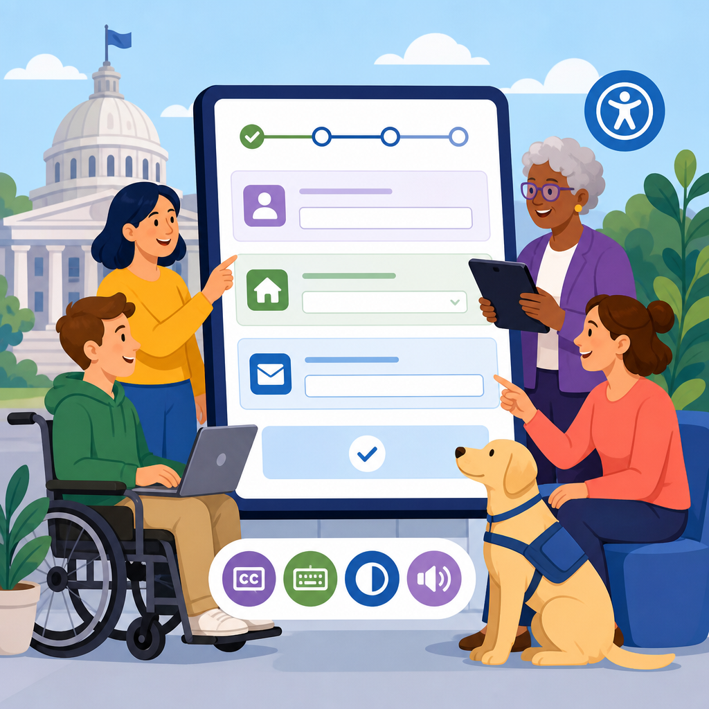
Designing accessible government forms and transaction flows is one of the highest leverage ways to improve public digital services, because forms are where policy, identity, eligibility, and payment all meet the citizen. In practice, a government website can publish excellent informational content and still fail residents if a license renewal, benefits application, tax filing, or voter registration process is confusing or unusable. Accessible technology means more than meeting a checklist. It means people with disabilities, older adults, limited English speakers, people using mobile devices, and residents under stress can complete essential tasks accurately, independently, and with dignity.
Government forms are structured interfaces that collect data, verify identity, and trigger decisions or services. Transaction flows are the full sequence around that form: discovery, instructions, account creation, authentication, data entry, validation, review, submission, confirmation, payment, and follow-up. I have seen teams focus narrowly on field labels while ignoring the broader flow, then wonder why completion rates remain low. Accessibility breaks down when any step creates friction, especially for screen reader users, keyboard-only users, people with low vision, users with cognitive disabilities, or applicants completing forms on older phones over unstable connections.
This hub article explains how to implement and advance accessible technology in government transactions from policy through design, content, engineering, testing, procurement, analytics, and governance. It matters because public services are mandatory or time sensitive; failing to make them accessible can block healthcare, housing, education, employment, and civic participation. In the United States, Section 508 and the ADA shape expectations for digital accessibility, while WCAG 2.1 AA remains the practical benchmark most teams use. The best government teams go further, building plain-language content, resilient front-end patterns, strong error recovery, multilingual support, and continuous testing into every release.
Start with service design, not screens
Accessible government forms succeed when the team maps the service before sketching interfaces. That means identifying user groups, legal requirements, risk points, data dependencies, and moments where people drop off. For example, an unemployment claim may require identity proofing, employment history, wage records, and document uploads. If those dependencies are not sequenced carefully, applicants may encounter repeated logins, duplicate questions, or inaccessible third-party checks. I have found that a service blueprint exposing frontstage screens and backstage systems is often the fastest way to reveal barriers hidden outside the form itself.
Good service design answers basic questions directly: Who is this form for? What documents are needed? How long will it take? Can progress be saved? What happens after submission? Citizens should not have to infer process rules from legal text. Use plain language headings, short summaries at the top of each step, and realistic completion time estimates. When a transaction affects benefits, deadlines, or legal status, provide channels for assisted completion such as phone support, live chat, relay-friendly contact options, and in-person appointments. Accessibility improves when digital channels acknowledge that some users need flexible paths, not a single idealized journey.
Hub pages under a technology and accessibility topic should also connect related guidance. Teams building forms need links to design systems, content standards, authentication guidance, document accessibility rules, translation workflows, procurement criteria, and testing methods. Internal links help staff move from broad principles to implementation details. As the subtopic lead page, this article frames that ecosystem: accessible technology is not one sprint task; it is an operating model spanning design, engineering, operations, and policy stewardship.
Build form patterns that assistive technology can interpret
The technical foundation of an accessible form is semantic markup paired with predictable interaction design. Use native form controls whenever possible because browsers and assistive technologies already understand them well. Labels must be programmatically associated with inputs. Group related options with fieldset and legend. Mark required fields consistently in visible text and in accessible names. Link error text to fields with aria-describedby only when native semantics are insufficient. Avoid custom dropdowns, date pickers, and comboboxes unless the team can implement keyboard support, focus management, naming, and state announcements correctly across browsers and screen readers.
Input design affects completion speed and error rates. Break long forms into manageable steps, but do not force unnecessary pagination that disrupts review. Use the right input types for email, telephone, and numeric entry so mobile devices present helpful keyboards. Support browser autofill and password managers. Preserve entered data when the session times out or validation fails. If a tax payment form wipes out twenty minutes of work after a timeout warning that was not announced to screen readers, the problem is not merely inconvenience; it is exclusion. Accessible technology must be fault tolerant.
Error handling deserves special attention because government forms often encode strict eligibility rules. Inline validation should not interrupt typing or trap focus. On submit, present a clear error summary at the top, move focus to it, and link each issue to the exact field. Write messages that explain how to fix the problem, not just that a rule was violated. “Enter a date in MM/DD/YYYY format” is better than “Invalid input.” For complex constraints, include examples drawn from real cases, such as acceptable parcel numbers or business registration IDs.
Write instructions and content people can act on
Plain language is an accessibility requirement in practice, even when teams treat it as only a content preference. Government forms are often completed under pressure: a parent applying for food assistance, a veteran updating health benefits, or a resident disputing a citation. Dense legal phrasing increases abandonment and mistakes. Put essential instructions before the fields they affect. Keep one instruction per sentence where possible. Expand acronyms on first use. Explain why certain data is requested when trust may be low, especially around Social Security numbers, income details, disability status, or immigration-related questions.
Content strategy also shapes navigation. Step names should reflect user goals, not agency org charts. “Household members” is better than “Applicant composition.” Confirmation pages should state what was submitted, when to expect a response, and what reference number to keep. Email and SMS notifications must repeat that information in accessible formats, with descriptive subject lines and links that make sense out of context. I have seen confirmation pages omit critical next steps such as document upload deadlines, causing avoidable denials that no amount of front-end compliance could solve.
Multilingual access is part of accessible technology because many barriers compound. If a form is translated, error messages, help text, date formats, and transactional emails must also be translated. Mixed-language experiences are common failure points. For languages with longer text expansion, responsive layouts must hold. Teams should define translation memory, glossary governance, and review by native-language subject matter experts. Machine translation can help with drafts but should not be the final authority for legal or benefits transactions.
Design for identity, security, and privacy without creating exclusion
Government services increasingly rely on account systems, multifactor authentication, fraud screening, and identity proofing. These controls are necessary, but they often introduce the hardest accessibility barriers. CAPTCHAs, inaccessible one-time-code inputs, timeout-heavy single sign-on flows, and third-party identity checks can stop users before they ever reach the form. The solution is not weaker security. It is accessible security design: support passkeys and password managers, ensure code entry fields work with paste and screen readers, provide accessible alternatives to visual challenges, and offer recovery paths that do not depend on one device or one phone number.
Privacy communication matters too. Residents are more willing to complete sensitive transactions when data use is explained in plain language. Tell users what is required by law, what is optional, how long records are retained, and whether information will be shared across agencies. For survivors of domestic violence, homeless residents, or people using library computers, address privacy risks directly, including session logout behavior and safe contact preferences. Accessibility includes the ability to use a service safely in real life, not just the ability to tab through a page.
| Transaction area | Common accessibility failure | Better implementation |
|---|---|---|
| Account creation | Password rules shown only visually | Persistent text instructions and programmatic association with the field |
| Identity proofing | Third-party widget not keyboard operable | Contract for WCAG conformance and provide assisted verification fallback |
| Document upload | Drag-and-drop only upload control | Native file input with size, type, and status messages announced |
| Payment | Session timeout with no warning announcement | Accessible timeout alerts, data preservation, and clear resume path |
| Confirmation | Reference number shown once on screen | Downloadable receipt, email copy, and printable confirmation page |
Test with disabled users, real devices, and production analytics
No government team can validate accessibility through automated scans alone. Tools such as axe, WAVE, Lighthouse, and pa11y are useful for catching missing labels, contrast issues, and structural errors, but they cannot tell you whether a blind applicant can complete an identity verification step or whether a person with dyslexia can understand an error message. Manual testing is essential: keyboard-only navigation, zoom to 200 percent and 400 percent, screen reader checks with NVDA, JAWS, and VoiceOver, and mobile testing on iOS and Android. Test in Chrome, Safari, Edge, and Firefox because support differences still matter.
The strongest programs include moderated usability testing with disabled participants early and often. Recruit people who use screen readers, screen magnifiers, switch devices, speech input, captions, and alternative keyboards. Include users with cognitive disabilities and older adults who may not identify as disabled but encounter the same barriers. In one benefits enrollment project, we found that the biggest obstacle was not coding errors; it was that the review page repeated long, unchunked summaries that made it hard for screen reader users to verify answers efficiently. We redesigned the page with section anchors and edit links, and completion improved measurably.
Production data should close the loop. Instrument every step: start rate, completion rate, field-level errors, save-and-return usage, timeout frequency, and device mix. Segment by browser, viewport, language, and assistive technology signals where privacy rules permit. Pair quantitative metrics with contact-center logs, complaint themes, and legal escalation data. When a specific field generates repeat errors, investigate whether the issue is content, validation logic, or upstream policy complexity. Accessible technology advances fastest when teams treat barriers as observable service defects, not isolated compliance tickets.
Governance, procurement, and continuous improvement
Accessible forms do not stay accessible by accident. Government teams need governance that sets standards, assigns ownership, and funds maintenance. A design system should provide approved patterns for labels, errors, step indicators, accordions, upload controls, and confirmation pages. Content standards should define reading level targets, translation requirements, and notification templates. Engineering standards should cover semantic HTML, focus order, event handling, and testing gates in CI/CD. Procurement language must require accessibility conformance reports, manual test evidence, remediation timelines, and the right to reject inaccessible third-party components.
Training is equally important. Product managers need to write accessibility acceptance criteria. Designers need to understand focus behavior, zoom, and reflow. Developers need fluency with forms, ARIA limits, and browser support. QA teams need repeatable test scripts. Legal and policy staff should review where statutory wording can be translated into clearer service language without changing meaning. The most mature organizations create accessibility champions in each delivery team and back them with central specialists who review difficult flows such as eligibility calculators, maps, scheduling systems, and payment portals.
Continuous improvement means setting measurable goals. Examples include reducing form abandonment by ten percent, cutting avoidable validation errors, increasing successful completion on mobile, or eliminating inaccessible document uploads. Publish accessibility statements that include contact methods and response timelines, then use incoming reports to prioritize fixes. If this hub article serves one purpose, it is to make the case that implementing and advancing accessible technology in government is a sustained discipline. Start by auditing one high-volume transaction, fix the biggest barriers, connect your teams to the related guidance across this subtopic, and build from there.
Frequently Asked Questions
Why are accessible government forms and transaction flows so important compared with other parts of a public website?
Accessible government forms and transaction flows matter because they are the point where residents must successfully complete a task, not just read about one. A public agency may have clear informational pages, but if the application, renewal, payment, identity verification, or eligibility process breaks down, the service has failed at the most important moment. These workflows often involve legal obligations, deadlines, benefits, taxes, permits, and civic participation, so even small usability barriers can have serious real-world consequences.
In government, forms are where policy becomes action. They translate rules into questions, collect evidence, validate identity, trigger decisions, and sometimes handle sensitive financial or personal data. That means accessibility is not simply about making fields technically available to assistive technology. It is also about making the entire flow understandable, predictable, forgiving, and usable for people with different disabilities, language needs, device constraints, and levels of digital confidence.
Well-designed accessible forms reduce abandonment, improve completion rates, lower support costs, and increase trust in public institutions. They help screen reader users, keyboard-only users, people with cognitive disabilities, residents using older phones, people with temporary impairments, and anyone completing a task under stress. In practice, accessible transactional design improves outcomes for nearly everyone because it removes friction, reduces ambiguity, and supports successful completion from start to finish.
What makes a government form truly accessible beyond basic compliance with accessibility standards?
Basic compliance is essential, but truly accessible government forms go further by addressing the full user experience. A form can technically meet many accessibility criteria and still be confusing, intimidating, or difficult to complete. True accessibility combines standards-based implementation with plain language, thoughtful interaction design, clear error handling, and a structure that reflects how residents actually understand the task.
At the interface level, accessible forms need properly associated labels, fieldsets and legends for grouped inputs, clear instructions, logical heading structure, sufficient color contrast, visible focus states, keyboard operability, and compatibility with screen readers and other assistive technologies. Error messages should be specific, announced properly, and located both inline and in a summary when needed. Required fields should be identified clearly without relying only on color or symbols. Timeouts, CAPTCHAs, file uploads, and multi-step flows should be designed so they do not create unnecessary barriers.
At the content and workflow level, accessibility means asking only necessary questions, using language residents understand, sequencing steps logically, and explaining why information is being requested. It also means offering save-and-return functionality when possible, avoiding jargon and bureaucratic phrasing, providing examples for difficult fields, and minimizing memory burden across steps. In short, real accessibility is achieved when people can perceive the form, understand the task, navigate the flow, recover from mistakes, and complete the transaction with confidence.
How should government teams handle errors, validation, and complex eligibility questions in an accessible way?
Error handling is one of the most critical parts of accessible transactional design because it is where many users get stuck, especially in high-stakes government processes. Good validation should help users succeed rather than punish them for misunderstanding the system. That starts with writing questions clearly, reducing unnecessary constraints, and validating at the right moment. If a date format is required, provide an example. If a number has a character limit, say so up front. If a user must provide a document or identifier, explain what counts as acceptable.
When errors do occur, messages should be written in plain language and tied directly to the relevant field. “Enter your Social Security number in the 9-digit format shown” is more useful than “Invalid input.” In longer forms, an error summary at the top can help users quickly understand what needs attention, but it should work alongside inline messages near each problem field. Screen reader users should be alerted when errors appear, and keyboard focus should be managed so users can find and correct issues efficiently without losing context.
Complex eligibility questions require even more care. Agencies often need to ask about income, household size, residency, disability status, citizenship, or prior benefits, but these topics can be sensitive and difficult to interpret. Break them into manageable steps, define terms clearly, and provide examples or contextual help when rules are complicated. Avoid forcing users to decode internal policy language. If a question may affect eligibility, explain why it matters and how to answer accurately. Accessible design in these moments is about clarity, empathy, and reducing the cognitive load that can otherwise cause people to abandon the process or submit inaccurate information.
What are the biggest accessibility mistakes agencies make in multi-step forms, sign-ins, and identity verification flows?
One of the biggest mistakes is treating each screen as a separate interface problem instead of designing the end-to-end journey. Residents do not experience sign-in, verification, document upload, payment, and confirmation as isolated components. They experience one continuous transaction. If any part of that chain is confusing or inaccessible, the whole service becomes unusable. This is especially common in government services that rely on third-party identity tools, legacy systems, or disconnected teams managing different steps.
Common failures include unclear progress indicators, unexpected session timeouts, inaccessible one-time passcode flows, poorly labeled authentication fields, upload requirements that are not explained in advance, and reliance on visual challenges or device-dependent verification methods. Another frequent problem is losing user-entered data when users navigate backward, refresh, or time out. These issues disproportionately affect people using assistive technology, residents with cognitive disabilities, people on shared or low-bandwidth devices, and users who need more time to read and respond.
Agencies also often underestimate the accessibility impact of security design. Security is necessary, but it should not force residents into rigid flows that assume everyone has a smartphone, can receive a text immediately, can scan a document perfectly, or can interpret a vague rejection message. Better practice includes offering alternative verification methods, warning users about needed documents before they begin, preserving progress, making timeout behavior understandable, and ensuring every step is keyboard accessible and screen reader compatible. Accessible security and accessible transactions are not opposing goals; they must be designed together.
How can government organizations test and improve the accessibility of forms and transaction flows over time?
The most effective approach is to treat accessibility as an ongoing service quality practice rather than a one-time audit. Automated testing, manual accessibility reviews, and standards checks are all important, but they are not enough by themselves. Government teams need to test complete user journeys with real people, including people who use screen readers, magnifiers, switch devices, voice input, captions, and keyboard-only navigation. They should also include users with cognitive disabilities, older adults, and residents with limited digital experience, because transactional success depends on more than technical conformance.
Journey-based testing is especially important. Instead of evaluating a single form screen in isolation, teams should test the full path from eligibility information to account creation, data entry, upload, payment, confirmation, and any follow-up notifications. This reveals breakdowns that checklists often miss, such as confusing transitions, inaccessible third-party steps, poor error recovery, or inconsistent language between pages. Analytics can also help identify abandonment points, repeated errors, or steps that generate high contact-center volume, but quantitative data should be paired with qualitative research to understand why users struggle.
Improvement should be continuous and operationalized. That means creating accessibility requirements in design systems, content standards, procurement, QA, and release processes. Teams should document recurring issues, prioritize fixes based on user impact, and revisit flows whenever policy, technology, or resident needs change. The strongest government digital services build accessibility into governance, not just into code. When agencies do this well, they create transaction flows that are more resilient, more equitable, and more effective for the public they serve.