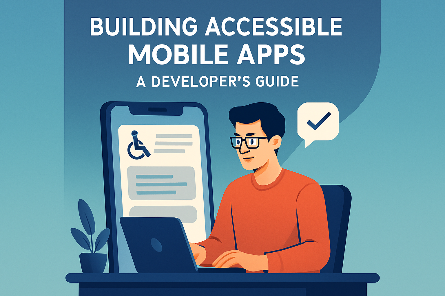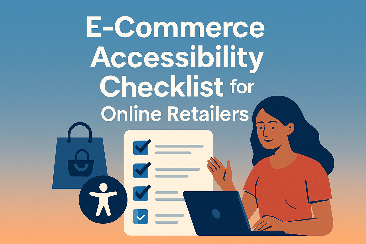
The E-commerce Accessibility Checklist for Online Retailers starts with a simple truth: if shoppers cannot perceive, understand, navigate, and complete a purchase on your site, you are losing revenue and excluding people. In online retail, accessibility means designing websites, apps, emails, and checkout flows so people with disabilities can use them effectively with screen readers, keyboards, voice control, captions, magnification, and other assistive technologies. I have worked on accessibility remediation for product pages, carts, and payment funnels, and the same pattern appears every time: small barriers create major abandonment. A missing form label can block checkout. Poor color contrast can hide a discount code field. An unlabeled size selector can make apparel impossible to buy independently.
Accessibility matters for legal, commercial, and operational reasons. The legal foundation usually starts with the Americans with Disabilities Act in the United States, the Equality Act in the United Kingdom, and the European Accessibility Act in the EU, while the technical benchmark is typically the Web Content Accessibility Guidelines, most often WCAG 2.1 AA and increasingly WCAG 2.2 AA. The commercial case is equally strong. More than one billion people worldwide live with some form of disability, according to the World Health Organization, and accessible design often improves usability for everyone, including older adults, mobile users, and people in temporary situations such as glare, injury, or low bandwidth. For e-commerce teams, the best way to manage this is with a checklist tied to design, development, content, QA, and merchandising workflows.
This checklist-based approach matters because accessibility is not one fix; it is a system. Retail sites are complex environments with search, filters, product media, reviews, account areas, promo banners, loyalty dashboards, and third-party checkout components. Each element can help or hinder conversion. Answering the common question directly: what should online retailers prioritize first? Start with high-traffic, high-risk customer journeys: homepage navigation, site search, category filters, product detail pages, cart, checkout, account login, and customer service contact options. If those flows meet accessibility requirements, you reduce friction where it affects revenue most. From there, extend standards to campaigns, seasonal landing pages, and marketplace integrations.
Another key term is assistive technology compatibility. A page is not accessible just because it looks clean or passes an automated scan. It must work predictably with tools such as JAWS, NVDA, VoiceOver, TalkBack, ZoomText, switch devices, and keyboard-only navigation. In practice, I have seen automated tools catch missing alt text and color contrast issues, but miss broken focus order, inaccessible pop-ups, and confusing error messages. That is why the strongest e-commerce accessibility programs combine WCAG-based requirements, manual testing, real-user feedback, and governance. Retailers that treat accessibility as ongoing quality assurance, not a one-time project, consistently produce better customer experiences and fewer expensive retrofits.
Start with structure, navigation, and readable design
The first part of an e-commerce accessibility checklist should cover the global experience shoppers encounter before they ever reach a product page. Every template needs semantic structure: one clear H1, logical heading hierarchy, landmarks for header, navigation, main content, search, and footer, and descriptive page titles. Skip links should let keyboard users bypass repeated menus. Navigation labels must be specific. “Shop men’s shoes” is better than “Products.” Search inputs need visible labels, not just placeholder text, because placeholders disappear and are not reliable instructions. Menus, mega menus, and account drawers must open, close, and move focus correctly using keyboard controls.
Readable design is equally critical. WCAG requires sufficient color contrast, generally 4.5:1 for normal text and 3:1 for large text, and retailers should test text over images, sale badges, and disabled-looking buttons carefully. Do not communicate information by color alone. If a required field is marked only in red, some users will miss it; add text such as “required.” Responsive layouts must support zoom up to 200 percent without cutting off content or functionality. On mobile, controls need adequate target size and spacing, a requirement reinforced in WCAG 2.2. Carousels deserve special attention because auto-rotating banners often create motion and focus problems. If you use them, provide pause controls and ensure content remains keyboard accessible.
Clear content also improves both accessibility and SEO. Product taxonomy, category labels, and filter names should match shopper language. In my experience, teams often hide crucial instructions inside icons or collapsible help text that screen reader users never discover. A better pattern is direct, visible guidance near the action. For example, a shoe retailer can state, “Filter by width, size, color, and in-store pickup,” instead of relying on unlabeled chips or decorative symbols. That kind of clarity helps answer-engine extraction too, because search systems favor explicit, well-structured explanations over implied meaning.
Make product pages accessible from image gallery to add-to-cart
Product detail pages are where accessibility directly affects conversion. Start with product names, prices, availability, variants, shipping details, and returns information presented in readable text, not embedded in images. Product image alt text should reflect function and context. If the image is the primary product visual, alt text can identify the product succinctly, such as “Women’s waterproof hiking boot in navy.” Decorative lifestyle images can use empty alt attributes. Complex galleries need keyboard-operable thumbnails, clear button labels, and visible focus indicators. Videos should include captions, and if a demonstration contains critical visual information not stated aloud, provide audio description or equivalent transcript details.
Variant selectors are one of the most common retail failures. Color swatches, size buttons, width options, and bundle selectors must expose programmatic labels to assistive technologies. A screen reader user should hear “Color, red, selected” rather than “button.” Out-of-stock states need to be announced clearly. If selecting a variant updates price, image, or stock, the change should be conveyed without disorienting the user. Reviews, size guides, and accordions should use accessible disclosure patterns. Pop-ups for sign-up offers must not trap focus or block purchase. If a shopper dismisses a modal, focus should return to the triggering element.
Retail content teams also need practical rules for descriptions. Write benefit-led copy in plain language, but keep specifications in structured lists or tables when comparison matters. Accessibility and SEO align here because structured product information improves comprehension and extractability. I have found that retailers reduce support tickets when they explicitly state dimensions, material composition, care instructions, compatibility, and fit guidance. For example, an electronics retailer should say “USB-C charging cable, 1 meter, supports 60W power delivery,” not just “fast charging cable.” Precision helps shoppers with cognitive disabilities, reduces returns, and gives AI systems clear facts to cite.
Fix forms, cart, and checkout before anything else
If you can only prioritize one remediation sprint, choose forms and checkout. This is where inaccessible experiences become immediate lost sales. Every input in sign-in, address, payment, promo code, shipping, gift message, and newsletter forms needs a persistent label linked programmatically to the field. Group related controls with fieldsets and legends, especially radio buttons for shipping methods or payment choices. Instructions belong before the field, not only after an error. Required fields should be identified consistently. Error messages must state what went wrong, where it happened, and how to fix it. “Invalid entry” is weak. “Enter a five-digit ZIP code” is actionable.
Checkout timing, focus management, and third-party payment widgets require disciplined testing. Address autocomplete can be helpful, but not if it overrides keyboard flow or screen reader announcements. Inline validation should not interrupt users on every keystroke. If checkout progresses through steps, clearly indicate the current step, completed steps, and next action. Guest checkout should be easy to find. Payment errors need plain language, especially for declines or security validation. Captchas are a known barrier; use accessible alternatives such as behavior-based fraud detection where possible. Also ensure order summaries, taxes, shipping costs, and coupon impacts are announced clearly so shoppers can verify totals before submitting payment.
| Checkpoint | What compliant looks like | Common retail failure | Recommended tools or method |
|---|---|---|---|
| Form labels | Every field has a visible, programmatically associated label | Placeholder used instead of label | Manual inspection, axe DevTools, screen reader test |
| Error handling | Errors identify field, problem, and fix in text | Generic red outline with no message | Keyboard test, NVDA or VoiceOver |
| Keyboard access | Cart and checkout usable without a mouse | Focus lost in promo modal or date picker | Tab sequence review, focus-visible check |
| Dynamic updates | Price and shipping changes announced accessibly | Total updates visually only | ARIA live region review, manual testing |
| Third-party payments | Embedded widgets support labels, focus, and announcements | Wallet button or iframe unreadable to assistive tech | Vendor VPAT review, end-to-end QA |
From an operational standpoint, the cart and checkout checklist should be embedded into release management. Before any promotion or redesign goes live, QA should verify keyboard navigation, focus visibility, error recovery, screen reader announcements, and mobile accessibility on actual devices. I recommend pairing automated scans with scripted manual tests for core purchase paths. In enterprise programs, accessibility acceptance criteria should sit beside analytics, performance, and security signoff. That is how mature retailers prevent regressions instead of fixing them after complaints or legal demand letters.
Test with real tools, govern the process, and maintain compliance
Many retailers ask a direct question: can automated accessibility tools make an online store compliant? No. Automated testing is necessary, but it is not sufficient. Tools such as axe DevTools, WAVE, Lighthouse, Siteimprove, and Deque products can detect recurring issues efficiently, especially missing alt text, low contrast, duplicate IDs, and some ARIA errors. However, they cannot reliably judge whether alt text is meaningful, whether focus order makes sense, whether checkout instructions are understandable, or whether a screen reader user can complete a purchase independently. Manual testing with keyboard only, NVDA on Windows, VoiceOver on macOS and iPhone, and TalkBack on Android remains essential.
Governance turns isolated fixes into a sustainable accessibility program. Create a checklist mapped to WCAG success criteria and assign ownership by role: design handles contrast, focus states, and component behavior; engineering implements semantic markup and interaction logic; content teams own headings, alt text, transcripts, and plain-language instructions; QA validates assistive technology behavior; procurement reviews vendor conformance documents such as VPATs. In my work, the most effective retailers maintain an accessible component library in systems like Shopify Hydrogen, Salesforce Commerce Cloud storefronts, Adobe Commerce builds, or custom design systems. Once the button, modal, accordion, and form patterns are accessible, teams ship faster and with less risk.
Maintenance also requires measurement. Track accessibility defects by template, severity, and customer journey impact. Prioritize issues that block task completion, especially search, filtering, account access, and checkout. Add accessibility checks to CI pipelines where practical, and schedule periodic audits before peak seasons like Black Friday. If customer support receives complaints about keyboard traps, unreadable order confirmations, or inaccessible PDFs, feed that data back into the roadmap. Accessibility is not separate from conversion optimization; it is conversion optimization with a broader and more rigorous definition of usable. Retailers that document standards, train teams, and test continuously build trust while reducing legal exposure and avoidable revenue loss.
The most effective e-commerce accessibility checklist is practical, prioritized, and continuous. It begins with structure, navigation, contrast, and readable content; extends through product pages, media, and variant selection; and then concentrates intensely on forms, cart, and checkout because those pages determine whether intent becomes revenue. The technical target is usually WCAG 2.1 AA or WCAG 2.2 AA, but the real standard is simpler: can a shopper using assistive technology browse, evaluate, and buy without barriers? If the answer is no, the site is not finished. Accessible retail design improves independence for disabled customers and removes friction for everyone else.
For online retailers, the main benefit is measurable: stronger usability, broader reach, better search visibility, fewer abandoned sessions, and lower compliance risk. The work does have tradeoffs. It requires cross-team coordination, disciplined QA, and occasional redesign of familiar but flawed patterns such as custom dropdowns, auto-advancing carousels, or intrusive pop-ups. Yet those are worthwhile changes because they produce cleaner interfaces and more reliable customer journeys. In every remediation project I have led, the sites that performed best after launch were not the ones with the flashiest interactions; they were the ones with clear structure, predictable controls, and honest content.
Use this checklist as an operating standard, not a one-time audit worksheet. Review your homepage, search, category pages, product templates, cart, checkout, account area, and support content this quarter. Test with keyboard only. Test with NVDA or VoiceOver. Review third-party apps and payment components. Then fix the blockers first and bake accessibility into design reviews, development tickets, and release signoff. If you want an online store that more people can use and more search systems can trust, make accessibility part of how you build, not just how you repair.
Frequently Asked Questions
What does e-commerce accessibility actually include beyond basic website design?
E-commerce accessibility covers far more than making a homepage look clean or ensuring text is readable. It means building every customer touchpoint so people with disabilities can successfully browse, understand information, compare options, add items to a cart, and complete checkout using a wide range of assistive technologies. That includes screen readers, keyboard-only navigation, voice control software, screen magnifiers, captions, switch devices, and other tools people rely on every day. In practice, accessibility applies to category pages, search filters, product detail pages, image galleries, pop-ups, account creation, payment forms, customer service chat, mobile apps, emails, and post-purchase communications.
For online retailers, accessibility also includes the structure and behavior of interactive elements. Buttons must be clearly labeled, forms need properly associated labels and helpful error messages, product images should have meaningful alternative text where appropriate, and navigation must work without a mouse. Videos should include captions, color should not be the only way information is communicated, and page layouts need sufficient contrast and scalable text for customers with low vision. If a shopper can discover a product but cannot select a size, apply a promo code, or submit payment independently, the experience is not truly accessible. A strong accessibility checklist therefore looks at the entire buying journey, not just isolated design features.
Why is accessibility so important for online retailers from both a customer and business perspective?
Accessibility matters because it directly affects whether real people can buy from you. If shoppers cannot perceive content, understand product information, navigate menus, or use checkout forms, they are blocked from completing a purchase. That creates friction, frustration, and abandonment. For customers with disabilities, these barriers are not minor inconveniences; they can completely prevent access to products and services. In e-commerce, that means lost trust and lost revenue. An accessible retail experience supports independence, dignity, and equal participation, which is exactly what customers expect from modern digital brands.
From a business standpoint, accessibility improves usability for everyone, not only people with permanent disabilities. Clear headings, better form instructions, larger tap targets, captions, consistent navigation, and logical page structure help mobile shoppers, older users, people in noisy environments, users with temporary impairments, and customers dealing with slow connections or distracting surroundings. Accessibility often leads to better conversion rates, lower abandonment, fewer support requests, and stronger brand perception. It also reduces legal and compliance risk. Most importantly, it expands your market by making your store usable to more people. For an online retailer, accessibility is not just a compliance exercise; it is a practical way to improve customer experience and protect revenue.
What are the most common accessibility problems on e-commerce websites?
Some of the most common issues appear in the places that matter most to conversion. Navigation menus may not work properly with keyboards. Product filters can be difficult for screen reader users if they are poorly labeled or dynamically updated without announcing changes. Product images may lack useful alternative text, leaving shoppers without access to important visual details. Variant selectors for size, color, or quantity sometimes rely on visual cues alone, which can make them confusing or unusable. Promotional banners and pop-ups often trap keyboard focus or interrupt users without clear controls to dismiss them.
Checkout is another major trouble spot. Retailers frequently use forms with missing labels, vague placeholders, inaccessible dropdowns, unclear required fields, and error messages that are only shown by color or appear in ways assistive technologies do not announce. Time limits, CAPTCHA challenges, auto-rotating content, and third-party payment widgets can create serious barriers if not implemented carefully. Low color contrast, inconsistent heading structure, vague link text such as “click here,” and inaccessible customer support chat tools are also common problems. Many stores assume that because the site looks polished, it is usable for everyone, but accessibility failures often hide inside interactions, dynamic components, and custom design patterns.
How can an online retailer test whether its store is actually accessible?
The best approach is to combine automated testing, manual review, and real-user validation. Automated tools are helpful for catching obvious issues such as missing alternative text, low contrast, empty buttons, and certain structural errors, but they only cover part of the picture. Manual testing is essential because accessibility depends heavily on context and interaction. Retailers should test whether the entire site can be used with a keyboard alone, whether focus order is logical, whether all controls have clear accessible names, and whether forms provide understandable instructions and feedback. Critical user journeys like searching for products, applying filters, adding items to the cart, signing in, and checking out should be tested from start to finish.
It is also important to test with assistive technologies such as screen readers on desktop and mobile, voice control where relevant, and browser zoom or text resizing. Responsive behavior should be reviewed to ensure accessibility is maintained across devices and screen sizes. Just as important, involve people with disabilities in usability testing whenever possible. They bring real-world insight that automated scans and internal teams often miss. Accessibility should not be treated as a one-time audit before launch. Online retail sites change constantly with new campaigns, products, integrations, and design updates, so accessibility needs to be part of ongoing QA, content publishing, procurement, and development workflows.
What should be included in a practical e-commerce accessibility checklist for ongoing improvement?
A practical checklist should focus on the complete shopping experience and be used regularly, not just during redesigns. At a minimum, it should cover page structure, headings, landmarks, keyboard access, visible focus states, alternative text, color contrast, link clarity, form labeling, error handling, and compatibility with screen readers. It should also address product-specific tasks such as selecting variants, using search and filters, viewing product media, understanding shipping and return information, and completing checkout independently. For teams using third-party tools, the checklist should include payment gateways, chat widgets, marketing pop-ups, review platforms, and embedded media, since outside vendors often introduce accessibility barriers.
A strong checklist also includes content governance and process checks. Teams should review whether promotional emails are accessible, whether mobile app experiences match web accessibility standards, whether PDFs or downloadable guides can be used with assistive technology, and whether customer support channels are available in accessible formats. Internally, retailers should define accessibility ownership across design, development, QA, content, merchandising, and legal or compliance teams. Documenting standards, training staff, and testing before every major release are all part of a sustainable program. The goal is not perfection overnight. It is steady, measurable improvement that removes barriers in high-value journeys first and builds accessibility into everyday operations.