The use of Braille on ADA (Americans with Disabilities Act) signs has become a standard practice in ensuring accessibility for those with visual impairments. However, the evolution and implementation of ADA guidelines encompass more than just Braille. Understanding these guidelines is crucial for creating inclusive spaces that accommodate all individuals, regardless of their disabilities. This article delves into the visual and tactile rules of ADA signage, going beyond Braille to explore features like color contrast, tactile characters, and positioning. Adhering to these rules not only fulfills legal requirements but also fosters a more inclusive society where individuals with disabilities can navigate public spaces with confidence.
ADA signage matters because it provides essential information to those who might otherwise be unable to understand visual cues. For blind or visually impaired individuals, tactile characters along with Braille offer a critical avenue for information. Meanwhile, proper color contrast and visual elements ensure that people with low vision or other visual challenges can effectively find their way around. By exploring these elements, this article aims to highlight why ADA signage rules are essential and how they can be applied in real-world scenarios to enhance accessibility for everyone.
Understanding Tactile Characters on ADA Signs
Tactile characters are raised letters or numbers that allow individuals to read signs through touch. While Braille assists those who are completely blind, tactile characters cater to those who are partially sighted or prefer feeling shapes. According to ADA guidelines, these characters must be uppercase, san serif or simple serif, and comply with specific size and thickness requirements. An example of tactile character implementation can be seen at airports where gate numbers are often raised and tactile for easier navigation.
A critical aspect of tactile characters is their placement. The ADA specifies that signs must be located where people can easily find and touch them, typically at heights between 48 to 60 inches off the ground. Furthermore, tactile elements must be accompanied by Braille to ensure users with different levels of sight impairment can access the information.
The Significance of Color Contrast in ADA Signs
Color contrast is an ADA requirement aimed at ensuring that all visual aspects of a sign are legible to those with low vision or color blindness. The ADA suggests a contrast level where light characters are displayed on a dark background or vice versa. This requirement is especially pertinent in educational settings, where clear signage can help direct students with visual impairments to classrooms and facilities.
| Contrast Level | Recommendation |
|---|---|
| High | Ideal for ADA compliance |
| Medium | Generally legible but risky for low vision users |
| Low | Not recommended as it challenges visibility |
High contrast examples are often implemented in public transit systems, where signs need to be quickly and easily read from a distance or low-light conditions. An effective color contrast ensures that signage is not only compliant but also universally accessible, significantly improving navigation for all users.
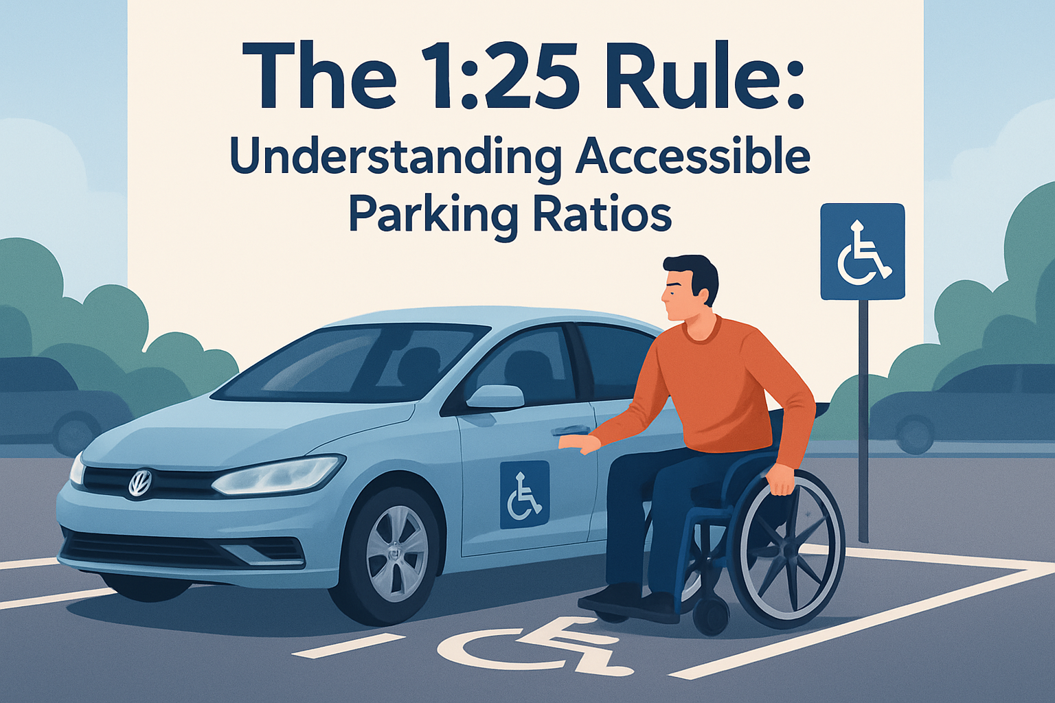
Accessibility in the Placement and Mounting of Signs
The ADA specifies particular mounting locations and methods to ensure accessibility. Signs must be placed where they are within reach of individuals with varying heights, including those in wheelchairs. Real-world application of these guidelines is evident in hospitals where room numbers and directional signs are positioned systematically to be reachable and readable by all visitors and staff, regardless of their physical condition.
The placement of signs should not pose an obstacle or hazard. Beyond simply being reachable, items like protruding signage that infringe upon walkways can hinder movement or become a safety issue for the visually impaired if not tactically avoided or designed within regulations.
The Role of Pictograms in ADA Signage
While text and tactile elements are essential for communication, pictograms serve an equally important role in conveying information quickly and understandably. These simple images are mandated where visual communication can be most effective and should occupy a space of at least 6 inches in height. For example, restroom signs with the universally recognized male and female symbols are necessary in facilitating quick understanding.
Pictograms are particularly beneficial in diverse environments like cultural centers where language barriers might exist. Their universal nature allows them to communicate essential messages across the spectrum of language and literacy, ensuring all visitors understand the intended directive.
Integrating Braille with Other ADA Sign Components
Braille remains a cornerstone of ADA signage rules, effectively serving those who rely on tactile reading. However, integrating Braille with other components like tactile characters and pictograms ensures comprehensive accessibility, accommodating a more extensive range of users. The seamless integration can be witnessed in shopping malls where elevator controls and floor directories frequently use a combination of tactile elements, Braille, and visual indicators.
- Braille is curved and rounded for ease of reading with fingers
- Placement is beneath or on the directly adjacent area of tactile characters
- Height requirements ensure that it is reachable and practical for use
By using all these elements in cohesive signage, entities can better cater to individuals with diverse accessibility needs, reinforcing their commitment to inclusivity and legal compliance.
Implementing ADA Signage in Private and Public Spaces
Attention to ADA signage is critical in private businesses, such as retail environments, ensuring compliance and avoiding penalties. For example, retail chains are required to place ADA-compliant signs at emergency exits, restrooms, and special service areas. With correct implementation, not only are businesses compliant but they also enhance their customer service and accessibility.
Public spaces, such as parks and community centers, must also adhere to ADA guidelines to be truly accessible. Wayfinding and informational signs provide users with guidance through complex environments. The thoughtful application of tactile and visual guidelines in these spaces promotes a friendly, inclusive atmosphere where everyone feels welcome and independent in navigating to their destinations.
Ultimately, ADA compliance ensures both moral responsibility and functional service to the community, laying the groundwork for improved accessibility on an ongoing basis. The proactive implementation of such signage drastically complements the function of any space aimed to be accessible and inclusive.
Conclusion: The Path Forward for Comprehensive ADA Signage
ADA signage goes beyond just tactile Braille; it involves a well-rounded approach of tactile characters, color contrasting, pictograms, and strategic placements. Understanding and implementing these components collectively allow for compliance with legal requirements and ethical considerations of accessibility. The awareness and application of these practices are crucial for both public and private sectors to ensure that all individuals, regardless of their disabilities, are afforded equal ease of access and independent navigation.
The initiatives discussed are not just a means of complying with laws but a pathway towards inclusivity and equality. This notion reinforces why businesses, organizations, and public services need to cognizantly evaluate and upgrade their signage systems.
The next step for those responsible for signage is a call to assess their current ADA compliance and identify areas for improvement. By investing in accessible signage solutions, the community commitment to accommodating and respecting all individuals is not only demonstrated but effectively achieved.
Frequently Asked Questions
1. What exactly are ADA signs, and why are they important?
ADA signs are more than just a standard design requirement; they’re a fundamental part of ensuring that public spaces are accessible to everyone, including those with disabilities. Under the Americans with Disabilities Act, these signs serve the crucial purpose of providing information in a way that can be perceived by individuals with visual, hearing, or cognitive impairments.
Unlike regular signs, ADA signs follow strict visual and tactile guidelines to ensure clarity and accessibility. These guidelines include factors like sign placement, tactile elements (such as Braille), color contrast, font size, and positioning that are essential for people with disabilities. Braille, while an important feature, is just one part of ADA signage requirements. By complying with these rules, businesses and public entities create more inclusive environments, making it easier for everyone to navigate spaces independently.
2. Beyond Braille, what are the visual and tactile rules of ADA signs?
The visual and tactile rules of ADA signage encompass a range of elements designed to optimize readability and accessibility. For instance, the color contrast between text and background is a critical visual rule. The ADA specifies sufficient contrast to ensure readability by individuals with low vision or color blindness. This involves using light-colored text on a dark background or vice versa.
Typography also plays a significant role, as using a sans-serif font that’s easy to read at a glance is preferred. The text should not only be legible but also of appropriate size—typically between 5/8 inch and 2 inches tall. Tactile guidelines include ensuring that raised characters and Braille are included to aid those with visual impairments, allowing them to locate rooms or navigate buildings independently by touch.
3. How should ADA signs be positioned for optimal accessibility?
Proper placement is crucial for ADA signs, as it directly affects their usability by those with disabilities. Signs should be installed on walls that are adjacent to a specific room entrance they serve, making them easy to locate. Additionally, the ADA mandates that tactile characters and Braille be positioned between 48 inches and 60 inches above the finish floor or ground surface, ensuring that people of varying heights can comfortably reach them.
The placement should also be clear of obstructions and mounted where the signage can be easily visible upon entrance or exit from a space. The ADA’s intention with these rules is to ensure that signs are intuitive, easy to find, and usable for anyone who needs them.
4. What are common misconceptions about ADA signage?
One of the most common misconceptions about ADA signage is that it’s synonymous solely with Braille inclusion. While Braille is a key feature, ADA guidelines for signage encompass a much broader range of visual and tactile requirements. This misunderstanding can lead to incomplete or improperly implemented signage, which fails to fully support individuals with disabilities.
Another prevalent misconception is that ADA compliance is only necessary for large public buildings or businesses. In reality, any publically accessible facility, regardless of its size, is required to comply with ADA guidelines. Misunderstanding or underestimating these requirements can result in signs that do not effectively communicate the intended message to all users, undermining their purpose and legality.
5. How can businesses ensure their signs comply with ADA guidelines?
To ensure that signage is ADA compliant, businesses should start by familiarizing themselves with the comprehensive set of ADA guidelines rather than just focusing on Braille. Consulting with accessibility experts or sign vendors who specialize in ADA signage can be extremely helpful as they are often well-versed in the latest requirements and best practices.
Regular audits of current signage can also aid in maintaining compliance, allowing businesses to identify any outdated or non-compliant signs. Furthermore, continuous education and training about ADA standards can empower staff and management to understand and prioritize accessibility in all aspects of their facilities.
By proactively engaging with these resources and guidelines, businesses can ensure their environments are welcoming and accessible to all individuals, fostering inclusivity and enhancing the customer experience.